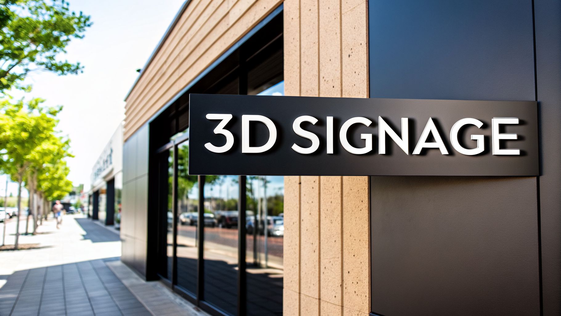
Imagine your business name doing more than just sitting on a wall—it projects forward, making a statement of quality and permanence before anyone says a word. That's the real-world power of 3D sign letters. Think of a standard flat sign like a photograph. It gets the job done, but a dimensional sign is more like a sculpture, adding physical depth that grabs attention from every angle. A practical example is a high-end salon using polished silver 3D letters; the sign itself communicates luxury before a client even sees a price list.
Why 3D Sign Letters Are a Smart Investment
On a busy street, a potential customer’s eyes are constantly scanning for something that stands out. Flat, forgettable signs just become part of the background noise. This is exactly where 3D sign letters give you a serious edge.
By creating real depth, these letters cast subtle shadows and play with light in a way that two-dimensional signs simply can't match. That dimensional quality makes them far more visible and memorable. It’s the difference between looking at a flat map and a topographical model—the model gives you a much richer, clearer understanding of the landscape.
To see the benefits in one place, here’s a quick breakdown:
Key Benefits of 3D Sign Letters at a Glance
| Benefit | Description | Best For |
|---|---|---|
| Enhanced Visibility | The physical depth creates shadows and highlights, making the sign naturally pop and grab attention from a distance. | Storefronts on busy streets, businesses in crowded commercial parks, and anyone competing for attention. |
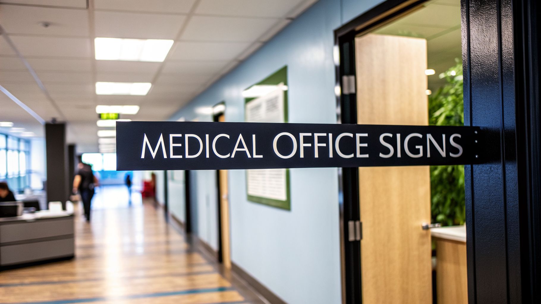
| Professional Credibility | High-quality materials and construction convey a sense of permanence, stability, and attention to detail. | Law firms, financial institutions, medical offices, and high-end retail or service businesses. |
| Stronger Brand Identity | The style, material, and finish can be perfectly matched to your brand, reinforcing your image as modern, classic, or rustic. | Any business looking to create a cohesive and memorable brand experience, from boutiques to corporate HQs. |
| 24/7 Impact | When illuminated, 3D letters create a striking effect at night, ensuring your business remains visible long after sunset. | Restaurants, bars, hotels, and retail stores with evening hours that need to attract nighttime traffic. |
Ultimately, choosing 3D sign letters is a strategic move to elevate how customers perceive your business from the very first glance. An actionable insight here is to drive past your location at different times of day to see what your competitors' signs look like, then choose a 3D style that will stand out in contrast.
Elevate Brand Perception and Trust
The materials and craftsmanship behind 3D letters instantly signal quality and permanence. A business that invests in solid, well-made signage sends a clear message: "We are established, professional, and here for the long haul." That feeling of stability builds trust before a customer even walks in.
The tangible, high-quality nature of 3D sign letters helps differentiate a business from competitors. It suggests an attention to detail that customers often assume extends to the products or services offered.
For example, a law firm with brushed metal letters in its lobby conveys authority and prestige. A chic boutique with sleek, acrylic dimensional letters feels modern and sophisticated. This ability to reinforce your brand's personality is a huge advantage. You can dive deeper into the financial side by exploring the overall cost of signage for your business.
Capitalize on a Growing Market Trend
This shift toward more impactful signage isn't just a hunch; it's a major market trend. The global signage market was valued at around USD 26 billion in 2023 and is on track to hit nearly USD 36 billion by 2030.
As detailed in this comprehensive market research blog, this growth is driven by businesses demanding more advanced solutions, like 3D letters, that deliver superior visual results. Investing in dimensional signage now simply positions your business to meet modern customer expectations.
Choosing the Right Materials and Finishes
Picking the right material for your 3d sign letters is like choosing the foundation for a building; it determines everything about your sign’s appearance, durability, and how well it stands up to the job you hired it to do. This isn't just a technical detail—it’s a core decision that dictates whether your investment lasts for years and perfectly represents your brand.
For example, a business right on the coast would be smart to use marine-grade aluminum to fight off the corrosive salt air. On the other hand, a high-end law firm looking to project a sense of stability and tradition would find brushed bronze letters in its lobby a far better fit. Each material tells a story.
Comparing Popular Material Choices
Let's break down some of the most common materials we work with and where they really shine. Getting a handle on these options is the first step to making a smart investment that pays off.
- Aluminum: This is the workhorse of the sign industry for a reason. It’s tough, lightweight, and completely rust-proof, making it perfect for outdoor signs that need to look great for years, no matter the weather. We can paint it any color to lock in your brand identity.
- Acrylic: Known for its clean, modern look and incredible color options, acrylic is a versatile plastic that delivers a high-end feel. It provides a sleek, high-gloss finish that’s a go-to for interior reception signs and upscale retail displays. Because it can be laser-cut with precision, it’s ideal for replicating complex logos.
- Stainless Steel: When you need to communicate a premium, sophisticated brand, nothing beats stainless steel. It signals permanence and quality, making it a top choice for corporate headquarters, financial institutions, and luxury brands. You can have it polished to a mirror-like shine or brushed for a softer, more subtle satin texture.
To really dive deep, it's worth checking out a professional 3D printing materials guide which covers the full range of plastics, resins, and metals available today.
The flowchart below shows how a simple thought process can align your sign’s purpose directly with your business goals.
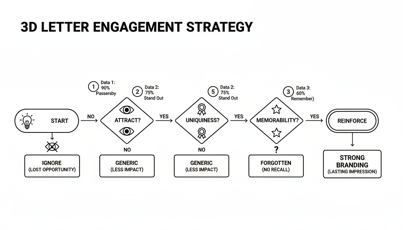
As you can see, the objective isn't just to put up a sign. It's to use that sign as a strategic tool to attract customers, make a powerful impression, and build a memorable brand.
Understanding Finishes and Their Impact
Beyond the base material, the finish is the final touch that truly brings your sign to life. It has a massive impact on both how readable your sign is and the specific feeling your brand gives off.
The finish on your 3D sign letters directly influences how light interacts with them, which can either enhance or hinder visibility. A thoughtful choice ensures your sign is just as effective in bright sunlight as it is on an overcast day.
Here are a few common finishes to consider:
- Matte: This non-reflective finish is excellent for minimizing glare, which makes it incredibly readable in direct sunlight. It gives off a modern, understated vibe.
- Gloss: A shiny, reflective finish that makes colors pop with richness and vibrancy. It’s fantastic for grabbing attention but can create distracting glare in certain lighting conditions.
- Brushed or Polished: Reserved for metals, these finishes add a sense of texture and expert craftsmanship. A polished finish is luxurious and mirror-like, while a brushed finish has fine, uniform lines that create a softer satin look.
By carefully weighing your options, you can land on a material and finish combination that’s perfect for your location. You can explore more options in our complete guide to exterior sign materials.
Illumination Options to Make Your Brand Shine
Adding light to your 3d sign letters is the difference between having a daytime asset and a hardworking, 24/7 marketing machine. Once the sun goes down, an unlit sign simply vanishes. An illuminated one, on the other hand, keeps working for you, catching eyes and projecting an image of success around the clock.
But the way you light your sign does more than just make it visible. The lighting style you choose sends a powerful message about your brand’s personality—it’s a core part of the design that helps tell your story.
Front-Lit for Maximum Visibility
Front-lit letters, often called standard channel letters, are the undisputed champion of bold, can’t-miss brightness. With this approach, the light source shines directly through the translucent face of each letter. The result is a powerful, highly visible glow that cuts through any visual clutter.
Think of it as the most direct way to get noticed. This style is a perfect fit for:
- Retail stores in busy shopping plazas where you’re fighting for attention among a sea of other signs.
- Gas stations and fast-food restaurants that need to be seen clearly from the road by drivers passing by at speed.
- Any business that wants to make a bright, confident, and unmissable statement.
Picture a bustling retail center at night. The businesses that command attention and pull customers in are almost always the ones with bright, front-lit channel letters.
Halo-Lit for a Touch of Elegance
If you're aiming for a more refined and sophisticated vibe, halo-lit letters are an exceptional choice. Also known as back-lit letters, this style involves mounting the letters slightly off the building’s surface, with the LEDs positioned behind them.
The light spills out from behind each letter, casting a soft, elegant glow onto the wall. This creates a beautiful "halo" effect that adds a sense of depth and prestige, making the letters appear to float.
Halo-lit signs are ideal for upscale restaurants, corporate offices, boutique hotels, and professional firms looking to project quality and sophistication. It’s a subtle, ambient feel that says "high-end" without shouting it. For a practical example, a steakhouse could use warm, halo-lit letters to create an inviting, premium atmosphere before customers even step inside.
Comparing 3D Sign Letter Illumination Types
| Illumination Type | Visual Effect | Ideal For | Brand Feel |
|---|---|---|---|
| Front-Lit | Bright, direct, and powerful glow | Businesses needing high visibility, like retail, fast food, and gas stations | Bold, Confident, Accessible |
| Halo-Lit | Soft, ambient glow creating a "halo" around letters | Upscale businesses, like fine dining, law firms, and boutiques | Elegant, Sophisticated, Premium |
| Combination Lit | Both a bright face and a soft halo effect | Businesses wanting both high visibility and a premium feel | Modern, Dynamic, High-Impact |
| Edge-Lit | A subtle, crisp line of light around the letter edges | Interior signs and brands seeking a minimalist, modern aesthetic | Sleek, Tech-Forward, Chic |
Ultimately, the best choice depends on the story your brand wants to tell. Each style creates a distinct mood and helps position your business in the minds of your customers.
The market for advanced displays, including the technology behind 3d sign letters, was valued at USD 5.27 billion in 2023 and is projected to grow significantly. This shows just how much businesses are investing in making a powerful visual impact.
For a deeper dive into all your lighting possibilities, you can explore our guide to electric signs for business. If your vision involves particularly complex or unique lighting effects, working with professionals who specialize in custom electrical design will ensure everything is installed safely and looks flawless.
Practical Design and Sizing Guidelines
An effective sign gets noticed and, more importantly, read in an instant. When it comes to 3d sign letters, this means looking past pure aesthetics and getting practical about design. The most beautifully crafted sign is completely useless if a potential customer driving by can’t make out its message in the few seconds you have their attention.
The entire game is legibility from a distance. A simple, time-tested rule of thumb is you need one inch of letter height for every 10 feet of viewing distance. If you want your sign to be crystal clear from 100 feet away, your letters need to be at least 10 inches tall. This is the starting point for making sure your message actually lands. A great actionable tip is to stand across the street from your location and have someone hold up a measuring tape to visualize how large the letters need to be.
Font Choice and Legibility
Turning a brand identity into a physical object is where font selection becomes absolutely critical. While a delicate, wispy script font might look elegant on a business card, it often becomes a fragile, unreadable blur when fabricated as 3D signage. Those thin strokes are not only difficult to read from a distance but can also be structurally weak.
For maximum impact and readability, you should always lean toward:
- Bold, clean fonts: Simple, thick letterforms are just easier for the human eye to process at a glance.
- Sans-serif styles: There's a reason fonts like Helvetica, Futura, and Arial are so popular. They don't have the small decorative feet (serifs) that can blur together from afar.
- Consistent stroke width: Letters with uniform thickness are easier to fabricate and read, and they illuminate much more evenly.
A good sign designer knows how to adapt a more complex or script-based logo for 3D fabrication. This might mean strategically thickening lines or simplifying certain elements to ensure the final product is both structurally sound and visually clear—all without losing your brand’s personality.
Spacing and Depth Are Critical
The space between individual letters, professionally known as kerning, has a huge impact on how well your sign reads. Pack the letters too tightly, and they become a jumbled mess. Space them too far apart, and the viewer’s brain has to work overtime just to form the words. A professional will fine-tune this spacing to create a balanced, effortless wordmark.
Letter depth also plays a key role. A deeper letter will cast a more prominent shadow, increasing its dimensional effect and making it pop off the wall. However, excessive depth on smaller letters can make them look chunky and hard to read up close.
The goal is to strike that perfect balance between height, depth, and spacing. This is what ensures your 3D sign letters are not just seen but are also understood, leaving a lasting and professional impression on every single person who passes by.
Navigating Installation and Local Permitting
Once your 3d sign letters are perfectly crafted, the final hurdle is getting them onto your building—and making sure it’s all done by the book. This last step can feel like the most intimidating part, but understanding the basics of installation and permitting turns a potential headache into a smooth, straightforward finish.
Choosing the right way to hang your sign is about more than just looks; it’s about the long-term stability and integrity of both your sign and your building.
Getting It on the Wall: Your Installation Options
First up is direct mounting. With this method, each letter is individually attached right to the building’s facade. This gives your signage a super clean, floating appearance, almost as if the letters are growing right out of the wall. It’s a fantastic choice for non-illuminated letters or when you have a solid surface that can be securely anchored into.
The other popular method is raceway mounting. Here, the 3D letters are first mounted onto a shallow metal box—the "raceway"—that neatly contains all the electrical components and wiring. The entire assembly is then installed on the wall as one single piece. This is the industry standard for illuminated signs because it dramatically simplifies the wiring and means far fewer holes need to be drilled into your building. The raceway can even be painted to match your wall, making it practically disappear.
Partnering with a professional sign company is the surest way to guarantee a secure, clean, and code-compliant installation. Experts can assess your building’s structure and recommend the best mounting method for a flawless and lasting result.
Navigating the Red Tape: Sign Permits Explained
Before any professional sign company drills a single hole, you’ll almost certainly need a permit from your city or county. This isn’t just bureaucratic red tape; it’s a non-negotiable step to ensure public safety and make sure your sign follows local rules. Municipalities use permits to verify that every sign is installed correctly and won't become a hazard.
City inspectors are typically focused on a few key things:
- Structural Integrity: Is the sign securely attached to handle strong winds and bad weather?
- Electrical Safety: Is all the wiring up to code to prevent any risk of fire?
- Zoning Compliance: Does the sign’s size, height, and location fit within the local ordinances?
Trying to tackle the permitting process yourself can quickly become a nightmare of paperwork and confusing regulations. A good sign partner handles this for you, from preparing the applications to managing the final inspection. This ensures your project moves along without costly delays or last-minute compliance failures.
Your Partner in Professional Signage
Bringing ambitious 3d sign letters to life shouldn't be a logistical nightmare. Getting it right means finding a true partner, not just a vendor—someone who can manage the entire process and turn your vision into a physical landmark that works as hard as you do.
The biggest advantage is having a single, expert guide. Instead of you trying to coordinate designers, fabricators, and installers, a dedicated project manager handles everything. This streamlined approach keeps the project on track and ensures your goals are met without costly miscommunications.
From Concept to Completion
An experienced sign partner uses the right fabrication techniques and materials to build a sign that not only looks sharp on day one but also holds up to the elements for years. This is about more than just aesthetics; it's about protecting your investment and making sure your brand looks professional and permanent.
Whether it’s a startup's very first lobby sign or a complex national rollout across dozens of locations, the right partner ensures every detail is perfect. If you're wondering what to look for, you can learn more about choosing a local sign company near me.
Think of a true signage partner as an extension of your team. They handle the complex logistics of fabrication, permitting, and installation so you can focus on what you do best: running your business.
The demand for dimensional signage is exploding. Search data shows that interest in '3d led logo sign' shot up dramatically in October 2025, jumping from almost nothing to a Google Trends score of 83. This trend, detailed in these insights about 3d logo sign trends, proves that businesses are actively looking for signs with more impact.
This isn't a niche trend; it’s a clear signal from the market. By working with a team that gets it, you position your brand to meet that demand with a sign that truly stands out from the flat, boring competition.
Frequently Asked Questions About 3D Signs
When you're thinking about upgrading to dimensional signage, it’s completely normal to have questions about the investment, how long it will last, and what’s possible with your design. Here are some straightforward, practical answers to the questions we hear most often about 3D sign letters.
How Much Do 3D Sign Letters Cost?
The cost of 3D sign letters is a bit like asking the price of a car—it really depends on the model and the features you choose. The final price tag is shaped by the sign's size, the materials used, how complex your design is, and whether you add illumination.
For example, a small set of non-lit acrylic letters for an indoor reception area might run a few hundred dollars. On the other hand, a large, illuminated channel letter sign for a major storefront can range from several thousand to well over ten thousand dollars.
Things like custom fonts, highly detailed logos, and tricky installation sites will also factor into the cost. The best way to get a real number is to request a custom quote, where a sign expert can look at your specific needs and give you an accurate estimate.
How Long Do 3D Signs Last?
The lifespan of your sign really comes down to the materials you pick and the environment it lives in. High-quality metals like aluminum and stainless steel are built like tanks and can easily last for decades with very little upkeep. Acrylic is also incredibly tough, often lasting 10 years or more, particularly when used indoors.
For illuminated signs, the LED components are the real workhorses. They typically have a lifespan of 50,000 to 100,000 hours. That translates to many years of bright, reliable performance, ensuring your sign stays a powerful marketing tool.
A little bit of regular cleaning goes a long way in maximizing the life of any sign and keeping your brand looking sharp.
Can My Existing Logo Be Made Into 3D Letters?
Absolutely. In nearly every case, we can translate an existing 2D logo into a stunning 3D sign. Our professional designers work with you to adapt your branding into a physical object that has real presence and structural integrity.
This might mean making a few small tweaks, like slightly thickening a thin line or simplifying an overly complex detail to ensure the final product looks great and is built to last. The goal is always to protect your brand's identity while making it pop in the real world. You’ll always get a final proof to approve before we start building anything.
Ready to bring your brand to life with professional signage? The team at On Display Signs, Inc. manages every step, from design and fabrication to permitting and installation, ensuring a flawless result. Get your free quote today.


