Your business sign is more than just a nameplate; it's a silent, 24/7 salesperson, a crucial landmark, and often the very first impression a potential customer has of your brand. The right signage does more than announce your location; it actively attracts foot traffic, builds immediate brand recognition, and can directly impact your bottom line. However, with countless options available, navigating the different types of commercial signs can feel overwhelming for business owners, developers, and facility managers alike.
This comprehensive guide is designed to demystify that process. We will break down the 10 most effective and popular sign categories, providing the actionable insights you need to make a strategic and informed investment. Forget generic advice; we will dive deep into each sign's ideal application, typical materials, and crucial design considerations that ensure your message cuts through the noise.
Whether you operate a retail storefront on a bustling street, manage a large industrial complex, or lead a community church, understanding these options is the critical first step toward creating a powerful and effective visual identity. This listicle will equip you with the knowledge to select, design, and implement signage that not only looks great but also delivers measurable results for your organization. From dynamic digital displays to stately monument signs, you'll learn how to choose the perfect solution to meet your specific goals and budget, ensuring your brand stands out for all the right reasons.
1. Digital LED Signs
Digital LED (Light-Emitting Diode) signs are one of the most dynamic and high-impact types of commercial signs available today. Unlike static signs, these electronic displays use a grid of LEDs to create bright, full-color content that can include text, images, animations, and even full-motion video. This versatility allows businesses to communicate multiple messages, promotions, or announcements from a single, highly visible platform.
These signs are incredibly effective because their content can be updated remotely and in real-time. For a practical example, a restaurant can display breakfast specials in the morning and switch to dinner promotions in the evening, while a gas station can instantly update fuel prices. This adaptability makes them a powerful tool for time-sensitive marketing and community engagement, as seen on everything from casino marquees to local bank displays showing the time and temperature.
Key Considerations and Best Practices
To maximize the return on a digital LED sign, careful planning is crucial. The sign's effectiveness depends on more than just its technology; it requires strategic content and placement. For businesses looking to integrate this advanced technology more broadly into their customer experience, exploring the top digital signage solutions can reveal innovative ways to engage patrons beyond the storefront.
When designing content, keep these actionable tips in mind:
- Keep It Brief: Passersby, especially in vehicles, have only 3-5 seconds to read your message. Use short phrases, large text, and a clear call-to-action. For example, instead of "We are having a sale this weekend," use "SALE THIS WEEKEND."
- Prioritize Contrast: High-contrast color combinations, such as yellow text on a black background, ensure maximum readability day and night. Test your color choices on-screen before deploying.
- Match Content to Your Audience: Schedule specific advertisements or messages to align with peak traffic times. A practical example is a retail store promoting a back-to-school sale during late afternoon hours when parents are picking up their children.
- Check Local Ordinances: Before investing, always verify local zoning regulations regarding digital sign brightness, animation restrictions, and placement. Many towns have rules against flashing or moving text to prevent driver distraction.
The following infographic highlights key data points to consider when budgeting for a digital LED sign.
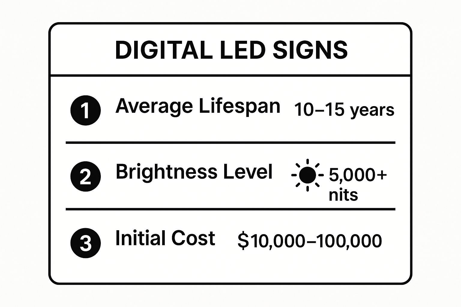
While the initial cost is significant, the sign’s long lifespan and high brightness level ensure it remains a valuable marketing asset for over a decade. This video from Daktronics, a leading manufacturer, demonstrates the visual impact and versatility of these powerful displays.
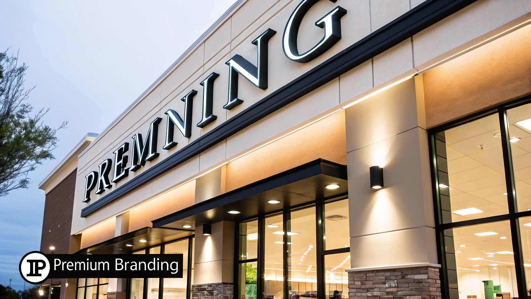
2. Channel Letter Signs
Channel letter signs are one of the most popular types of commercial signs for storefronts and building identification due to their professional and high-impact appearance. These signs consist of three-dimensional, individually fabricated letters, numbers, or logos. Typically crafted from aluminum and plastic, each character is a self-contained unit with internal illumination, usually from energy-efficient LEDs, creating a clean, sophisticated look.
The dimensional quality of channel letters makes a business stand out, both day and night. You can see them used effectively by national retailers like Target and Home Depot, which require consistent, high-end branding across all locations. A practical example of their versatility is their use on local restaurants, corporate office buildings, and tenants in a shopping center who want to project an image of quality and permanence. This type of sign provides excellent readability from a distance, making it a powerful tool for attracting customers.
Key Considerations and Best Practices
To ensure your channel letter sign is effective and long-lasting, careful planning in the design and installation stages is essential. The right choices in illumination, mounting, and sizing will significantly impact the sign's visibility and brand consistency. For businesses seeking a sign company with a long history of quality craftsmanship in this area, exploring the work of pioneers like Federal Heath can provide valuable insights into manufacturing standards.
When designing your channel letter sign, keep these actionable tips in mind:
- Choose LED Illumination: Opt for LED lighting over traditional neon. LEDs are more energy-efficient, require significantly less maintenance, and offer a longer lifespan, reducing long-term operational costs.
- Consider Halo-Lit (Reverse) Letters: For a modern, upscale aesthetic, halo-lit letters create a soft glow around each character by directing light backward onto the mounting surface. This is an excellent choice for a law firm or a high-end salon wanting to convey a premium brand image.
- Ensure Proper Sizing: A practical rule of thumb for readability is to have one inch of letter height for every ten feet of viewing distance. A sign viewed from 100 feet away should have letters at least 10 inches tall.
- Plan for Mounting: If your building facade cannot hide wiring, a raceway-mounted sign is an ideal solution. A raceway is a metal box that houses the power supply and wiring, simplifying installation and minimizing penetrations into the building wall.
- Request a Night-Time Mockup: Ask your sign provider for a digital rendering of how the sign will look when illuminated at night. This helps you evaluate brightness, color accuracy, and overall visual impact before fabrication begins.
3. Monument Signs
Monument signs are ground-level, freestanding structures that create a prestigious and permanent first impression. Unlike pole signs that tower over a location, these signs are built at or near eye level, featuring a solid, durable base made from materials like brick, stone, or concrete. This substantial construction integrates seamlessly with the surrounding landscape and architecture, conveying a sense of stability and permanence.
These types of commercial signs are incredibly effective for marking entrances to business parks, corporate headquarters, hospitals, and upscale retail centers. A practical example is a medical campus using a stone monument sign at its main entrance to direct patients and project an image of authority and trust. Their low-profile design provides clear identification without obstructing the building’s facade, making them a sophisticated choice for properties with ample street-facing frontage.
Key Considerations and Best Practices
To ensure a monument sign serves as a long-term asset, both its design and placement require careful consideration. The goal is to create a structure that is both visually appealing and highly functional, complementing the brand and the physical environment. For those planning larger commercial developments, exploring resources from industry leaders like ASI Signage can provide valuable insights into creating a cohesive system.
When designing your monument sign, keep these actionable tips in mind:
- Match Architectural Style: Choose materials and colors for the base that complement your building’s exterior. A practical example: a modern office might use sleek concrete and metal, while a traditional church might use classic red brick.
- Plan for Visibility and Safety: Ensure the sign is positioned with clear sight lines from the street and does not obstruct traffic views. Maintain clear zones around the sign by keeping landscaping neatly trimmed.
- Illuminate for Nighttime Impact: Integrate landscape lighting or internal illumination to ensure the sign is visible and professional-looking 24/7. Up-lighting can create a particularly dramatic and elegant effect.
- Design for Durability: An actionable insight is to consider factors like drainage in the foundation to prevent water damage and select darker-colored base materials to minimize the visibility of dirt and stains over time.
4. Pylon/Pole Signs
Pylon signs, also known as pole signs, are freestanding structures designed for maximum visibility from a distance. Mounted on single or double poles, these signs tower over surrounding buildings and obstructions, making them a landmark for businesses located along high-speed roadways or set back from the street. Ranging from 20 to over 100 feet tall, they are essential for attracting the attention of drivers on highways and busy thoroughfares.
These signs are particularly effective for shopping centers, gas stations, hotels, and restaurant plazas where multiple tenants share a single, highly visible structure. A practical example is the iconic McDonald's golden arches on a tall pole or the large price signs for gas stations visible from an interstate exit. Their height and scale make them a navigational beacon, guiding customers directly to a location they might otherwise miss.
Key Considerations and Best Practices
To ensure a pylon sign is a sound investment, engineering and strategic planning are paramount. These structures must be designed not only for visibility but also for safety and compliance with local regulations. Their large scale requires careful consideration of factors like wind load and soil conditions.
When planning for a pylon sign, keep these actionable tips in mind:
- Prioritize Legibility from a Distance: Use large, bold fonts and simple, high-contrast graphics. The goal is instant recognition for fast-moving traffic.
- Conduct a Visibility Study: An actionable step is to determine the optimal height needed to be seen over trees, other buildings, and terrain from key approach routes before finalizing the design.
- Verify Local Height and Setback Ordinances: Zoning laws for these types of commercial signs are often strict. Confirm all regulations regarding height, size, and placement before beginning the engineering phase.
- Incorporate Your Business Category: For highway travelers, adding generic terms like "GAS," "FOOD," or "LODGING" can significantly increase effectiveness, as it instantly communicates your service.
- Plan for Maintenance Access: Ensure the design includes safe and practical access for servicing lights, panels, and electrical components. A hinged face or catwalk can save significant costs later.
- Consider Shared Costs: For multi-tenant properties, a shared pylon sign is a cost-effective way for all businesses to gain premium visibility.
5. Awning and Canopy Signs
Awning and canopy signs are a classic and functional type of commercial sign that integrates branding directly into architectural elements. These signs are featured on fabric or metal structures that extend from a building's facade, serving a dual purpose: they protect customers from the elements while also acting as a highly visible branding tool. Graphics, logos, and text are printed, painted, or applied directly onto the awning material, creating an elegant and traditional aesthetic.
This approach is highly effective for businesses aiming to enhance their storefront's charm and provide a comfortable customer experience. A practical example is a street-side cafe using a branded awning to offer shade and shelter, making its entrance more inviting and encouraging foot traffic. It adds depth and architectural interest to a flat facade, making businesses like boutique retail shops and historic downtown businesses stand out.
Key Considerations and Best Practices
To ensure an awning sign is both durable and effective, careful selection of materials and adherence to best practices are essential. The right design can transform a simple storefront into a landmark, while poor choices can lead to rapid deterioration and a negative brand impression. A well-maintained awning sign signals quality and attention to detail before a customer even steps inside.
When planning for an awning sign, consider these actionable tips:
- Choose Durable Fabric: Opt for solution-dyed acrylic fabric, which offers superior resistance to fading from sun exposure and harsh weather.
- Plan for Weather: In areas with high winds or heavy snowfall, a practical solution is a retractable awning that can be safely stowed away to prevent damage.
- Maximize Readability: Use high-contrast color combinations between the fabric and the graphics to ensure your business name and logo are easily visible from a distance.
- Incorporate Lighting: Add backlighting or attach LED lighting strips underneath the awning to maintain visibility and create an ambient, welcoming glow after dark.
- Ensure Proper Drainage: A well-designed awning includes a proper slope and drainage system to prevent water from pooling, which can cause damage and staining. This is a crucial actionable insight for longevity.
- Check Local Codes: Awnings often extend over public sidewalks, so it's crucial to verify local zoning regulations and obtain the necessary permits before installation.
6. Window Graphics
Window graphics are one of the most cost-effective and versatile types of commercial signs, turning existing glass surfaces into prime advertising real estate. These adhesive vinyl films can be applied directly to windows and doors, transforming them with everything from simple text like store hours to elaborate, full-color murals. This allows businesses to communicate branding, promotions, and essential information without needing additional structures.
Their strength lies in maximizing underutilized space. A practical example is a restaurant displaying vibrant photos of its signature dishes, a retail store announcing a major sale, or a fitness center showcasing its class schedule directly to passersby. From a minimalist logo on a glass storefront to frosted vinyl providing privacy in a bank's office, window graphics serve both marketing and functional purposes, offering a high-impact visual solution at a fraction of the cost of other sign types.
Key Considerations and Best Practices
To get the most out of your window graphics, design and application must be carefully planned. An effective graphic is not just about aesthetics; it needs to be readable, durable, and strategically placed. For businesses wanting to create a holistic storefront presentation, it's also worth exploring captivating window display ideas to complement your graphics and attract more customers.
When designing your window graphics, keep these actionable tips in mind:
- Prioritize Readability: Use large, bold fonts and high-contrast color combinations. Passersby often have only a few seconds to absorb your message, so clarity is essential.
- Maintain Interior Visibility: For large-scale graphics covering entire windows, use perforated vinyl. This material displays a solid image from the outside while allowing those inside to see out clearly.
- Keep It Clean and Simple: Avoid clutter. A good guideline is the 70/30 rule, where graphics cover no more than 30% of the window space, leaving 70% open to maintain an inviting feel.
- Ensure Proper Application: The glass surface must be meticulously cleaned before application to prevent bubbles and peeling. Professional installation is recommended for large or complex designs.
- Include a Clear Call-to-Action: Don't just show your brand; tell customers what to do next. Include your website, phone number, or a scannable QR code to drive engagement. A practical example: "Scan for 10% Off!"
7. Blade/Projecting Signs
Blade signs, also known as projecting signs, extend perpendicularly from a building’s facade, making them uniquely visible to pedestrian and vehicular traffic moving along a street. Mounted on decorative arms or brackets, these two-sided signs are a hallmark of walkable downtowns, historic districts, and bustling urban environments. Their design captures attention from a distance, guiding customers directly to an entrance long before they are directly in front of the building.
This classic signage style, reminiscent of old-world European pub and shop signs, adds a touch of charm and character to a storefront. Practical examples include the iconic signs of Bourbon Street in New Orleans or the quaint boutique signs in historic shopping districts. Blade signs are incredibly effective for businesses that rely on foot traffic, like a bookstore or a coffee shop. They can be internally or externally illuminated, ensuring visibility day and night while complementing the building's architecture.

Key Considerations and Best Practices
To create a blade sign that is both effective and compliant, careful planning is essential. These signs must be structurally sound and meet local regulations while enhancing the building's aesthetic. Proper design ensures the sign is a welcoming beacon rather than an obstruction.
When designing your blade sign, keep these actionable tips in mind:
- Prioritize Structural Integrity: A projecting sign is subject to wind load. Ensure its mounting hardware and structural engineering are sufficient to withstand local weather conditions and prevent safety hazards.
- Check Clearance Requirements: Local ordinances mandate a minimum height clearance above sidewalks to ensure pedestrian safety. Always verify these regulations before installation to avoid costly fines and modifications.
- Embrace Architectural Harmony: Select materials and decorative brackets that complement your building's architectural style. In historic districts, this coordination is often a requirement.
- Maximize Readability: Design clear, concise graphics that are easily readable from both directions. An actionable insight is that a simple logo or symbol is often more effective than cluttered text.
8. A-Frame/Sidewalk Signs
A-frame signs, also known as sidewalk signs or sandwich boards, are portable, freestanding signs ideal for capturing the attention of pedestrian traffic. These double-sided displays are among the most approachable and cost-effective types of commercial signs, perfect for communicating immediate, temporary messages right at the storefront. Their simple, movable design allows businesses to place them strategically during operating hours and bring them inside for safekeeping overnight.
The charm of A-frame signs lies in their versatility and the personal touch they can convey. A practical example is a local café using a chalkboard A-frame to advertise its daily latte special, while a retail boutique can announce a flash sale with a hand-lettered message. This direct-to-consumer approach feels authentic and engaging, making it a favorite for independent businesses, restaurants promoting happy hour, and real estate agents directing visitors to an open house.
Key Considerations and Best Practices
To make an A-frame sign an effective marketing tool, the design and message must be compelling enough to stop a passerby. The goal is to provide a quick, scannable piece of information that encourages an immediate action, like stepping inside your store. This requires a blend of clear communication and strategic placement.
When creating your sidewalk sign content, keep these actionable tips in mind:
- Keep It Short and Scannable: Pedestrians are on the move. Your message should be readable in just a few seconds, using large, bold text and concise phrasing.
- Update Content Frequently: A static A-frame message quickly becomes part of the background. An actionable tip is to change specials, promotions, or witty quotes daily or weekly to keep it fresh and interesting.
- Ensure Stability: To prevent your sign from tipping over in the wind, use a model with a fillable base (sand or water) or add weights, especially if it weighs less than 20 pounds.
- Use High-Contrast, Weather-Resistant Materials: Opt for high-contrast colors and use weather-resistant chalk markers or vinyl lettering that won’t run in the rain.
- Check Local Regulations: Many municipalities have specific rules regarding the size, placement, and permitted hours for sidewalk signs. Always verify these ordinances to avoid fines.
- Include a Clear Call-to-Action: Drive immediate action by including pricing, a time-sensitive offer like "Happy Hour 4-6 PM," or a simple directive like "Come On In!"
9. Neon Signs
Neon signs are an iconic and artful type of commercial sign, known for their distinctive, warm glow and nostalgic appeal. These signs are crafted from glass tubes bent into custom shapes, letters, or designs, which are then filled with neon or other inert gases. When an electrical voltage is applied, the gas ionizes and emits a vibrant, colored light, creating a look that is difficult to replicate. This artisanal quality makes them a timeless choice for businesses aiming to cultivate a specific, often retro or high-end, atmosphere.
The visual impact of neon is undeniable. Its glowing, three-dimensional lines command attention and can evoke a sense of authenticity and craftsmanship. This makes it a popular choice for bars, classic diners, and boutique hotels. A practical example is the vintage marquees of Las Vegas or the simple "OPEN" sign in a café window. Neon signs create an inviting and memorable ambiance that has been a staple of commercial signage for over a century.
Key Considerations and Best Practices
To successfully harness the unique aesthetic of neon, businesses must focus on quality craftsmanship and proper maintenance. The creation of a traditional neon sign is a skilled trade, and the final product's longevity and visual appeal depend heavily on the artisan's expertise. For those interested in how this classic medium is being preserved and celebrated, the Museum of Neon Art (MONA) offers a fascinating look into its history and artistic potential.
When planning for a neon sign, consider these actionable tips:
- Hire an Experienced Bender: The quality of a neon sign is directly tied to the skill of the glass tube bender. Vet potential fabricators to ensure they have a strong portfolio of durable and aesthetically pleasing work.
- Plan for Professional Installation: Neon signs require high-voltage transformers and specialized wiring. Always use a licensed and experienced sign installer to ensure the sign is mounted securely and meets all electrical safety codes.
- Consider a Protective Enclosure: For outdoor signs exposed to the elements, a clear acrylic or polycarbonate enclosure can protect the fragile glass tubes from damage and prolong the sign's life.
- Budget for Energy and Maintenance: Traditional neon signs consume more electricity than LED alternatives and require periodic maintenance. Factor these ongoing operational costs into your budget.
10. Cabinet/Lightbox Signs
Cabinet signs, often called lightbox signs, are among the most ubiquitous and cost-effective types of commercial signs. They consist of an enclosed, box-like frame (the "cabinet") with a translucent face, typically made from acrylic or polycarbonate. Internal illumination, traditionally from fluorescent tubes but now more commonly LEDs, lights up the face from behind, making the graphics and text glow brightly and uniformly.
This straightforward design makes them incredibly versatile and popular across various industries. They are a staple for franchise businesses like 7-Eleven, which require consistent and easily replicable branding across numerous locations. A practical example is a tenant identification panel in a shopping center or a wall-mounted sign for an independent pharmacy or dry cleaner. Their simple construction allows for efficient mass production and easy maintenance, providing excellent visibility day and night.
Key Considerations and Best Practices
To get the most out of a cabinet sign, focusing on quality materials and modern technology is essential. While they are a budget-friendly option, small upgrades can significantly extend their lifespan and enhance their visual appeal, ensuring they represent your brand effectively.
When planning for a lightbox sign, keep these actionable tips in mind:
- Retrofit to LED: An actionable insight for older signs with fluorescent bulbs is that switching to LED lighting can result in energy savings of 50-70% and drastically reduce maintenance needs.
- Invest in Quality Materials: Use high-grade, outdoor-rated translucent vinyl for graphics and opt for thicker acrylic or polycarbonate faces (at least 3/16-inch) to prevent cracking and discoloration.
- Ensure a Proper Seal: A well-fitted gasket around the sign face is crucial to prevent moisture, dirt, and insects from getting inside, which can damage the internal components and obscure the sign's graphics.
- Clean Regularly: The flat face of a cabinet sign can accumulate dirt and grime, dimming its brightness. Regular cleaning with soap and water will keep it looking vibrant and professional.
- Add Dimension: Enhance a standard lightbox by adding decorative trim, a custom-shaped border, or even push-through acrylic letters to give it a more dimensional, high-end appearance.
Top 10 Commercial Sign Types Comparison
| Sign Type | Implementation Complexity 🔄 | Resource Requirements ⚡ | Expected Outcomes 📊 | Ideal Use Cases 💡 | Key Advantages ⭐ |
|---|---|---|---|---|---|
| Digital LED Signs | High (requires electrical, software, permits) | High (electricity, maintenance, software) | High impact customer engagement, dynamic content | High-traffic locations, frequent message updates, entertainment venues | Highly visible, remote updates, high ROI |
| Channel Letter Signs | Medium-High (custom fabrication, electrical work) | Medium (materials, professional install) | Professional, strong brand presence | Retail storefronts, restaurants, office buildings, premium branding | Polished appearance, durable, customizable |
| Monument Signs | High (site prep, foundation, permits) | High (materials, construction) | Permanent, prestigious presence | Corporate campuses, medical facilities, business parks | Durable, upscale, zoning-friendly |
| Pylon/Pole Signs | Very High (engineering, permits, complex install) | Very High (structural, electrical, maintenance) | Maximum long-distance visibility | Highway businesses, shopping centers, hotels, gas stations | Landmark visibility, multi-tenant capable |
| Awning and Canopy Signs | Medium (fabrication, mounting, permits) | Medium (materials, replacement fabric) | Functional protection with branding | Retail shops, restaurants, cafés, pedestrian storefronts | Weather protection, cost-effective, aesthetic |
| Window Graphics | Low-Medium (printing, installation) | Low (materials, installation labor) | Cost-effective branding, temporary promotions | Retail, offices, restaurants, temporary campaigns | Affordable, quick update, privacy enhancement |
| Blade/Projecting Signs | Medium-High (structural mounts, permits) | Medium (materials, installation complexity) | High pedestrian visibility both directions | Historic districts, urban storefronts, pedestrian areas | Two-sided visibility, traditional appeal |
| A-Frame/Sidewalk Signs | Low (simple setup, no permits usually) | Low (materials, frequent updates) | Effective short-term promotions | Restaurants, cafés, retail shops, high foot traffic | Portable, affordable, easy to update |
| Neon Signs | High (specialized fabrication, electrical) | Medium-High (materials, skilled labor) | Distinctive vintage aesthetic, strong visibility | Bars, entertainment venues, retro-themed businesses | Nostalgic, artisanal, 360° glow |
| Cabinet/Lightbox Signs | Medium (electrical, weather sealing) | Medium (materials, graphics, lighting) | Even illumination, cost-effective visibility | Franchises, shopping centers, quick-service restaurants | Durable, replaceable graphics, energy-efficient |
Making Your Final Signage Decision
Navigating the world of commercial signage can feel overwhelming, but as we’ve explored, each option serves a distinct purpose. From the dynamic, attention-grabbing power of Digital LED Signs to the classic, three-dimensional authority of Channel Letters, the right choice is a strategic asset that communicates your brand's identity long before a customer steps inside. This article has detailed ten unique types of commercial signs, and the ultimate decision rests on a careful evaluation of your specific business context.
Your journey to selecting the perfect sign isn't about finding a one-size-fits-all solution; it's about aligning the sign's function with your business's core objectives. A practical example is a sprawling distribution warehouse that gains immense visibility from a towering Pylon Sign visible from the highway, while a boutique retail shop on a historic main street benefits far more from the pedestrian-level charm of a Blade Sign or the inviting functionality of an Awning Sign.
Synthesizing Your Options: Key Takeaways
To move from understanding to action, let’s distill the core decision-making factors. Your choice hinges on the interplay between location, objective, brand, and budget.
- Visibility vs. Ambiance: Are you trying to capture fast-moving traffic from a distance or create an intimate, welcoming atmosphere for foot traffic? Pylon signs and large-scale monument signs excel at the former, while blade signs, window graphics, and A-frame signs are masters of the latter.
- Information Delivery: Do you need to convey static information (your name and logo) or dynamic, changing messages? For static branding, channel letters and cabinet signs are timeless. For promotions, events, and real-time updates, the versatility of a Digital LED Sign is unparalleled.
- Architectural Integration: How will the sign complement your building's design? Monument Signs should echo the materials and textures of your property, creating a cohesive and upscale entrance. Awning Signs must blend seamlessly with the storefront's facade, adding to its character rather than detracting from it.
- Regulatory Landscape: Local zoning laws and landlord restrictions are non-negotiable. These regulations will often dictate the size, placement, and even the type of sign you can install. For instance, a historic district might prohibit internally illuminated cabinet signs but welcome classically designed blade signs.
Crucial Insight: Your sign is more than just a marker; it is your 24/7 salesperson. It is a silent ambassador that shapes public perception, drives traffic, and reinforces your brand's promise of quality and professionalism. A well-chosen sign is an investment that pays dividends through increased visibility and customer trust.
Actionable Next Steps to Finalize Your Choice
With a clearer understanding of the various types of commercial signs, your next steps are practical and focused.
- Conduct a Site Analysis: Physically walk your property and the surrounding area. Note traffic patterns, viewing distances, and neighboring business signs. Where is the optimal line of sight for both drivers and pedestrians?
- Define Your Primary Goal: Be specific. Is your main goal to increase foot traffic by 15%? To establish your new corporate headquarters as a local landmark? This primary objective will immediately narrow down your options. For example, a church looking to announce weekly service times and community events would find a Digital LED Sign far more effective than a static monument sign.
- Consult a Professional: The complexities of permitting, material durability, and structural engineering are best left to experts. Engaging with a national sign company early in the process can save you from costly mistakes and ensure your sign is not only beautiful but also compliant and built to last.
By moving through these stages, you transform a broad list of possibilities into a targeted, strategic decision. You are no longer just picking a sign; you are crafting a vital piece of your business's marketing and branding infrastructure. This final choice will define your physical presence, welcome your customers, and stand as a lasting symbol of your brand's commitment to excellence.
Choosing, designing, and installing the perfect sign involves navigating permits, material science, and local regulations. Partnering with an end-to-end expert like On Display Signs, Inc. simplifies this entire process, ensuring your vision becomes a high-impact, durable reality. Explore their portfolio of stunning commercial signs and learn how their national expertise can elevate your brand at On Display Signs, Inc..

