When you move beyond a flat printed sign, 3d lettering signage gives your brand a real, physical presence that’s impossible to ignore. A standard sign is like a photograph, but a 3D sign is more like a sculpture. It creates depth, plays with shadows, and gives off a feeling of permanence that people notice right away.
What Is 3D Lettering Signage and Why It Works
Think of a flat, printed sign as a quiet statement. It gets the job done, but it doesn't command the room. In contrast, 3D lettering gives your brand a confident voice, turning that statement into a conversation starter.
By adding physical depth, these signs create a dynamic visual with natural highlights and shadows that our eyes are instinctively drawn to. This makes the sign feel more substantial and real, instantly communicating a sense of quality and professionalism. When customers see a well-crafted dimensional sign, they subconsciously connect those same qualities to your business—it tells them you’re established, you care about the details, and you invest in your image.
The Power of a Strong First Impression
In a crowded marketplace, your storefront sign is the first handshake you offer a potential customer. A standard printed sign can easily get lost in the visual noise of a busy street. But 3D letters pop. They make your business easier to spot and harder to forget.
This boost in visibility is crucial for grabbing the attention of passersby and building brand recognition. The high-end look of 3D lettering makes sure that the first impression you make is a powerful and positive one.
The real magic of 3D lettering is how it creates a sense of permanence and authority. The depth and shadows give your brand a physical weight and presence that flat graphics just can't match, making it a smart investment in how your business is perceived.
Real-World Applications
One of the best things about 3D lettering is its versatility. You can match the material and style to fit any brand's personality, turning a simple name into a powerful piece of your identity.
- Corporate Offices: Polished, brushed metal letters in a reception area immediately convey sophistication and stability. For example, a law firm might use brushed aluminum letters on a dark wood panel behind the front desk to project authority.
- Retail Boutiques: Fun, brightly colored acrylic letters can create a modern and inviting vibe that draws shoppers in. Imagine a children's toy store with vibrant, glossy red acrylic letters that look playful and exciting.
- Restaurants: Illuminated channel letters are perfect for making an establishment stand out, especially after dark. A classic example is an Italian restaurant using warm, halo-lit brass letters to create an elegant and inviting nighttime atmosphere.
- Law Firms: Classic bronze or brass letters mounted on an exterior brick wall project tradition and trustworthiness.
Each of these examples does more than just display a name; it actively shapes how a customer feels about the brand from the very first glance. This is just one of many options, and it’s always a good idea to understand all the different types of outdoor business signs to find the perfect fit for your goals. Ultimately, investing in 3D lettering is an investment in how the world sees your brand.
Choosing the Right Materials for Your 3D Sign
Picking the right material for your 3D lettering signage is a lot like choosing the perfect fabric for a custom suit. The choice dictates the final look, the feel, and how well it holds up over time. It's the foundation of your entire sign, influencing everything from weather resistance to how it gets installed.
Making the right call ensures your sign not only fits your brand’s personality but can also handle its environment. A sleek tech company might go for brushed aluminum, while a quirky creative agency could opt for vibrant, colourful acrylic. Each material tells its own story.
Durable and Prestigious Metals
For any business wanting to project an image of strength, stability, and class, metal is almost always the go-to. It’s incredibly durable, making it the perfect choice for outdoor signs that have to battle the elements year after year.
- Aluminum: Lightweight, totally rust-proof, and incredibly versatile, aluminum is a crowd favorite for a reason. It can be finished in a dozen different ways—brushed for a slick, textured look, polished to a mirror shine, or painted to nail your exact brand colours. For specific applications like official building markers, you can find great examples in cast aluminum plaques.
- Stainless Steel: If you're going for a premium, high-end feel, nothing beats stainless steel. It’s ridiculously strong and corrosion-resistant, making it a smart long-term investment for any high-profile exterior sign. For instance, a luxury hotel could use polished stainless steel letters for its main entrance sign to convey opulence.
- Brass and Bronze: These classic materials just ooze timeless elegance. They’re a perfect fit for institutions like law firms, banks, or historic buildings that want to communicate tradition and authority. An example would be a university using bronze letters on a stone monument at its entrance.
Metal’s natural strength makes it a solid bet for impactful, long-lasting 3D lettering that commands respect. If you need that durability but in a lighter package, it's also worth it to explore the benefits of aluminium composite signage as a more budget-friendly alternative.
Versatile and Modern Acrylic
If metal is the classic power suit, then acrylic is the sharp, modern blazer—it’s stylish, flexible, and comes in every colour imaginable. Acrylic is a type of plastic prized for its clean, polished look and incredible design flexibility.
It's much lighter than metal and can be laser-cut with pinpoint precision into the most intricate logos and shapes. Acrylic is available in a massive range of standard colours, but it can also be custom-painted to match any shade your brand needs. It's also fantastic for illuminated signs because it diffuses light so well, creating stunning front-lit or halo-lit effects.
Actionable Insight: For interior lobby signs, consider layering materials. A common technique is to use a 1/4" thick polished acrylic letter mounted on top of a 1" thick foam letter. This gives you the impressive depth of foam with the premium, glossy finish of acrylic at a lower cost than solid metal or thick acrylic.
This infographic breaks down the core benefits that a well-crafted 3D sign brings to the table.
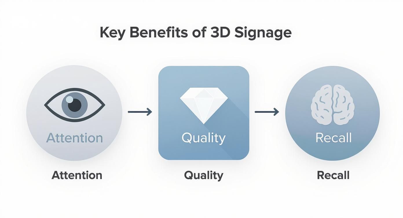
As you can see, the main advantages are grabbing attention, communicating quality, and boosting brand recall—and the material you choose plays a huge role in all three.
Cost-Effective and Lightweight Foam
For businesses that want the dimensional look without the hefty price tag, foam is a fantastic solution, especially for indoor signs. High-Density Urethane (HDU) foam is a popular material because it’s surprisingly durable, extremely lightweight, and can be carved into complex shapes.
Foam can be finished with a hard coat for extra protection and painted to look just like more expensive materials. It's often faced with a thin laminate of acrylic or metal to give it that premium finish while keeping the sign light and easy to hang.
Choosing the right material is a balancing act between aesthetics, budget, and durability. To make it a little easier, here’s a quick comparison of the top contenders.
3D Signage Material Comparison Guide
| Material | Best Use | Durability | Aesthetic | Cost |
|---|---|---|---|---|
| Aluminum | Exterior & Interior | High | Modern, Sleek | $$ |
| Stainless Steel | Exterior & Interior | Very High | Premium, Industrial | $$$ |
| Brass/Bronze | Prestige Exteriors | Very High | Classic, Elegant | $$$$ |
| Acrylic | Interior & Illuminated | Medium-High | Modern, Colourful | $$ |
| Foam (HDU) | Interior & Trade Shows | Medium | Versatile, Budget-Friendly | $ |
Ultimately, the best material is the one that tells your brand’s story most effectively and stands up to the demands of its environment.
Designing 3D Letters for Maximum Impact
A truly great 3D lettering sign is where artistic vision meets practical science. It’s not enough for it to just look good up close on a design proof. That sign has to work hard, grabbing attention and communicating your message clearly from the street.
Every single element—from the font you pick to the glow of the lights—has to work together. This isn't just about putting your name on a wall; it's about telling people who you are.
Typography and Readability Essentials
The font you choose is the personality of your sign. Think about it: a bold, modern sans-serif font like Helvetica practically screams efficiency and innovation, making it perfect for a tech startup. But a classic serif font like Garamond projects tradition and trustworthiness—a solid choice for a law firm or a generations-old business.
But it goes beyond just picking a font you like. The physical details are what make it work in three dimensions. Letter depth, or how far the letters pop off the wall, creates the shadows that give your sign dimension. Too much depth can make the letters look distorted from an angle, while too little makes them feel flat and uninspired. A practical rule of thumb is to aim for a depth that is about 10-20% of the letter height for balanced dimensionality.
Then there’s kerning, which is just a fancy word for the spacing between letters. Get it right, and your name is crystal clear from across the parking lot. Get it wrong, and the letters mush together into an unreadable mess. For a deeper look at how typefaces translate to physical materials, check out our guide on finding the best fonts for metal signs.
The Power of Strategic Illumination
Lighting is what turns your 3D sign from a daytime landmark into a 24/7 beacon for your brand. Good lighting doesn't just make your sign visible after sunset; it sets a mood and reinforces the exact feeling you want your business to give off.
There are two main ways to light up your letters, and each one creates a totally different vibe:
- Front-Lit (or Face-Lit) Letters: This is the classic, can't-miss-it approach. Light shines right through the face of each letter, creating a bright and incredibly clear message. It’s the go-to style for retailers and restaurants on a busy street that need to shout, "We're open!" For example, a 24-hour pharmacy would use front-lit letters for maximum visibility at all times.
- Back-Lit (or Halo-Lit) Letters: If you're going for a more sophisticated, understated look, this is it. LEDs are mounted inside the letters, pointing back at the wall. This creates a soft glow, or "halo," around each character, adding an elegant feel that’s popular with upscale hotels, boutiques, and corporate offices. An art gallery, for instance, would benefit from the subtle elegance of halo-lit signage.
Actionable Insight: When choosing illumination, consider the color of your building. A halo-lit sign works best against a lighter, non-reflective surface that can catch the light well. If your building is dark brick, a front-lit sign will provide much better contrast and readability from a distance.
Embracing a Minimalist Approach
In the world of 3D signage, less is almost always more. We're seeing a huge shift toward clean, minimalist designs. When you use simple, uncluttered fonts, you let the physical shape and depth of the letters do the talking.
A design that’s too busy or complex just creates noise, distracting from your actual name and making it harder to read. By keeping it clean, the sign's dimensionality becomes the star of the show. This ensures your name is delivered with style and clarity, making an impact that feels both immediate and professional.
How Your 3D Signage Is Crafted
Turning a digital design on a screen into a stunning piece of 3D lettering signage is a fascinating mix of high-tech machinery and old-school craftsmanship. It’s a journey from a computer file to a physical landmark, and every step along the way is critical to getting that flawless, professional look.
The first move is always precision cutting. For materials like acrylic and foam, technicians load your approved design into a CNC (Computer Numerical Control) router. These machines are unbelievably accurate, carving out each letter and logo element with robotic perfection. For thinner metals and acrylics, a laser cutter may be used for even finer detail.
This isn’t just about speed; it's about getting every curve and angle just right. It guarantees that the sign you get is an exact match to the design you fell in love with—something that’s nearly impossible to do by hand.
Shaping and Assembling Metal Letters
When you’re working with metal like aluminum or stainless steel, the process gets much more hands-on. After the flat faces and returns (the side walls of the letters) are cut, skilled fabricators take over. They meticulously bend, shape, and weld the individual pieces together to create the hollow, three-dimensional characters known as channel letters.
This part of the job requires serious skill and an eye for detail. The quality of the welds and the precision of the bends don’t just affect how the sign looks—they determine how long it will last. For illuminated signs, this step is everything; perfect seams are needed to prevent light leaks and keep the structure strong.
The fabrication of 3D signage is where art meets engineering. While machines provide the precision, it’s the hands-on expertise of technicians in welding, finishing, and assembling that brings the true quality and character to your sign.
Applying the Finishing Touches
Once the letters are built, the focus shifts to making them look incredible and function perfectly. This is where your sign really starts to reflect your brand’s personality.
The finishing process is detailed and has several key steps:
- Professional Painting: Letters are often taken into a specialized paint booth where they get coats of automotive-grade paint. This isn't just for color—it creates a tough, weather-resistant shield that protects your investment from the elements.
- Applying Textures: Metal signs can get special treatments to create a specific vibe. A brushed finish offers a sophisticated, textured look, while a polished finish delivers a clean, mirror-like shine.
- LED Integration: For any illuminated sign, this is the most important part of the build. Technicians carefully fit high-quality, energy-efficient LED modules inside each letter, making sure the glow is perfectly even. All the wiring is neatly managed for safety, durability, and easy maintenance down the road.
Knowing what goes into building your sign gives you a better appreciation for the final product. It also explains why quality takes time and why working with true experts makes all the difference. If you're looking for a team that has this process down to a science, finding the right channel letter sign companies near you is the best place to start.
Proper Installation and Long-Term Care
Your gorgeous new 3D lettering signage isn't finished when it leaves the workshop—it’s only finished when it’s safely and securely on your wall. Professional installation is the final, critical step that makes sure your sign looks exactly as you imagined and stays put for years to come.
How your letters attach to the wall is a huge part of the final look. It's not just a technical detail; it's a design choice. The best method depends on the sign’s weight, its material, and what kind of wall it’s going on.
Common Mounting Techniques
Choosing a mounting style isn’t just about hanging a sign. It’s about finishing the look and making it feel like a natural part of your building’s architecture.
- Flush Mount: This is your go-to for a clean, seamless look. The letters are mounted directly against the wall, creating a solid, built-in appearance that’s perfect for smooth interior walls. Studs are typically drilled into the back of the letters, which then go into holes in the wall, secured with adhesive.
- Standoff Mount: A hugely popular choice, this technique uses small spacers to "float" the letters off the wall. That tiny gap is all it takes to create subtle drop shadows that add extra depth and make the sign pop. It's also the required method for halo-lit signs.
Actionable Insight: Before installation, ask your sign company for a paper mounting template. This is a full-size printout of your sign that shows exactly where to drill each hole. It eliminates guesswork and ensures perfect alignment and spacing, whether you or a professional is doing the installation.
Installation and Permitting Considerations
Before a single hole is drilled, you need to think about the practical details, especially for outdoor signs. The wall surface—whether it’s brick, drywall, stucco, or metal—dictates exactly what kind of hardware is needed to hang the sign securely.
If your sign is illuminated, getting the electrical hooked up is non-negotiable. This has to be handled by a qualified electrician to keep everything safe and up to code. On top of that, most cities and towns have strict rules for exterior signs. You will almost certainly need a permit, and that process can be a headache. It's always smart to get familiar with local sign permit requirements before you even start the project to avoid fines and delays.
A Simple Maintenance Checklist
Once your sign is up, a little bit of care will keep it looking brand new. A simple and consistent maintenance routine protects it from the elements and makes it last a whole lot longer.
- Regular Cleaning: Give the letters a gentle wipe-down with a soft cloth and a mix of mild soap and water at least twice a year. Never use harsh chemicals or abrasive scrubbers, which can ruin the finish on painted or acrylic surfaces.
- Visual Inspection: Every now and then, just look it over. Check for any loose parts or cracked paint. For exterior signs, check after major storms. Catching small issues early stops them from becoming big, expensive problems later.
- Check Electrical Components: For lighted signs, keep an eye out for any flickering or dim spots. This could signal a failing LED or a wiring problem, and any electrical work should always be left to a professional.
Following these simple tips ensures your sign continues to be a vibrant and effective ambassador for your brand for many years.
Understanding the Cost of 3D Lettering
Trying to pin down the exact cost of 3D lettering signage is a bit like pricing out a custom car—there’s no single sticker price. The final number really comes down to the ingredients you choose. Think of it less as an off-the-shelf purchase and more as a custom-built asset for your brand.
The biggest piece of the pricing puzzle is almost always the material. Solid metals like stainless steel or bronze carry a premium feel and price tag, while materials like acrylic or HDU foam offer a fantastic look for a more modest investment. Each one strikes a different balance between durability, style, and cost, so you can dial in the perfect choice for your brand and your budget.
Key Factors That Shape Your Quote
Once you’ve settled on a material, a few other key details will shape the final quote. It goes without saying that a huge, illuminated sign for your building’s exterior is a completely different project than a small, non-lit logo for the reception desk.
- Size and Thickness: The bigger and deeper the letters, the more material and fabrication time they require. A sign with a six-inch depth will cost more than one with a two-inch depth, even if they’re the same height and width.
- Design Complexity: A simple, bold font is far easier to produce than a swirling, custom script or a logo with tons of fine details. Every extra cut, curve, and individual piece adds to the labor involved.
- Illumination: Lighting is one of the best ways to make your sign pop, but it adds a few line items to the quote. You have to account for the LED modules themselves, the power supply, extra wiring, and the skilled labor needed to put it all together safely.
Knowing these variables helps you have a smarter conversation with your sign maker. You can figure out where to spend for maximum impact and where you might be able to save a few dollars without compromising the final look.
Smart Budgeting for 3D Signage
Getting a high-end look doesn't always mean picking the most expensive option on the menu. For example, you can get the look of solid metal for a fraction of the cost by using foam letters with a thin metal laminate on the face. It’s a clever workaround, especially for interior signs that don't have to battle the elements.
Actionable Insight: If your budget is tight, focus your spending on the most visible element. For an exterior sign, invest in durable, weatherproof material like aluminum. For an interior sign, you can save money by choosing HDU foam but elevate the look with a high-quality brushed metal laminate face. This strategic choice delivers the best visual impact for your dollar.
There's a reason so many businesses are investing in this type of branding. The global signage market was valued at around $26 billion in 2023 and is expected to hit nearly $36 billion by 2030, with dimensional signs leading the charge. You can find more insights about this trend in the signage industry on excelkc.com. This growth just goes to show how effective 3D lettering is at creating that premium feel, and by weighing the factors above, you can make a smart investment in your brand’s physical presence.
Your 3D Signage Questions, Answered
When you're considering 3D lettering signage, a few questions always come up. We've put together some straight answers to the most common ones to give you the clarity you need to make the right call for your business.
Think of this as your cheat sheet for understanding the practical side of investing in dimensional signs.
How Long Will My 3D Sign Last?
This is a great question, and the answer really comes down to the material and where it's installed. With the right materials and a little bit of care, a well-made 3D sign can easily last seven to ten years—and often much longer.
Tough materials like aluminum and stainless steel are champs outdoors, built to take a beating from the weather. For indoor signs, materials like acrylic and HDU foam are fantastic long-term choices. The best way to get the most out of your investment is simple: keep it clean and give it a quick check-up now and then.
Are 3D Signs Good for the Outdoors?
Absolutely. In fact, 3D signs are one of the best choices for outdoor branding, mainly because they're so tough. When they're made from weather-resistant materials like aluminum, steel, or a special outdoor-grade acrylic, they’re designed to stand up to sun, rain, and whatever else Mother Nature throws at them.
We often finish them with automotive-grade paints and special coatings that resist fading from UV light. This extra shield keeps your colors bright and the sign itself solid, ensuring your brand looks sharp year after year.
Think of outdoor 3D signage as a permanent landmark for your business. Choosing the right weatherproof materials is the key to ensuring it remains a powerful, professional beacon for your brand, no matter the season.
Can You Add Lights to 3D Letters?
Yes, and you absolutely should if you want to maximize your sign’s visibility. Adding illumination is one of the easiest ways to make your sign work for you 24/7, grabbing attention long after the sun goes down.
There are a couple of popular ways to do this, and they create very different effects:
- Back-Lit: This creates a beautiful "halo" glow that outlines each letter. It's a very high-end, sophisticated look.
- Front-Lit: This is all about brightness. Light shines through the face of the letters, making your sign impossible to miss.
Today, modern LEDs are the go-to for lighting signs. They use very little energy, last for ages, and give off a clean, consistent light. It’s a smart and cost-effective choice for any lighted 3D lettering signage project.
Ready to elevate your brand's presence with a sign that truly stands out? The team at On Display Signs, Inc. manages every step of the process, from initial design to professional installation. Let us help you create a memorable and effective sign that drives results.
