An acrylic standoff sign is a modern signage solution where a sleek acrylic panel is mounted a short distance from a wall, creating a subtle but impactful "floating" effect. It's the difference between a poster tacked to a wall and a framed piece of art. That small separation adds a layer of depth and professionalism that immediately upgrades any space.
What an Acrylic Standoff Sign Reveals About Your Brand
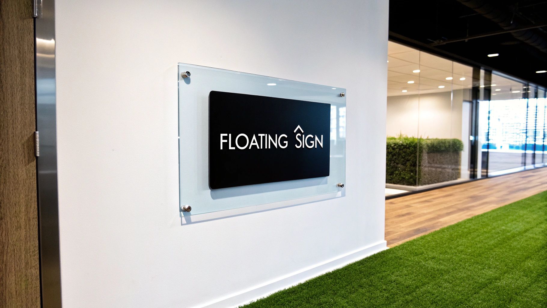
Think about how a museum displays its most valuable pieces. They aren't just hung flush; they're presented with intention, often floating just off the surface to give them prominence and a sense of importance. An acrylic standoff sign borrows that exact principle to elevate your logo and brand message.
The magic comes from two simple parts: the acrylic panel itself and the standoff hardware. These are small, cylindrical barrels that create a gap between the sign and the wall. This separation creates a soft shadow and a three-dimensional look that flat-mounted signs just can't match. It quietly communicates permanence, quality, and a sharp eye for detail.
To give you a clearer picture, here’s a quick breakdown of what makes these signs so effective.
Acrylic Standoff Sign Key Features at a Glance
| Feature | Description | Primary Benefit |
|---|---|---|
| Floating Effect | The sign panel is mounted away from the wall using standoff hardware. | Creates a professional, three-dimensional appearance with depth and shadow. |
| Material Clarity | Made from high-quality, clear, or frosted acrylic panels. | Offers a clean, modern aesthetic that looks premium and high-end. |
| Versatile Graphics | Graphics can be printed on the front or back surface of the acrylic. | Allows for unique visual effects, like added depth with reverse printing. |
| Durability | Acrylic is a tough, shatter-resistant material suitable for high-traffic areas. | Provides a long-lasting, low-maintenance sign that won't easily break. |
In short, these features work together to create a sign that does more than just inform—it impresses.
An Instant Upgrade in Professionalism
Choosing this type of sign is a deliberate move to present your brand as established, modern, and polished. It’s a popular choice for a reason, especially in environments where that first impression is everything. For instance, a law firm using a thick, clear acrylic sign with polished chrome standoffs in their reception area instantly conveys a sense of stability and prestige.
This versatility makes it a perfect fit for all kinds of commercial settings:
- Corporate Lobbies: Greet visitors with a bold, clean logo that reinforces your company’s identity the moment they walk in.
- Retail Boutiques: Add a touch of elegance to your interior branding or point-of-sale displays.
- Medical Offices: Create a professional and calming atmosphere with clearly marked suites and directories.
More Than Just a Sign
Ultimately, an acrylic standoff sign does more than just display your name. It acts as a piece of interior decor that actively shapes how customers see you. It's an investment in your brand's image, showing a commitment to quality before you even say a word. For example, a financial advisor's office with a frosted acrylic sign communicates both professionalism and client privacy.
While these signs have a distinct modern appeal, businesses looking at different visual tools might also benefit from understanding the impact and advantages of LED signs for businesses. To see how different sign types can work together in your space, check out our guide to effective signage for commercial buildings.
Choosing Your Materials and Finishes
This is where you bring your vision to life. The power of an acrylic standoff sign comes from its incredible versatility, and the materials you choose are critical. Think of it like framing a valuable piece of art—the right combination of materials and finishes sets the mood and makes sure your brand’s message lands perfectly.
It all starts with the acrylic panel itself. Your choice here sets the entire tone for the sign, so getting it right is the first step toward creating something that doesn’t just inform people, but genuinely enhances your space.
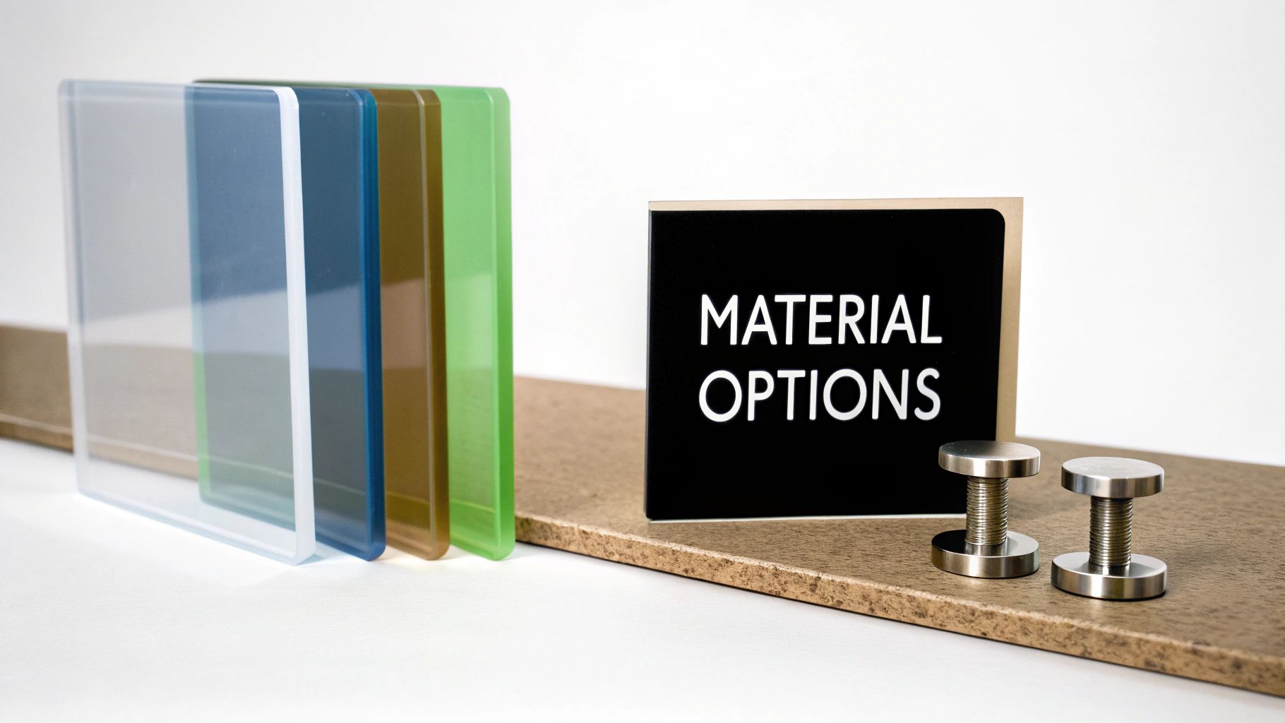
Selecting the Ideal Acrylic Panel
The type of acrylic you pick is the backdrop for your entire design. It dictates the sign's personality and feel. There are three main options, and each one is a great fit for different brands and environments.
- Clear Acrylic: This is the crowd favorite for a reason. It gives you that clean, modern, almost invisible look that lets the wall behind it become part of the sign. Practical Example: A tech startup with an exposed brick wall could use a clear acrylic sign to showcase its logo without hiding the wall's texture, creating an industrial-chic look.
- Frosted Acrylic: If you’re going for a softer, more sophisticated feel, frosted acrylic is your best bet. It diffuses light beautifully, cutting down on glare and giving you a subtle elegance. Practical Example: A high-end spa can use frosted acrylic for room numbers and directional signs to create a calm, private atmosphere.
- Colored Acrylic: When your brand needs to make a bold, confident statement, this is the way to go. Opaque or tinted colored acrylic makes your brand colors pop with total consistency, no matter what kind of wall you hang it on. Practical Example: A creative marketing agency might use a bright, opaque red acrylic sign that matches their brand color to project energy and confidence.
Graphic Application Methods That Matter
Once you’ve got your panel picked out, the next decision is how to get your graphics onto it. This choice doesn't just affect how the sign looks—it has a huge impact on how long it will last.
You could go with first-surface printing, where the graphics are applied right to the front of the panel. This creates crisp, vibrant images and works well for signs with fine details or designs that might need to be updated down the road.
Actionable Insight: The gold standard—and the method we almost always recommend—is second-surface printing. We print your graphics in reverse on the back of a clear acrylic panel. This means you're looking at the design through the acrylic, which acts as a built-in shield against scratches, scuffs, and fading. This is the most durable option for high-traffic areas like hallways and lobbies.
It’s like putting your design behind a protective layer of glass. Not only does it dramatically increase the sign’s lifespan, but it also adds a stunning sense of depth and a glossy finish that just screams professionalism.
Choosing Your Standoff Hardware
The final piece of the puzzle is the standoff hardware. Don't underestimate these small components; they do more than just hold the sign on the wall. They’re a key part of the final aesthetic, and their finish should complement both your sign and your space.
Here are the most common hardware choices:
- Stainless Steel: It's tough, looks fantastic, and resists corrosion, making it a reliable choice for any indoor setting.
- Aluminum: This is a lightweight but surprisingly durable option that gives you a great balance of performance and value. If you're looking for other tough signage, you can explore our guide on aluminum composite signage.
These materials also come in different finishes to nail your brand's look. Brushed silver has a modern, textured appearance, while polished chrome delivers a bright, mirror-like shine. And for a seriously bold, contemporary feel, matte black standoffs create an awesome contrast, especially against lighter walls.
Selecting the Right Sign Dimensions
Choosing the right size for your acrylic standoff sign is a bit like buying a suit—get the fit wrong, and the whole look falls apart. The perfect sign isn't just about the acrylic panel itself; it’s about how the size, thickness, and hardware all come together to look intentional and professional, not like a last-minute decision.
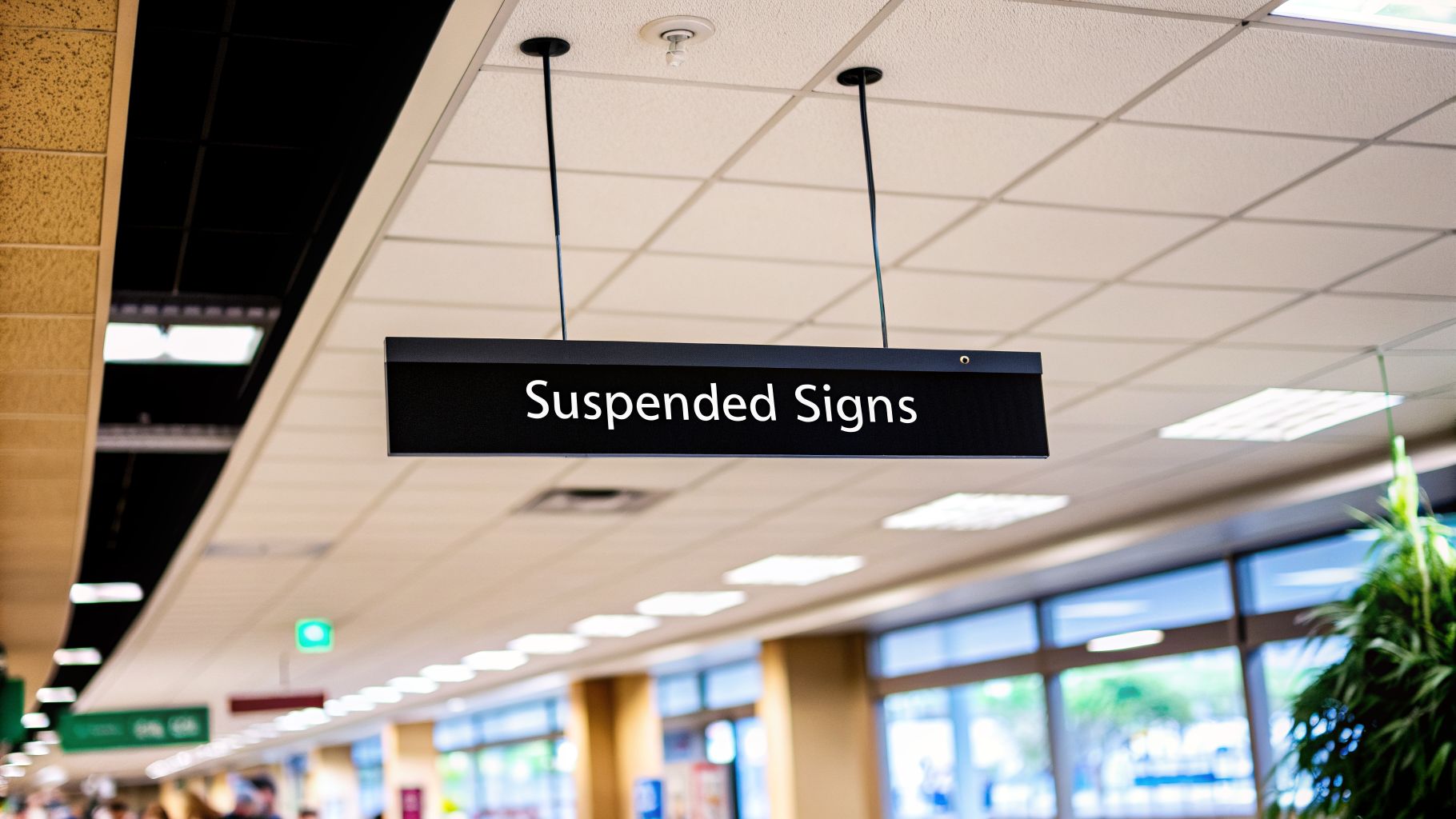
The first thing to nail down is the overall size of the sign. This really comes down to where it’s going and what it needs to do. A huge, impressive sign in your reception area makes a statement. Smaller signs, on the other hand, are perfect for pointing people in the right direction or labeling individual offices.
A great place to start is just measuring the wall and thinking about how far away people will be when they read it. Here's an actionable insight: for every 10 feet of viewing distance, your text needs to be at least 1 inch tall. This simple trick helps you avoid the common mistake of designing a sign that's too small to be useful.
Matching Thickness to Sign Size
Once you’ve settled on the overall dimensions, it’s time to think about thickness. This detail has a huge impact on the sign's durability, cost, and how substantial it feels. While you can get thinner acrylic, most professional signs use a couple of standard options that just feel more premium.
- 1/4" (6mm) Acrylic: This is the go-to for most small and medium-sized signs, like you'd see on an office door or marking a department. It’s got great rigidity and looks high-end without being too heavy.
- 3/8" (10mm) Acrylic: When you're dealing with a larger lobby sign or a main branding piece, upgrading to a 3/8" panel adds a real sense of weight and importance. The thicker edge catches the light beautifully, giving the sign more depth and presence.
Sure, thicker acrylic costs a bit more, but that investment pays off in how people perceive your brand. It sends a message of quality and permanence that reflects well on your business.
Selecting Proportional Standoff Hardware
The standoff hardware—those metal barrels that make the sign "float"—needs to feel proportional to the sign panel. If you use tiny hardware on a massive sign, it doesn’t just look strange; it can actually compromise the installation.
The hardware has two key measurements: its diameter and its length (how far it pushes the sign off the wall). Bigger, heavier signs demand standoffs with a wider diameter to support the weight and look visually balanced. The hardware should feel like a natural part of the sign, not something that was just grabbed from a spare parts bin. This is especially true when you consider the wide range of types of outdoor business signs where stability is a top priority.
Actionable Insight: A large sign needs robust hardware. For a panel over 36 inches wide, consider standoffs with a diameter of at least 3/4" to ensure a secure mount and a visually pleasing result. This prevents the sign from looking undersupported and ensures long-term stability.
By carefully balancing the sign’s size, thickness, and hardware, you end up with a finished product that’s both structurally sound and visually stunning. It’s this attention to detail that elevates a simple sign into a powerful branding tool.
Designing Your Sign for Maximum Impact
An acrylic standoff sign is way more than just a piece of plastic on a wall; it's a piece of your brand's architecture. To get the most out of it, you have to stop thinking about just slapping your logo on it. A great design works with the sign's unique qualities—its transparency, the depth it creates, and the way it plays with the light and shadows around it.
Smart design starts with embracing negative space. With a clear or frosted sign, the wall behind it isn't just a background; it's part of the design itself. This is your chance to make your logo or message really pop, giving it room to breathe and grabbing the viewer's eye without feeling cluttered.
Mastering Typography and Color Contrast
At the end of the day, a sign has one job: to be read. For acrylic standoffs, that means picking fonts with viewing distance in mind. Clean, bold, sans-serif fonts are almost always the winning choice because they stay clear and legible from across a lobby or down a long hallway. Stay away from fussy, overly thin, or decorative fonts that get fuzzy and hard to read when seen from an angle through the acrylic.
Color is your secret weapon for creating killer contrast. Since the wall color is part of the final look, you have to design for it from the very beginning.
- Light Walls: If your sign is going on a classic white or beige wall, use deep, saturated colors for your text and graphics. Practical Example: A navy blue logo printed on clear acrylic and mounted on a cream-colored wall will be highly visible and look sharp.
- Dark Walls: For richer walls like navy or charcoal gray, flip the script. Bright whites, silvers, or even light pastels will create a stunning contrast that’s impossible to miss. Practical Example: White text on clear acrylic mounted on a dark gray wall creates a dramatic, high-end effect perfect for a modern office.
Basically, treat the wall like another layer in your design file. When you do that, the finished sign looks intentional, professional, and is easy for everyone to see.
Creating a Real Sense of Depth
Here's where standoff signs get really exciting. You can create actual, physical depth that a flat sign could only dream of. By printing graphics on both the front and back surfaces of the acrylic, you build a sophisticated, layered effect that just screams high-end.
For example, you could print a subtle, semi-transparent background pattern on the back of the panel (we call this second-surface printing). Then, put your main logo and text right on the front (first-surface printing). As people walk past, the elements seem to float and shift independently, creating a dynamic visual that feels custom and expensive.
Actionable Insight: An acrylic standoff sign allows you to treat space as a design element. By layering graphics on multiple surfaces, you're not just creating a sign; you're building a small-scale architectural feature that interacts with light and perspective. For maximum impact, use a ghosted version of your logo on the back and your full-color logo on the front.
The Power of Illumination
Want to really make a statement? Add light. Lighting can completely transform an acrylic standoff sign from a simple branding piece into a showstopper. Backlighting is especially effective, making the polished edges of the acrylic glow while casting a soft, elegant halo of light onto the wall behind it. This is the go-to move for upscale restaurants, boutique hotel lobbies, or modern corporate offices where you want to set a specific mood.
These modern signs don't just look better; they're incredibly efficient, using up to 70% less power than old-school lighting. You can see this trend for yourself by looking at the top-selling acrylic signage online.
A Practical Guide to Installation and Care
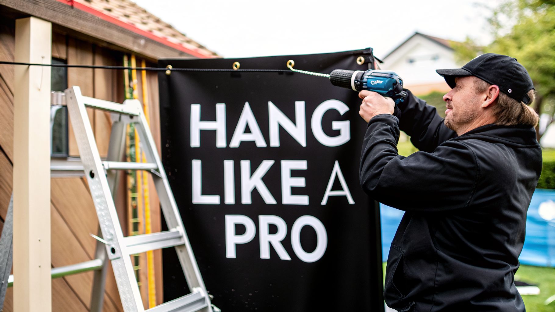
An acrylic standoff sign is a durable asset, but its final look—and how long it lasts—comes down to two things: a solid installation and a little bit of care. Get these right, and your sign will look sharp from day one and stay that way for years.
The installation itself isn't complicated if you take it one step at a time. This is where a little patience goes a long way, helping you avoid those small, frustrating mistakes that can ruin an otherwise perfect sign.
Step-by-Step Installation Process
Getting your sign mounted correctly is the final, crucial step. Follow this process for a secure, level finish that looks like a pro handled it.
To keep things simple, we've put together a quick checklist. Following these steps will help you get a flawless installation every time.
| Step | Action | Pro Tip |
|---|---|---|
| 1. Mark Your Spot | Use a level and measuring tape to pinpoint the exact placement for each standoff barrel. Mark these spots lightly with a pencil. | Measure twice, drill once! Double-check that your marks are perfectly level before you even think about picking up the drill. |
| 2. Drill & Anchor | Drill pilot holes at your marked locations. For drywall or plaster, gently tap wall anchors into the holes until they’re flush with the wall. | A snug anchor provides a solid foundation for the hardware, preventing any wobble down the road. Use the right anchor for your wall type (e.g., drywall, brick, concrete). |
| 3. Attach the Barrels | Screw the standoff barrels directly into the wall anchors. They should be snug, but don’t crank them down just yet. | You want them firm, but leave a tiny bit of play for the final adjustments. |
| 4. Mount the Sign | Carefully place your acrylic sign panel onto the barrels, aligning the pre-drilled holes. Screw the standoff caps through the acrylic and into the barrels to lock it all in place. | Hand-tighten the caps until they're secure. This is where you make sure everything is perfectly aligned before the final tightening. |
This checklist is your roadmap to a professional-looking installation, ensuring your sign is secure and perfectly displayed.
A crooked sign is one of those tiny details that can make an entire space feel off. Another common mistake is over-tightening the standoff caps. This creates stress points on the acrylic that can lead to cracks and costly damage.
This visual guide breaks down some of the design thinking that comes before installation even begins—getting this right makes the whole process smoother.
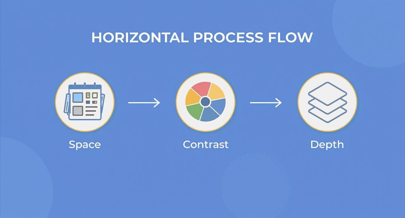
As the infographic shows, smart use of space and contrast not only looks good but also contributes to a sign that’s easy to handle and mount correctly.
Long-Term Care and Maintenance
Keeping your sign looking brand new is surprisingly easy. A bit of light, regular cleaning is all it takes to prevent dust from settling and keep the acrylic looking crystal clear.
Actionable Insight: The golden rule for acrylic care is simple: no harsh chemicals. Cleaners with ammonia, alcohol, or abrasives will absolutely ruin the surface, leaving it cloudy or covered in fine scratches. Never use paper towels, as their wood fibers can cause micro-scratches.
For the best results and achieving a streak-free finish, all you need is a soft microfiber cloth with a little mild soap and water.
Gently wipe the sign down, then use a second, dry cloth to buff away any moisture. That’s it. This simple habit is all you need to protect your investment and keep it looking sharp.
Understanding Costs and Justifying the Investment
Let's talk about the budget. When you're looking at a sleek acrylic standoff sign, it's easy to see it as just another line item. But thinking of it as a pure expense is missing the point entirely. A sign like this is a long-term investment in your brand's physical presence and how people perceive its quality.
The final price tag isn't just one number; it's a combination of choices you make. Once you understand what goes into it, you can see exactly where your money is going and how to get a sign that feels like a perfect fit for your brand and your budget.
Breaking Down the Main Cost Drivers
Every acrylic standoff sign is custom, and several key variables will shape the final quote. Each one is a lever you can pull to dial the sign into your exact needs.
- Acrylic Size and Thickness: This is usually the biggest piece of the puzzle. Bigger signs simply use more material, and thicker acrylic—like a premium 3/8" sheet—has a more substantial feel and a higher cost.
- Design Complexity: Think of it this way: a simple logo with one color is going to be more straightforward to produce than a complex, multi-layered design with intricate cutouts and tons of text. The more complex the art, the more time it takes to get it just right.
- Standoff Hardware: Even the mounting hardware plays a part. You might prefer the look of polished chrome or matte black standoffs, which can have a different price point than the standard brushed silver options.
- Professional Installation: While it's an upfront cost, getting it professionally installed is like buying insurance for your investment. It guarantees the sign is perfectly level, secure, and mounted without any risk of cracking the acrylic or damaging your wall.
Sample Cost Ranges for Common Signs
To make this more concrete, here are a few ballpark estimates. Of course, every project is different, but this gives you a realistic starting point for planning.
| Sign Type | Typical Size | Estimated Cost Range | Common Use Case |
|---|---|---|---|
| Office Door Sign | 8" x 3" | $75 – $150 | Naming individual offices or conference rooms. |
| Directional Sign | 24" x 6" | $200 – $400 | Guiding visitors down a main hallway. |
| Lobby Centerpiece | 48" x 24" | $600 – $1,500+ | Creating a powerful brand statement in your reception area. |
As you can see, these signs are scalable. They're a high-end option that can work for a wide range of budgets and applications.
Actionable Insight: An acrylic standoff sign isn't just a purchase; it's a branding asset. Its durability and timeless appeal mean less frequent replacement, offering superior long-term value compared to cheaper, less permanent signage options that can quickly look dated or worn.
The Real Return on Your Investment
The true value of a great sign is so much more than what it's made of. It's your silent brand ambassador, working 24/7 to shape the first impression of every client, visitor, and employee who walks in the door. A quality sign doesn't just label your space; it builds trust and reinforces a professional atmosphere.
Unlike a temporary banner that frays or a poster that fades, a professionally crafted acrylic standoff sign is built to last for years. Its tough construction and classic look mean you won't be thinking about replacing it anytime soon, which makes that initial investment incredibly effective over its lifespan. Exploring different business sign ideas can help you see how a permanent, quality sign transforms a space. In the end, it’s a smart move that pays for itself by making your brand look its best.
A Few Final Questions
As we wrap things up, you probably have a few practical questions kicking around. It’s totally normal. Choosing the right acrylic standoff sign means thinking about how long it will last, how it’s made, and when you can get it.
Let's clear up the most common questions we hear so you can feel confident about your decision.
How Well Do These Signs Hold Up Outside?
This is the big one, and for good reason. While acrylic is a tough material, its outdoor performance really comes down to choosing the right kind. Standard acrylic, when left in direct sunlight for years, can start to yellow.
Actionable Insight: The trick is to use UV-resistant acrylic and second-surface printing (where we print the graphics on the back of the panel). This combination is a game-changer. It acts like a permanent shield, protecting the sign from sun damage and keeping your colors sharp and vibrant for the long haul.
What’s a Realistic Turnaround Time?
So, how long does it take? A good rule of thumb is about 7 to 14 business days after you’ve given the final thumbs-up on the design. That window gives us time to get everything just right.
Of course, a few things can shift that timeline:
- Design Complexity: A simple logo on a square panel is quicker than a sign with layered pieces, custom shapes, and intricate details.
- Sign Size: Bigger signs take more time to produce and handle safely.
- Shop Schedule: Like any custom work, our production queue can affect timing. It’s always smart to talk deadlines early on.
The best approach is always to chat with us about your timeline from the start. We’ll always give you a straight answer on what’s possible.
Can I Update the Graphics Later On?
Generally, no. The graphics on a professionally made acrylic sign are printed to be permanent, especially with that durable second-surface method we mentioned. The design is locked in behind the acrylic, so you can't just peel it off and change it.
Actionable Insight: If you know you'll need to swap out information—like names in a directory or weekly specials—let's plan for it. A great solution is a permanent header sign with a system for interchangeable inserts below. You get that same sleek, professional look but with the flexibility you need. This modular approach is perfect for directories in office buildings or menu boards in cafes.
Thinking through these details now ensures your new sign doesn't just look great on day one, but serves your business well for years to come.
Ready to create a sign that makes people stop and stare? The team at On Display Signs, Inc. is here to walk you through it all, from the first sketch to the final installation. Contact us today for a free consultation and let’s make your brand unforgettable.


