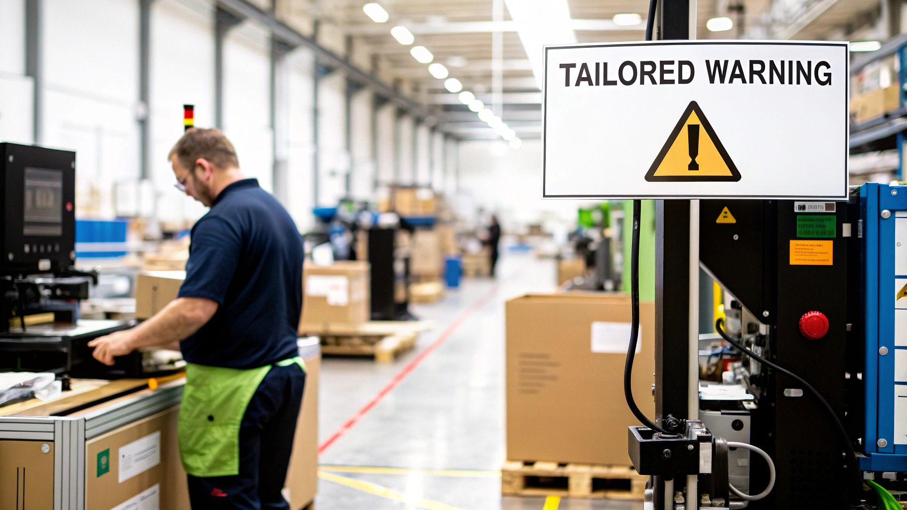
A custom warning sign is more than just a notice; it's a vital communication tool designed for specific hazards that standard, off-the-shelf signs can't cover. It provides clear, direct instructions for dangers unique to a location or piece of machinery, ensuring everyone on site understands the exact risks involved.
Why Custom Warning Signs Are Critical for Safety
Consider the difference between a generic "Caution" sign and one that reads, "Caution: Automated Machinery Starts Without Warning." The first is vague and easy to ignore. The second provides a clear, actionable instruction that can prevent a serious accident.
This specificity is what makes custom warning signs essential. They are fundamental safety tools, not mere decorations.
Generic signs for common hazards like "Wet Floor" or "High Voltage" certainly have their place. However, they are insufficient when a facility has unique processes, specialized chemicals, or machinery with non-standard protocols. For example, a standard sign cannot inform an employee about the specific PPE required for a proprietary chemical blend or warn them about a machine with an unusual start-up sequence.
Addressing Unique Site-Specific Hazards
Customization closes this critical safety gap. It allows you to create a sign that speaks directly to its environment, which leads to better understanding and faster reaction times. This tailored approach is fundamental to building a strong safety culture where every potential risk is clearly identified and communicated.
Here are the practical benefits:
- Targeted Messaging: You can directly address specific dangers, such as "Warning: Sudden Pressure Release" on a pneumatic system, leaving no room for guesswork.
- Improved Compliance: Custom signs help meet precise safety requirements, which is especially important in complex environments. You can get a better sense of this by reviewing our guide on construction site signage requirements.
- Enhanced Worker Confidence: When instructions are clear, employees feel more empowered to work safely because they know exactly what hazards to look out for.
The need for this level of specificity is growing. As workplace safety regulations become more stringent, the market for warning signs is projected to reach $249.5 million by 2025. This growth is driven by industries recognizing the necessity of robust safety protocols.
A custom warning sign acts as a silent safety officer. It provides constant, specific guidance right where it’s needed most, turning an unknown variable into a clearly defined risk that can be managed safely. In any responsible workplace, customization is a necessity, not a luxury.
Understanding Essential OSHA and ANSI Standards
Navigating safety regulations from organizations like the Occupational Safety and Health Administration (OSHA) and the American National Standards Institute (ANSI) can seem complex, but their purpose is simple: to create a universal language for safety. These guidelines ensure a warning sign at one job site means the exact same thing as a similar sign across the country.
Think of these standards as a grammar book for visual safety communication. Just as grammar makes a sentence easy to understand, OSHA and ANSI rules make signs instantly recognizable. This consistency is crucial for preventing accidents and ensuring everyone, from seasoned employees to new visitors, can understand a potential hazard in a split second.
Decoding ANSI Z535 Color and Signal Words
The ANSI Z535 series provides the rules for the visual elements of safety signs—colors, layouts, and signal words. This system is designed for instant hazard recognition. Misusing these standards doesn't just make a sign non-compliant; it creates a confusing message that could lead to serious injury.
The color-coding system is the most critical part of the standard. Each color is assigned a specific level of danger.
- Red: Paired with the signal word DANGER. It is reserved for the most severe scenarios—imminently hazardous situations that will result in death or serious injury if not avoided. A practical example is a sign on exposed high-voltage equipment.
- Orange: Matched with the signal word WARNING, orange indicates a potential hazard that could lead to death or serious injury. It's for serious risks that are not as immediate as a "Danger" situation, such as the moving parts on a machine.
- Yellow: Used with the signal word CAUTION, yellow points to a potential hazard that may cause minor or moderate injury. The classic "Slippery When Wet" sign is a perfect example.
By adhering to this color system, your custom warning signs tap into a subconscious understanding of risk that most people already have. That instant comprehension is exactly what you need when a few seconds can make all the difference.
The Role of Universal Pictograms
While words are essential, pictures can transcend language barriers. Pictograms—simple, universally understood symbols—are used for this purpose. ANSI Z535 strongly recommends using them to show the type of hazard at a glance, like a flame for flammable materials or a lightning bolt for an electrical shock risk.
When designing custom warning signs, selecting the right pictogram is non-negotiable. It must clearly represent the hazard without ambiguity. For instance, a sign about a corrosive chemical must use the standard symbol of a substance eating away at material and skin. It’s a visual shortcut that provides an immediate warning, even to someone who cannot read the text.
A Simple Compliance Checklist for Your Designs
Ensuring your signs meet all requirements doesn't have to be complicated. Before finalizing a design, ask these practical questions:
- Does the Signal Word Match the Hazard Level? Have you used DANGER, WARNING, or CAUTION correctly based on the severity and immediacy of the risk?
- Is the Color Coding Correct? Are you using red, orange, or yellow according to ANSI Z535 rules? Other colors like blue (Notice) and green (Safety First) have their own specific uses. Our article on emergency exit signage requirements provides more detail on how colors are used in different safety contexts.
- Is the Sign Legible from a Safe Distance? The text and pictogram must be large enough for someone to read and react before entering the danger zone.
- Is the Pictogram Clear and Unambiguous? Stick to internationally recognized pictograms whenever possible to avoid confusion.
Actionable Principles for Effective Sign Design
Meeting OSHA and ANSI standards is the starting point, not the destination. A sign can be fully compliant yet fail to communicate a hazard clearly. An effective sign moves beyond mere compliance and uses design principles to capture attention and deliver its message instantly.
The goal is to create something that is immediately noticeable, delivers its message in a split second, and is understood by everyone.
Think of it this way: a compliant-only sign is like a technically perfect sentence full of jargon that no one understands. An effective sign is a short, powerful statement that’s impossible to misinterpret.
Prioritize Readability Above All Else
If a warning sign cannot be read from a safe distance, it has failed. This comes down to two simple elements: font and color contrast.
For instant legibility, always choose bold, sans-serif fonts like Helvetica, Arial, or Franklin Gothic. These fonts lack the decorative flourishes (serifs) found on fonts like Times New Roman, which can blur from a distance or in poor lighting. Their clean lines are designed for quick reading.
Equally critical is high-contrast color pairing. The classic combinations—black on yellow, white on red—are standards for a reason. They are based on the science of visibility. These pairings make the text stand out from the background, cutting through the visual clutter of a busy worksite. Avoid low-contrast pairs like gray on light blue or red on orange, which can render your message unreadable.
An effective sign design assumes the viewer is distracted, in a hurry, and possibly in a low-light environment. By prioritizing bold fonts and high-contrast colors, you create a message that can cut through the noise and deliver its warning instantly.
Master Visual Hierarchy
When someone looks at your sign, what is the first thing they see? Visual hierarchy is the arrangement of elements to guide the viewer's eyes to the most important information first. For a warning sign, that is always the hazard itself.
You can establish a strong visual hierarchy with a few straightforward techniques:
- Size: The most critical element—such as the pictogram or the signal word "DANGER"—should be the largest feature on the sign.
- Color: The brightest, boldest colors should be reserved for the most important information to instantly draw the eye.
- Placement: People naturally look at the top or center of an object first, so place your key elements in these areas.
A sign with a weak hierarchy might have a tiny pictogram buried under a large block of text, causing the message to be lost. A sign with a strong hierarchy uses a large, clear symbol and a bold signal word to instantly communicate the risk, with less critical details in smaller text below.
Embrace Simplicity and Clarity
In safety communication, less is always more. A simple, instantly recognizable icon is more effective than a paragraph of text. The human brain processes images 60,000 times faster than text, making pictograms your most powerful tool for immediate communication.
When designing custom warning signs, resist the urge to explain every detail. Stick to one core message.
- Do: Use the standard, universally understood pictogram for "High Voltage."
- Don't: Write a long sentence like, "Be advised that this panel contains high-voltage electrical components that could cause severe injury or death if touched." The simple lightning bolt icon conveys all of that in a fraction of a second.
This principle of clarity is key. Just as an effective warning sign needs careful design, understanding the importance of custom design applies across all types of safety and security installations. The goal is always to create something built for its specific environment. For situations requiring dynamic attention-grabbing, you might consider digital LED signs. Regardless of the tool, the mission is the same: deliver a clear, unambiguous message that keeps people safe.
Choosing Durable Materials for Any Environment
The material of your custom warning sign is as important as its message. A sign that fades, cracks, or rusts quickly becomes a liability. Selecting the right material from the start ensures your safety message remains clear and effective for years, protecting both your team and your investment.
Think of the material as the foundation. You wouldn't build a house on sand, and you shouldn't print a critical warning on a material that can't withstand its environment.
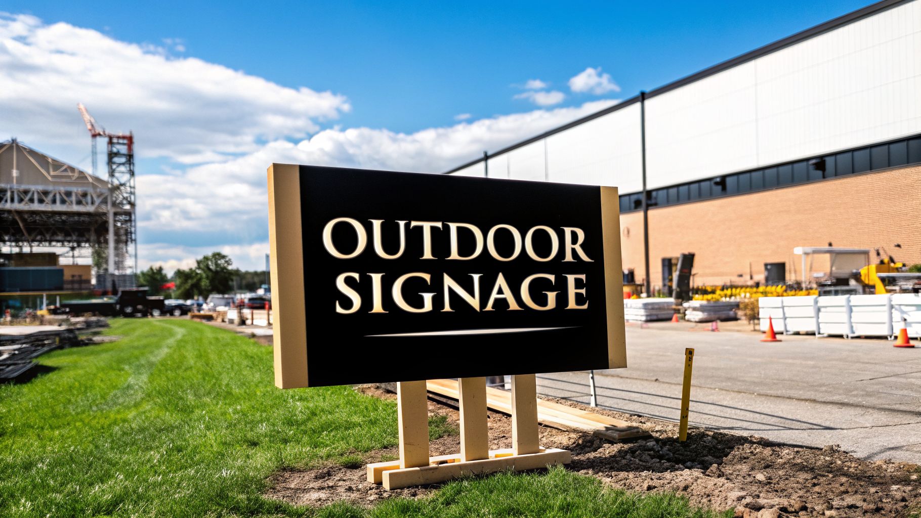
This infographic outlines the core principles of effective sign design, all of which depend on the right material choice.
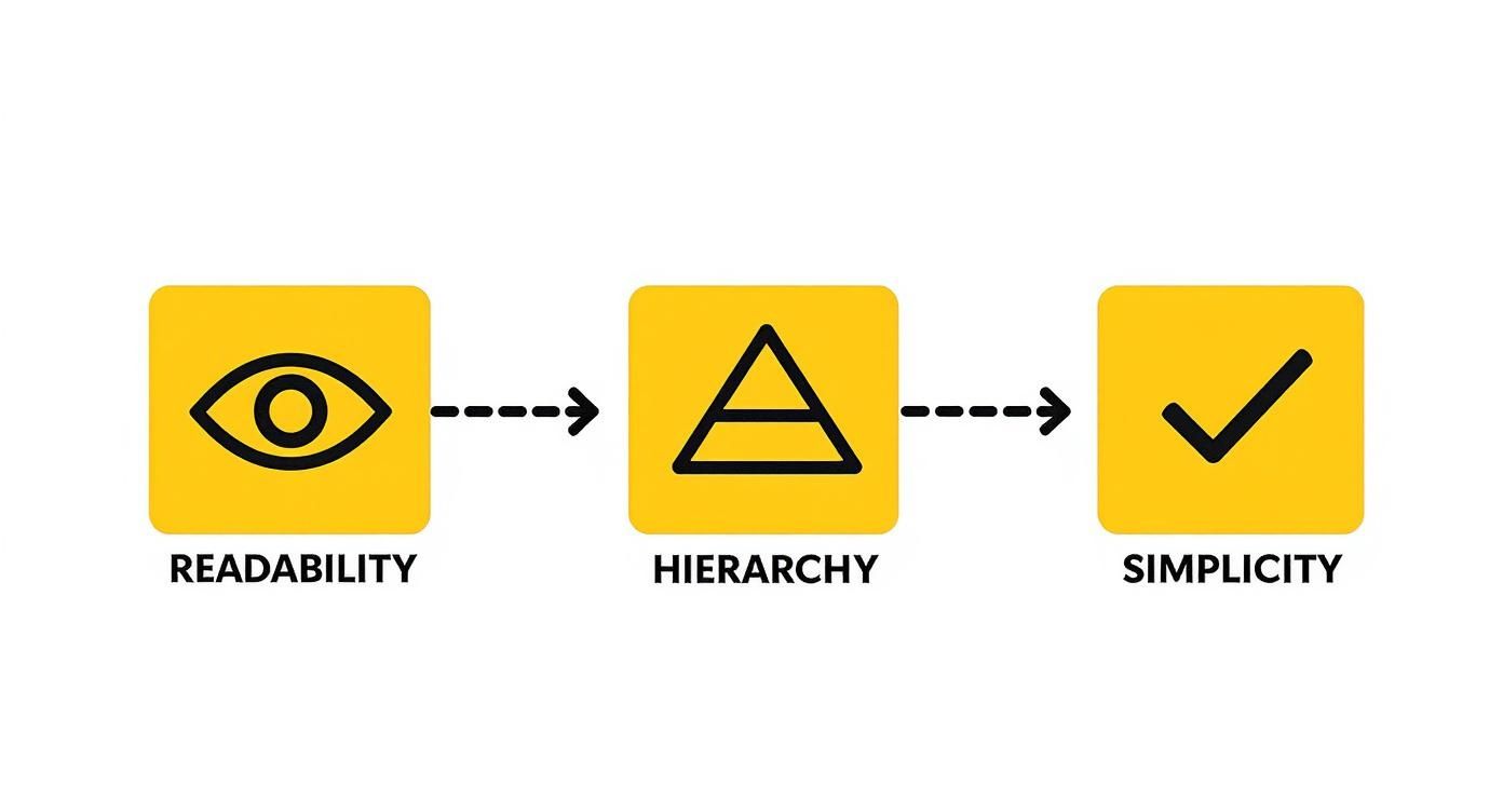
As you can see, simplicity and readability are paramount. A durable material ensures these qualities are not diminished by weather or time.
Matching Materials to Your Environment
The most significant factor in your decision is the sign's location. An indoor sign in a climate-controlled office has different requirements than a sign on a construction site fence, which will face sun, rain, and physical impact.
Let's examine the most common and reliable material options.
Comparison of Common Sign Materials
This table breaks down the most popular choices to help you find the perfect fit for your environment and budget.
| Material | Best For | Durability | Weather Resistance | Cost |
|---|---|---|---|---|
| Aluminum | Long-term outdoor use, professional look | High | Excellent (rust-proof) | $$ |
| Aluminum Composite (ACM) | High-impact outdoor areas, premium look | Very High | Excellent (rust-proof, rigid) | $$$ |
| HDPE Plastic | Industrial sites, chemical exposure | Very High | Excellent (chemical-resistant) | $$ |
| PVC Plastic | Indoor & short-term outdoor use | Medium | Good | $ |
| Reflective Aluminum | Nighttime visibility, roadsides | High | Excellent | $$$$ |
Each material serves a specific purpose. While PVC is suitable for temporary indoor warnings, aluminum composite is the clear winner for a permanent sign that needs to look professional and withstand the elements for years.
A Closer Look at the Top Contenders
Aluminum and Aluminum Composite
For outdoor applications, rust-proof aluminum is nearly always the best choice. It is lightweight yet rigid and can withstand rain, snow, and UV rays without deteriorating.
- Standard Aluminum: A fantastic, long-lasting option that will never rust. It provides a smooth, professional finish ideal for permanent safety signs.
- Aluminum Composite Material (ACM): This is an enhanced version of aluminum, made by bonding two aluminum sheets to a solid plastic core. The result is a sign that is just as weather-resistant but far more rigid and resistant to impacts.
For most businesses, aluminium composite signage offers the ideal balance of durability, a clean look, and long-term value for nearly any use, indoors or out.
Plastics for Specialized Needs
In certain industrial settings, plastics offer unique advantages.
- HDPE (High-Density Polyethylene): This tough material is resistant to chemicals, moisture, and impacts, making it the go-to choice for manufacturing plants or industrial facilities with harsh conditions.
- PVC (Polyvinyl Chloride): A versatile and budget-friendly plastic that works well for indoor signs and some sheltered outdoor locations. It offers a smooth surface for high-quality printing.
Don't Forget About Visibility and Special Conditions
Sometimes, durability alone is not enough. For nighttime operations, poorly lit warehouses, or emergencies, your sign must be visible in the dark.
This is where reflective materials are non-negotiable. Signs coated with retroreflective sheeting will brilliantly reflect light from headlights or flashlights, making them highly visible in the dark. This is critical for parking lots, access roads, and any area used after sunset.
Strategic Installation for Maximum Visibility
A brilliantly designed custom warning sign is useless if no one sees it. The placement of your sign is the final, critical step. Poor placement renders a sign invisible; strategic installation ensures your message is seen, understood, and acted upon.
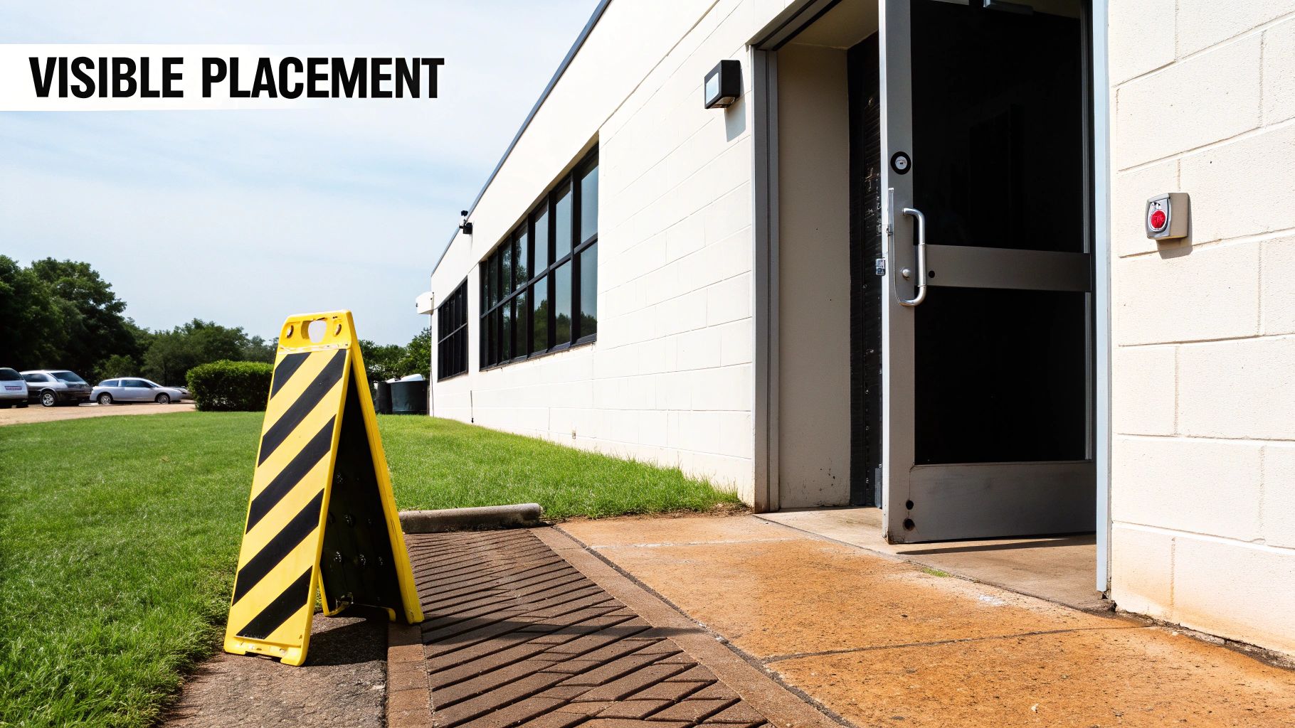
A warning is only effective if it is received before a person enters a dangerous area. Smart placement delivers the message at the precise moment it is needed to make a safe decision.
Mounting Signs at the Right Height and Angle
The first rule is simple: place the sign where people will naturally look. A sign that is too high or too low will be missed. The generally accepted best practice is to mount signs so the center is between 4.5 and 5.5 feet (54 to 66 inches) from the ground.
This height is at eye level for most adults, whether they are walking or operating a forklift. Mount the sign flat against a surface, perpendicular to the line of sight, to minimize glare and distortion.
Avoiding Common Placement Mistakes
A well-made sign can be defeated by a simple placement error. Before installation, walk through the area and view it from all angles to identify potential obstructions.
Common mistakes include:
- Hiding It Behind Obstructions: Never place a sign where it can be blocked by an open door, a stack of pallets, or equipment. Check sightlines from every possible approach.
- Placing It in Poorly Lit Areas: A sign in a dim hallway or dark corner is ineffective. Ensure the area has good lighting, or use a reflective material for the sign.
- Getting Too Close to the Hazard: A warning must provide enough time for people to see, read, and react. A "Forklift Crossing" sign placed right at a blind corner is too late. It should be positioned well ahead of the corner to give adequate warning.
The primary function of a custom warning sign is proactive prevention. Its placement must provide enough time and distance for someone to see the warning, process it, and alter their course of action.
Context Is Everything: The Point of Decision
The type of hazard determines the sign's placement. The goal is to deliver the warning at the point where a person is about to make a critical decision.
Consider these practical examples:
- Slippery Floor Sign: The correct place for a "Caution: Wet Floor" sign is not in the middle of the wet area, but at every entrance to it, warning people before they step onto the slick surface.
- High Voltage Sign: A general "High Voltage" sign on a nearby wall is adequate, but a specific "Danger: High Voltage" sign mounted directly on an electrical panel door is far more effective. It communicates the risk at the exact moment of potential interaction.
- Confined Space Sign: This warning must be posted at the entrance to the space, informing workers about entry procedures or permits before they attempt to enter.
By considering how people move and work in the space, you can place your custom warning signs to deliver clear, actionable information exactly when and where it is needed. Remember that some signs may require official approval; familiarize yourself with local sign permit requirements to ensure your installation is compliant from the start.
Maintaining Signs for Long-Term Effectiveness
Installing a safety sign is the beginning, not the end, of the process. Over time, even the most durable custom warning signs can be compromised by sun, weather, and grime, rendering them useless. A sign that cannot be read is a safety failure, which is why regular maintenance is an essential part of any comprehensive safety plan.
Think of your signs as silent guardians that need to be kept in top condition to perform their duty. A simple maintenance schedule is all that is required to keep them clear, visible, and effective.
Conducting Regular Inspections
The first step is a simple visual inspection of your signs. Once a month—or more frequently in harsh environments—conduct a quick check for common issues.
Use this practical checklist:
- Fading: Has the bright yellow "Caution" sign faded to a pale cream? If the color has lost its intensity, so has the warning.
- Damage: Look for cracks, peeling, deep scratches, or dents that obscure the text or symbols.
- Grime and Dirt: In industrial or construction settings, dust, mud, or grease can quickly accumulate and make a sign unreadable.
- Visibility: Has an object been placed in front of the sign? A sign that cannot be seen provides no warning at all.
Simple Cleaning and Upkeep
If a sign simply needs cleaning, use appropriate materials. Harsh chemicals or abrasive scrubbers can damage the sign's surface, causing it to wear out faster. Following effective sign maintenance tips will protect their finish and legibility.
For most standard aluminum and plastic signs, a soft cloth or sponge with mild soap and water is all that is needed. Gently wash away the grime, rinse, and let it air dry.
An outdated or damaged sign can be more dangerous than no sign at all. It can create a false sense of security by communicating incorrect or incomplete information about a hazard.
The most important aspect of maintenance is ensuring relevance. A sign must be replaced as soon as the hazard it describes changes. If a machine's start-up procedure is updated but the old sign remains, you have created a new danger. Keeping your safety communication current is just as critical as keeping it clean.
Frequently Asked Questions About Custom Signs
Embarking on a custom warning sign project naturally raises some questions. From production times to ensuring legal compliance, getting clear answers is key. Here are some of the most common questions we encounter.
This section serves as a quick-start guide to the practical details.
What Is the Turnaround Time for Custom Orders?
A common question is, "How long will this take?" For most standard custom jobs, signs can be produced and shipped within 3-5 business days after the final design is approved.
Large orders or signs made from highly specialized materials may take longer. It is best to inform your sign provider of your deadline at the outset of the project.
Can I Use My Own Logo or Graphics on a Sign?
Absolutely. Adding your company logo and specific graphics is a primary benefit of custom signs. This is particularly effective for branding your company's safety procedures or highlighting rules for proprietary equipment.
For the best results, provide your artwork as a high-resolution vector file (e.g., AI, EPS, or PDF). Vector files can be resized without losing quality, ensuring your final sign looks crisp and professional.
How Do I Know My Custom Sign Is OSHA and ANSI Compliant?
You do not need to be an expert on government regulations to ensure compliance. A reputable sign company is well-versed in OSHA and ANSI standards and will guide your design to meet all requirements.
They will verify the correct use of signal words (like DANGER or WARNING), approved color schemes, and universal pictograms. This built-in expertise removes the guesswork from compliance.
A good provider will review your design for compliance before it is printed, giving you peace of mind that your sign will not only look good but will also meet all legal safety standards.
Ready to create signs that keep your team safe and your facility compliant? The experts at On Display Signs, Inc. manage every step of the process, from design consultation to final installation, ensuring your custom warning signs are clear, durable, and effective. Start your custom sign project with us today!


