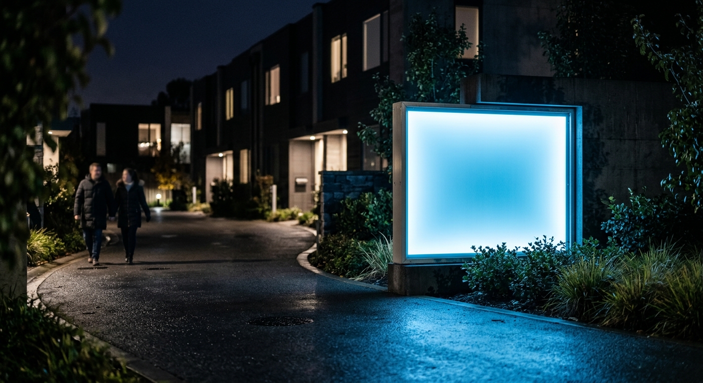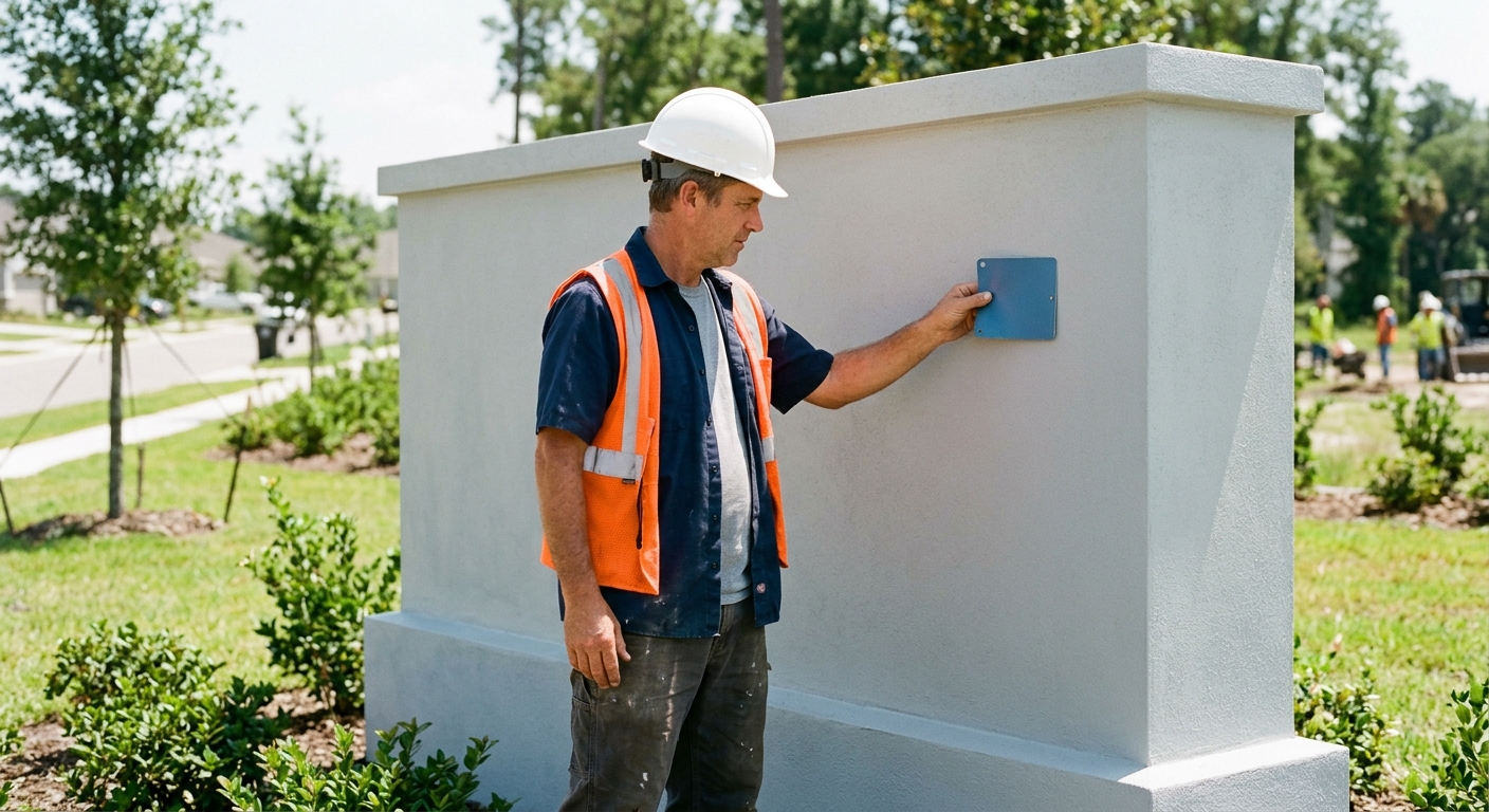
When developing a new commercial property or multi-unit residential complex, exterior signage is a critical branding decision. You need a sign that captures attention and fits your budget, which often comes down to a choice between two popular options: dimensional letters and channel letters.
At On Display Signs, we help developers and property managers across Kentucky and Indiana navigate these exterior branding and lighting decisions. You won't have to figure out the technical specifications alone. We pair you with a dedicated Project Manager who handles every part of the process for you. From initial design to fabrication and installation, we provide consistent communication and guide you to ensure you get a stress-free sign that elevates your brand.
Structural Differences Between the Two Letter Types
The Hollow Framework of Channel Letters
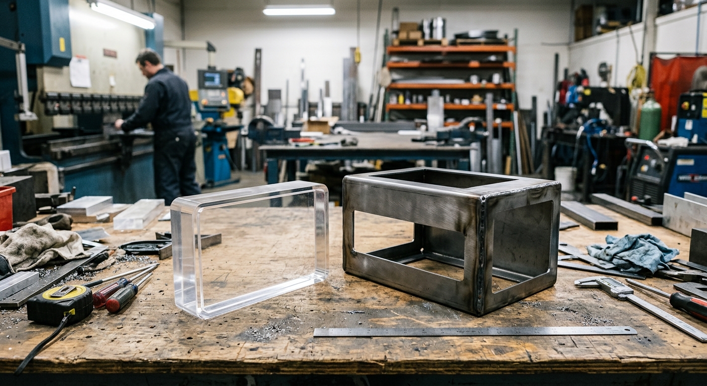
Channel letters are engineered as three-dimensional, hollow structures. At On Display Signs, we fabricate these signs with an internal cavity specifically designed to house electrical components safely. The back and sides—known in the signage industry as the "returns"—are typically formed from aluminum, creating a sturdy but relatively lightweight enclosure.
This hollow space is the defining structural characteristic of a channel letter. It is where we install the wiring, power supplies, and LED modules required for illuminated building signs. Because they must accommodate these electrical parts while protecting them from Kentucky and Indiana weather conditions, channel letters are built with a minimum depth, usually ranging from three to five inches. The front face is often capped with translucent acrylic, allowing the internal light to shine through brightly. For back-lit signs, the structure is reversed to cast illumination against the mounting wall.
The Solid Construction of Dimensional Letters
In contrast, dimensional letters are solid elements. We cut or route these letters directly from flat sheets of material, such as acrylic, solid aluminum, or high-density foam. Because they are solid throughout, dimensional letters do not possess internal cavities.
This structural difference means dimensional letters cannot house internal electrical components or wiring. While they provide excellent depth and a premium three-dimensional look—often used for interior signage or exterior monument signs—they rely entirely on external lighting sources if you need them visible at night. The depth of a dimensional letter is dictated strictly by the thickness of the raw material used or by layering solid materials together, resulting in a sleeker, lower-profile appearance compared to the deep returns of channel letters.
Comparing the Physical Specifications
When our Project Managers consult with national developers and property managers branding multi-unit residential complexes, we help them weigh these structural differences. Understanding how a sign is built ensures the final product is effective, engaging, and within your budget.
| Structural Feature | Channel Letters | Dimensional Letters |
|---|---|---|
| Internal Structure | Hollow cavity | Solid throughout |
| Electrical Capacity | Houses internal wiring and LEDs | None (requires external lighting) |
| Primary Materials | Aluminum returns, acrylic faces | Solid acrylic, flat metal, or PVC |
| Overall Depth | Typically 3 to 5+ inches | Varies strictly by material thickness |
| Weight Profile | Heavier due to internal components | Generally lighter |
These structural variations directly impact how we plan your fabrication and installation process. Specifically, the differences dictate the following project requirements:
- Wall Penetration: Channel letters require drilling behind the sign to route electrical wiring into the building's power source, whereas dimensional letters only require small holes for mounting studs.
- Mounting Methods: The hollow framework of channel letters often requires mounting onto an aluminum raceway or utilizing heavy-duty structural supports, while solid dimensional letters are frequently flush-mounted directly to the facade.
- Serviceability: The hollow cavities of channel letters feature removable faces so our technicians can service the internal lighting components over time, whereas solid dimensional letters require no internal maintenance.
Because the internal structure of a sign dictates its lighting capabilities, choosing between the two depends entirely on whether your location requires self-contained illumination to promote your brand at night.
Lighting Capabilities and Exterior Visibility

Built-In Illumination for Channel Letters
When national developers and property managers approach us for signage that commands attention around the clock, lighting is often the deciding factor. Channel letters are fabricated specifically to house internal electrical components. Because we specialize in electrical building signs, we frequently use energy-efficient LED modules inside each individual letter. This built-in illumination ensures your brand remains highly visible to passing traffic long after the sun goes down.
Depending on the aesthetic you want for your commercial business or residential complex, channel letter lighting can be customized in several ways:
- Standard (Front-Lit): The LEDs shine through a translucent acrylic face, making the letters glow brightly in your specific brand colors.
- Halo-Lit (Reverse): The face is solid metal, and the LEDs shine out the open back, creating a glowing "halo" effect against the building facade.
- Front and Back-Lit: A combination of both styles, providing maximum brightness and a striking dual-lighting effect.
External Lighting Requirements for Dimensional Letters
Unlike channel letters, dimensional letters do not have internal wiring or LED modules. They rely entirely on ambient or external light sources for nighttime visibility. If your business operates after dark or you want your multi-unit residential complex to maintain its branding at night, you must plan for external illumination.
To make dimensional letters visible at night, you will need to incorporate architectural lighting solutions, such as:
- Gooseneck fixtures: Mounted above the sign, casting light downward onto the letters.
- Ground-mounted spotlights: Installed in the landscaping below to wash the sign and the surrounding wall in light.
- Recessed soffit lighting: Built into the building's overhang to illuminate the facade where the letters are mounted.
While external lighting can create a sophisticated, classic look—especially on brick or textured walls—it does not offer the same crisp, edge-to-edge readability as internal LEDs. Shadows cast by the 3D letters can sometimes distort the text depending on the angle of the light.
Comparing Illumination Methods
When deciding between the two for your exterior visibility, your dedicated Project Manager will help you weigh how each option aligns with your branding goals and budget. Here is how the lighting capabilities compare:
| Feature | Channel Letters | Dimensional Letters |
|---|---|---|
| Light Source | Internal LED modules | External fixtures (spotlights, goosenecks) |
| Nighttime Readability | Crisp, exact shape definition | Dependent on external light angle; can cast shadows |
| Wiring Location | Behind the wall or in a raceway | Separate electrical run for external fixtures |
| Color Customization | Colored acrylic faces and colored LEDs | Relies on the painted finish of the letter and white or colored spotlights |
| Ideal Application | Commercial buildings needing 24/7, high-contrast visibility | Businesses wanting a classic, architectural look with ambient lighting |
If your commercial building requires exact, crisp brand visibility from a distance at night, choose channel letters with built-in LEDs rather than relying on external spotlights that can cast distracting shadows over dimensional letters.
Material Selection and Fabrication Methods
The physical structure of your sign dictates the materials we use during fabrication. Because channel letters are hollow enclosures designed to house electrical components, they require different materials than dimensional letters, which are cut from solid sheets of material. There is a lot to creating a sign, but your dedicated Project Manager will handle every part of this fabrication process for you, ensuring the final product is the sign your company deserves.
Fabricating Channel Letters
To build a channel letter, we construct a hollow, three-dimensional shape. We primarily use sheet aluminum for the body of the letter because it is lightweight, durable, and highly resistant to rust. This weather resistance is a crucial factor for exterior building signs exposed to the elements across Kentucky and Indiana.
The fabrication process for a standard channel sign involves assembling several distinct parts:
- Routing the back: We cut the base letter shape from a flat sheet of aluminum to form the back panel.
- Forming the returns: We bend strips of aluminum to create the sides, or returns, of the letter. These strips are attached to the back panel to form the hollow "channel."
- Attaching the face: For standard front-lit channel letters and illuminated cabinet signs, we cut the front face from translucent acrylic. This acrylic allows internal lighting to shine through brightly and can be customized with translucent vinyl overlays to match your brand colors. The acrylic face is secured to the aluminum body using a specialized molding called a trim cap.
Crafting Dimensional Letters
Dimensional letters are solid, meaning they do not have a hollow internal cavity. Instead of being assembled from multiple pieces like channel letters, dimensional letters are typically routed or laser-cut directly from a single, thick sheet of material.
This solid construction opens up a different range of material options for your branding:
- Solid Metals: We frequently cut dimensional letters from solid aluminum, brass, bronze, copper, or stainless steel. These metals can be brushed, polished, or painted, providing a premium, architectural look often used by national developers for multi-unit residential complexes.
- Solid Acrylics: Acrylic can be cut into thick, solid letters and painted to match your exact specifications, offering a sleek, glossy, and modern finish.
- PVC and Formed Plastics: For commercial businesses needing thick letters without the weight of solid metal, we use durable plastics that provide excellent depth while keeping the project within your budget.
Material and Construction Comparison
We will work with you and guide you to ensure you select the most effective materials for your specific location. Here is a breakdown of how the two fabrication methods compare.
| Feature | Channel Letters | Dimensional Letters |
|---|---|---|
| Primary Structure | Sheet aluminum (hollow cavity) | Solid metal, acrylic, or PVC |
| Face Material | Translucent acrylic | Same as the primary structure |
| Depth Method | Bent aluminum returns (sides) | The natural thickness of the material sheet |
| Fabrication Process | Assembled from multiple cut and bent pieces | Routed or laser-cut from a single solid sheet |
Because channel letters must be hollow to house electrical components, they cannot be manufactured from the heavy, solid metal blocks often used for premium dimensional lettering.
Installation Considerations for Commercial Properties
Preparing Your Building's Facade
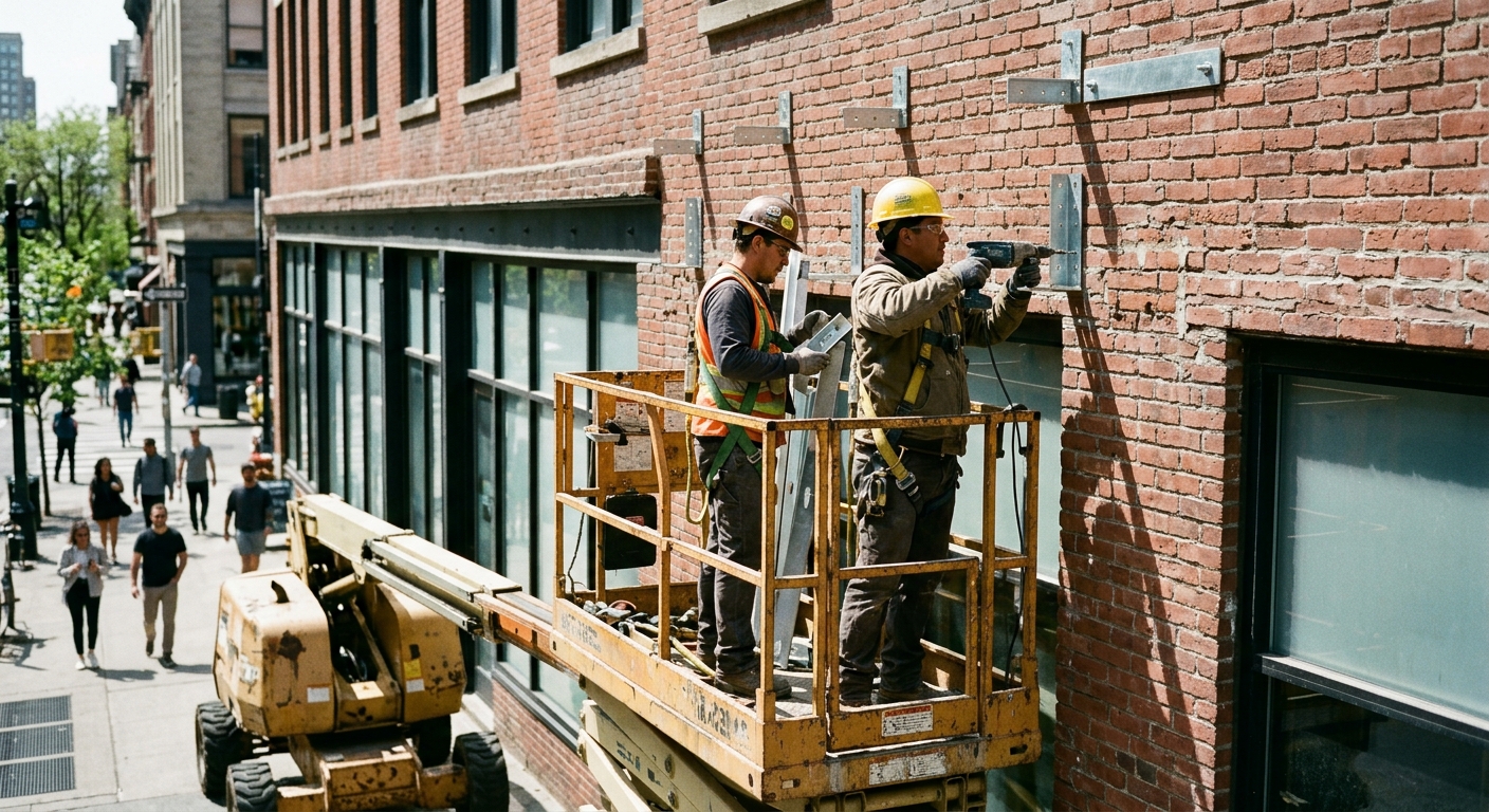
When we design and install signage for commercial businesses and multi-unit residential complexes across Kentucky and Indiana, the building's architecture dictates much of our installation approach. Because channel letters and dimensional letters interact with your building's facade in fundamentally different ways, understanding these physical requirements early prevents unexpected construction delays.
At On Display Signs, your dedicated Project Manager handles every part of this coordination for you. Whether your building's exterior is brick, stucco, or corrugated metal, we work directly with you and your property managers to ensure the installation is smooth, stress-free, and structurally sound.
Channel Letter Installation and Electrical Access
Channel letters are internally illuminated, meaning their installation is heavily dependent on secure electrical access. We must route wiring from the individual letters to power supplies housed either behind the building's fascia or within an external mounting structure.
There are two primary ways we install electrical channel letters:
- Flush Mounting: Each letter is mounted directly to the building facade. This provides a highly desired, seamless look, but it requires drilling multiple holes for every single letter—both for the structural mounting studs and the electrical wiring. Crucially, your building must have accessible, hollow space directly behind the wall to house the power supplies and connect the wires safely.
- Raceway Mounting: The letters are pre-assembled onto a rectangular metal box (the raceway) that safely houses all the electrical wiring and power supplies. The raceway is then painted to blend in with your building's exterior. We frequently use this method for large corporations and national developers when property owners mandate minimal wall penetrations, or when behind-the-wall electrical access is completely blocked.
Dimensional Letter Mounting Techniques
Because dimensional letters do not include internal lighting components, the installation process is significantly simpler and faster. Without the need to conceal bulky power supplies or pull electrical wiring through an exterior wall, we can mount these non-illuminated signs on almost any flat surface.
Common installation methods for dimensional letters include:
- Stud Mounting: We drill small holes into the wall and insert threaded metal studs that are attached to the back of the letters. We can push the letters flush against the wall or use metal spacers to float the letters a half-inch or more away from the surface, creating natural drop shadows.
- Adhesive Flush Mounting: For lighter acrylic letters or interior lobby signs, we can often use industrial-grade adhesives or high-strength double-sided tape to secure the letters directly to smooth walls, eliminating the need for drilling entirely.
| Installation Feature | Channel Letters | Dimensional Letters |
|---|---|---|
| Electrical Access | Required (wiring and power supplies) | Not required |
| Wall Penetrations | High (flush) or Moderate (raceway) | Low to None (stud or adhesive) |
| Primary Mounting Methods | Raceway mount, Flush mount | Stud mount, Adhesive mount |
| Installation Complexity | High (requires electrical routing) | Low (straightforward attachment) |
Always verify the structural and electrical access behind your building's exterior wall before finalizing a flush-mounted channel letter design, as a lack of interior clearance may force a last-minute switch to a raceway mount.
Choosing the Right Sign for Your Development Project
Evaluating Your Branding Goals and Budget
When branding multi-unit residential complexes or commercial facilities, your signage sets the tone for the entire property. Selecting between dimensional letters and channel letters often comes down to balancing your desired visual impact with your project budget. For national developers and property managers, ensuring consistency across multiple locations is also a key branding goal.
Dimensional letters provide a sophisticated, classic look that works well for properties prioritizing daytime visibility or those with strict budget constraints. Channel letters require a higher initial investment due to their electrical components, but they deliver 24/7 brand visibility.
To help you weigh your options, here is a comparison of how these two sign types align with common development priorities:
| Sign Type | Typical Budget Profile | Best Branding Application |
|---|---|---|
| Dimensional Letters | Highly cost-effective; scales easily depending on the chosen material | Classic, architectural branding where daytime visibility is the primary focus |
| Channel Letters | Higher initial investment due to wiring and electrical fabrication | High-impact, 24/7 visibility to attract tenants and customers around the clock |
Navigating Local Zoning Laws
Even the most striking sign design must comply with local regulations. Municipalities across Kentucky and Indiana have specific codes that dictate what you can and cannot install on your commercial property. Before committing to a sign type, developers and property managers must evaluate how local ordinances impact their choices.
When reviewing zoning laws for your location, we look closely at several specific restrictions to ensure compliance:
- Illumination allowances: Some zoning districts, particularly those near residential neighborhoods or historic areas, strictly limit or prohibit internally illuminated signs. This can automatically rule out channel letters for certain properties.
- Size and scale limits: Municipalities regulate the maximum allowable square footage of a sign based on your building's frontage, the speed limit of the adjacent road, or the property's overall size.
- Property setbacks: If your letters are being mounted to an exterior monument sign rather than the building facade, local codes will dictate exactly how close to the roadway or property line the structure can be placed.
A Smooth Process with Dedicated Project Management
There is a lot to creating a sign, and balancing budgets, branding, and zoning codes can quickly become overwhelming for developers juggling multiple aspects of a new build. We have experience designing signs for every size business in every industry, and our goal is to ensure the final product is the sign your company deserves.
At On Display Signs, our smooth, stress-free process is built around consistent communication. When you work with us, you get one dedicated Project Manager who handles every part of the project for you. Instead of bouncing between different departments for design, permitting, and fabrication updates, you have a single point of contact. From consulting on the most effective letter style for your budget to navigating local zoning laws, your Project Manager will guide you through the entire process. We will work with you to make sure your sign is effective, engaging, and within your budget.
Always verify your local zoning and illumination codes before finalizing your branding budget, as municipal restrictions can quickly force a pivot from illuminated channel letters to non-illuminated dimensional letters.