Your restaurant's menu sign is so much more than a list of what you sell. Think of it as your most effective salesperson—one that greets every customer, shapes their first impression, and quietly guides them toward what to order. A well-designed menu board can do heavy lifting for your business, boosting sales of high-margin items and streamlining your entire operation.
How the Right Menu Sign Drives Restaurant Success
Your menu board is your restaurant’s silent workhorse. It’s on the clock 24/7, communicating your brand’s personality and value. Whether it’s a rustic chalkboard in a cozy cafe or a bright digital display in a fast-paced eatery, the right sign serves a clear business goal. It's not just another expense; it’s a smart investment that directly impacts the customer experience, your brand identity, and ultimately, your bottom line.
A sign’s influence kicks in long before a customer even thinks about their order. It sets the tone for their entire visit. For quick-service restaurants, where speed and clarity are everything, finding the right Quick Service Restaurant solutions can make or break the customer experience.
Creating the First Impression
The second a customer lays eyes on your menu, they’re forming an opinion about your restaurant. Is it cluttered and confusing? That suggests a disorganized kitchen. Is it clean, professional, and easy to read? That builds immediate confidence. You only get one chance to make that first connection.
Well-designed menu signs for restaurants get a few key jobs done right away:
- Establish Brand Identity: The materials, fonts, and colors you choose tell a story. For example, a sign made from reclaimed wood perfectly suits a farm-to-table concept, while a brightly backlit menu feels right at home in a modern burger joint.
- Simplify the Ordering Process: An intuitive layout guides customers through their choices, cutting down on "menu anxiety" and keeping the line moving. This is an absolute game-changer during your busiest hours.
- Highlight Profitable Items: Smart design can draw the eye exactly where you want it to go. A simple tactic is to place a box around your highest-margin combo meal or use a small, tasteful icon next to a signature dish. These visual cues can increase sales of specific items by 15-20%.
Boosting Sales and Efficiency
Beyond just looking good, a strategic menu sign is a powerhouse for your operations. It directly contributes to a higher average check size and a much smoother workflow for your team. By clearly displaying combos, add-ons, and specials, you’re upselling without an employee having to say a word.
The primary job of a menu sign is to sell. Its design should make it as easy as possible for customers to find what they want, discover new items they’ll love, and turn a simple order into a great experience.
This efficiency ripples through your entire business. When the menu is clear, customers decide faster. That means shorter lines and higher table turnover. It also slashes ordering errors, saving you money on wasted food and keeping customers happy.
While your interior menu board is vital, the journey often starts on the sidewalk. You can learn how to pull customers in from the curb in our guide to the perfect outdoor restaurant sign. By thinking of your signs as a complete system—from the street to the counter—you create a seamless and profitable customer journey.
Comparing the Different Types of Menu Signs
Picking the right menu sign for your restaurant is one of those decisions that quietly shapes your entire customer experience and even your day-to-day operations. It's not just a list of what you sell; it's a critical sales tool. Every type offers a completely different set of advantages, so the trick is matching the sign to what you’re trying to accomplish.
The main players are the classic static boards, eye-catching illuminated signs, and the endlessly flexible digital screens. A cozy, farm-to-table bistro, for instance, gets a ton of mileage out of a beautiful, hand-lettered chalkboard. It screams "fresh and local." On the flip side, a bustling fast-food joint needs the speed and punch of digital screens to push a lunch special or 86 a sold-out item on the fly.
This decision tree helps frame the conversation. Are you trying to boost sales, streamline ordering, or just nail a certain vibe? Your answer points you toward the right tool for the job.
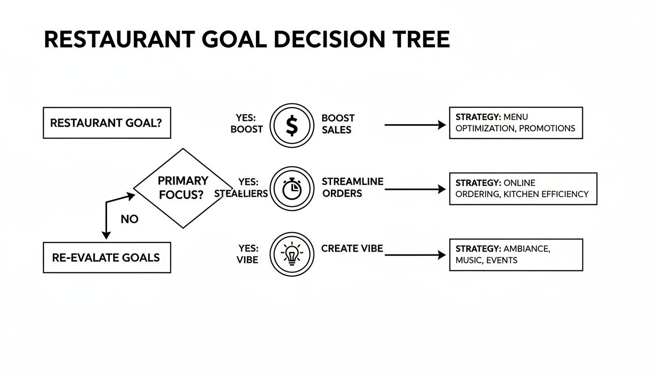
The best sign is simply the one that solves your biggest problem—whether that’s efficiency, atmosphere, or pure sales power. To make it easier, here's a quick comparison of the most common options.
Comparison of Restaurant Menu Sign Types
| Sign Type | Best For | Flexibility | Initial Cost | Visual Impact |
|---|---|---|---|---|
| Static Boards | Cafes, diners, and bistros with stable menus or a rustic, handcrafted brand. | Low. Changes require reprinting. Chalkboards are flexible but need artistic skill. | Low | High for brand personality; can feel classic or artistic. |
| Illuminated Signs | Drive-thrus, counter-service spots, and any restaurant needing to stand out in low light. | Low. It's a static sign with lights, so updates still mean reprinting. | Medium | Very High. Excellent for grabbing attention from a distance. |
| Digital Menu Boards | QSRs, fast-casuals, and any restaurant that changes specials, prices, or promotions often. | Extremely High. Instant updates can be made from anywhere. | High | Dynamic. Can show videos, animations, and cycle through promotions. |
Each of these has its place. Let's dig a little deeper into what makes each one tick.
Classic Static Menu Boards
Static signs are the tried-and-true workhorses of the restaurant world. This isn’t just one thing; it’s a whole category, covering everything from handwritten chalkboards to professionally printed signs slotted into simple frames or lightboxes. Their biggest draw? Simplicity and a much lower upfront cost.
- Best For: Cafes, diners, and independent spots with menus that don't change much, or anyone going for that nostalgic, handcrafted feel. For example, a local coffee shop's chalkboard can highlight a "Muffin of the Day" to create a sense of freshness and exclusivity.
- Flexibility: Pretty limited. If you need to change a price on a printed sign, you’re reprinting the whole thing. Chalkboards give you more freedom, but you need a steady hand to keep them looking sharp.
- Visual Impact: They can be incredibly effective at setting a tone. A well-designed printed board feels clean and classic, while a chalkboard can give off a quirky, artistic vibe.
Illuminated and Backlit Signs
Take a static display, add some internal lighting, and you’ve got an illuminated sign. These signs use LEDs to make your menu pop, especially when it’s dark or your interior is dimly lit. It’s a fantastic way to pull your customers' eyes exactly where you want them.
These are perfect for grabbing attention from across the room or from a car, which is why they’re a staple at counters and drive-thru lanes. While they cost more than a non-lit sign, that boost in visibility often pays for itself in increased sales. You can explore a ton of different styles in our guide to the main types of signage.
Dynamic Digital Menu Boards
Digital menu boards are the most modern and powerful solution out there. We’re talking about high-resolution screens that can display your menu with crisp images, slick animations, and even video. Their superpower is the ability to make changes instantly, from anywhere with an internet connection.
Digital menu boards transform a static list into a dynamic sales tool. They empower restaurants to adapt promotions, manage inventory, and highlight high-margin items in real time, directly influencing customer decisions at the point of sale.
Quick-service restaurants (QSRs) are all over this trend. Digital displays now make up over 62% of the entire menu board market, with QSRs accounting for more than 75% of that adoption. It's a race to create more engaging and efficient ordering experiences, and the technology is getting better every year.
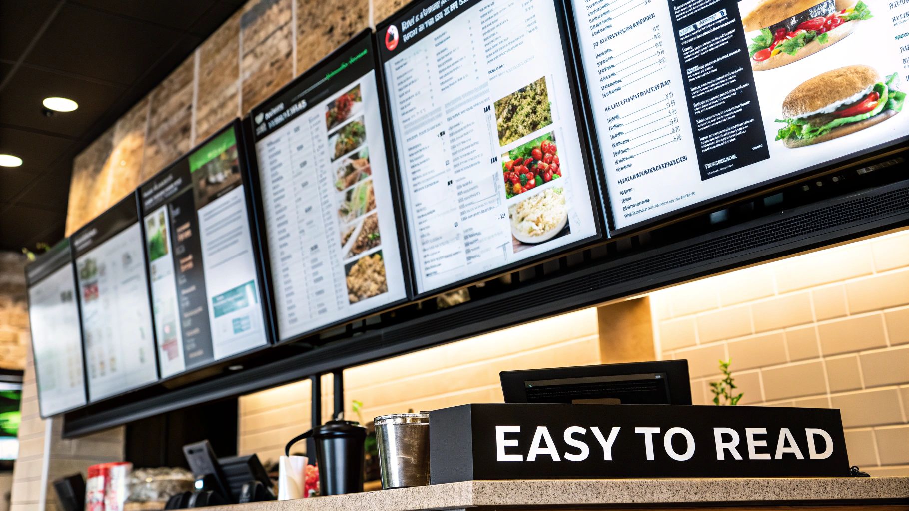
Designing a Menu Board for Easy Reading and Sales
Let's be blunt: if customers have to squint to read your menu, you're leaving money on the table. A great menu board is more than just a list of items; it’s a silent salesperson, guiding customers from "what should I get?" to "I'll take that!" in seconds. This isn't about throwing flashy graphics at the wall—it's about creating clarity that speeds up decisions and keeps the line moving.
The absolute bedrock of a high-performing menu sign is its typography. The fonts you pick have to walk a tricky tightrope between showing off your brand's personality and being dead simple to read from across the room. Sure, a whimsical script font might feel perfect for a little bakery, but if people can't tell a "croissant" from a "cruller," the font has failed its one true job.
Making Smart Font Choices
Think of your menu font as the voice of your brand—it needs to speak clearly and with confidence. For your item names and section headers, you can't go wrong with clean, no-fuss sans-serif fonts. Think Helvetica, Open Sans, or Lato. They were born for readability, especially on a backlit sign or a digital screen.
Here are some actionable tips to avoid common typography mistakes:
- Too Many Fonts: Don't turn your menu into a ransom note. Stick to a maximum of two or three fonts that work well together. A practical example is using one bold font for headers (like "Burgers") and a simpler, clean font for the item descriptions.
- All Caps: WRITING IN ALL CAPS FEELS LIKE YOU'RE YELLING. It's also scientifically harder to read, slowing down comprehension and the entire ordering process.
- Wrong Font Size: Here’s a solid rule of thumb: text needs to be at least one inch tall for every 10 feet of viewing distance. An actionable step is to print a sample line of text, tape it to the wall, and stand where your customers will. If you have to squint, it's too small.
Using Color and Contrast to Guide the Eye
Color does a lot more than just prettify your menu; it sets a mood and tells people where to look. Warm reds and oranges are known to stimulate the appetite, while cooler blues and greens can create a more laid-back vibe. But the specific color you choose is far less important than the contrast it creates.
High contrast is completely non-negotiable. There's a reason dark text on a light background (and vice versa) is the universal standard—it’s what the human eye processes best. Avoid painful combinations like yellow text on a white background or dark gray on black. That just leads to eye strain and frustrated customers.
A well-designed menu doesn't make customers work. It uses visual cues like color, bolding, and negative space to create a natural path for the eyes, leading them from section to section and highlighting key items along the way.
Structuring Your Menu Layout for Maximum Sales
The layout of your menu board is your secret weapon for boosting the average ticket size. You can nudge customers toward your most profitable dishes simply by using strategic grouping and a bit of empty space. People's eyes tend to scan menus in a "Z" pattern, often landing on the top right corner first. Placing a high-margin special or a killer combo in that prime real estate can dramatically increase its sales.
Thinking strategically about your menu layout is just as important as building a profitable coffee menu for your business. The core principle is the same: make it effortless for customers to find—and buy—your best stuff.
Use simple boxes, lines, or different background colors to group related items like entrees, sides, and drinks. This visual organization helps people find what they're looking for fast. And most importantly, fight the urge to cram every square inch with text. That empty space—what designers call negative space—is your best friend. It prevents the menu from looking cluttered and gives the eyes a place to rest, making the whole thing feel less overwhelming and more approachable. For more inspiration, check out our guide to sign design ideas.
Nailing Placement, Sizing, and ADA Rules
You can have the most beautiful menu sign in the world, but if your customers can’t see it—or if it violates legal standards—it’s basically useless. Getting the placement and sizing right is every bit as important as the design. It directly impacts how smoothly customers move through your space, how easily they can read your offerings, and whether you’re on the right side of the law.
The whole point is to make ordering feel easy and intuitive for every single person who walks in.
When placing your menu signs for restaurants, you have to put yourself in your customer’s shoes. Inside, the most obvious spot is right above or behind the order counter. It’s a natural focal point where people are already looking. But if you have a larger restaurant or a more complex layout, think about adding wall-mounted menus along the main path to the counter. This lets guests figure out their order before they even join the queue, which is a huge win for speeding up service.
Exterior signs are a different ballgame, especially for drive-thrus. A practical insight is to place a "pre-menu" board with your top combos and specials well before the main speaker box. This gives drivers time to decide on their order without feeling rushed, which keeps the line moving efficiently. The main menu has to be positioned perfectly for clear viewing from the driver’s window, taking into account things like sun glare at different times of the day.
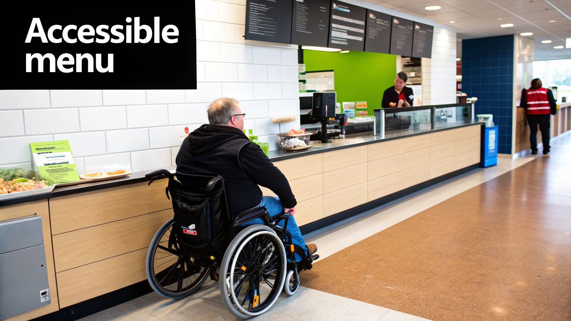
Getting ADA Compliance Right
Beyond smart placement, your signs absolutely must be accessible to everyone. This isn’t just good service; it’s the law. The Americans with Disabilities Act (ADA) has very clear rules for signage to make sure people with disabilities aren’t left out. Blow off these rules, and you’re looking at hefty fines and, worse, you’re telling a whole segment of your community they aren’t welcome.
Here’s a practical checklist of key ADA rules for menu signs:
- Mounting Height: Generally, characters on a sign need to be between 40 and 60 inches off the floor. This makes them readable for someone in a wheelchair.
- Character Proportions & Size: Letters have specific requirements for their thickness-to-height ratio, and the font size needs to be large enough for the typical viewing distance.
- Finish and Contrast: Glare is the enemy. Signs must have a non-glare finish (think matte or eggshell). You also need strong contrast between the text and the background to ensure readability.
Following accessibility standards isn't just about ticking boxes on a government form. It's a statement that you're committed to serving everyone in your community. That builds the kind of trust and loyalty that grows a business.
Getting these details right is non-negotiable. For a more detailed breakdown, it’s worth learning more about ADA sign compliance to make sure your restaurant is truly open to all.
Don't Forget Local Codes and Permits
Finally, before you even think about installing an outdoor sign, you have to deal with local zoning laws. Every city and county has its own rulebook for the size, height, lighting, and placement of business signs. Trying to bypass this and install a sign without a permit is just asking for trouble. You’ll likely be ordered to take it down, forcing you to start from scratch and throwing money down the drain.
The permitting process can be a headache of paperwork, technical drawings, and back-and-forth with city officials. This is where a good sign partner proves its worth. A professional company will handle the entire permitting maze for you, ensuring your project is 100% compliant before the first hole is ever drilled.
The True ROI of Digital Menu Boards
It’s easy to see digital menu boards as just a modern coat of paint for your restaurant. But that misses the point entirely. They’re powerful business tools, and while the upfront cost is higher than a static sign, their real value comes from their flexibility and direct impact on your sales.
Think of your menu as a dynamic canvas. Imagine a breakfast special that’s just not selling. With a few clicks, you can swap it out for a flash promotion on a higher-margin lunch item—and roll it out across all your locations before the morning rush even ends. That’s a level of real-time control you could never get with printed signs.
Ultimate Flexibility and Instant Updates
The single biggest win with a digital menu board is its ability to adapt on the fly. Traditional signs lock you into prices and offerings until your next expensive print run. Digital displays, on the other hand, let you stay nimble and react to the day-to-day realities of running a restaurant.
This flexibility isn't just a convenience; it's a direct line to better operations and more revenue.
- Day-Parting Automation: You can schedule your menu to automatically switch from breakfast to lunch and then to dinner. For example, at 10:30 AM, all screens can instantly change from showing egg sandwiches and coffee to burgers and fries, with zero effort from your staff.
- Instant Item Removal: Run out of your signature brisket? Take it off the menu instantly across every screen. No more disappointed customers or awkward conversations at the counter.
- Real-Time Price Adjustments: If a supplier jacks up the price of an ingredient, you can adjust your menu pricing immediately to protect your margins. In a volatile market, that’s not a luxury—it’s a necessity.
This turns your menu signs for restaurants from a passive list of items into an active management tool.
Driving Sales with Dynamic Content
Let’s be honest: human eyes are drawn to motion. Digital menu boards use this simple fact to their advantage, showcasing your food in a way static signs never could. An appetizing video of a sizzling steak or a steaming latte creates an immediate craving that a simple photo just can't match.
That visual appeal has a real impact on what people buy. Studies show that displaying video content can lead to 20-30% of customers making an unplanned purchase. A practical example is showing a short, looping video of cheese being pulled on a fresh pizza next to the pizza combo deal. This grabs attention and drives impulse buys, pushing your average check size higher.
A digital menu board's job is to make your food look so irresistible that customers are inspired to try something new or add that side. It turns the menu from a simple price list into a compelling sales pitch.
The business case gets even stronger when you look at the numbers. Digital menu boards deliver a tangible return by boosting sales and cutting long-term costs. Research consistently shows a 3-5% increase in average ticket sales after switching. One study found that even a conservative 2% lift can add $24,000 in extra annual revenue for a single store. For a chain with 10 locations, that's an extra $240,000. Even better, these displays convince 20% or more of customers to choose premium, higher-margin promotional items.
Lowering Costs and Testing New Ideas
While the initial investment is a key factor, digital displays slash your long-term operating costs. Think about all the recurring expenses of printed menus: design fees, printing, shipping, and the staff time spent swapping them out. Those costs add up fast, especially if you have multiple locations or run frequent specials. A digital display menu wipes those expenses off the books for good.
Beyond savings, digital boards are the perfect lab for menu development. You can test-drive a new item at a single location for a week, see exactly how it sells with data from your POS system, and then make a smart decision about a wider rollout. It’s a data-driven approach that minimizes risk and helps you fine-tune your menu to be as profitable as possible.
How to Choose the Right Signage Partner
Picking a partner for your restaurant's signage is one of the most important calls you’ll make. This isn't just about finding someone to print a menu board. It’s about hiring a collaborator who can take your vision from a sketch to a finished, installed reality—on time and on budget.
The right company makes the whole process smooth. The wrong one can leave you with costly delays, a mountain of stress, and a final product that just doesn't work.
The Value of an End-to-End Provider
A truly valuable partner acts as an extension of your own team. They get that a sign is a powerful sales tool, not just a pretty object. That’s why finding a company that handles everything from start to finish is such a game-changer.
When one firm manages the initial design, manufacturing, permitting, and final installation, you get a seamless process with a single point of contact. This integrated approach avoids the nightmare of trying to coordinate separate designers, fabricators, and installers who aren’t on the same page.
An end-to-end partner handles the complicated stuff you don’t have time for, like:
- Navigating Local Permits: They know the local codes inside and out and will manage the entire application process to keep your project compliant.
- Material Expertise: They can recommend the most durable and cost-effective materials for your specific environment, whether it’s for an indoor digital display or an outdoor sign that has to survive harsh weather.
- Quality Control: Since they control every step from the factory to the final installation, they are 100% accountable for the quality of the finished product.
What to Look For in a Signage Partner
When you're vetting potential companies, you have to look beyond the initial quote. The cheapest option often comes with hidden costs—shoddy materials, unreliable service, and zero support when something goes wrong. You’re looking for a partner who delivers long-term value, not a quick, cheap fix.
A great signage partner doesn't just build what you ask for; they ask the right questions to ensure the final product achieves your business goals. Their expertise should guide you toward a solution that boosts sales and enhances the customer experience.
Before you sign any contracts, make sure a potential partner checks these boxes:
- A Strong Portfolio: Ask to see their work with other restaurants. Does it show a high level of craftsmanship and an eye for detail?
- National Project Management Experience: If you're a growing chain, this is non-negotiable. A partner with experience in multi-site rollouts knows how to maintain strict brand consistency across different cities and states.
- Transparent Communication: They should be able to clearly explain their process, timelines, and costs. A dedicated project manager is a huge green flag.
- Commitment to Durable Materials: Ask what kind of materials they use and about the warranties they offer. A quality sign is an investment that should last for years.
Your Menu Sign Questions, Answered
Jumping into the world of menu signage can feel overwhelming. You've got questions about costs, design, and even legal red tape. Getting solid answers is the key to making an investment you feel good about. Here are the straight-up responses to the questions we hear most from restaurant owners.
What’s the Real Cost of a Restaurant Menu Sign?
The truth is, menu signs for restaurants have a massive price range. A simple printed board might run you a few hundred dollars. On the other end, a big, custom-lit exterior sign for a drive-thru can easily cost several thousand. For a full digital menu board system at one location, you're typically looking at a range of $2,500 to $10,000+, depending on how many screens you need and what the software can do.
It’s better to think of this as an investment in your #1 sales tool, not just an expense. When you're running the numbers, don't forget to include the long-term savings from never having to pay for reprints again. Always ask for a detailed quote that breaks down everything: the design work, the sign fabrication, and the final installation.
What’s the Single Most Important Part of a Good Menu Sign?
Readability. Hands down. If your customers can't quickly and easily see what you're selling, the sign has failed—no matter how cool it looks.
Getting this right comes down to a few critical design decisions:
- Clear, Legible Fonts: Stick with simple, clean fonts that are a breeze to read from a distance. No one wants to squint.
- High-Contrast Colors: Use proven, punchy combinations like dark text on a light background (or vice versa).
- An Uncluttered Layout: Give your items room to breathe. A chaotic, busy design creates a bottleneck at the counter and frustrates hungry customers.
How Often Should I Be Updating My Menu Signs?
That really boils down to the type of sign you have. If you’re using static, printed signs, you absolutely have to update them the second a price or item changes for good. Nothing sours a customer's experience faster than seeing one price on the board and another at the register. It kills trust.
But with digital menu boards, the game changes completely. Their real power is in making frequent, smart updates. The best operators update daily specials, automatically switch menus between breakfast and lunch (a pro move called day-parting), and instantly 86 an item when it sells out. Keeping your menu fresh makes your whole operation look sharp, efficient, and on top of its game.
"Your menu sign is a living document that communicates the pulse of your restaurant. Regular updates—whether daily or weekly—show customers you are attentive and responsive, which builds confidence in your entire operation."
Will I Need a Permit for My Menu Sign?
It all depends on where you plan to put it. Exterior signs, especially the big or illuminated ones you see at a drive-thru, almost always require a permit from your local city or county. These rules are in place to control things like size, placement, and even brightness for public safety and community aesthetics.
Interior signs? Not usually. You typically don't need a permit for signs inside your four walls. However, they still have to meet federal ADA (Americans with Disabilities Act) standards for things like mounting height and readability to ensure accessibility for everyone. A good, full-service sign partner will handle the entire permitting maze for you, making sure your project follows all the local rules and avoids any expensive fines or delays.
Ready to create menu signs that stop customers in their tracks and boost your sales? The team at On Display Signs, Inc. handles everything from start to finish—design, fabrication, permitting, and installation. Contact us today to discuss your project.


