Your outdoor restaurant sign is the first handshake you offer a potential customer. It works around the clock to grab their attention and tell your story, long before they ever taste your food. More than just a nameplate, your sign is your most dedicated employee—setting the tone and communicating your brand's unique vibe 24/7.
Your Sign Is Your Best 24/7 Salesperson
Stop thinking of your outdoor sign as a static object and start seeing it as your best customer acquisition tool. It's the tireless salesperson that never calls in sick, constantly working to make you stand out on a crowded street. A great sign does more than just show people where you are; it becomes a local landmark that builds trust and familiarity.
That first impression is everything. A clean, bold sign might suggest a sleek, modern cafe, while a rustic, hand-painted one hints at a cozy, farm-to-table joint. It's a visual promise of the atmosphere, quality, and service that’s waiting inside. For example, a sign using neon tubing and retro fonts instantly tells passersby they can expect a classic diner experience.
Setting Expectations and Driving Foot Traffic
The true test of your sign is whether it can pull people through the door. It has to be clear, readable, and interesting enough to catch the eye of someone driving by or a group walking down the sidewalk. This is your one shot to turn a random passerby into a paying customer.
An effective outdoor restaurant sign is a silent storyteller. It communicates your brand's personality, hints at the dining experience, and makes a promise of quality—all in a single glance.
Just like a standout farmers market booth setup uses strong visuals to pull in shoppers, your sign needs to create an immediate, appealing presence. Ultimately, a great sign sparks curiosity and makes people feel good about their decision to walk in.
Becoming a Recognizable Brand Asset
Over time, your sign becomes more than just an advertisement; it becomes a core piece of your brand. It builds the kind of recognition that fuels repeat business and gets people talking. For anyone looking for inspiration, exploring different business sign ideas is a great way to see what's possible. Once you start viewing your sign as a primary marketing tool, you’ll be ready to make the smart decisions we’ll cover next.
Choosing the Right Sign Type for Your Eatery
Picking the right outdoor sign for your restaurant is a lot like choosing the perfect dish to represent your menu—it has to make a great first impression. It’s not just about slapping your name on the building; it’s about making a deliberate choice that communicates your brand’s personality before anyone even walks through the door.
For instance, a trendy, minimalist coffee shop might go for sleek backlit channel letters to create a modern, sophisticated glow. On the other hand, a cozy, family-run Italian place would probably do better with a warm, traditionally lit sign that feels classic and welcoming.
Key Sign Types and Their Strengths
The best sign for you really boils down to your location, your budget, and the story you want to tell. Let's look at three popular options that each bring something different to the table.
-
Illuminated Channel Letters: These are the big, bold, individual 3D letters you see on many professional storefronts, usually lit from the inside. They’re fantastic for visibility, especially after dark, and project a very polished, established image. Practical example: If your restaurant is in a suburban strip mall with lots of other businesses, these letters will help you stand out from the visual noise.
-
Hanging Blade Signs: These are the signs that stick out from the side of a building, perpendicular to the wall. They’re absolutely perfect for catching the eyes of people walking down the sidewalk. Practical example: A French bakery on a historic main street would use a wrought-iron hanging sign to enhance its charming, old-world feel.
-
Monument Signs: A monument sign is a freestanding structure, typically low to the ground and built near your property’s entrance. It communicates permanence and authority, making it an excellent choice for standalone restaurants with their own parking lots. Practical example: An upscale steakhouse set back from the road uses a stone monument sign at the driveway entrance to convey quality and guide drivers in.
This decision tree gives you a quick visual check on whether your sign is doing its job—telling your story, grabbing attention, and building your brand.
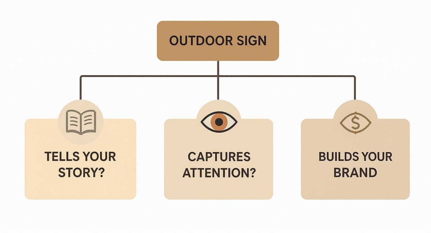
As you can see, the sweet spot is where all three elements—story, attention, and branding—come together. That’s when a sign really starts working for you.
Making an Informed Decision
Finding the perfect sign means balancing the visual "wow" factor with practical things like your budget and how well the materials will hold up over time. It's a serious investment. The outdoor signage market is booming, valued at $43.30 billion in 2024 and expected to climb to $64.31 billion by 2035. That growth tells you just how critical good signage is for businesses.
To help you sort through the options, we put together a quick comparison table that breaks down the most common choices for restaurants.
Outdoor Restaurant Sign Type Comparison
| Sign Type | Best For | Typical Cost | Key Advantage |
|---|---|---|---|
| Illuminated Channel Letters | High-traffic streets, professional branding, nighttime visibility | $$$ | Maximum visibility and a polished look |
| Hanging Blade Signs | Pedestrian-heavy areas, historic districts, boutique feel | $$ | Catches attention from down the block |
| Monument Signs | Standalone locations with parking, conveying permanence | $$$$ | Establishes a strong, permanent brand presence |
| A-Frame / Sidewalk Signs | Daily specials, promotions, areas with heavy foot traffic | $ | Affordable, portable, and easily updated |
| Window Graphics | Displaying hours, menus, or branding without a large fixture | $ | Cost-effective and great for storefronts |
This table gives you a starting point, but every restaurant's situation is unique. Think of your sign as a long-term investment in your brand’s physical footprint. Taking the time to weigh the options now will pay off for years by attracting the right kind of customers.
For a deeper dive into all the possibilities, check out our full guide on the different types of outdoor business signs. It’ll help you narrow down the perfect match for your restaurant’s unique personality.
Selecting Materials That Endure the Elements
An outdoor restaurant sign is in a constant battle with nature. The real test isn’t what looks good on day one, but what will still look good after a thousand days of sun, rain, and wind. The material you pick is the foundation of your sign’s longevity, determining whether it represents your brand professionally for years to come.
Think of it like building a house—you wouldn’t use interior drywall for an exterior wall. Your sign needs a material built to handle your specific local climate. If you're in a sunny, arid region, for example, understanding how local weather impacts outdoor installations can give you a good idea of the kind of resilience you'll need.
Durable and Versatile Material Choices
Every material brings a different mix of durability, style, and cost to the table. Let’s break down some of the most reliable options for an outdoor restaurant sign that is truly built to last.
-
Aluminum: Lightweight, strong, and completely rust-proof, aluminum is a total workhorse for modern signage. It won't warp, swell, or complain in humid conditions, making it a safe bet for just about any environment. Actionable Insight: Choose a powder-coated finish for your aluminum sign to add an extra layer of protection against chipping and fading, significantly extending its life.
-
Acrylic: If you’re planning an illuminated sign, acrylic is your best friend. This versatile plastic is known for its excellent weather resistance and its ability to diffuse light evenly. That's what creates the vibrant, eye-catching glow for channel letters or backlit signs that get noticed after dark. Actionable Insight: Opt for UV-resistant acrylic to prevent yellowing or becoming brittle from prolonged sun exposure, especially in southern climates.
-
High-Density Urethane (HDU): Want the classic, dimensional look of a carved wood sign without all the maintenance headaches? HDU is the answer. This waterproof composite material won't rot, crack, or peel like wood, yet it can be sandblasted and carved into incredibly intricate designs. Actionable Insight: HDU is ideal for signs with complex textures or logos, as it holds detail much better than wood over time.
Your sign's material is a long-term investment in your brand's physical presence. A sign that peels, fades, or rusts sends a message of neglect. A well-maintained sign, on the other hand, communicates quality and attention to detail before a customer ever walks through the door.
Traditional Materials and Modern Innovations
Classic materials like wood will always offer a timeless, rustic appeal. But that look comes with a price: consistent upkeep like staining and sealing to protect it from moisture and sun damage.
This is where modern composites come in, offering the best of both worlds—traditional aesthetics with far superior durability. For instance, aluminum composite panels give you a sleek metal finish with better rigidity and a lighter weight, making installation easier and more affordable.
The entire outdoor printed signage market is growing, driven by innovations in just these kinds of durable materials. The market is estimated at $34.65 billion in 2025 and is forecasted to reach a massive $57.09 billion by 2030. This trend, highlighted in a Mordor Intelligence market report, shows just how vital this physical advertising remains.
Choosing the right material ensures your sign is a lasting asset, not a recurring expense.
Designing a Sign That Makes People Hungry
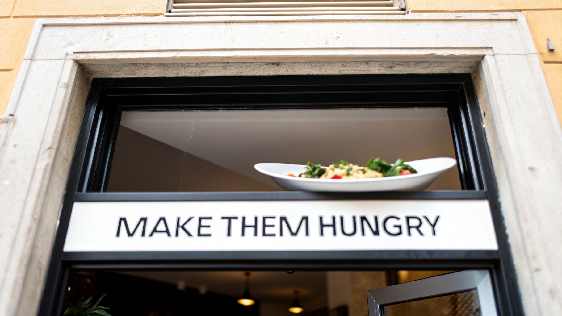
Great sign design is about more than just slapping your logo on a board. It’s the art of creating a visual hook that stops people in their tracks, sparks their curiosity, and ultimately makes their stomach rumble. Your outdoor sign has to tell your story in a split second, turning a passing glance into a decision to come inside for a meal.
Your sign's design should be a direct promise of the experience waiting inside. A fast-casual burger joint? Think bold, sans-serif fonts and bright, high-energy colors that scream fun and speed. A high-end steakhouse, on the other hand, would lean into an elegant script and a deep, moody color palette to communicate sophistication.
Readability and Visual Hierarchy
If there's one golden rule in sign design, it's readability. It doesn't matter how beautiful your sign is if nobody can read it from their car or across the street. If they can't read it, it's not working. Getting this right comes down to a few fundamental choices.
-
High Contrast: The color of your letters needs to pop right off the background. Practical example: White letters on a dark green background for a healthy cafe, or bright yellow letters on a black background for a late-night pizzeria. These combinations are instantly legible.
-
Font Choice: Pick a font that’s clear and legible first, and on-brand second. Those delicate, swirly script fonts might look great on your menu, but they often turn into an unreadable smudge from 50 feet away. Actionable Insight: Test your font choice by printing it out and viewing it from a distance to simulate how it will look to passersby.
-
Simplicity: Fight the temptation to cram every last detail onto your sign. Your restaurant's name and maybe a simple tagline like "Italian Kitchen" or "Artisan Bakery" is all you need. Save the phone number and website for your door or window.
An uncluttered outdoor restaurant sign acts like a confident introduction. It communicates the most important information clearly and leaves the rest to the imagination, inviting customers to come closer and discover more.
Color Psychology and Brand Identity
Color isn't just for decoration; it’s a powerful tool for triggering emotions and, in this case, appetites. The food industry has this down to a science. Bright reds and oranges are famous for stimulating hunger and creating a sense of urgency, which is why you see them plastered all over fast-food brands.
Deeper greens suggest freshness and natural ingredients, making them perfect for a farm-to-table spot or a healthy cafe. Blues can create a feeling of calm and trust, while rich browns and burgundies evoke warmth and luxury—ideal for a cozy coffee shop or an upscale chophouse. The right colors start telling your brand's story before a potential customer even reads the name on the sign.
To add another layer of professionalism, many restaurants use dimensional elements that give their signs a depth and presence that flat signs just can't replicate. If you want to see how raised elements can make a design truly pop, it's worth checking out the different types of 3-D letters signage. A thoughtful design that combines readability, color, and branding is a powerful invitation that gets people thinking about their next meal.
Navigating Permits and Professional Installation
Before your gorgeous new sign can start pulling customers off the street, you have to get the green light from your local government. This is the part of the process—dealing with permits and zoning laws—that can feel like a headache. But tackling it head-on saves you from massive fines and frustrating delays later.
Think of a sign permit as your official permission to make a mark on the local landscape. Every city, town, and county has its own rulebook, usually called a sign ordinance, that lays out exactly what you can and can’t do. These rules are there for a reason: to keep the public safe, maintain the area’s character, and prevent a chaotic visual free-for-all.
Understanding Local Sign Ordinances
The first step is a quick trip to your local planning or building department’s website (or just give them a call). You absolutely need to know their rules before you finalize a design.
Most ordinances will have specific restrictions on a few key things:
- Size Limitations: Cities almost always have maximum height and square footage rules based on your building’s size or your location. For instance, a sign in a quaint historic district will have much tighter restrictions than one in a sprawling commercial plaza.
- Placement Rules: There are very specific rules about how far a sign needs to be from the road, sidewalks, and property lines. You can't just put it wherever you think it looks best.
- Lighting and Illumination: Some communities regulate how bright your sign can be, what colors you can use, and even when you’re allowed to have it turned on. This is to avoid distracting drivers or bothering nearby residents.
A professional sign company doesn't just build signs; they understand the local rulebook. Partnering with an expert who knows the permit process can save you countless hours and protect you from designing a sign that will ultimately be rejected.
The Value of Professional Installation
Once you have your approved design and your permit in hand, it's time for the final step: installation. While it might look simple enough, installing a heavy outdoor sign is a job that demands experience. This is all about safety, longevity, and staying compliant.
A proper installation ensures your sign is anchored securely enough to handle high winds and nasty weather, protecting both your property and the public. Professionals have the right equipment, understand the structural needs for different building materials, and can handle all the electrical work safely and up to code.
Choosing a reputable installer is the last critical piece of the puzzle. It’s what guarantees your investment is safe, legal, and ready to welcome customers for years to come.
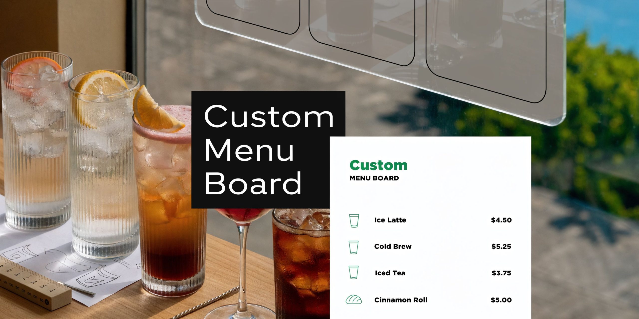
Exploring Modern Digital Signage Options
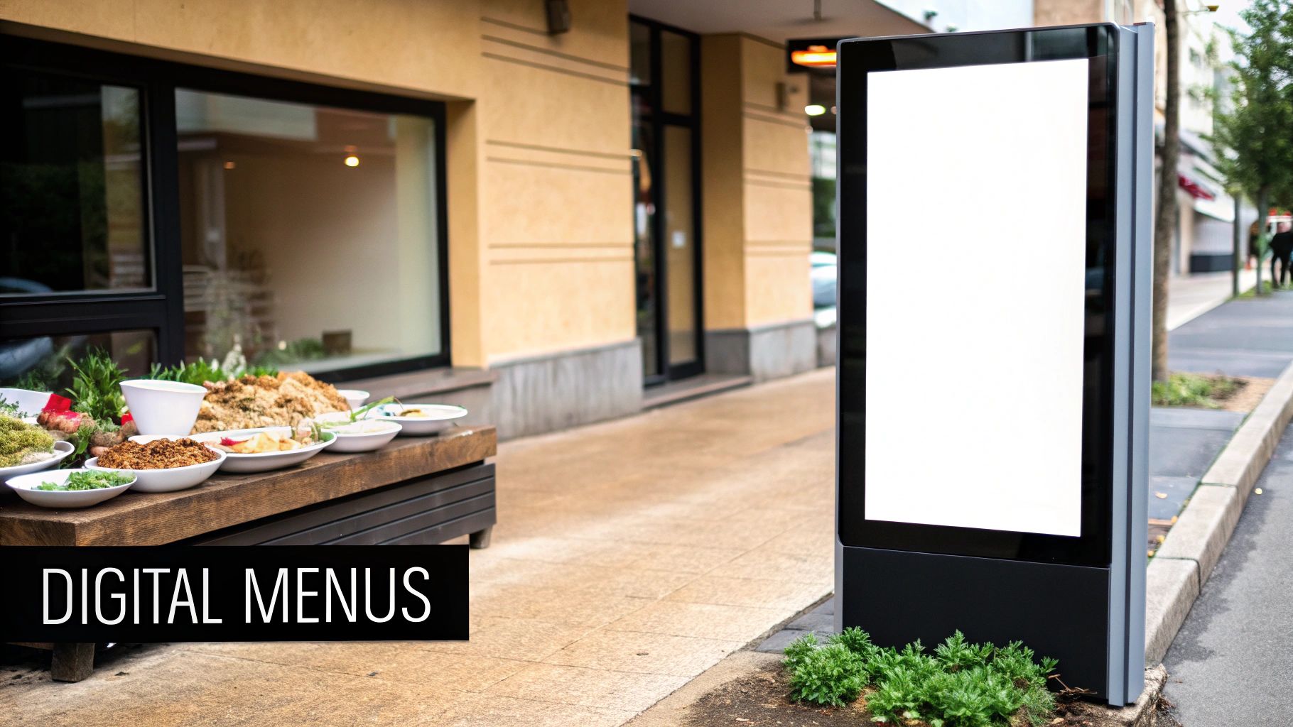
Digital signs are completely changing how restaurants talk to customers. They move beyond the static, printed sign and turn your storefront into a live, dynamic conversation starter. The single biggest advantage here is adaptability. You can change your message in an instant to match the time of day, a sudden cold snap, or a flash promotion. That's something a printed sign could never do.
Practical example: Your coffee shop could advertise a hot pumpkin spice latte on a chilly morning, then automatically switch to a half-price appetizer special right as happy hour kicks off. This kind of flexibility lets you hit customers with timely, relevant offers that pull people in right off the street. You’re no longer locked into one design for months; you have a powerful marketing tool you can adjust every single day.
Comparing Digital Technologies
Not all digital screens are the same. The right technology for you really comes down to your budget and what you’re trying to accomplish.
-
LED Message Boards: These are a perfect entry point into the world of digital signage. They’re fantastic for displaying simple, text-based messages like daily specials, updated hours, or a simple welcome note. While they can't handle high-res photos, they are incredibly bright, built to last, and get the message across loud and clear.
-
High-Definition Video Screens: If you’re looking for maximum visual punch, full HD video screens are the way to go. These let you show off mouth-watering videos of your food, broadcast customer testimonials, or run vibrant, animated ads that are simply impossible for people to ignore.
A digital outdoor restaurant sign transforms your storefront into a live stage. It allows you to test promotions, update menus in real-time, and create a sense of immediacy that encourages passersby to stop and see what’s new.
Key Financial Considerations
Let's be upfront: the initial investment for a digital sign is higher than for a static one. But its long-term value and marketing horsepower can deliver a huge return. You'll also need to consider the content management software, which is the brains behind the operation that lets you update your sign from a phone or computer.
This technology is catching on fast. In the restaurant industry alone, the global digital signage market is expected to hit around $1.6 billion by 2034, growing at a steady clip of about 7.7% each year. This boom is fueled by restaurants discovering how these displays improve the customer experience and drive sales.
For those interested in the hardware itself, our guide on digital and LED sign options offers a deeper dive into the technology.
Your Top Outdoor Restaurant Sign Questions Answered
Picking out a new outdoor sign is a big move, and it's totally normal to have a few questions swirling around. Getting straight answers is the best way to feel good about your decision and make sure it pays off for years to come.
We’ve rounded up the questions we hear most often to give you clear, practical answers. Think of this as the final checklist to help you move forward with confidence.
How Much Should I Budget for a Quality Outdoor Restaurant Sign?
This is the big one, and the honest answer is: it depends. A simple, non-lit sign might start around $1,500, but costs can climb quickly. A large, professionally installed sign with modern LED lighting or a digital display can easily run $10,000 or more.
The best strategy is to get quotes from a few different sign companies. That way, you’re not just comparing prices—you’re comparing the materials, the process, and the value each one offers for your specific design.
How Long Will My Outdoor Sign Last?
The lifespan of your sign really comes down to two things: the materials it’s made from and the weather it has to put up with. A quality sign built from tough stuff like aluminum or high-density urethane (HDU) can easily last 10-15 years, sometimes even longer, with just a little upkeep.
Think of your sign's material as its core strength. Choosing a weather-resistant option is the single most important factor in ensuring it remains a beautiful, functional asset for over a decade, not a source of constant repair bills.
Don't forget that professional installation plays a huge part, too. A well-installed sign is built to withstand the elements from day one.
What Is the Most Important Element of an Effective Sign Design?
If you take away only one thing, let it be this: readability is everything. If people driving by can't instantly read your restaurant's name and figure out what you do, the fanciest design in the world won't matter.
Get readability right by focusing on these three essentials:
- High Contrast: Make sure your letters pop against the background. Think black on white, or yellow on dark blue—not beige on tan.
- Clear Font: Ditch the overly decorative or skinny fonts. You need something clean and bold that’s easy to read in a split second.
- Simplicity: Less is more. A cluttered sign is an ignored sign. Stick to the absolute essentials.
A clean, legible sign will always outperform a busy one.
Ready to create an unforgettable sign that drives traffic and elevates your brand? The experts at On Display Signs, Inc. manage everything from design and permitting to fabrication and installation, ensuring a seamless process from start to finish. Get your free quote today!


