Safety warning signs are so much more than a box to check on a compliance form—they are a critical tool for preventing accidents and keeping people safe. Think of them as a silent, universal language that speaks to everyone in your facility, no matter their job role or what language they speak at home. A smart signage strategy isn't just a good idea; it's a non-negotiable investment in your team.
Why Effective Signage Is Essential for Workplace Safety
Good safety signage is the bedrock of a proactive safety culture. It takes safety out of the employee handbook and puts it right into the physical workspace, offering constant, impossible-to-miss reminders of potential dangers.
When your team sees clear warnings for high-voltage areas, simple instructions for wearing the right PPE, or obvious directions to the nearest fire exit, they have the information they need to make smarter, safer choices in the moment. This constant visual reinforcement builds an environment where safety awareness becomes second nature. It’s not about inspiring fear; it's about fostering respect for the work environment and its risks.
The Foundation of Hazard Communication
At its core, a safety sign is all about hazard communication. It bridges the critical gap between a known risk and a worker's awareness of that risk.
Picture a busy warehouse. Without clear signage, a delivery driver could easily wander into an active forklift lane, creating a recipe for disaster. A single, well-placed sign can stop a serious accident before it ever has a chance to happen. This same principle applies everywhere:
- Manufacturing: Practical examples include signs warning of hot surfaces on machinery, automated equipment that may start without warning, or the need for hearing protection in noisy areas.
- Healthcare: Actionable signage includes identifying biohazard zones, rooms requiring special sanitation protocols, or areas with MRI machines that pose a risk to those with metallic implants.
- Construction: Effective signs mark unstable ground, active overhead work, or deep excavations.
This kind of communication isn't just a suggestion; it’s a fundamental part of keeping your operation running safely. Consistency is key, too. For instance, well-planned warehouse floor marking guidelines work hand-in-hand with wall signs to create a complete safety system that everyone can understand at a glance.
A strong signage program does more than just prevent accidents—it shows your team you're committed to their well-being. It sends a clear message that you value people over productivity, which boosts morale and creates a more disciplined workforce.
A Growing Market Reflects a Growing Need
The focus on workplace safety isn't just a local trend; it's a global shift. As regulations get stricter and companies better understand risk management, the demand for quality safety signs has exploded. The global market for safety signs is on track to hit $2.0567 billion by 2025.
This isn't just an abstract financial trend. It reflects the real-world truth that investing in prevention is always smarter and more cost-effective than dealing with the aftermath of an accident.
Understanding OSHA and ANSI Signage Standards
Trying to get a handle on the rules for safety signs can feel like deciphering a secret code. But it all boils down to two key players: the Occupational Safety and Health Administration (OSHA) and the American National Standards Institute (ANSI). Getting to know their roles is the first real step toward a safer workplace that’s actually compliant.
Here’s a simple way to think about it: OSHA is the law. Their standards are federal regulations, and following them is non-negotiable. ANSI, on the other hand, is like a committee of industry experts who develop the best practices. While their standards are technically voluntary, OSHA often points directly to them, making ANSI the unofficial gold standard for getting hazard communication right.
Bottom line? Sticking to both sets of guidelines is the surest way to make signs that are clear, effective, and keep you on the right side of the law.
The Hierarchy of Hazard Communication
Not all dangers are created equal, and your signs need to reflect that. Both OSHA and ANSI have a clear system that uses specific "signal words" to rank how serious a risk is. This setup helps people instantly gauge the level of danger they're walking into.
Think of it as a three-tiered ladder of severity:
- DANGER: This is the top rung, reserved for the most serious hazards. A DANGER sign warns about a situation that will cause death or severe injury if someone doesn't follow the instructions. Practical examples include signs on high-voltage equipment, in confined spaces with toxic atmospheres, or near unguarded machinery.
- WARNING: This is the middle step. A WARNING sign flags a hazard that could lead to death or serious injury. Common examples include signs near equipment with moving parts that could cause entanglement or in areas with significant fall risks.
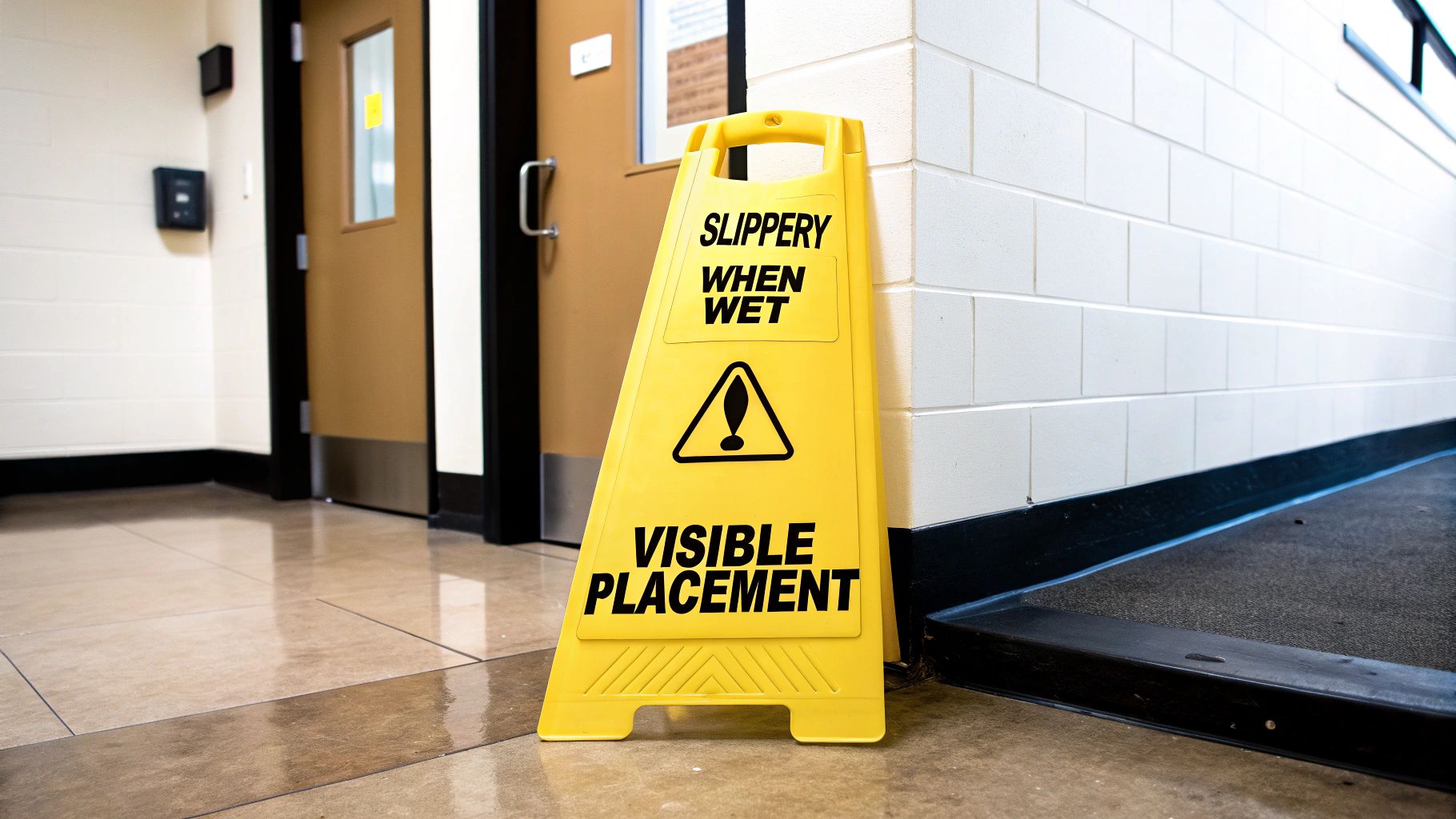
- CAUTION: This is the first rung, used for hazards that could cause minor or moderate injury if ignored. Classic examples are "Slippery When Wet" signs on floors or reminders to wear eye protection in an area with potential for flying debris.
Using this hierarchy correctly means your message always matches the risk—you won't be crying wolf or, even worse, downplaying a life-threatening situation.
To make this even clearer, this table breaks down the core differences between the two main standards bodies.
OSHA vs ANSI Signage Standards at a Glance
| Feature | OSHA (29 CFR 1910.145) | ANSI (Z535 Series) |
|---|---|---|
| Legal Status | Federal Law (Mandatory) | Voluntary Consensus Standard |
| Primary Focus | Establishes basic requirements for signage to alert employees to workplace hazards. | Provides detailed best practices for the design, application, and use of safety signs. |
| Signal Words | Originally defined DANGER, CAUTION, and safety instruction signs. | Expanded the hierarchy to include WARNING and NOTICE, providing more nuance. |
| Color Coding | Sets foundational color requirements (e.g., Red for DANGER). | Standardizes specific color shades (Pantone colors) for consistency and visibility. |
| Symbols/Pictograms | Recommends symbols but does not mandate a specific system. | Provides a comprehensive library of standardized safety symbols to overcome language barriers. |
| Sign Layout | Specifies the signal word panel but is less prescriptive about overall format. | Defines a detailed multi-panel format (signal word, text message, symbol panel) for clarity. |
As you can see, OSHA sets the mandatory baseline, while ANSI provides the detailed playbook for creating truly effective and modern safety communication.
Decoding the Color Language of Safety
Just like signal words, colors give an immediate gut-level sense of a hazard. This color-coding system is a core part of both OSHA and ANSI standards because it’s designed to be understood in a split second, even from across the room.
The whole point of standardized colors is to trigger an instant reaction. Seeing red should immediately scream "serious danger" long before you’re close enough to read the words.
This infographic shows how creating a safe culture and meeting regulatory compliance are two sides of the same coin.
It perfectly illustrates that a strong safety program needs both: compliance is the foundation you have to build on, but culture is what drives safe choices every single day.
Here are the essential colors and what they mean:
- Red: Always paired with DANGER for the absolute worst hazards. It’s also the go-to color for fire safety equipment and emergency stop buttons.
- Orange: Used with the word WARNING. It signals a serious risk that could still result in death or major injury.
- Yellow: This is the color for CAUTION. It flags a hazard that could lead to minor or moderate injuries and is also used to mark physical risks like tripping hazards.
Sticking to this color code is non-negotiable for effective safety signs. For places with unique dangers like construction sites, these rules are even more critical. To dig deeper, you can explore specific construction site signage requirements that build on these core principles.
Beyond the U.S. standards from OSHA and ANSI, it’s also smart to be aware of other national frameworks. For a great example of another country’s comprehensive approach, check out this guide on Australian Workplace Safety Standards. Mastering these rules doesn't just protect your team—it protects your business from massive fines and legal headaches.
How to Choose the Right Sign for Every Hazard
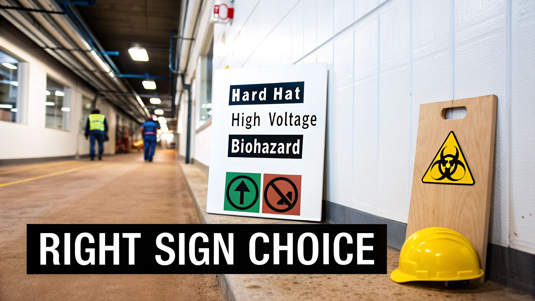
Once you've got a handle on the rules, it's time to put them to work. Think of choosing a safety sign like being a translator—your job is to turn a potential hazard into a visual message that people understand instantly. Getting it wrong is just as bad as having no sign at all, as it can create confusion or, even worse, a false sense of security.
That's why you need a game plan. By breaking down signs based on what they're supposed to do, you can quickly find the right one for any situation and make sure your message hits the mark every time.
Prohibition Signs: Telling People What Not to Do
Prohibition signs are your non-negotiable commands. They're the clearest way to say "don't even think about it" to prevent a dangerous action. You know them the second you see them: a bold red circle with a slash through a black symbol. It's the universal visual for "stop."
Their entire job is to shut down behavior that could cause immediate harm. There's no gray area here.
- Industrial Setting: The classic "No Smoking" sign near flammable storage is a perfect example. It directly stops an action—smoking—that could trigger a fire or explosion in that spot.
- Public Facility: A "Do Not Enter – Authorized Personnel Only" sign on an electrical room door keeps untrained people out of a high-risk zone. Simple and effective.
Mandatory Signs: Showing What Must Be Done
If prohibition signs scream "stop," mandatory signs say "you must do this." They spell out exactly what action is required to stay safe in a given area. Their look is just as distinct: a solid blue circle with a white symbol inside, delivering a clear, positive command.
These signs are your best tool for enforcing policies around personal protective equipment (PPE) and other critical safety steps.
Think of a mandatory sign as the price of admission. To enter this space safely, you agree to follow its instructions. It's a simple contract to protect yourself and everyone else from a known hazard.
Here’s where you see them in action:
- A "Hard Hat Area" sign at a construction site entrance makes it perfectly clear that head protection is required before you take another step.
- "Eye Protection Required" signs are non-negotiable in workshops where flying debris is a real risk.
- In a medical building, a "Wash Hands Before Entering" sign is a critical tool for enforcing hygiene and stopping the spread of germs.
Warning Signs: Alerting to Potential Hazards
Warning signs are probably the most common safety signs you’ll see. Their job isn’t to stop you or force an action but to give you a heads-up about a potential hazard that might not be obvious. They’re designed to make you aware so you can proceed with caution.
These are the signs that don't forbid you from doing something but instead raise your awareness. You'll recognize them by their yellow triangular shape (common internationally) or a yellow header with "Caution" or "Warning" in the US.
- Chemical Lab: A "Biohazard" sign instantly marks containers or areas with infectious materials, telling technicians to use the proper handling protocols.
- Commercial Property: The familiar "Slippery When Wet" sign is a perfect example. It doesn't tell you not to walk; it warns you to change how you walk to avoid a fall.
- Electrical Work: A "High Voltage" warning sign alerts anyone nearby to a serious electrical hazard, ensuring they take the right precautions before opening a panel or touching equipment.
The growing emphasis on workplace safety has made these signs more important than ever. In fact, the global market for warning signs is projected to hit roughly $1.5 billion by 2025 and is expected to keep climbing. If you're interested, you can explore additional data about the warning signs market to see just how big this industry has become.
Best Practices for Sign Design and Material Selection

A truly effective safety sign has to nail three things: it needs to be seen, it must be understood in a split second, and it has to last. If any one of those fails, the sign's power to protect people is gone. This is why smart design and the right material choice are every bit as critical as the message itself.
Great design is all about clarity. The mission is to communicate a hazard so quickly that it's understood almost subconsciously, even from across the room. Rushing this part of the process is how you end up with confusing signs that are completely useless when it counts.
Designing for Instant Readability
The absolute most important job of a sign is being legible. If your team can’t read the message from a safe distance, the sign has already failed. That's why professional sign design is built on a few core principles that guarantee the warning gets through loud and clear.
Think of it this way: your sign is in a constant battle for attention against a noisy, chaotic work environment. To win that battle, every design choice has to be laser-focused on immediate comprehension.
Here are the key elements you have to get right:
- Font Choice: Stick with clean, no-nonsense, sans-serif fonts like Helvetica, Arial, or Highway Gothic. These typefaces were designed for readability, stripping away any decorative fluff that can cause letters to blur together from a distance.
- Text Size: Your text size must be directly tied to the viewing distance. A solid rule of thumb is that you need one inch of letter height for every 25-30 feet of distance.
- High Contrast: Use color combinations that pop. Think classic black text on a yellow or white background, or crisp white text on a red or blue background. This makes the words jump out, especially in low-light situations.
The Power of Universal Symbols
While clear text is essential, pictograms are the real heavy hitters of safety communication. A well-chosen symbol cuts through language barriers, delivering its message to anyone, no matter what language they speak. This is non-negotiable in today's diverse workplaces.
ANSI has created a whole library of standardized pictograms for this very reason. Using these established symbols ensures the meaning of "High Voltage" or "Biohazard" is understood instantly, without anyone needing to read a single word. It’s a visual shorthand that speeds up reaction times.
A pictogram works because it taps into a shared visual language. The image of a person slipping on a wet floor is universally understood, making the warning immediate and intuitive in a way that text alone can never be.
For those situations that demand a more specific message, it's a good idea to look into custom warning signs. This lets you combine standardized pictograms with text that's tailored to your unique hazard, giving you the best of both worlds: universal understanding backed up by precise instructions.
Choosing Materials That Endure
The final piece of the puzzle is picking a material that can survive its environment. A paper sign tacked up in a damp outdoor area will become an unreadable mess in a matter of days, making it worthless. The material you choose is a direct investment in the sign's long-term reliability.
Let your decision be guided by where the sign will live and what conditions it will have to put up with.
Material Comparison for Common Applications
| Material | Best For | Key Advantages | Potential Downsides |
|---|---|---|---|
| Aluminum | Outdoor Use & Harsh Environments | Extremely durable, rust-proof, and resistant to UV fading and chemicals. | Higher initial cost compared to plastic or vinyl. |
| Plastic (PVC) | Indoor & Sheltered Outdoor Areas | Lightweight, cost-effective, and resistant to moisture and many chemicals. | Can become brittle in extreme cold or warp in high heat. |
| Adhesive Vinyl | Direct Application to Surfaces | Flexible and versatile for application on equipment, doors, or windows. | Durability depends heavily on the quality of the surface and adhesive. |
| Photoluminescent | Emergency Egress & Low-Light Areas | Glows in the dark after exposure to light, providing critical guidance during power outages. | Requires a light source to "charge" and can be more expensive. |
When you carefully match design clarity with the right physical materials, you create safety signage that doesn't just check a compliance box—it actively protects your team, day in and day out.
Strategic Placement for Maximum Visibility and Impact
Here’s the thing: even the most perfectly designed safety sign is completely useless if nobody sees it. Strategic placement is that final, make-or-break step that turns a piece of plastic or metal into a life-saving tool.
It’s not good enough to just stick a sign somewhere near the hazard. It has to be positioned to grab attention and give people enough time to actually react. Think of it like a conversation—you have to deliver the right message to the right person at exactly the right moment.
An actionable example: a "Slippery When Wet" sign placed ten feet inside a wet area is a total failure. The warning comes far too late. It needs to be right at the entrance, intercepting people before they step into danger.
Core Principles of Effective Placement
Getting your sign placement right isn't about guesswork. It’s about understanding how people move through and interact with their surroundings. The best strategies are built on a few common-sense principles that ensure your signs get the job done.
These aren't just suggestions; they are fundamental rules for making sure your message is seen and understood.
- Line of Sight: Your signs must be in a person’s direct line of sight. No one should have to crane their neck or look away from their path just to see the warning.
- Mounting Height: The sweet spot is mounting a sign so its center is about 60 to 78 inches from the floor. This puts it right at eye level for most adults.
- Good Lighting: A sign in the dark is invisible. Make sure the area is well-lit, whether from the room’s main lighting or a dedicated light source aimed at the sign.
The ultimate test is simple: can a person walking toward a hazard see the sign, read it, and have enough time to do what it says? If the answer is no, you need to move the sign.
A Proactive Maintenance Checklist
Safety signs are not a "set it and forget it" piece of equipment. They are an active, living part of your safety program that needs regular attention to stay effective. Weather, accidental damage, and plain old wear and tear can make a sign unreadable over time.
The only way to keep your signs compliant and legible is to build a routine inspection schedule. Use this simple, actionable checklist to guide your regular safety walks:
- Check for Visibility: Is the sign clean? Is it blocked by stacked boxes, overgrown bushes, or anything else?
- Inspect for Damage: Look for any cracks, peeling, or vandalism. Fading from sunlight is a huge issue for outdoor signs, so check for that, too.
- Confirm Accuracy: Is the warning still relevant? Sometimes processes change, and a sign becomes outdated or just plain wrong.
- Verify Lighting: For illuminated signs, make sure they are actually working. This is absolutely critical when it comes to emergency exit signage requirements, where visibility is non-negotiable.
When you treat placement and maintenance as core parts of your safety strategy, you ensure the signs you invested in continue to protect your team day in and day out.
Exploring the Future of Digital Safety Signage
Traditional static signs have long been the backbone of workplace safety, but digital technology is completely changing the game. Think about it: what if a safety sign could react to a developing hazard in real time? That’s the power of digital safety signage—it makes safety communication instant, relevant, and far more effective.
Unlike a fixed aluminum sign that says the same thing day in and day out, a digital display can change its message on a dime. This is a massive advantage in places where conditions can shift without warning. Imagine a sudden chemical spill on a factory floor. Digital screens across the facility can instantly flash alerts, pointing people to the safest evacuation routes and warning them away from the danger zone.
Dynamic Communication in Action
The real-world uses for this are practically endless. On a sprawling corporate campus or in a massive industrial plant, digital screens can cycle through important safety reminders. This keeps protocols top of mind without letting the message fade into the background like a tired old poster.
Here’s where it gets really practical:
- Public Venues: During a packed concert or sporting event, digital signs can show real-time crowd flow, guide people to less-crowded exits, or broadcast emergency alerts instantly.
- Industrial Plants: A screen might show normal operating stats one minute, then immediately switch to a critical “Machine Overheating” warning the next, giving workers specific, actionable information right when they need it.
This adaptability is what makes digital displays such a powerful tool. Being able to push the right message to the right place at the right time is a huge leap forward for workplace safety.
The Growth of Digital Communication
The move to digital isn't just a small trend; it's a major industry shift. The global digital signage market, which includes these advanced safety systems, is already valued at $28.83 billion. It’s projected to explode to $45.94 billion by 2030 as more industries demand smarter, more responsive communication tools.
Digital signage turns safety communication from a one-way street into a dynamic conversation. It can react to sensors, update with new information, and interact with employees to make sure the message is always fresh and relevant.
Emerging Innovations in Safety Tech
And this is just the beginning. The next wave of technology is set to make safety information even more intuitive and integrated. For instance, interactive displays could let workers pull up detailed safety data sheets or emergency plans with a simple touch.
The really exciting frontier is augmented reality (AR), where safety info is layered directly onto a person’s view of the real world. A technician wearing AR glasses could look at a machine and instantly see live data, step-by-step repair guides, or bold warnings about high-voltage areas. To see how AR is already becoming a critical safety tool, check out A Guide to Augmented Reality Safety in the Workplace. These kinds of innovations are making safety signage smarter and more connected than ever before.
Frequently Asked Questions About Safety Signage
Even when you have a good handle on safety signs, questions always pop up in the real world. This is your quick-reference guide for the day-to-day details that make the difference between a compliant signage program and an effective one.
Getting these specifics right is how you turn a safety strategy on paper into a truly protected and efficient facility.
What Is the Main Difference Between OSHA and ANSI Standards
Here’s the simplest way to think about it: OSHA sets the law, and ANSI provides the playbook.
OSHA is the government body that creates the legally mandatory rules. Their standards establish the absolute minimum requirements you have to meet for communicating workplace hazards. It's the "what you must do."
ANSI, on the other hand, is a non-governmental organization that develops consensus-based best practices. Their guidelines are the "how you should do it" in the most effective way possible, offering a much more detailed and modern framework for everything from color codes to symbol design.
While ANSI standards aren't technically the law, OSHA often points to them as the gold standard for hazard communication. Following the latest ANSI guidelines is the single best way to make sure your signs are not only compliant but actually clear and easy to understand.
How Often Should I Inspect My Safety Signs
There’s no hard-and-fast federal rule for every single sign, but the industry best practice is to make sign checks a routine part of your regular safety audits. For most facilities, that means a thorough inspection at least quarterly.
However, if a sign is in a harsh environment—think outdoors baking in the sun or inside a busy industrial area with constant traffic and grime—you need to bump that up. A quick monthly check is a smarter, safer bet for those high-wear areas.
During your inspection, be on the lookout for:
- Fading colors that make the sign hard to read or less vibrant.
- Physical damage like cracks, peeling vinyl, or deep scratches.
- A buildup of dirt, grease, or grime that covers up the message.
- Anything new that might be blocking the view of the sign.
If a sign isn't perfectly legible, accurate, or up to current standards, it needs to be replaced immediately. No exceptions.
Can I Make My Own Safety Signs
Yes, you can absolutely create your own safety signs in-house. But—and this is a big but—you take on all the responsibility for getting it exactly right. If you go the DIY route, your signs must strictly follow all applicable OSHA and ANSI specifications.
There's no room for creative license here. The rules for color codes, signal words, text size, symbols, and layout are incredibly precise for a reason. Any small deviation can make your sign non-compliant and, worse, ineffective, opening you up to serious liability. This is why most businesses find it’s just easier and safer to partner with a professional sign company that guarantees every sign meets these critical standards.
At On Display Signs, Inc., we live and breathe this stuff. We create fully compliant, durable, and effective safety warning signage that’s built for your facility's unique challenges. We'll handle everything from design to installation so your safety communication is always crystal clear. Get a free quote today and build a safer workplace.
