A-frame signs, often called sidewalk or sandwich board signs, are the ground-level workhorses of storefront marketing. Think of them as your silent salespeople, standing right outside your door to grab the attention of anyone walking by and turn a casual glance into a new customer.
Turn Passersby Into Customers With Sidewalk Signs
Picture a potential customer on a busy street, overwhelmed with choices for where to shop or grab a coffee. Your a frame business sign is the handshake before the hello. It cuts right through all that noise with a direct, personal invitation that’s impossible to ignore.
This isn’t just a static announcement—it's an active marketing tool that works tirelessly to pull people off the sidewalk and into your business. Unlike a digital ad that someone can just scroll past, a well-placed sidewalk sign physically intercepts a customer's journey, giving them a compelling, real-time reason to stop and step inside. That direct engagement is incredibly powerful.
The Power of Proximity and Impulse
A-frame signs are masters at sparking impulse decisions. The right message at the right time can instantly convince someone who had no intention of stopping to become your next customer.
It works because it’s simple and direct. Here are some actionable examples:
- A coffee shop: A sign reading, "Warm Up Inside! Pumpkin Spice Latte Is Here," is a perfect temptation on a chilly afternoon.
- A retail boutique: Seeing "FLASH SALE: 40% Off All Sweaters Today Only!" creates an immediate sense of urgency that’s hard to walk away from.
- A restaurant: A sandwich board with a mouth-watering photo of the daily lunch special can easily win over a hungry pedestrian deciding where to eat.
- A service business (like a barber): A sign that says "Walk-Ins Welcome! No Wait Before 11 AM" provides a direct solution to a common problem.
This strategy is so effective that the global market for these signs hit an estimated $500 million in 2025, driven by small businesses that rely on their high visibility. Studies have repeatedly shown that great sidewalk signs can increase foot traffic by as much as 20-30% in high-traffic areas, proving just how strong their ROI can be.
The genius of an A-frame sign is its simplicity. It doesn’t need a complex strategy—just a clear message placed where people can see it. It’s one of the few marketing tools that can pay for itself in a single afternoon.
Ultimately, these signs are an essential, low-cost tool for any brick-and-mortar business. They close that final gap between the street and your front door, giving a potential customer the final nudge they need to come inside. For additional strategies on boosting your in-store traffic, you might be interested in our guide on how to increase retail sales.
Choosing The Right A-Frame Sign For Your Business
Picking the right a-frame business sign is a lot like choosing the right tool for a job. You wouldn't use a sledgehammer to hang a picture frame, and you shouldn’t use a flimsy sign in a high-wind area. The material, style, and display type need to be a perfect match for your brand, your message, and the sidewalk where it will stand.
Get this right, and your A-frame stops being just a sign and starts becoming a silent salesperson, pulling customers in off the street.
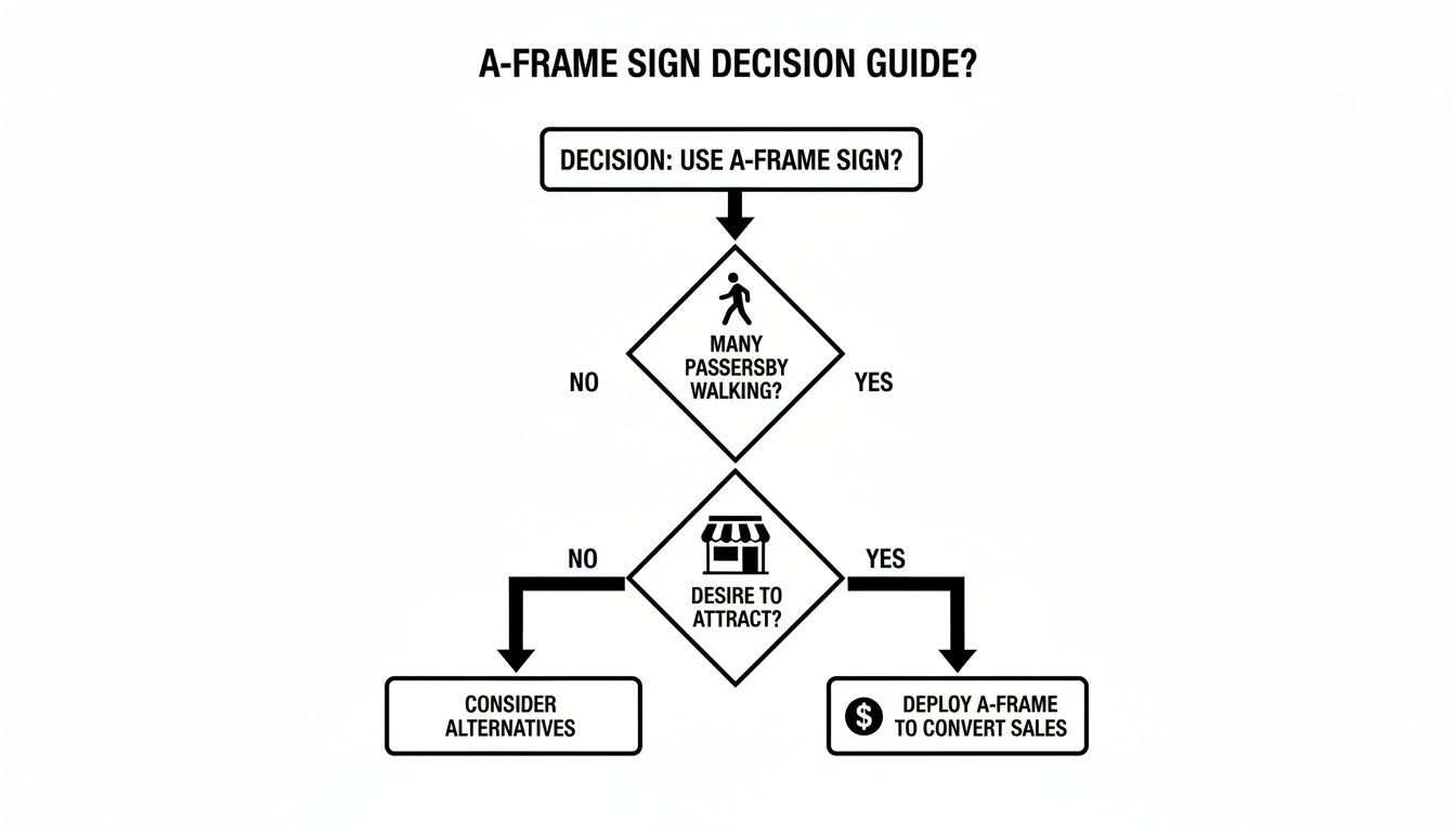
The decision is pretty simple when you break it down. An A-frame is your ground-level ambassador, working to turn a casual passerby into an interested customer. That's why every detail, from the frame to the message, matters.
Matching Material To Your Mission
The frame’s material is its foundation. It dictates not just the sign's look and feel, but also its durability and how it stands up to the daily grind. Think of it as the sign's personality—is it rugged, sleek, or charming?
A well-chosen material sends an immediate signal about your brand. Here's a look at the most common options to help you decide which one best tells your story.
A-Frame Sign Material And Style Comparison
| Material/Style | Best For | Pros | Cons |
|---|---|---|---|
| Plastic | High-traffic areas, outdoor events, budget-conscious businesses | Lightweight, durable, weather-resistant, can be filled for stability | Can look less premium than other materials |
| Metal | Corporate offices, real estate, professional services, modern retail | Sleek, sturdy, professional appearance, good wind resistance | Heavier, can be more expensive, may rust if not treated |
| Wood | Boutiques, cafes, restaurants, businesses with a rustic or artisanal vibe | Warm, high-end look, great for creating a specific ambiance | Requires maintenance, susceptible to weather damage over time |
Ultimately, the best material is the one that aligns with your brand's image while being practical for its intended environment. A cafe gains character from a wooden chalkboard, while a construction site needs the rugged reliability of a plastic Signicade. For a deeper dive, our guide on the best material for outdoor signs is a great resource.
Display Options And Their Best Uses
If the frame is the personality, the display surface is the voice. This is where your message lives, and how you choose to display it determines how flexible your marketing can be.
Think of the display as the canvas for your daily marketing masterpiece. A static message works for some, but a changeable one offers a new opportunity to engage customers every single day.
Here are the most popular choices and where they shine:
Printed Panels (Coroplast): These are rigid inserts that slide right into the frame. They are perfect for semi-permanent branding—your logo, hours, or core services. The printed graphics are crisp and weather-resistant, making them a "set it and forget it" solution that always looks professional.
Chalkboards & Dry-Erase Boards: Nothing beats a writable surface for daily specials, witty quotes, or flash sales. A cafe can announce its "Soup of the Day" or a boutique can promote a 25% off special. They give people a reason to look at your sign every time they walk by, waiting to see what’s new.
Changeable Letters: Think classic movie theater marquees. These signs use tracks to hold individual letters and numbers, giving them a cool retro vibe. They are incredibly effective for straightforward, high-impact messages like "SALE TODAY" or "OPEN HOUSE" and are a go-to for gas stations or event venues.
Designing Graphics That Actually Convert
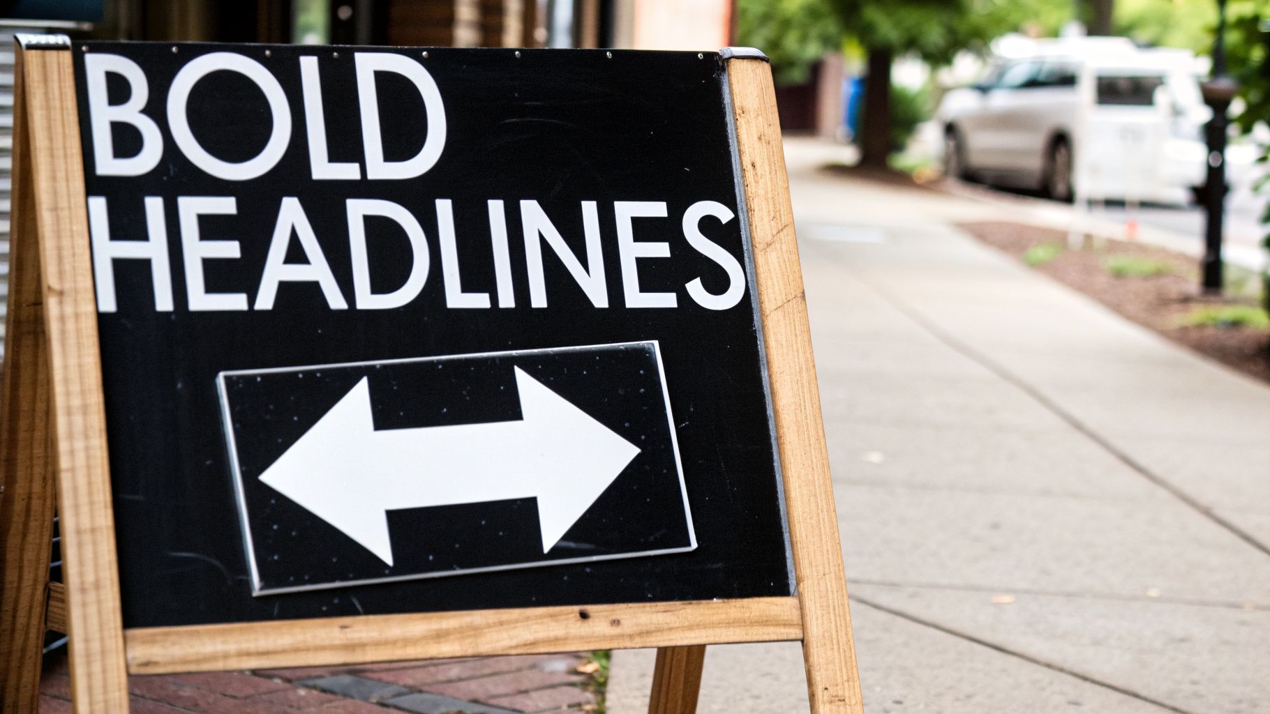
A great a frame business sign isn't about winning an art award; it's about pure, unfiltered communication that gets someone to walk through your door. You have about three seconds—that’s it—to catch the eye of a person walking by, make them understand your offer, and convince them to act. If your design is cluttered or confusing, that opportunity vanishes.
Think of designing a great sidewalk sign as an act of subtraction. The real goal is to strip away everything non-essential until only the most powerful, persuasive message is left. Your sign has to work like a miniature billboard for pedestrians—it needs to be bold, quick to the point, and impossible to misunderstand.
This means you have to distill a whole paragraph of marketing-speak into a powerhouse headline. Instead of a long-winded "We are excited to announce a limited-time promotional offer on our fresh-brewed coffee beverages," your sign needs to yell, "Fresh Coffee, Half Price!" with a giant arrow pointing right at your entrance.
Mastering The Three-Second Rule
To win that split-second battle for attention, your design has to be built on three pillars: high contrast, clear font hierarchy, and a dead-simple message. It's a simple formula for literally stopping foot traffic in its tracks.
A design that works is one that can be absorbed in a single glance. Your best weapon here is high contrast. Dark text on a light background (or the reverse) isn't just a suggestion; it’s essential for readability in the real world, from a distance, and in bright sunlight. Ditch the subtle color palettes that look great on a computer screen but turn to mush on a sidewalk.
The single most important rule in sidewalk advertising is clarity over cleverness. A straightforward offer will always outperform a witty phrase that makes people pause and think. You don’t want them to think; you want them to act.
Crafting A Message That Sells
Once you've grabbed their attention, your message has to do the heavy lifting. Every single word matters, so choose them carefully. Stick to the 5-7 word rule for your main headline to make sure it’s digestible in a flash.
Here are the non-negotiable parts of a message that actually converts:
- A Powerful Headline: This is your hook. State your offer clearly and create a sense of value or urgency. Think "Happy Hour Starts Now" or "Today's Special: Tacos."
- A Clear Call-to-Action (CTA): Tell people exactly what you want them to do. Simple commands like "Come In," "Order Inside," or even just a big, fat arrow are incredibly effective.
- Strategic Branding: Your logo should be there, but it shouldn't be the star of the show. Tuck it at the top or bottom so the offer remains the hero. The goal is to associate your brand with the great offer, not let the brand overshadow it.
A local bakery, for example, could have a sign that screams, "Fresh Bread Daily" in a huge, bold font. Underneath, a smaller line might add, "Sourdough & Rye," with their logo placed neatly at the bottom. This hierarchy does the work for the reader, guiding their eye from the main point to the details. If you're curious about what makes a great sign in general, check out our detailed guide on how to make signs that get noticed.
Design Dos And Don'ts For A-Frame Signs
Getting the design right can be the difference between a slow afternoon and a line out the door. Here's a quick cheat sheet to make sure your A-frame signs are working as hard as you do.
Do:
- Use High-Contrast Colors: Black on white, yellow on black, and dark blue on white are classics for a reason—they pop.
- Stick to a 5-7 Word Headline: Keep it short, sweet, and punchy.
- Choose a Bold, Readable Font: Sans-serif fonts like Helvetica, Arial, or Futura are your best friends here.
- Place Key Info at Eye Level: Your main offer should live in the top half of the sign for maximum impact.
Don't:
- Use More Than Two Fonts: Too many fonts create visual noise and make the sign a chore to read.
- Clutter with Too Much Information: Resist the urge to add your full address, phone number, and social media handles.
- Choose Low-Contrast Color Schemes: Pastels and other soft colors will completely wash out in the sun.
- Make Your Logo the Biggest Element: The offer is the hook. The logo is for reinforcement.
Staying Compliant With Local Sign Regulations
An eye-catching a frame business sign can be one of your best marketing tools, but placing it on the sidewalk isn't as simple as just setting it down. An overlooked local rule can quickly turn your best salesperson into a costly headache, leading to fines or even confiscation.
Think of the public sidewalk as a shared space with its own set of traffic laws. You can’t just park in the middle of a busy street, and you can't just block the flow of foot traffic with your sign. These regulations exist for good reason—to ensure safety and accessibility—and they change significantly from one city to the next.
Understanding ADA and Pedestrian Right-of-Way
The most important rule of thumb, and one that’s federally mandated, involves the Americans with Disabilities Act (ADA). This law ensures public pathways, including sidewalks, are accessible to everyone, from parents with strollers to people who use wheelchairs.
For your A-frame sign, this has a very clear and direct implication:
- Clear Path Requirement: You must leave a clear, unobstructed path for pedestrians. Most cities mandate a minimum of 36 to 48 inches.
- Placement Logic: This means your sign belongs close to your building or near the curb—never in the middle of the walkway. The goal is to leave a straight, wide path for people to pass by easily.
- Consequences of Non-Compliance: Blocking this path isn't just a nuisance; it's a violation that can get your sign taken away and land you a fine.
Ignoring ADA requirements is the quickest way to run into trouble. It's a non-negotiable part of using any sidewalk sign.
Common Local Sign Rules to Watch For
Beyond the ADA, every city, town, and business district has its own playbook. These rules might seem nitpicky, but they’re designed to prevent visual chaos and keep public areas safe. While the specifics will differ, you can expect to see a few common themes pop up.
Before you even think about buying a sign, make a quick call to your local city planning or zoning department. It’s a five-minute conversation that can save you hundreds of dollars and a ton of frustration.
Here are some of the most common restrictions to look out for:
- Time-of-Day Restrictions: Most municipalities only allow signs to be out during business hours. Leaving them out overnight is a common mistake that can lead to confiscation.
- Placement Prohibitions: There are always no-go zones. Expect rules against placing signs near crosswalks, fire hydrants, bus stops, or intersections where they might block visibility.
- Permitting and Fees: Some towns require you to buy an annual permit. While it might feel like another fee, a permit officially registers your sign and protects you from penalties as long as you play by the rules.
- Size and Number Limits: Don’t be surprised if you’re limited to one sign per entrance or if there are specific caps on how tall or wide your A-frame can be.
If you’re managing multiple locations across different towns, tracking these rules is critical. A simple compliance checklist for each store is a smart way to stay ahead of any issues. To get a better handle on what to expect, you can learn more about general sign permit requirements and how to navigate them.
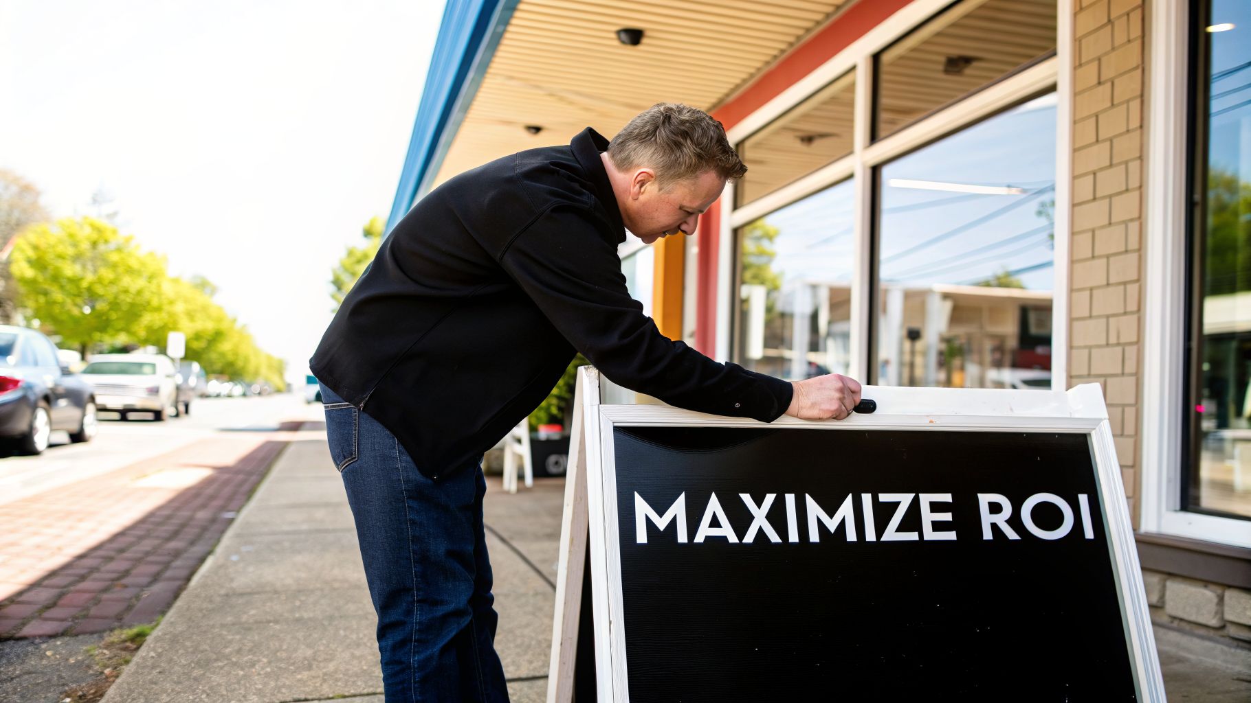
Maximizing Your Return On Investment
A well-designed a frame business sign does more than just grab attention for a week or two; it’s a hardworking asset that should pay for itself for years to come. The key is to stop thinking of your sign as a one-time expense and start seeing it as a long-term investment in your marketing. Smart choices on materials and a simple care routine can dramatically extend its life and multiply your return.
Think of a quality A-frame like a trusty tool in your marketing toolbox. Just like you'd keep a valuable piece of equipment clean and maintained, a little upkeep ensures your sign keeps looking professional and pulling in customers, season after season.
Smart Maintenance For A Longer Lifespan
Protecting your sign from the daily grind of sun, rain, and street grime is the single best way to maximize its value. A little proactive care is all it takes to keep it looking sharp.
Regular cleaning is the easiest win, but the method depends on the material:
- Plastic Frames & Panels: A bit of mild soap and water is perfect. Just gently wipe down the surfaces to get rid of dirt and scuffs, keeping it looking bright.
- Metal Frames: Soap and water work great for powder-coated metal. If you notice any deep scratches, a quick touch-up with rust-resistant paint will stop corrosion in its tracks.
- Wooden Frames: These need a little more care. A damp cloth is fine for light cleaning, but make sure the frame dries completely. Plan on applying a fresh coat of weather-resistant sealant once a year to shield the wood from moisture.
Where you store your sign is just as important. When it’s not on duty—especially overnight or during a storm—bring it inside to a dry, clean spot. This simple habit protects it from unnecessary wear, potential theft, and accidental damage.
The Power of UV Protection And Swappable Graphics
The sun is your sign's worst enemy. Its UV rays are notorious for turning vibrant, eye-catching colors into a faded, tired mess. Investing in UV-resistant inks and laminates is one of the smartest upfront decisions you can make. It's like sunscreen for your sign, keeping your message bold and clear for far longer.
The real economic genius of modern A-frame systems is their versatility. A single frame can become an entire campaign-in-a-box, letting you pivot your message in seconds without buying a whole new sign.
This is where A-frames with swappable inserts really shine, transforming your sign from a static object into a dynamic marketing tool. One frame can suddenly do the work of three or four.
Take a café, for example. With one A-frame, they can:
- Run a "BOGO Coffee" special in the morning rush.
- Slide in a new panel to announce the "Lunch Special" at midday.
- Swap it again for a "Happy Hour Deals" sign in the evening.
This approach is incredibly cost-effective. Instead of shelling out for a completely new sign for every promotion, you only need to order a new, inexpensive insert. It keeps your marketing fresh and gives repeat customers a reason to always check what's new. To get a better sense of how this fits into your overall budget, check out our complete guide on the cost of signage for business.
The market is clearly shifting toward these durable, multi-use solutions. The latest State of the Sign Industry survey shows that sign companies are gearing up for major growth, with 70% expecting sales to increase through 2026. High-margin, practical items like weatherproof A-frames are a huge part of that, as everyone from pop-up shops to major retailers demands signage that is both portable and reusable.
Your A-Frame Sign Questions, Answered
Even with the perfect spot picked out, you probably still have a few practical questions. That's a good thing—it means you're thinking like a pro. We hear these same questions from business owners every day, so let's get you some straight answers.
How Much Should I Expect to Pay?
The price tag on an A-frame sign can range quite a bit, but it’s helpful to think in a couple of buckets. For a simple, standard plastic A-frame with two printed inserts, you’re typically looking at a range of $100 to $150. This is a fantastic, hard-working entry point for almost any business.
If you’re looking for something with more presence or durability, the price will go up. A heavy-duty steel frame or a custom-crafted wooden A-frame can cost $300 or more. But remember, a great sign isn't an expense; it's an investment that pays for itself in foot traffic and new customers.
How Do I Keep My Sign From Blowing Over?
Nothing is more frustrating than seeing your sign lying flat on the sidewalk. Stability, especially in windy cities, is a huge deal. The key is to choose a sign that's built to handle the elements.
- Weightable Designs: Many plastic models, like the popular Signicade, are hollow for a reason. You can fill them with sand or water to add serious weight, anchoring them securely to the ground.
- Heavier Materials: Sometimes the simplest solution is the best. A solid metal or dense wood frame has its own built-in stability, no filler required.
- Wind-Flex Signs: For seriously gusty locations, look for A-frames with spring-loaded bases. They’re designed to flex and bend with the wind instead of fighting it, which means they stay upright while other signs tip over.
Can I Use the Same Frame for Different Sales and Events?
Absolutely—in fact, you should. This is where A-frames really shine and how you get the most value from your investment. The trick is to get a frame that’s built for quick changes.
Treat the frame as the permanent fixture and the message as the temporary, swappable part. This strategy turns a single sign into a tool for unlimited marketing campaigns.
Look for a frame with slide-in channels or hinged faces. These systems let you swap out printed panels, chalkboard inserts, or dry-erase boards in seconds. This makes it incredibly easy to run a "Taco Tuesday" special, a weekend flash sale, or a seasonal promotion without buying a whole new sign.
What’s the Single Most Important Design Rule?
If you remember only one thing, make it this: Clarity beats cleverness, every single time.
Your potential customer is walking by, distracted, and has about three seconds to understand your sign. A witty pun or a complex design that makes them stop and think is a design that has already failed. Your message must be instant.
Stick to big, bold fonts and high-contrast colors. Most importantly, limit your text to 5-7 words, max. A direct offer like "Happy Hour 4-6 PM" or "20% Off All Sweaters" will always outperform a clever but confusing sentence. Make it simple, make it bold, and point them to your door.
Ready to turn your sidewalk into a customer-generating machine? The team at On Display Signs, Inc. specializes in creating durable, high-impact A-frame signs that get results. From design to delivery, we’ll help you create the perfect sign for your brand. Explore our signage solutions at https://www.ondisplaysigns.com.

