A busy dock goes sideways fast. One driver pulls into the wrong bay, a forklift operator wastes a trip checking whether a trailer is live, and a supervisor starts answering questions that a sign should have answered from across the yard.
That’s usually when warehouse operators realize they don’t have a sign problem. They have a communication problem happening at the most dangerous and time-sensitive point in the building.
Good warehouse dock door signs fix more than identification. They help drivers find the right door without circling, give inside teams instant status cues, support safer traffic movement, and keep the dock from turning into a guessing game. Bad signs do the opposite. They fade, blend into the background, get mounted where no one can see them, or use numbering systems that make sense only to the person who created them.
Why Your Dock Door Signs Are More Than Just Numbers
If your dock runs hard all day, you’ve seen the pattern. A carrier checks in, gets sent to Door 12, then stops at Door 21 because the numbering isn’t visible from the approach lane. Inside, a lift driver heads to the wrong position because the exterior number doesn’t match the interior marker. Someone props open a pedestrian route to wave the truck over. None of that looks dramatic until it stacks up into delays, wrong door assignments, and near-misses.
That’s why warehouse dock door signs should be treated as part of the operating system, not wall decoration. Loading docks account for approximately 25% of all warehouse accidents, according to Raymond Handling Concepts on loading dock safety. When one area of the building carries that much risk, every visual cue at that area matters.

What signs solve on a real dock
A solid dock sign system does four jobs at once:
- Door identification: Drivers can find the assigned bay quickly from the yard.
- Status communication: Teams know whether a bay is open, occupied, or waiting.
- Movement control: Forklift operators, spotters, and pedestrians get clearer direction.
- Error reduction: Inbound and outbound activity stays aligned with the right location.
When those basics are missing, people fill the gap with radio calls, hand signals, memory, and assumptions. That works until shift change, bad weather, low light, or a temp driver who’s never visited your site.
Practical rule: If your dock team has to explain where a door is more than once a day, the sign system is underperforming.
A dock sign system works with floor marking
Door signs also work best when they’re paired with the rest of the visual environment. If a driver can find Door 8 but your interior traffic lanes, pedestrian walkways, and staging boundaries are unclear, you’ve only solved half the problem. That’s why many operators pair dock identification with documented warehouse floor marking guidelines so the route to and from the door is just as clear as the number above it.
The practical takeaway is simple. Numbering the doors is the starting point. Building a visual system that controls approach, confirms status, and supports safe movement is what improves the dock.
Choosing Your Dock Sign Materials for Maximum Durability
A dock sign fails in predictable ways. It fades until drivers can’t read it from the lane. It warps in heat. It corrodes at the edges. Or the graphic peels off long before the substrate gives out. The cheapest sign is usually the one you buy twice.
Material choice should match exposure, viewing distance, and replacement tolerance. If the sign is mounted outside above an active dock, treat it like exterior equipment, not office décor. Clear identification of loading doors can reduce truck maneuvering time by up to 30%, and anodized aluminum with UV-resistant graphics or Metalphoto® can resist fading for 10+ years under direct sunlight while reducing total cost of ownership by 40% compared to vinyl-over-polycarbonate alternatives, according to All Barcode Systems' dock door sign guidance.
What works best by environment
Here’s the practical comparison operators usually need before ordering.
| Dock Door Sign Material Comparison | Best For | Average Lifespan (Outdoor) | Key Advantage | Consideration |
|---|---|---|---|---|
| Anodized aluminum | Exterior dock door numbers, harsh sun, weather exposure | 10+ years | Strong fade resistance and long-term durability | Higher upfront cost than basic indoor materials |
| Aluminum composite material | Large exterior panels needing rigidity | Qualitatively long outdoor service life | Stays rigid and resists corrosion | Not always necessary for smaller signs |
| Rigid PVC | Interior dock signs, protected indoor walls | Not ideal for outdoor use | Cost-effective and easy to fabricate | Poor choice for sustained exterior heat and weather |
| High-performance vinyl over lower-grade panels | Short-term or budget-driven applications | Shorter than premium metal solutions | Lower upfront spend | Greater risk of fading, peeling, and replacement cycles |
The trade-off most buyers miss
The mistake isn’t choosing a low-cost material for the whole facility. The mistake is using the same material everywhere.
An indoor dock identifier mounted behind the door in a protected area can often use a more economical substrate. An outdoor number over the bay opening can’t. It sees sun, rain, dirt, impact, and temperature swings all year. Treating those two signs as the same product creates avoidable maintenance work.
A practical spec split often makes more sense:
- Exterior signs: Use anodized aluminum or another heavy-duty exterior-grade option with UV-resistant graphics.
- Interior signs: Use rigid PVC where weather and direct sun aren’t the issue.
- Reflective applications: Upgrade where low light, dusk visibility, or long viewing distances matter.
Why total cost matters more than unit price
Procurement teams sometimes focus on line-item price because signs look simple. Operations teams deal with the true cost later. That includes replacement ordering, lift access, installation labor, misreads from faded numbers, and the downtime that comes from taking shortcuts.
A dock sign should outlast the conversation about whether it was worth buying.
If you’re evaluating options, a broader look at best material choices for outdoor signs becomes helpful. The right question isn’t “What’s the cheapest panel?” It’s “What holds up at this mounting location with the fewest service calls?”
Practical buying guidance
Use this filter before approving a dock sign package:
- Check sun exposure. South- and west-facing doors usually punish weak graphics first.
- Look at washdown and weather. Exterior signs need edge stability and corrosion resistance.
- Consider impact risk. Forklifts, trailers, and door hardware all create contact points.
- Match lifespan to ownership plans. If this site will run the same dock plan for years, buy for longevity.
- Separate indoor and outdoor specs. One-size-fits-all usually means underbuilt outside or overspending inside.
Good materials don’t just preserve appearance. They preserve legibility, and legibility is what makes the sign useful.
Designing Dock Signs for At-A-Glance Readability
A durable sign that nobody can read is still a failure. Dock environments don’t give people much time to interpret visual information. Drivers are lining up an approach. Lift operators are moving. Yard conditions change by the hour. Your sign has to communicate in a glance.
For high-visibility applications, reflective sheeting laminated polyester or fiberglass signs with reflectivity greater than 250 cd/lx/m² can remain readable at 300 feet in dusk, and bold vinyl characters at 6-12 inch height with a sans-serif font and 10:1 contrast ratio can maintain 99% legibility in fog and rain, according to ASG's dock door sign specifications.
Size for the viewer, not the wall
The first design question is simple. Who needs to read this sign first?
A yard driver approaching from distance needs a larger number than a forklift operator already inside the building. If both audiences matter, don’t compromise with a mid-size sign that serves neither well. Use larger exterior identifiers and separate interior markers where needed.
Good practice usually looks like this:
- Exterior door numbers: Large enough for approach visibility from the yard.
- Interior confirmation signs: Clear enough for operators moving between dock and staging areas.
- Status signs: Readable from the point where the action decision happens, not just at the door face.
Keep numbering logical
Confusing numbering creates mistakes even when the signs themselves are perfectly made. I’ve seen facilities use building-era numbers on one side, leased-space numbers on the other, and temporary paper labels for overflow doors. That setup guarantees phone calls and wrong turns.
A numbering system should be easy to explain in one sentence. If it isn’t, simplify it.
Examples that usually work well:
- Sequential numbering across a straight dock wall
- Odd numbers on one side and even on the other in paired layouts
- Prefixes that separate inbound and outbound when doors serve distinct functions
If a new driver can’t understand your numbering pattern in under a minute, the pattern is too clever.
Placement matters as much as graphic design
A great sign mounted behind an open trailer is invisible. Mounting location has to account for docked equipment, seals, overhead doors, lighting glare, and the angle of approach from the yard.
Exterior signs generally perform best when they’re mounted high enough to stay visible above operational clutter while still sitting in the driver’s natural line of sight. Interior signs should confirm door identity from the aisle or staging zone where operators make movement decisions.
For broader ideas on readable industrial identification, this overview of high-visibility signs is useful because the same principles apply. Contrast, scale, and placement do most of the work.
A short visual example helps. This video shows the kind of at-a-glance communication dock teams respond to quickly.
Readability checklist before production
Before you release artwork, verify these points:
- Character style: Use clean sans-serif fonts.
- Contrast: Prioritize strong foreground-to-background separation.
- Redundancy: Pair numbers with color or status cues where helpful.
- Obstruction check: Review views with trailers present, not just empty bays.
- Night conditions: Confirm readability in dusk and low-light conditions.
Dock signs don’t need to look complicated. They need to be obvious.
Navigating OSHA Fire Egress and Traffic Flow Codes
A dock sign package can look organized and still create compliance problems. The common issue isn’t one dramatic mistake. It’s a series of small misses: a pedestrian route that isn’t clearly marked, a fire egress path that gets visually lost in dock clutter, a warning sign with poor contrast, or door numbering that’s readable only to people who already know the building.
ADA and accessibility are often the overlooked layer here. According to ID Label's guidance on dock door signs, OSHA data from 2025 cites 15% of loading dock injuries linked to miscommunication, with accessibility gaps contributing. The same guidance points to high-contrast numbering with a minimum 4.5:1 ratio and considering tactile options for diverse workforces.
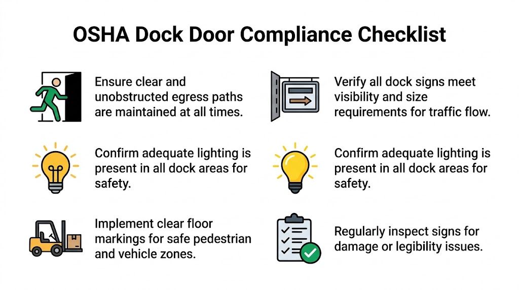
Egress around the dock
The dock is one of the easiest places in a facility to unintentionally blur an exit path. Pallets get staged near doors. Temporary barriers move. Drivers and warehouse staff focus on trailer activity instead of life-safety routes.
That’s why exit-related signage and route marking have to stay distinct from operational signage. A fire exit can’t disappear into a sea of door numbers and shipping notices. If your dock area includes emergency routes or exit discharge paths, the signage plan should support them visibly and consistently.
This guide to emergency exit signage requirements is a useful reference when the dock sits close to designated exits or personnel doors.
Traffic flow is a safety issue, not a convenience issue
Warehouse operators sometimes separate “safety signs” from “traffic signs” as if they serve different goals. On a dock, they’re tightly connected. A driver who hesitates at the wrong lane entrance or a pedestrian who cuts across an active trailer path creates the same kind of risk that warning signs are supposed to reduce.
A good dock sign plan supports:
- Vehicle routing: Clear entry, queue, and assigned-door movement
- Pedestrian separation: Marked walkways and crossing points near dock activity
- Inside-outside alignment: Exterior door IDs that match interior staging references
- Hazard communication: Warnings where pinch points, trailer movement, or restricted access exist
For teams reviewing the bigger picture, Material Handling USA’s article on OSHA compliant warehouse design is a practical resource because it connects signage to floor planning rather than treating signs as an afterthought.
Compliance works best when signs, floor markings, and routes all say the same thing.
Accessibility should be built into the dock plan
Many warehouses focus on durability first and assume accessibility can be handled later. That usually means it never gets handled properly. High-contrast numbering, readable placement, and tactile or other accessible options should be part of the initial specification, especially in facilities with mixed lighting, indoor-outdoor transitions, and a diverse workforce.
Useful questions to ask during review:
- Can the sign be read quickly under dock lighting conditions?
- Does the color contrast stay strong when the surface gets dirty?
- Do interior and exterior signs use the same numbering logic?
- Are pedestrian and egress routes visually separated from dock operations?
- Would a new worker or visiting driver understand the layout without verbal correction?
If the answer to that last question is no, the compliance risk usually isn’t limited to paperwork. It shows up in daily movement.
Proper Installation and Long-Term Sign Maintenance
Installation is where good sign design either holds up or gets undermined. I’ve seen solid materials and clean layouts ruined by bad mounting choices. A sign placed on the wrong surface, fastened with the wrong method, or set at the wrong angle won’t stay readable for long.
The first decision is attachment method. High-bond tape can work well on clean, smooth, stable surfaces. Mechanical fasteners are usually the better choice when you’re dealing with corrugated metal, masonry, uneven cladding, vibration, or exposure that puts constant stress on the panel.
Match the mounting method to the wall
Use the wall condition as the guide, not installer preference.
- Smooth metal or finished panels: High-bond tape can be appropriate if the substrate is flat, clean, and dry.
- Corrugated or ribbed surfaces: Use screws, rivets, or bracketed mounting so the sign isn’t bridging gaps and loosening over time.
- Masonry or block: Mechanical anchors are the safer route.
- High-vibration areas: Favor hardware that won’t creep or release with movement.
If a dock sees frequent trailer impact nearby, pressure washing, or seasonal expansion and contraction, lean toward mechanical fastening. It gives you a more forgiving installation over time.
Install for serviceability, not just day-one appearance
A clean install matters, but access matters too. If a sign ever needs replacement, cleaning, or renumbering, the maintenance team shouldn’t have to dismantle half the wall assembly to reach it.
That’s one reason some operators use brackets or modular panels on exterior docks. They’re easier to swap when building use changes. If your team needs project support beyond fabrication, a professional sign installation service can help standardize methods across different wall types and site conditions.
A dock sign becomes a liability when it loosens, twists, or drops below readable height. Installation quality is part of safety.
Keep maintenance simple and scheduled
Most facilities don’t need a complicated sign maintenance program. They need a basic inspection routine that is implemented.
A practical dock sign check should include:
- Legibility: Can drivers and operators still read the sign from the intended distance?
- Attachment: Are corners lifting, brackets loosening, or fasteners backing out?
- Surface condition: Is the face cracked, faded, dented, or covered in grime?
- Alignment: Does the sign still point to the right location after any dock changes?
- Consistency: Do interior and exterior identifiers still match current operations?
This is also the point where dock safety hardware should be reviewed alongside signage. Wheel restraint practices, chocks, and communication cues all affect how safely the bay operates. For a practical look at trailer restraint basics, Wilcox Door Service has a useful article on MOL-compliant wheel chocks that fits well into a broader dock safety review.
A sign program lasts longer when installation and maintenance are treated as part of the same decision.
Streamlining Multi-Site Rollouts and Custom Branding
Single-site dock signage is manageable. Multi-site dock signage gets messy fast. One location uses white-on-blue door IDs, another uses black-on-yellow, and a third has hand-painted numbers over worn bays because nobody updated the standard. The result isn’t just a branding inconsistency. It creates different operating habits from site to site.
That’s why multi-site warehouse dock door signs should be built as a standardized program. Standardized doesn’t mean identical in every detail. It means the logic, design rules, material standards, and installation playbook stay consistent while adapting to each building.
What a rollout package should standardize
At minimum, a multi-site package should lock down:
- Numbering rules
- Approved material specs by environment
- Color standards for identification and warnings
- Character size ranges
- Mounting details
- Replacement and reorder procedures
That gives operations, facilities, and procurement one shared reference. It also prevents every site manager from reinventing the dock sign package with local shortcuts.
Branding can help, but it can also get in the way
Custom branding belongs on dock signs only if it doesn’t compromise legibility. A logo is fine. Corporate colors can work. But the function of the sign comes first.
What usually works:
- Brand colors used as a border, header band, or secondary element
- Consistent numbering style across all facilities
- Branded wayfinding that still maintains strong contrast
What usually fails:
- Door numbers squeezed to make room for oversized logos
- Low-contrast color combinations chosen for brand consistency
- Site-specific customizations that break the numbering logic
A branded sign that slows recognition is doing the wrong job well.
Smart dock signs are moving from niche to practical
The most interesting shift in warehouse dock door signs is the move from static identification to connected status communication. According to Signal-Tech's warehouse loading dock overview, 42% of distribution centers are adopting IoT dock management, reducing docking errors by 30% and improving throughput by 25%.
That matters because static numbering tells people where the bay is. Connected illuminated signs can also tell them what the bay is doing.
Examples of useful smart-sign applications include:
- A dock status display that changes when a trailer is present
- Visual indicators tied to dock occupancy
- Signs that sync with warehouse management software so availability updates automatically
- Multi-site reporting on bay usage and sign status
You don’t need smart signs at every facility. But if you run high-volume docks, frequent trailer turnover, or coordinated appointment windows, they’re worth evaluating now instead of later.
Why centralization wins
A centralized sign standard reduces friction in three places. Purchasing gets repeatable specs. Operations gets predictable layouts. Maintenance gets simpler replacements.
That also makes expansion easier. When a company adds a new building, the sign package shouldn’t have to be designed from scratch. It should be deployed from an existing standard, then adjusted only where the building or code conditions require it.
For growing operators, that’s the difference between managing signs and managing exceptions.
Turning Your Dock Doors into Strategic Assets
Warehouse dock door signs affect more than identification. They shape how people move, how quickly trucks get positioned, how clearly hazards are communicated, and how often your team has to compensate for preventable confusion.
The strongest dock sign programs don’t chase the lowest unit cost. They choose materials based on exposure, design for fast recognition, account for code and accessibility, and install signs in ways that hold up under daily abuse. They also make future maintenance easier instead of treating replacement as someone else’s problem.
That’s why dock signs should be budgeted like operational infrastructure. A clear, durable, readable, well-mounted sign helps the dock run the way the process was intended to run. A weak sign system steadily adds friction to every shift.
If your current setup relies on driver questions, radio clarification, faded numbering, or inconsistent site standards, it’s time to rebuild the system. Audit the dock from the yard approach to the interior staging line. Look at what a first-time driver sees, what a forklift operator sees, and what a safety manager sees. Then specify signs that solve those real conditions.
Frequently Asked Questions About Dock Door Signs
Should exterior and interior dock signs be the same material
Usually not. Exterior signs face weather, sunlight, and heavier wear, so they need tougher materials. Interior signs can often use more economical options if the environment is protected. Matching the material to the location usually gives you better value than forcing one spec across the entire dock.
What’s the most common design mistake
The most common mistake is making the sign too small for the actual viewing distance. The second is poor placement. A number can be perfectly printed and still fail if a parked trailer, dock seal, or glare hides it at the moment someone needs to read it.
Should I put logos on warehouse dock door signs
Only if the logo doesn’t compete with the functional message. Door numbers, directional information, and status cues need to dominate the layout. Branding should support the system, not shrink the number or weaken contrast.
Are reflective faces worth it
They often are when docks operate in early morning, evening, or low-light yard conditions. Reflective faces can improve recognition at the moments when standard surfaces start disappearing into the background. They’re especially useful where drivers approach from distance.
How often should dock signs be inspected
A regular facility inspection schedule is usually enough, as long as signs are included intentionally. Check readability, mounting security, surface damage, and whether the numbering still matches live operations. Any dock reconfiguration should trigger a sign review.
Do I need separate signs for drivers and forklift operators
In many facilities, yes. Drivers and lift operators view the dock from different angles and distances. A sign that works from the yard may not be enough for interior confirmation, especially in busy staging zones.
Is ADA really relevant at the loading dock
Yes. Accessibility gets overlooked in industrial environments, but contrast, readability, and inclusive communication still matter. If the dock serves a varied workforce or blends indoor and outdoor traffic, accessibility should be addressed at the specification stage.
When does it make sense to use illuminated or smart signs
They make sense when dock status changes frequently, trailer volume is high, or the building needs faster visual coordination than static signage can provide. They’re also a strong fit for multi-site operators looking for standardized status communication.
Can I just replace faded numbers and leave everything else alone
Sometimes, but only if the underlying numbering logic, placement, and traffic flow still work. If your team still relies on verbal directions or frequent corrections after replacing the signs, the problem isn’t the print quality. It’s the system design.
What should be standardized across multiple facilities
Start with numbering logic, color use, materials by environment, character sizing, and installation details. Those standards make reorders easier and keep each location from drifting into its own version of the dock layout.
If you’re ready to standardize, replace, or redesign your warehouse dock door signs, On Display Signs, Inc. can help you plan the full system, from design consultation and material selection to permitting, installation, and multi-site rollout support. Their team works nationally and can help turn a patchwork dock setup into a clear, durable signage program built for daily operations.


