A lot of sign projects start the same way. A business opens a new location, renovates an old one, or inherits a building with tired branding out front. Someone says, “We need a sign,” and within a week the conversation gets messy. The logo looks fine on a screen, the landlord has restrictions, the city wants permit drawings, operations wants something durable, and finance wants to know why one version costs more than another.
That’s where graphics signage design either becomes a business asset or a line item that causes problems for years.
A working sign isn’t just a larger logo file. It has to read quickly, fit the building, survive weather, satisfy code, install safely, and still look right after daily use. If any one of those pieces gets ignored, the final product usually shows it. The common failures are predictable. Lettering that’s too small. Colors with weak contrast. Materials chosen for appearance but not location. Attractive concepts that can’t be fabricated cleanly or maintained without recurring headaches.
Signage has always carried that practical burden. In 1389, England’s King Richard II required taverns and ale houses to display outdoor signs for public identification and inspection, an early example of standardized visual communication that still matters for modern businesses managing trust and visibility (history of signage requirements and standardized graphics). The tools have changed. The job hasn’t.
If you’re early in the process, it helps to understand how a sign gets made before choosing colors or finishes. A basic overview of how a sign is made often clears up why strong projects start with planning, not decoration.
Beyond the Logo An Introduction to Strategic Signage
A bakery moving into a neighborhood retail center might think the assignment is simple. Put the name above the door, add hours on the glass, and move on. But if the storefront sits beside louder competitors, faces fast-moving traffic, and has a shallow facade with limited mounting space, the sign has to do much more than identify the tenant.
That’s why the first real question isn’t “What should it look like?” It’s “What job does it need to do?”
The job of the sign
A sign can help a customer find the business, confirm they’re in the right place, reinforce the quality of the brand, and guide them once they walk inside. Those are different jobs. They often require different sign types, different message lengths, and different fabrication methods.
A monument sign for a medical office park has a different purpose than dimensional lobby lettering. A wayfinding panel in a warehouse has a different tolerance for visual complexity than a boutique storefront sign meant to create atmosphere. Good graphics signage design starts by naming those differences early.
A design that works in a brand deck can still fail on a wall, over a roadway, or under poor lighting.
The mistake clients make most often
The most common issue isn’t bad taste. It’s skipping the operating conditions.
Clients often approve artwork before anyone confirms viewing distance, mounting surface, electrical access, local code, landlord standards, or serviceability. Then fabrication begins and compromises pile up. Stroke widths change. Illumination gets value-engineered. Letter spacing tightens. Installation crews discover field conditions that weren’t in the original concept.
That’s expensive because late changes affect more than design. They affect engineering, permits, materials, and scheduling.
What strategic signage looks like in practice
A strategic approach usually includes these decisions before artwork gets locked:
- Primary audience: Drivers, pedestrians, visitors, staff, or tenants.
- Message priority: Name first, category first, direction first, or suite identification first.
- Environment: Indoor, outdoor, roadside, campus, retail center, warehouse, or worship space.
- Lifecycle: Temporary campaign, long-term identity sign, or expandable program for multiple locations.
When those decisions are clear, design gets easier. So do approvals, fabrication, and maintenance.
The Unbreakable Rules of Sign Legibility and Hierarchy
A sign only has a few seconds to work. In some settings, it has less. That’s why legibility comes before style. If people can’t read it quickly, the design has already failed.
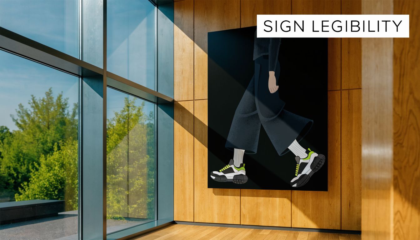
Start with viewing distance, not the logo file
In graphics signage design, a reliable baseline is 1 inch of letter height for every 25 feet of viewing distance. For traffic moving at 30 mph, where the maximum reading distance is about 410 feet, the smallest letters should be at least 16.4 inches high. Designs that miss that threshold can reduce message retention by up to 50% because the viewer has less time to process blurred or crowded information (letter height and reading distance guidance).
That rule changes conversations fast. A client may want the logo mark, tagline, website, and phone number on one roadside panel. At scale, that usually means none of it reads well. The better decision is to shorten the message and enlarge what matters most.
If you’re evaluating type choices, this guide to fonts for metal signs is useful because it shows how letterform details affect fabrication and readability at the same time.
Hierarchy decides what gets noticed first
Once letter height is correct, the next issue is hierarchy. People don’t read signs the way they read brochures. They scan for the biggest clue first, then confirm with one or two supporting details.
A practical hierarchy usually looks like this:
- Business name or destination
- Category or directional cue
- Supporting information, only if there’s enough time and space
A retail pylon might need only the tenant name. A hospital campus sign might need destination names with directional arrows. An interior donor wall can carry more detail because the viewer is standing still.
What works and what does not
Here’s the trade-off teams often face:
| Situation | What works | What usually fails |
|---|---|---|
| Roadside monument | Short message, large letters, strong contrast | Multiple lines of equal size |
| Storefront fascia | Clear brand name, simplified logo lockup | Thin scripts and low-contrast palettes |
| Interior wayfinding | One decision per sign face | Packing directions for several turns onto one panel |
| Industrial signs | High contrast, direct wording, durable finish | Decorative typography and glossy glare-heavy surfaces |
Negative space is doing real work
Clients sometimes think empty space means unused space. In practice, empty space gives the message room to breathe. It separates the brand name from secondary information and helps the eye lock onto the critical line.
Practical rule: If every element looks important, nothing is important.
That’s especially true when a sign competes with windows, landscaping, street clutter, parked cars, and neighboring tenants.
Typography choices affect fabrication too
Not every font survives enlargement, routing, illumination, or weather exposure equally well. Fine strokes, tight counters, and delicate serifs can create production problems even before installation. Halo-lit letters, push-through acrylic, and cut metal faces all respond differently to type design.
That’s why the strongest concepts usually use a type system built for the sign’s actual conditions, not just the brand’s digital style guide. A font can feel elegant on a website and still be the wrong choice for exterior fabrication.
Designing for Brand and Environment
The best sign on the wrong building still looks wrong.
Brand standards matter, but physical context matters just as much. Graphics signage design works when the sign feels like a natural extension of the business and a sensible fit for the site. That means translating flat brand assets into scale, depth, finish, and placement.
A brand guide is a starting point, not the final answer
Most clients arrive with some combination of logo files, color codes, website screenshots, and social graphics. That’s useful, but a sign isn’t a website header. Materials change how colors read. Illumination changes mood. Architectural lines can make a centered design feel awkward or make a balanced logo feel off once it’s mounted over doors or windows.
A strong design review asks practical questions:
- Does the brand font hold up at building scale?
- Will the official brand color stay legible against the facade?
- Does the logo need a simplified version for fabrication?
- Should the sign blend with the building or create contrast on purpose?
For smaller companies that haven’t formalized all of that yet, outside references on graphic design for local businesses can help clarify how brand systems translate from marketing materials into physical touchpoints.
The building changes the answer
A law office in a traditional brick building usually needs restraint. A youth retail concept in a new mixed-use center may benefit from stronger contrast and dimensional depth. A church campus often needs a calmer tone and clearer wayfinding than a fashion storefront, even if both occupy large properties.
At this stage, environmental design becomes practical, not theoretical. Placement, proportion, and finish determine whether a sign supports the site or fights it. If the facade has strong vertical columns, a wide low cabinet may feel disconnected. If the frontage is shallow and glass-heavy, stand-off letters or window graphics may work better than a bulky raceway solution.
For projects with multiple layers of wayfinding, branding, and architectural integration, this overview of environmental graphic design is a good reference point.
Good signage doesn’t ignore the building. It borrows from it.
Three common mismatches
A few mismatches come up repeatedly in the field:
- Historic facade with overly glossy modern treatment: The sign may be readable, but it looks temporary and out of place.
- Minimalist brand pushed onto a busy tenant frontage: Clean design gets lost unless contrast and scale are adjusted.
- Large suburban site using small urban sign logic: The brand may be stylish, but visitors can’t find it soon enough.
The right answer usually isn’t to abandon the brand. It’s to adapt the expression so the sign can perform in the actual environment.
Choosing the Right Materials and Illumination
Material selection is where many budgets are won or lost. It’s also where good-looking concepts become either durable assets or maintenance problems. Every substrate and lighting method comes with trade-offs in finish quality, fabrication complexity, service access, and long-term appearance.

Comparing common sign materials
No single material is right for every project. The better question is what problem the material solves.
| Material | Good use cases | Watch-outs |
|---|---|---|
| Aluminum | Exterior panels, cabinets, long-term branded signs | Can look flat without thoughtful finishing |
| Acrylic | Dimensional letters, face-lit signs, interior branding | Surface scratching and edge quality matter |
| HDU | Routed monument signs, painted dimensional work | Finish system matters outdoors |
| Wood | Rustic branding, specialty interiors, selected monument designs | Requires more maintenance in exposed conditions |
Aluminum is often the practical workhorse because it balances clean appearance with weather resistance. Acrylic gives you strong visual flexibility, especially when lighting is involved. HDU is useful when a carved look is part of the design language. Wood can look excellent in the right brand setting, but clients should go into that choice knowing appearance and upkeep are tied together.
A more detailed primer on exterior sign materials helps when you’re comparing longevity, finish options, and fabrication fit by sign type.
Illumination changes both visibility and tone
Lighting isn’t just a visibility feature. It changes how the brand feels after dark.
Front-lit channel letters are often the straightforward answer for retail and restaurant sites because they’re familiar, highly visible, and efficient. Halo-lit letters create a more architectural look and usually work well for offices, hospitality, and premium interiors. Cabinets and push-through letters solve different visibility and budget needs. Monument lighting can be subtle or assertive depending on the site and the viewing angle.
What doesn’t work is choosing illumination after the design is already approved. Lighting method affects return depth, face material, trim, mounting method, and service strategy. It should be part of the concept phase.
Digital signage has its own design rules
Digital displays introduce a different set of constraints. Resolution, contrast, file preparation, and content pacing matter as much as the physical cabinet.
For digital signage, 1920×1080 Full HD is the standard baseline for crisp text at 10 to 50 feet, and high-contrast combinations such as white text on black can improve detection by 40%. Designs should be built in pixels, not DPI, and a 3:1 contrast ratio supports readability for commercial audiences (digital signage design rules for resolution and contrast).
That means a print designer can’t repurpose a flyer for an LED menu board or interior display. Fine details, dense copy blocks, and low-contrast color fields usually break down on screen.
A short visual example helps clarify how lighting decisions affect the finished product:
Cost, durability, and maintenance are linked
Clients often ask for the least expensive option that still looks premium. Sometimes that’s possible. Often it depends on where the sign lives and how often it will be serviced.
A few practical realities:
- Complexity costs money: More layers, more colors, deeper returns, and custom finishes increase labor and assembly time.
- Service access matters: A beautiful illuminated sign can become expensive if routine repairs require difficult access.
- Environment drives wear: Sun exposure, moisture, cleaning chemicals, and impact risk all affect material choice.
- Consistency matters in chains: National programs usually benefit from repeatable material specs instead of location-by-location improvisation.
One company that handles design, fabrication, permitting, installation, and maintenance under a project-management model is On Display Signs, Inc.. That type of end-to-end structure can be useful when a client wants fewer handoff points across a larger signage program.
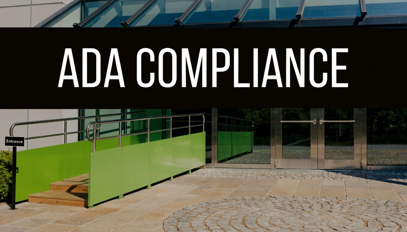
Navigating Permits Codes and ADA Compliance
The sign can be beautifully designed and still hit a wall at permit review. That’s not unusual. Municipal codes, landlord criteria, and accessibility requirements shape the project from the start, whether the design team likes it or not.
Why permit issues happen
Most permit problems don’t come from exotic design ideas. They come from ordinary oversights. Sign area exceeds code. Projection is too far from the building. Illumination type is restricted. The landlord only allows a certain mounting method or color palette. Structural details are missing from submittals.
The cleanest process is to pull code and property standards before design approval, not after. That sounds basic, but many redesigns begin with artwork approved too early.
ADA is a design issue, not a last-minute checklist
Accessible signage isn’t just a compliance box. It affects placement, copy, contrast, tactile components, and user experience. Teams that treat ADA signage as a separate afterthought usually end up with inconsistent interiors and rushed revisions.
For a grounded reference, these ADA signage requirements help clients understand how tactile text, braille, mounting conditions, and related details shape production choices.
Going beyond baseline accessibility
One area the industry often underestimates is neurodiverse wayfinding. Beyond basic ADA, high contrast and ample negative space can improve readability by 40%, and 2025 eye-tracking studies found neurodiverse users need 30% more white space than average. The same source notes that 1 in 5 visitors may report navigation stress in settings such as schools, warehouses, and churches (neurodiversity and accessible signage design).
That has direct design implications. Bigger isn’t automatically better. A larger sign overloaded with destinations, icons, and color shifts can be harder to process than a smaller sign with a calmer layout and one clear decision point.
Field note: The best wayfinding systems usually reveal the next decision, not every decision.
A practical compliance filter
Before releasing a sign package, project teams should check four things:
- Site rules: City code, landlord criteria, and any campus standards.
- User access: Tactile requirements, mounting logic, contrast, and path-of-travel considerations.
- Maintenance access: Whether service staff can safely reach and repair the sign.
- Digital support: Whether physical signage should connect to mobile navigation tools.
That last point matters more every year. For operators exploring digital-physical access tools, this article on improving venue accessibility with QR codes is a useful example of how physical signs can support a broader navigation experience without replacing core wayfinding.
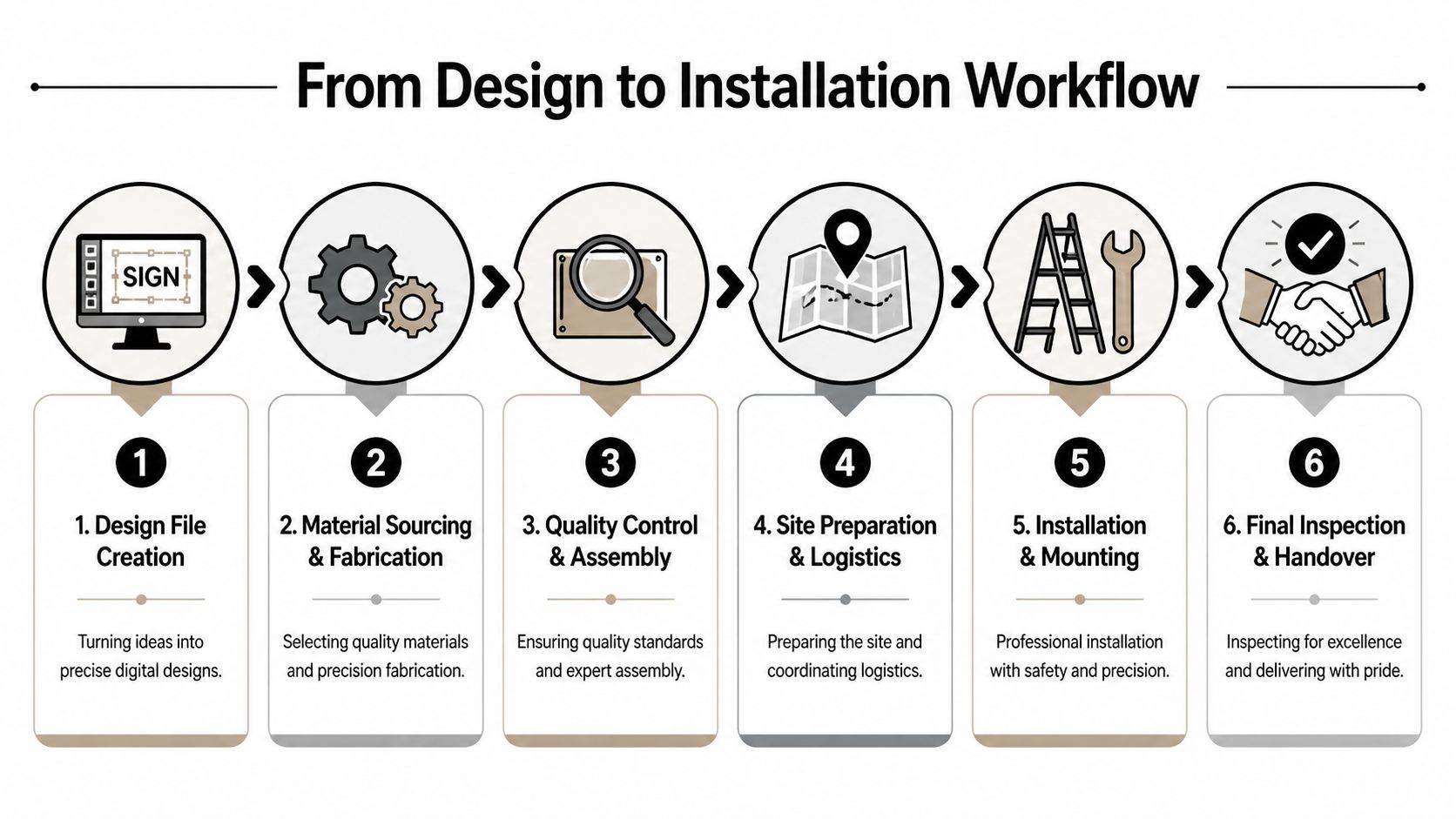
From Design File to Final Installation Workflow
Clients often see only the proof and the finished sign. The difficult part lives in the middle. That middle determines whether the sign installs cleanly or turns into a chain of revisions, field fixes, and delayed approvals.
File prep has to match fabrication reality
A sign fabricator needs more than a pretty PDF. Vector artwork, correct logo versions, approved colors, dimensions, and mounting intent all matter. If the only source file is a low-resolution web graphic, the design team usually has to rebuild art before production can even begin.
The cleaner the input, the fewer production surprises. Brand teams should provide original art files when possible, identify required finishes clearly, and flag any protected logo proportions or spacing rules before proofs start circulating.
The six steps that matter most
Most signage projects move through a sequence like this:
Design file creation
The design is translated into production-ready artwork, not just presentation mockups.Material sourcing and fabrication
The shop orders substrates, hardware, electrical components, and specialty finishes based on the approved method.Quality control and assembly
Components are checked for finish consistency, fit, lighting behavior, and overall assembly.Site preparation and logistics
The project team confirms access, field dimensions, equipment needs, and installation conditions.Installation and mounting
Crews place and secure the sign according to engineered and permitted details.Final inspection and handover
The sign is reviewed for appearance, operation, and punch-list corrections before closeout.
Where delays usually enter the process
The file itself is only one source of delay. Others are more operational:
- Late approvals: Stakeholders keep tweaking artwork after fabrication windows are reserved.
- Missing field verification: Wall conditions or power access differ from assumptions.
- Unclear responsibility: Nobody owns permit follow-up, landlord review, or installation scheduling.
- Brand inconsistency: Different departments send different logo files or color standards.
Good project management isn’t glamorous. It prevents avoidable rework.
Installation is not just mounting
Installation crews aren’t there to solve unresolved design questions in the field. By the time the truck rolls, dimensions, hardware, access routes, and mounting conditions should already be locked. If they’re not, installation becomes the most expensive place to discover basic mistakes.
That’s why experienced teams treat the workflow as one connected process. Design decisions affect fabrication. Fabrication choices affect installation. Installation constraints affect maintenance from day one.
Protecting Your Investment Maintenance and Multi-Site Rollouts
A sign that looks right on opening day can drift out of spec slowly. Faces cloud. LEDs fail. Paint systems chalk. Fasteners loosen. Branding changes one location at a time until a chain no longer looks like a chain. None of that is dramatic, but it’s exactly how signage programs lose value.
Maintenance is cheaper than emergency replacement
Most signs don’t fail all at once. They age in parts. One letter goes dark. A panel fades unevenly. A cabinet remains structurally sound, but the graphics no longer match the current brand system. When teams inspect and service signs proactively, they usually catch the issue at the lower-cost stage.
A practical maintenance plan should include:
- Routine cleaning: Match the method to the material and finish so staff don’t scratch acrylic, damage coatings, or leave streaking on illuminated faces.
- Lighting checks: Look for partial outages, color inconsistency, and signs of moisture intrusion.
- Hardware review: Verify mounting stability, especially on exterior signs exposed to weather and vibration.
- Graphic refresh decisions: Determine whether the issue is cosmetic, electrical, structural, or program-wide.
The business question is simple. Are you maintaining a functioning asset, or are you waiting until the only option is replacement?
Multi-site rollouts succeed when standards are boring
National programs rarely fail because the logo is weak. They fail because every location interprets the program differently. One region uses a different paint finish. Another substitutes materials. A third approves local art changes that no longer align with the brand. After enough exceptions, consistency disappears.
The strongest rollouts use a documented sign program that spells out:
| Program element | Why it matters |
|---|---|
| Approved sign types | Prevents ad hoc substitutions |
| Material and finish standards | Keeps appearance consistent across markets |
| File package rules | Reduces errors from outdated art |
| Permit review process | Helps local code issues surface early |
| Installation closeout standards | Creates a consistent handoff and inspection routine |
Centralized management reduces friction
For chains, developers, and franchise groups, one central project manager or rollout lead often makes the difference. That person doesn’t just track schedules. They control scope, coordinate vendors, align stakeholders, and keep local exceptions from breaking the program.
This matters when different sites have different facades, landlords, and code conditions. A centralized process can still allow for local adaptation, but only within defined rules. That’s how you preserve the brand without forcing every building into the exact same solution.
Know when to repair and when to replace
Clients sometimes hold onto outdated sign structures because “the cabinet is still fine.” Sometimes that’s a smart move. Sometimes it creates a false economy if the retrofit compromises visibility, appearance, or serviceability.
A good decision usually comes down to four questions:
- Can the existing structure support the new design cleanly?
- Will the refreshed sign still match the brand program?
- Does the retrofit create maintenance headaches?
- Will the finished result look intentional, not patched together?
If the answer to those questions is shaky, replacement may cost more upfront but save trouble over the life of the program.
Conclusion The Lasting Impact of Great Signage Design
Good graphics signage design looks simple when it’s done right. That’s part of the challenge. People see the final sign and assume the work was mostly about style. In reality, the finished piece reflects dozens of decisions about legibility, scale, materials, lighting, code, fabrication, and maintenance.
That’s why the strongest projects start with operating conditions, not decoration. A sign has to be readable in its actual environment. It has to fit the building, survive the site, satisfy regulations, and support the brand without creating service problems later. Those decisions are connected. If one part is weak, the rest of the project has to compensate.
The long-term view matters just as much. Installation isn’t the finish line. Signs need maintenance, inspections, and occasional refreshes. If you’re managing several locations, they also need standards that can survive local code differences and field realities without losing brand consistency.
Physical signage is also entering a more blended environment. A 2023 SEGD survey found that 68% of urban visitors under 30 ignore static signage when apps like Google Maps provide directions, especially creating problems in places with poor GPS such as indoor malls and dense warehouses. That’s a strong signal that future signage programs will need to connect physical wayfinding with digital touchpoints such as QR-enabled experiences (survey on younger visitors ignoring static signage and the case for digital-physical fusion).
The businesses that handle signage well don’t treat it as a one-time purchase. They treat it as a physical communication system. That’s the right mindset whether you’re opening one storefront, updating a school campus, managing a warehouse, or rolling out a national sign program across multiple markets.
If you’re planning a new sign, a rebrand, or a multi-location rollout, On Display Signs, Inc. can help you move from concept to installation with practical guidance on design, fabrication, permitting, and long-term maintenance.
