Trying to make sense of ADA signage rules can feel like untangling a giant knot, but the core idea is simple: make sure everyone can navigate your space safely and independently. These signs aren't just a legal checkbox; they're a fundamental tool for accessibility, using tactile characters and Grade 2 Braille to identify permanent rooms and spaces.
Think of them as a vital form of communication that makes your building usable for all.
Why ADA Signs with Braille Matter for Your Business
For many business owners, ADA compliance feels like a complex legal maze. But let's shift that perspective. The Americans with Disabilities Act (ADA) created these standards to remove barriers, and ada signs with braille are a huge part of that. It's not about avoiding fines—it's about creating an accessible environment where every customer feels welcome.
For a person with a visual impairment, a sign identifying a restroom or an exit provides the same crucial information a sighted person gets at a glance. For instance, a well-placed braille sign for "Room 101" allows them to confirm their location independently. When those signs are missing or incorrect, it creates real confusion and potential safety hazards.
The Foundation of an Accessible Environment
Installing compliant signage is a proactive way to build trust. It shows you value every individual's ability to access your services with dignity, a commitment that extends beyond your customers to their friends and families who champion businesses that prioritize accessibility.
And this isn't a niche issue. In the United States, about 7.6 million Americans live with a vision disability. That number is projected to more than double by 2050, making permanent accessibility solutions more critical than ever. You can learn more about the demographic shifts creating this need for ADA signs on martinaadasigns.com.
At its core, the goal of ADA signage is to provide universal information. A compliant sign should be just as useful to someone who reads Braille as it is to someone who reads the visual text, ensuring equal access for all.
To help simplify things, here's a quick breakdown of what goes into a compliant Braille sign.
Quick Guide to ADA Braille Signage Compliance
This table summarizes the essential components you need to get right. Each element plays a specific role in making the sign easy to read and understand.
| Requirement Area | Key Consideration | Why It Matters |
|---|---|---|
| Tactile Characters | Raised letters (1/32"), specific fonts (sans serif), and spacing. | Allows individuals to read the sign by touch, providing a primary source of information. |
| Grade 2 Braille | Must be located directly below the tactile text and follow specific dot spacing. | This is a universally recognized shorthand that makes signs faster and easier to read for Braille users. |
| Color & Finish | High contrast between text and background (e.g., light on dark), with a non-glare finish. | Ensures visual legibility for people with low vision and prevents glare from obscuring the text. |
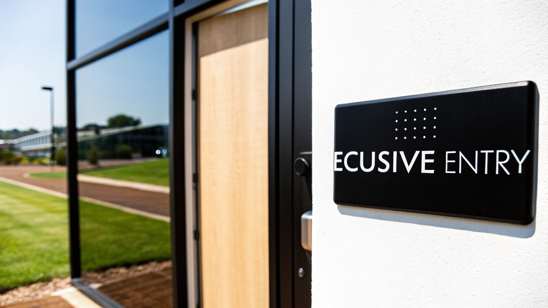
| Mounting Location | Placed on the latch side of the door, within a specific height range (48" to 60" from the floor). | A consistent, predictable location makes signs easy to find without creating an obstruction. |
| Clear Floor Space | 18" x 18" minimum clear space in front of the sign. | Guarantees that a person can approach the sign closely enough to read it by touch without obstacles. |
Getting these details right is the difference between a sign that just hangs on the wall and one that truly serves its purpose.
What You Will Learn in This Guide
Navigating the rules for ADA signs can be a headache, but we're going to break it all down into actionable steps. Forget the dense legal language—this guide offers clear, practical insights you can use immediately.
Here’s what you’ll discover:
- The essential technical rules for tactile characters, Braille type, and color contrast.
- Precise installation guidelines, including mounting height and clear floor space requirements.
- A clear breakdown of where Braille signs are mandatory and where they are exempt.
- Guidance on choosing durable materials that ensure long-term compliance and quality.
- How to avoid common, expensive mistakes that can lead to fines and legal trouble.
By the end, you'll have the confidence and knowledge to ensure your facility's signage is not just compliant but a true asset to every person who walks through your doors.
Decoding the Technical Rules for Compliant Signage
Trying to turn ADA regulations into a physical sign can feel like learning a whole new language. But the rules aren't arbitrary—they're designed with a clear goal in mind: to make sure signs are easy to read, both by sight and by touch. Let's break down the anatomy of compliant ada signs with braille into simple, straightforward guidelines.
Think of the raised letters on a sign as a tactile roadmap for someone’s fingertips. That’s why the rules for them are so precise. To be easily felt, these characters must be raised by at least 1/32 of an inch from the sign's surface.
The Anatomy of Tactile Characters
The first decision you'll make is the font. It’s not just about aesthetics. All text on ADA signs must use a sans-serif font, like Helvetica or Arial. Fonts with decorative strokes (serifs), such as Times New Roman, can feel muddled and confusing to the touch, making it tough to tell letters apart.
Beyond the font choice, the actual dimensions of the characters are what make or break a sign’s readability.
- Character Height: All tactile letters have to be between 5/8 inch and 2 inches high. This is the sweet spot—big enough to feel clearly, but not so big that a simple room name takes up the whole sign.
- Stroke Thickness: The thickness of the lines forming each letter can’t be more than 15% of the character’s height. This rule prevents letters from feeling like indistinct blobs.
- Character Spacing: The spacing between letters and words is just as critical. The regulations ensure there’s enough negative space to create a clear and frustration-free reading experience.
For a deeper look into all the specifics, from character dimensions to mounting heights, you can explore the full breakdown of ada signage requirements.
Understanding Grade 2 Braille
Once the raised characters are handled, the next layer is the Braille itself. The ADA specifically requires Grade 2 Braille, which is an important detail. Grade 1 Braille is a direct, letter-for-letter translation, which is slow to read.
Grade 2, on the other hand, uses contractions and shorthand for common words, much like how a sighted person can read shorthand. This makes reading much faster and more efficient for anyone fluent in Braille. The Braille must always be placed directly below the line of tactile text it corresponds to, creating a predictable layout on every sign. And while these are U.S. standards, it’s interesting to see how they compare to global standards like the Building Code of Australia (BCA), which also prioritizes building accessibility.
The core idea behind all these technical rules is consistency. By standardizing everything from font and size to Braille type, the ADA ensures that a person with a visual impairment can confidently read a sign in any public building across the country, whether it’s a local library or a major airport.
The Critical Role of Visual Contrast
A great ADA sign isn't just for touch; it also has to be easily readable for people with low vision. This is where Light Reflectance Value (LRV) comes into play. You need a contrast level of at least 70% between the letters and the background.
Don't worry, this doesn't trap you into using only black and white. Plenty of color combinations can hit that 70% mark while still fitting your brand’s look and feel.
Practical Examples of Compliant Color Pairings:
- High Contrast: White text on a black background, black text on a yellow background, or dark blue text on a white background.
- Low Contrast (Non-Compliant): Gray text on a light gray background, yellow text on a white background, or red text on a black background.
Finally, the sign’s finish matters just as much as its color. Every ADA sign must have a matte or non-glare finish. This simple requirement prevents reflections from overhead lights or sunny windows from washing out the text, making sure the sign is legible from any angle. Nailing these details ensures your signage works for everyone who walks through your doors.
Mastering Sign Placement and Installation
A perfectly designed sign is useless if nobody can find it. After you’ve nailed all the technical rules for characters, Braille, and contrast, the next make-or-break step is the installation. Placement isn't just a suggestion; it’s a detailed requirement designed to make signs easy to locate and read for everyone.
Think of the installation rules as creating a consistent "finding zone" in every building. When someone with a visual impairment looks for a room sign, they know exactly where to reach. This predictability is the foundation of independent navigation.
Before you even think about mounting, you have to get the sign itself right. The design process has its own strict sequence.

This simple flow shows you the essentials. It all starts with the correct font, then you add the necessary Braille, and finally, you ensure proper visual contrast. Only when those three elements are perfect is the sign ready for the wall.
Nailing the Correct Mounting Height
The single most important rule for installation is the mounting height. The ADA lays out a very precise range to ensure signs are just as accessible to standing individuals as they are to people who use wheelchairs.
Key Takeaway: The baseline of the tactile characters on your sign must be mounted between 48 inches minimum and 60 inches maximum from the finished floor.
This 12-inch zone is non-negotiable. If you mount a sign below 48 inches, it’s too low for many standing adults to read comfortably. Go above 60 inches, and you’ve put it out of reach for many wheelchair users. It’s a surprisingly common mistake—you’ll often see signs mounted way too high at 6 or 7 feet, which completely defeats their purpose.
Ensuring Clear Floor Space
Once you’ve got the height right, you have to make sure the area in front of the sign is completely clear. The ADA requires an unobstructed floor space of at least 18 inches by 18 inches, centered on the tactile characters of the sign.
This space gives a person room to approach the sign without bumping into furniture, trash cans, or other obstacles. It’s about making sure they can get close enough to read the tactile characters and Braille without having to lean or reach awkwardly.
Here’s what that looks like in the real world:
- Office Hallway: A sign for Conference Room A needs that 18" x 18" clear zone. Stick a large potted plant directly below it, and you're no longer compliant.
- Restroom Entrance: The floor in front of the restroom sign has to be clear. A freestanding hand sanitizer station can't block that approach space.
This rule proves that accessibility is about the entire experience, not just the sign itself. Getting professional help can ensure these critical details aren't missed. Check out our guide on commercial sign installation to see how experts handle these precise requirements.
Where to Mount the Sign at Doorways
The final piece of the placement puzzle is the sign's horizontal location relative to the door it identifies. The rules are specific and change depending on the type of door you’re dealing with.
- Single Doors: The sign must be mounted on the wall on the latch side of the door. This simple rule prevents a person reading the sign from getting hit if the door suddenly swings open.
- Double Doors: If you have double doors with only one active door, the sign goes on the wall next to the inactive one. If both doors swing open, the sign should be mounted to the right of the right-hand door.
- No Wall Space: What if there's no wall space on the latch side? In that case, the sign can be mounted on the nearest adjacent wall. Mounting it directly on the door is an absolute last resort and usually non-compliant, since the sign moves every time the door is opened.
By mastering these three components—height, clear space, and location—you can ensure your facility's signs are not only compliant but genuinely useful for every single person who walks through your doors.
Where Do You Actually Need ADA Braille Signs?
One of the biggest headaches for business owners is figuring out exactly which signs need to be ADA compliant. The good news? The rules are surprisingly logical once you grasp the simple idea behind them. They primarily focus on signs that identify permanent rooms and spaces—the areas that won’t be changing their purpose anytime soon.
Think of it this way: if a room has a fixed function, it needs a permanent, tactile sign. This is what allows someone with a visual impairment to confidently find their way around your building, whether they’re looking for a restroom, a conference room, a stairwell, or a specific office.
The All-Important Dividing Line: Identification vs. Directional Signs
The most critical distinction to get right is the difference between a sign that identifies a space and one that guides you toward it. Only identification signs are required to have raised text and Braille. Nailing this down can save you a ton of time and money.
- Identification Signs (Braille Required): These are the nameplates right next to the door of a permanent room. They say, "You've arrived."
- Directional Signs (Braille Exempt): These signs, also known as wayfinding signs, point the way. They say, "Go this way to find what you're looking for." While they still need to meet visual rules for contrast and fonts, they don’t need any tactile elements.
This separation makes perfect sense in practice. A visually impaired person might use a directional sign to get to the correct hallway, then use the tactile identification sign at the door to confirm they’ve found the right room. If you want to dive deeper into building a user-friendly navigation system, you can explore the principles of wayfinding signage in our detailed guide.
Real-World Examples to Make It Clear
Let's ground this in some practical scenarios. While the rules are the same everywhere, how they apply can look a little different depending on the building.
Hotel or Apartment Complex:
- Required: Signs for individual room numbers (like "Room 204"), the fitness center, the laundry room, and stairwells must have Braille.
- Exempt: A large lobby map or a sign at the end of a hall with an arrow pointing toward rooms 200-210.
Hospital or Clinic:
- Required: Identification signs for exam rooms, restrooms, patient rooms, and offices like "Radiology" or "Admissions" need to be fully compliant.
- Exempt: Overhead signs directing visitors to different wings or departments.
Office Building:
- Required: Signs identifying specific offices ("Suite 101"), conference rooms, electrical closets, and kitchens must have ADA signs with braille.
- Exempt: The main building directory in the lobby or temporary signs for a one-day event.
The ADA's modern Braille signage requirements, which were finalized on March 15, 2011, were a game-changer for accessibility in public spaces. These rules mandate that identification signs for permanent rooms include raised characters and Grade 2 Braille, high-contrast text, and often pictograms. However, they wisely exempt directional signs and temporary signs (used for less than 7 days). You can find more details in the official ADA sign guides on access-board.gov.
Braille Required vs. Braille Exempt Signage
To help you get this right every time, here’s a simple cheat sheet that breaks down common sign types. Think of this as your quick-reference guide when auditing your facility.
| Braille Required (Identification Signs) | Braille Exempt (Directional & Temporary) |
|---|---|
| Restroom & Bathroom Signs | Directional Signs (e.g., "Restrooms →") |
| Room Number & Name Signs (Office, Hotel) | Building Directories & Floor Maps |
| Stairwell & Exit Identification Signs | Temporary Event Signs (used under 7 days) |
| Kitchen & Breakroom Signs | Company Logos & Slogans |
| Electrical & Janitorial Closet Signs | Safety Warning Signs (e.g., "Wet Floor") |
| Conference & Meeting Room Signs | Parking Lot & Garage Signs |
| Fitness Center & Pool Signs | Menus on a Restaurant Wall |
Getting a handle on this distinction is the first step toward a smart, cost-effective, and fully compliant signage strategy. By focusing your budget and attention on the permanent room identification signs, you meet your legal obligations without overspending on signs that don't need tactile features. It's the kind of clarity that lets you walk through your own space with confidence.
Choosing Durable Materials for Lasting Compliance
Think of an ADA sign as a long-term investment in your building’s safety, accessibility, and legal standing. Choosing the right materials isn't just a cosmetic decision; it's about making sure your ada signs with braille can handle daily life and stay fully functional for years without needing to be replaced. You're aiming for that perfect balance of toughness and a design that looks like it belongs in your space.
Picking a material is a lot like choosing the right tool for a job. A sign in a busy hospital hallway is going to face a lot more wear and tear than one tucked away in a quiet corporate office. Your choice here will directly determine how long the sign lasts and whether its tactile elements hold up over time.
Common Materials and Their Best Uses
Every material brings something different to the table. The single most important factor in your decision should be the environment where the sign will live.
- Acrylic: This is the go-to for a reason. Acrylic is versatile, lightweight, and won't break the bank. Plus, it can be customized with just about any color you can imagine, making it a perfect fit for indoor spots like offices, schools, and medical clinics where it’s safe from the elements.
- Metal (Aluminum, Brass, Stainless Steel): When you need something tougher or want to project a more high-end feel, metals deliver. Aluminum is a fantastic all-rounder for both indoor and outdoor signs because it won’t rust or corrode. Brass, on the other hand, gives off a classic, authoritative vibe that’s right at home in places like law firms or historic buildings.
- Photopolymer: If you're looking for the toughest option out there, this is it. With photopolymer, the tactile letters, symbols, and Braille dots are all created as a single, solid piece of the material itself. This one-piece design means there are no glued-on bits that can be picked at or fall off, making it the ideal choice for high-traffic public spaces like transit hubs or shopping centers.
To see how these materials compare to other options, check out our guide to different types of sign board material.
The Non-Negotiable Rule of Non-Glare Finishes
No matter what base material you end up with, the finish is just as important for compliance. The ADA is crystal clear on this: all signs must have a non-glare or matte finish. This isn't a design suggestion—it's a hard and fast rule to ensure people with low vision can actually read the sign.
A glossy finish is a compliance killer. It can catch reflections from lights or windows, making the sign impossible to read from certain angles. Think about trying to read your phone screen in the bright sun—that’s the exact problem a matte finish solves.
Ensuring Tactile Elements Last
The real test of an ADA sign's durability comes down to how its tactile parts are constructed. The raised lettering and Braille dots are the most critical functional components, and they absolutely have to stay put.
Common Fabrication Methods:
- Appliqué: This is where individual letters and Braille dots are cut out and glued onto the sign's surface. It's a budget-friendly approach, but it's also the least durable. These pieces can be vandalized or just fall off over the years.
- Engraving (Raster Braille): With this method, tiny holes are drilled into the sign, and little beads are inserted to form the Braille dots. It's a step up from appliqué in terms of durability, but you're still relying on separate components staying in place.
- Photopolymer Processing: As we mentioned earlier, this process creates a seamless, one-piece sign where the tactile elements are part of the sign face itself. This is the gold standard for durability and vandal resistance, guaranteeing your investment will last.
By getting the material and fabrication method right from the start, you ensure your signs don't just pass inspection today but continue to do their job for years to come.
Avoiding Common Mistakes and Costly Fines
Overlooking the fine print in ADA standards isn't a simple mistake—it's a massive financial risk. Getting the details right on your ada signs with braille is about more than helping people find their way; it's about protecting your business from some very real legal and financial headaches.
The penalties for non-compliance are steep for a reason. This isn't just a suggestion box—failure to comply can trigger fines up to $75,000 for a first offense and a staggering $150,000 for any after that. And that’s before you factor in the cost of potential lawsuits.
To keep you on the right side of the law, we've put together a checklist of the most common pitfalls we see trip up business owners, along with straightforward, practical ways to avoid them.
The Wrong Braille Grade
This is hands-down one of the most frequent errors we see. It’s using Grade 1 Braille when the rules explicitly call for Grade 2. It sounds like a tiny technicality, but it makes a world of difference to the people who actually use it.
- The Mistake: Grade 1 Braille is a simple letter-for-letter translation. While it seems logical, it’s incredibly clunky and slow for fluent Braille readers to get through.
- The Solution: You must specify Grade 2 Braille on all your sign orders. Grade 2 is a contracted form that uses shorthand for common words and letter groups, making it the universal standard for efficient reading.
Poor Color Contrast
Another common slip-up is choosing color schemes that match the decor but fail the basic test for visual accessibility. Aesthetics can never override readability.
Key Takeaway: The whole point of a sign is for it to be read—by as many people as possible. The ADA mandates a minimum of 70% light-reflecting contrast between the characters and the background.
That trendy light gray text on a slightly darker gray background? It’s almost guaranteed to fail. You have to stick with high-contrast pairings—dark on light or light on dark—to make sure your signs are legible for everyone.
Incorrect Mounting and Placement
You can have a perfectly designed, fully compliant sign, but if you hang it in the wrong spot, it’s completely useless in the eyes of the law. Installation mistakes are surprisingly common and can instantly put you in non-compliance.
- The Mistake: Hanging signs too high (above the 60-inch maximum from the floor) or too low (below the 48-inch minimum). Another classic error is putting the sign on the door itself or on the hinge side of the frame.
- The Solution: Follow the placement rules to the letter. Mount signs on the latch side of the door, make sure the baseline of the tactile text falls within that 48" to 60" sweet spot, and verify there’s a clear 18" x 18" patch of floor space in front of it.
Using Non-Approved Fonts
Finally, while that decorative font might look great with your brand, there's a good chance it’s not ADA-compliant. The rules require simple, easy-to-read fonts for a very practical reason.
- The Mistake: Using serif fonts (like Times New Roman) or other stylized, condensed, or script-like fonts. The little feet and flourishes make them incredibly difficult to read by touch.
- The Solution: Stick to simple sans-serif fonts like Helvetica or Arial. Their clean, uniform lines ensure the raised characters are easy for fingertips to distinguish.
Nailing these details is a huge part of the process, but don't forget that local codes can add another layer of rules. For a deeper dive into navigating local regulations, take a look at our guide to understanding sign permit requirements. A quick audit of your facility for these specific issues can prevent small oversights from turning into major problems down the road.
Common Questions About ADA Braille Signs
Trying to get a handle on ada signs with braille can bring up a lot of questions. Let’s clear up a few of the most common ones so you can make sure your building is both welcoming and compliant.
Do I Really Need Braille on Every Sign?
Thankfully, no. The ADA is very specific here. Braille is only required on signs that identify permanent rooms and spaces. Think restrooms, conference rooms, office numbers, and stairwells.
Signs that are temporary (up for seven days or less), provide directions, or act as building directories are generally exempt.
What’s the Big Deal About Grade 1 vs. Grade 2 Braille?
This is a critical distinction and a common source of costly mistakes. Think of Grade 1 Braille as spelling out every single word, letter by letter—it’s slow and clunky for anyone who reads Braille fluently.
The ADA mandates Grade 2 Braille, which is much more efficient. It uses contractions and shorthand for common words and letter patterns, making it faster to read.
A good analogy is the difference between typing out "laughing out loud" versus just using "LOL." Grade 2 Braille is like the shortcut—it's the standard for a reason.
Can I Just Install ADA Signs Myself and Save Some Money?
While it might seem like a simple DIY job, this is one area where you don't want to cut corners. ADA regulations on sign placement are incredibly precise, dictating exact mounting heights, clearances from the door frame, and the amount of clear floor space needed in front of the sign.
Being off by even half an inch can make your sign non-compliant, opening you up to fines and legal headaches. Hiring a professional installer isn't an extra cost—it's insurance that the job is done right the first time, protecting your investment and ensuring your facility is truly accessible.
When you need to get every detail right, trust the experts at On Display Signs, Inc. We handle everything from design to final installation, ensuring your signs are fully compliant, durable, and effective. Visit us to learn more about our end-to-end signage solutions.


