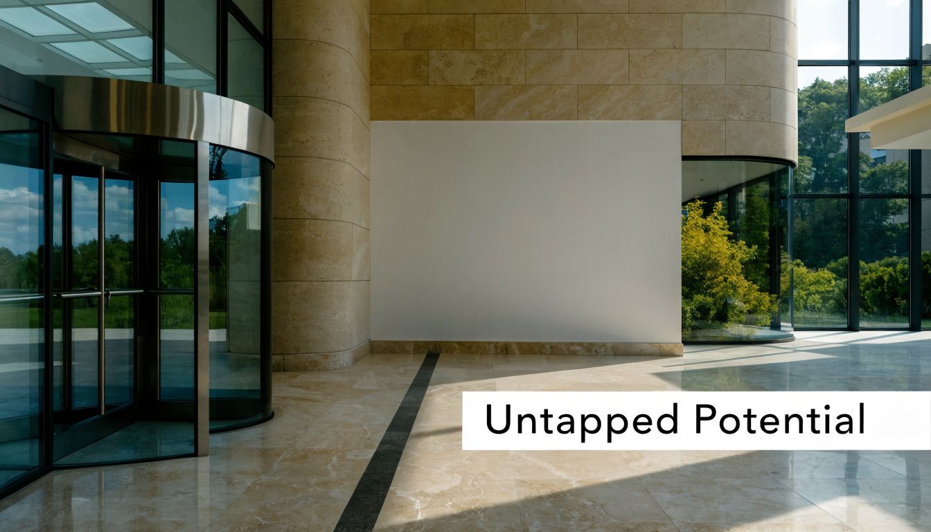
You’re probably looking at walls that are technically finished but not doing any work.
The paint is fresh. The space is clean. Customers walk in, employees pass through, vendors visit, and none of those surfaces help explain who you are, what matters in the space, or where people should go next. That’s a missed opportunity in retail, offices, warehouses, churches, and commercial developments.
Graphics on wall change that. Done well, they turn blank square footage into a business tool. They can support brand recognition, improve navigation, reinforce safety habits, shape first impressions, and make a location feel intentional instead of temporary. The difference is rarely the printer alone. It comes from making smart decisions across design, material selection, site conditions, installation, and long-term upkeep.
Beyond Paint The Business Case for Wall Graphics
A painted wall finishes a room. A wall graphic gives that room a job.
That distinction matters more than most owners expect. In a lobby, graphics on wall can set expectations before anyone speaks to a guest. In a retail store, they can frame a product category or clarify the feel of a seasonal launch. In a warehouse, they can support wayfinding and operational consistency. In an office, they can keep your mission, process, or story visible instead of buried in a slide deck.
Blank walls create hidden business problems
Most companies don’t notice the issue until they compare two spaces side by side. One looks complete but generic. The other feels branded, organized, and easier to understand.
The second space usually does three things better:
- It reinforces identity: A logo, brand colors, and message hierarchy make the business feel established.
- It reduces confusion: Directional or zone-based graphics help visitors and staff move with less hesitation.
- It improves consistency: Multi-room and multi-site environments feel connected rather than pieced together.
A lot of companies spend heavily on digital marketing, then leave the physical environment underdeveloped. That’s backwards. Your space is part of your advertising system, especially for walk-in traffic, interviews, tours, and repeat customers. If you want a broader view of how physical signage supports buyer attention, this overview of signs in advertising is useful context.
Wall graphics work because people already read rooms
People scan environments fast. They notice whether a business feels polished, outdated, energetic, careful, premium, practical, welcoming, or disorganized. They make those judgments before they read a brochure.
Practical rule: If a wall sits in a high-visibility area, it should either clarify the space, strengthen the brand, or support a customer decision.
That doesn’t mean every wall needs a mural. Some walls should stay quiet. The point is strategic use, not maximum coverage.
Business owners usually ask the wrong first question
The first question is often “How much does it cost?”
A better first question is “What do I need this wall to do?” Once that answer is clear, the cost conversation gets easier because the scope has a reason behind it.
Good graphics on wall can help a business:
- Frame the customer journey in retail and showroom settings
- Support culture and recruiting in offices
- Standardize messaging across multiple facilities
- Make underused square footage productive without construction
Paint changes color. Graphics can change behavior.
What Are Wall Graphics Exactly
Wall graphics are printed or cut visual elements applied to an interior wall surface to communicate something specific. That “something” might be branding, information, direction, atmosphere, or all four at once.
They’re broader than many owners realize. Some are nothing more than precision-cut vinyl lettering for a mission statement in a lobby. Others are full-wall murals that reshape how a space feels from the moment someone enters. That range is what makes graphics on wall so useful in business settings.
Three functional types you’ll see most often
The easiest way to understand wall graphics is by function.
Informational graphics
These help people act correctly or move efficiently.
Examples include department names, directional arrows, room IDs, process reminders, branded safety messaging, and zone markers in warehouses or production areas. These graphics need clarity first. Decorative flourishes come second.
Branding graphics
These build recognition and memory.
Think logo walls, brand statements, company timelines, value walls, founder stories, and visual systems that carry your color palette and typography through the space. However, many businesses underinvest in these elements. They use a small logo plaque when the wall could explain who they are in a more memorable way.
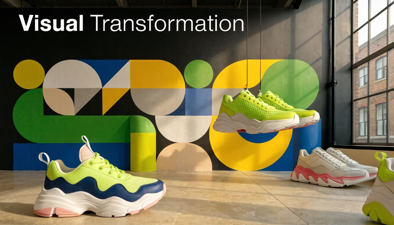
Atmospheric graphics
These shape mood and make the room feel designed.
This category includes murals, patterns, textured visuals, scenic backdrops, and large-scale photography. If a website has a hero image that sets tone immediately, a mural plays a similar role in physical space. Smaller cut vinyl phrases or icons act more like calls to action. They guide attention to a specific point.
This isn’t a new idea
Walls have carried useful information for a very long time. The impulse to use walls for communication is ancient. The Turin Papyrus Map, considered the first documented data visualization from 1160 B.C., used symbolic graphics on a papyrus “wall” to illustrate the location of gold mines and guide expeditions for Egyptian pharaohs, establishing an early precedent for functional, large-format graphics (Smith Hanley).
That historical example matters because it reminds us that wall graphics aren’t just decorative. They’ve long been used to direct action.
Wall graphics are not wallpaper with a logo
Businesses often confuse three different things:
- Paint: changes color only
- Wallpaper: adds surface pattern or texture
- Wall graphics: deliver a message tied to a business purpose
Sometimes the visual result can overlap. If you’re thinking through room treatments and want inspiration on how a feature wall can change a space, this guide to an accent wall gives useful design context.
For a business environment, a key advantage is integration. Graphics on wall can support the broader discipline of environmental branding, where architecture, messaging, and customer experience work together. This overview of environmental graphic design is a good reference if you’re planning more than a single wall.
A wall graphic should answer one question clearly: what should this space say before your staff says it?
Selecting the Right Materials for Durability and Impact
Material choice decides whether a wall graphic looks sharp for the long haul or starts failing at the edges far sooner than expected.
Owners sometimes focus only on the printed design. Installers know the better question is whether the film, adhesive, laminate, and wall condition match the environment. A lobby, church hallway, retail fitting area, and warehouse breakroom don’t place the same demands on a graphic.
Start with how permanent the graphic should be
Some projects are meant to stay in place for years. Others need to come down cleanly after a campaign refresh, tenant change, or remodel.
That single decision affects nearly everything else:
- Adhesive choice
- Print film type
- Surface prep standards
- Removal risk
- Installation labor
For removable wall graphics, the optimal adhesive thickness is typically between 1.0 to 1.5 mils. That range helps the graphic conform to minor wall textures while still supporting cleaner removal later, which is especially important in leased spaces (Jessup Manufacturing).
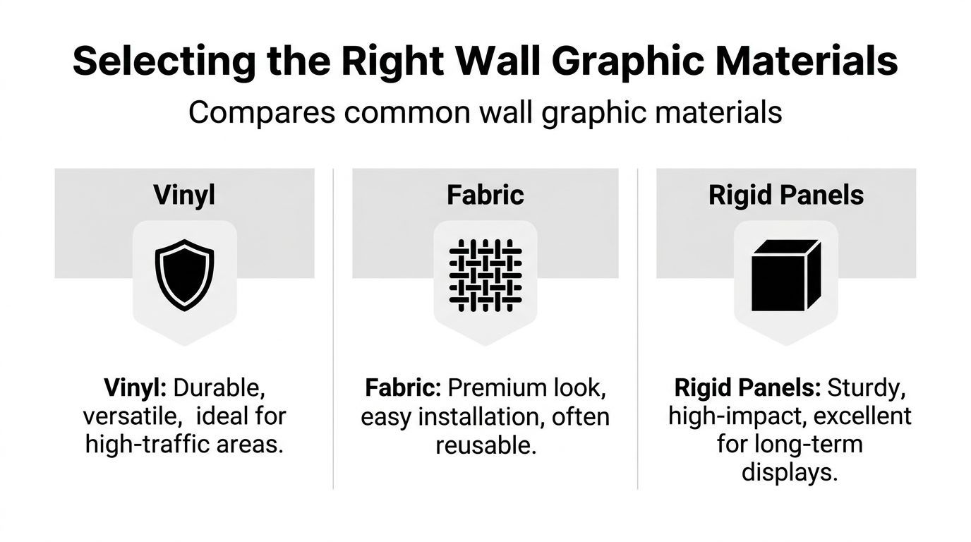
Common material categories in real business use
Vinyl film
Vinyl is the workhorse option for most graphics on wall projects.
It handles branding walls, room identification, directional graphics, large-format murals, and many high-contact areas. The appeal is versatility. You can cut it as lettering, print full-color imagery on it, laminate it for added protection, and choose finishes that reduce glare or add punch.
Use vinyl when you need:
- Clean edges and precise shapes
- Strong color reproduction
- A broad range of applications
- An easier path to standardization across locations
The trade-off is surface sensitivity. Vinyl performs best when the wall is properly prepared, reasonably smooth, and fully cured.
Fabric-based wall media
Fabric media fits spaces where the visual finish matters as much as the message.
It often gives a softer, more premium appearance than standard film. In offices, worship spaces, hospitality settings, or presentation areas, that texture can make a wall feel less commercial and more integrated into the room design.
Fabric can be a strong choice when:
- You want reduced glare under interior lighting
- The design is image-heavy
- The room needs a warmer visual tone
The caution is that not every fabric product behaves the same way during install or removal. Some are forgiving. Some aren’t. Sample testing matters.
Rigid panels
Rigid panels aren’t applied directly like films, but they solve a different class of problem.
They’re useful when the wall is inconsistent, rough, damaged, or not suitable for adhesive graphics. They also work when you want a dimensional, more architectural feel. In some spaces, they’re the cleaner answer than trying to force a film onto a poor substrate.
Wall Graphic Material Comparison
| Material Type | Best For | Durability | Cost Level |
|---|---|---|---|
| Vinyl film | Branding walls, wayfinding, murals, high-traffic interiors | High when matched to the surface and use case | Moderate |
| Fabric media | Offices, churches, presentation areas, softer premium interiors | Moderate to high, depending on product and wall condition | Moderate to higher |
| Rigid panels | Rough walls, long-term displays, dimensional branded areas | High | Higher |
Finish matters more than people think
A gloss finish can make colors pop, but it also reflects overhead lights. In conference rooms, retail aisles, and lobbies with strong lighting, glare can reduce readability.
Matte often works better for:
- Text-heavy walls
- Mission and values displays
- Photography-heavy murals
- Spaces with direct lighting
Satin lands in the middle and can be a practical compromise.
Don’t choose materials in isolation
A wall graphic doesn’t exist by itself. It competes or coordinates with flooring, fixtures, paint sheen, and nearby finishes. If you’re developing a full interior concept, reviewing visual references like wall tile patterns and layouts can help clarify whether your wall treatment should be bold, restrained, geometric, textured, or quiet.
Ask these material questions before approving production
- How long should this graphic stay in place
- Does the wall have texture, patched areas, or fresh paint
- Will people touch this wall often
- Is clean removability important
- Does the finish need to avoid glare
- Will the same material be used across multiple sites
The wrong material can make a strong design look cheap within months. The right material makes the design feel built into the space.
For companies comparing signage substrates more broadly across indoor and outdoor programs, this guide to the best material for outdoor signs helps frame how durability decisions change by environment.
Designing Graphics That Reinforce Your Brand
A wall graphic can be perfectly printed and still miss the mark if the design doesn’t match the room, the audience, or the brand.
That usually happens when businesses treat the wall as a giant blank canvas instead of a communication surface. Bigger space doesn’t mean more content. It means more responsibility to organize the message well.
Start with one message per wall
The cleanest branded walls usually have one dominant purpose.
A lobby wall might establish trust and identity. A hallway wall might tell a timeline story. A sales floor wall might focus attention on one collection or category. When owners try to combine mission statement, service list, product icons, social handles, and a giant logo on one surface, the result usually feels cluttered.
A better approach is to decide what the viewer should remember after three seconds.
Good wall messaging usually falls into one of these patterns
- Identity-first: logo, tagline, and visual brand system
- Story-first: origin, history, milestones, process
- Culture-first: mission, values, hiring message, team standards
- Action-first: shop this collection, find this department, enter here
Scale for the room, not the file on your screen
Designers often approve layouts on a monitor that don’t hold up once enlarged.
A small logo can disappear on a long wall. Fine text becomes unreadable from normal viewing distance. Low-resolution artwork looks soft or pixelated when printed large. Experienced production teams save projects in these situations. They review file quality, viewing distance, and wall dimensions before fabrication starts.
One of the best historical examples of visual storytelling is Charles Joseph Minard’s 1869 flow map of Napoleon’s Russian campaign, which shows the army’s size shrinking from 422,000 to 10,000 troops on a single wall-displayable chart (John Grimwade). The lesson for modern businesses isn’t military history. It’s clarity. A good graphic can carry a complex story if the hierarchy is disciplined.
Design test: If a visitor can’t tell the main point from across the room, the layout needs fewer competing elements.
Match the design to the zone
Not every room should feel the same.
Lobby and reception
Keep it authoritative and clean. In this context, sharp typography, a restrained palette, and a strong focal point usually outperform busy layouts.
Sales and showroom areas
Use energy carefully. Product-driven imagery, category labels, and campaign graphics can do real work here, but they still need breathing room.
Conference rooms
These spaces benefit from quieter visuals. Brand reinforcement works well, but it shouldn’t compete with presentations or conversations.
Hallways and transitional spaces
Effective storytelling is frequently achieved through these means. Timelines, process graphics, milestones, and culture walls can turn circulation space into useful brand real estate.
Use brand assets consistently
Consistency doesn’t mean repeating the logo everywhere. It means carrying recognizable visual rules across the environment.
That includes:
- Type choices that match your established brand
- Color use that stays within your actual palette
- Image style that feels like the rest of your marketing
- Tone of voice that sounds like your company, not a stock slogan
If you’re exploring concepts with a design partner, galleries of creative signs and graphics can help you evaluate what fits your brand language and what feels forced.
From Plan to Placement The Installation Process
A strong wall graphic project is won before the installer opens the first panel.
Most failures come from issues that looked minor at the start. Fresh paint that wasn’t cured long enough. Dust left on the wall. Texture that seemed harmless but telegraphed through the film. A patch job that became obvious once the graphic was up. Good installation teams catch those risks early because they know a wall doesn’t become graphic-ready just because it’s upright.
Surface preparation decides the outcome
For drywall, a Level 3 finish is recommended for optimal wall graphic adhesion. That finish includes an additional coat of joint compound over joints and provides a smoother, more uniform surface, which helps prevent imperfections from showing through the graphic (Arlon technical bulletin).
That recommendation matters in real projects because many business owners assume any painted drywall is ready. It isn’t.
Conditions that usually support better results
- Smooth painted surfaces: These give the adhesive consistent contact.
- Clean walls: Dust, grease, and residue interfere with bond strength.
- Fully cured paint: Freshly painted walls are one of the most common trouble spots.
- Stable room conditions: Temperature affects how the adhesive develops its initial bond.
Professional crews often inspect the wall before final scheduling. If the surface isn’t ready, delaying install is cheaper than reprinting and reinstalling later.
What a professional install usually includes
Large graphics on wall aren’t just peeled and stuck. The process is controlled.
A typical workflow includes field measurement, production proofing, panel planning, wall cleaning, alignment marks, staged application, edge work, and post-install inspection. Installers also manage pressure carefully during application so the film bonds well without being forced too deep into irregularities that create removal problems later.
This is where a project manager earns their keep, especially on multi-site programs. Someone has to coordinate design approvals, site readiness, shipping, installation windows, and any local building constraints. A national provider such as commercial sign installation services can be useful when a company needs one process carried consistently across several locations.
A wall graphic install should feel boring on install day. If people are improvising on site, something upstream was missed.
DIY works only in narrow cases
Small cut vinyl text on a smooth office wall might be manageable for an in-house team.
A full mural, a textured substrate, a multi-panel alignment, a public-facing lobby, or a deadline tied to an opening event is different. That’s where DIY mistakes get expensive. Bubbles, wrinkles, silvering, visible seams, bad edge adhesion, and crooked placement all stand out more on a wall than people expect.
Don’t ignore permitting and site rules
Interior wall graphics often move faster than exterior signage, but not every project is permit-free. Certain building types, landlord standards, historic districts, healthcare environments, or large public-facing graphics can involve review requirements.
Ask early:
- Does the landlord require approvals
- Does the property manager have finish standards
- Are there fire or material restrictions
- Will installation need after-hours access
- Are lifts or special access equipment required
Maintenance is simple if you plan for it
Most wall graphics don’t need heavy maintenance, but they do need sensible care.
Use non-abrasive cleaning methods. Don’t let staff scrub printed surfaces with harsh tools. Inspect edges periodically in high-contact areas. If a room is being repainted or repaired nearby, protect the graphic before other trades start working.
A clean install on a prepared wall usually stays that way longer.
Measuring the ROI of Your Wall Graphics Investment
Wall graphics aren’t hard to justify when they solve a visible problem. The challenge is that many businesses measure them too narrowly.
If you only ask whether a wall graphic directly produced a sale, you’ll miss most of the value. Graphics on wall often affect the conditions around the sale. They shape trust, clarity, consistency, and movement through the space. Those outcomes matter.
Where the return shows up
Some returns are operational. Others are perceptual.
Tangible returns
These are the easiest to evaluate because they affect day-to-day performance.
- Wayfinding efficiency: Staff and visitors spend less time asking where things are.
- Merchandising support: Product zones and featured collections become easier to notice.
- Facility consistency: Multi-site spaces follow the same visual standards.
- Space utilization: Walls that were doing nothing start supporting communication goals.
Intangible returns
These are harder to track in a spreadsheet, but owners usually feel them quickly.
- Stronger first impressions
- A more polished environment for client visits
- Better employee perception of the workspace
- Clearer cultural messaging for recruiting and onboarding
Three practical use cases
Retail shop
A retailer launches a new collection and wants it to feel intentional without rebuilding fixtures. A wall graphic behind the display can anchor the collection, set mood, and help shoppers understand what belongs in that zone.
The key isn’t decoration alone. It’s reducing hesitation. If the wall tells the story well, the product area feels curated instead of random.
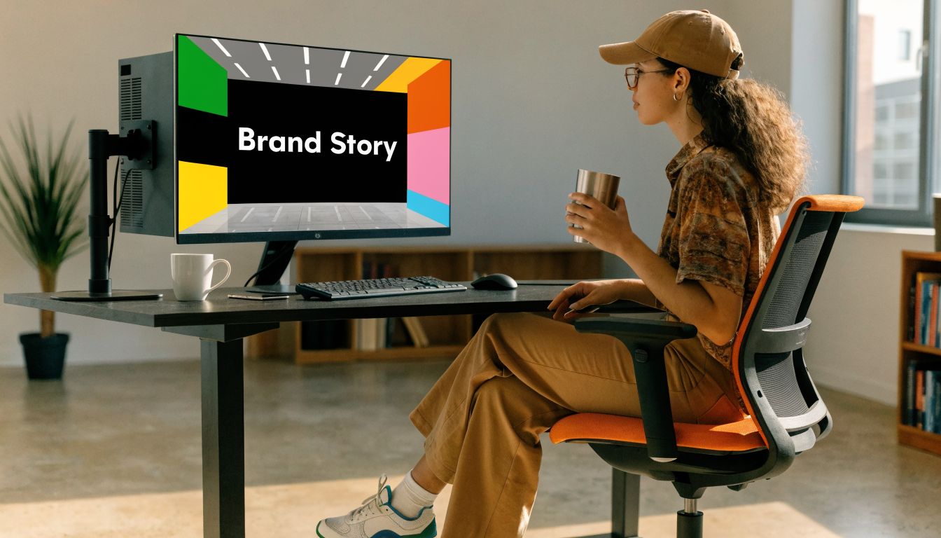
Corporate office
An office lobby or corridor often carries too little meaning. A business may have a strong mission, a clear process, and a long history, but none of it is visible in the environment.
A branded story wall fixes that. It helps clients, recruits, and employees understand the company without requiring a spoken presentation every time someone walks through the space.
Good office graphics reduce the gap between what a company says it stands for and what visitors actually experience on site.
Multi-site logistics or warehouse operation
These environments benefit from consistency more than flair.
Wall graphics can support location branding, internal navigation, operational reminders, and standardized messaging across facilities. When every site improvises its own visual communication, the result is drift. One building looks polished. Another looks temporary. A managed rollout keeps the system aligned.
How to judge whether the project worked
Look for practical signals after installation.
In customer-facing spaces
- Do visitors understand the business faster
- Are product zones easier to shop
- Does the space feel more intentional in photos and walkthroughs
In employee-facing spaces
- Do people reference the walls because the information is useful
- Does onboarding feel more supported by the environment
- Do teams treat the space like a permanent operation rather than a placeholder
In multi-site programs
- Are graphics being replicated consistently
- Are local teams asking fewer one-off design questions
- Does each location still feel like the same brand
Cost questions should be tied to use case
Owners often ask whether wall graphics are “worth it.” The answer depends on fit.
If the wall sits in a back room no one sees, maybe not. If it frames your entry, supports a key sales zone, or solves a navigation problem that staff deals with every day, then the wall has business value before the first panel is even installed.
The strongest ROI usually comes from projects where the graphic serves more than one purpose. A well-designed lobby wall can brand the space, improve client perception, support recruiting, and make photography for marketing look better. That’s a stronger investment than a purely decorative piece with no role in the customer journey.
Your Wall Graphics Decision Checklist
A wall graphic project gets easier when you make the big decisions in the right order.
Use this checklist before requesting final pricing or approving artwork.
Define the job of the wall
- Choose the main purpose: branding, wayfinding, storytelling, atmosphere, or safety support.
- Identify the audience: customers, employees, visitors, tenants, students, or mixed traffic.
- Set the viewing distance: across a lobby, from a hallway, or up close in a waiting area.
Review the physical site
- Check the wall condition: smooth, textured, patched, freshly painted, or damaged.
- Note environmental factors: lighting, glare, cleaning routines, and touch frequency.
- Confirm access: ladders, lifts, after-hours work, occupied rooms, or restricted areas.
Shortlist the right material path
- Need removability: ask for a removable adhesive system suited to interior walls.
- Need a premium finish: compare vinyl, fabric, and panel options based on the room.
- Need durability: consider how often the wall will be touched, cleaned, or exposed to wear.
Get the design right before production
- Use high-quality files: large walls expose weak artwork quickly.
- Keep one message dominant: don’t overload a wall with every brand element.
- Match the room: energetic visuals for selling zones, calmer systems for focused areas.
Vet the install partner
- Ask about site surveys: a serious provider checks measurements and wall readiness.
- Ask who manages the project: you want one point of contact when schedules get tight.
- Ask about multi-site coordination: consistency matters if more than one location is involved.
- Ask about post-install care: cleaning guidance and maintenance expectations should be clear.
When you can answer those questions, you’re no longer buying decoration. You’re planning a space asset.
If you’re evaluating graphics on wall for one location or a broader rollout, On Display Signs, Inc. handles design consultation, fabrication, permitting, installation, and maintenance for commercial signage programs across the U.S. That kind of end-to-end coordination is especially useful when wall graphics need to align with other branded signage, site conditions, and local requirements.

