Getting a sign made is a lot like building a house. You wouldn't pour a foundation without a solid blueprint, and you shouldn't start picking colors or materials for your sign without a rock-solid strategy. The entire process breaks down into three key stages: Strategy, Design, and Execution.
Nailing that first stage—the strategy—is what separates a sign that just hangs there from one that actively pulls customers through your door.
Starting Your Sign Project With a Clear Strategy
Before you get lost in sketches and font choices, every successful sign project begins with a plan. This is where you think critically about the sign’s real job. Is it meant to scream “Grand Opening!” from the rooftops, guide foot traffic to a specific department, or quietly build brand recognition over time?
Without this upfront thinking, even the most beautiful and expensive sign can completely miss the mark. A clear strategy is your roadmap, ensuring every decision that follows serves your ultimate business goals.
Defining Your Project Scope
First things first: you need to outline the mission. This means defining the sign's primary objective, who you're trying to reach, and what your budget looks like. A temporary banner for a weekend sale has a totally different scope than a permanent, illuminated monument sign for a new corporate headquarters.
Getting this right is why the signage industry is booming. Businesses see the returns; a great sign can boost visibility significantly in a busy area.
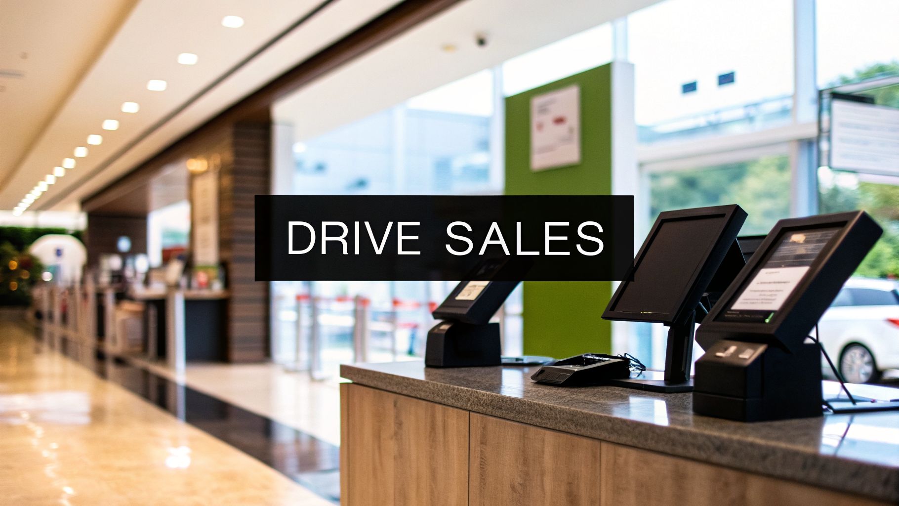
A sign is your silent salesperson, working 24/7 to represent your brand. Investing time in the initial strategy ensures it’s communicating the right message effectively.
This simple flowchart shows how these three stages connect, moving from the initial plan to the final product.
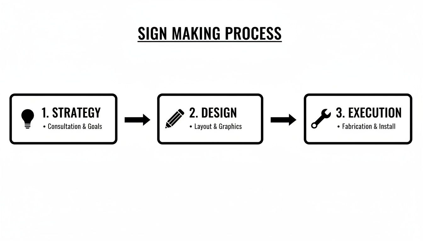
As you can see, a successful project flows logically from planning and creative development through to the physical production and installation.
To give you a clearer picture, this table breaks down the core phases of a typical sign project.
Key Sign Project Phases at a Glance
| Phase | Primary Goal | Key Activities |
|---|---|---|
| Strategy | Define the purpose, budget, and rules of the project. | Audience analysis, budget setting, site survey, permit research. |
| Design | Create a visual concept that is effective and compliant. | Concept sketches, material selection, mockups, technical drawings. |
| Execution | Fabricate, install, and maintain the finished sign. | Permitting, fabrication, electrical work, installation, maintenance plan. |
Each phase builds on the last, which is why getting the early details right is so critical for a smooth and successful outcome.
Key Considerations for Your Plan
Once you have the big picture, it’s time to zoom in on the details that will make or break your sign's effectiveness. Thinking through these elements now will save you from major headaches and costly revisions down the road. You can dive deeper into this topic in our detailed guide on signage project management.
Your strategic plan must lock down these core elements:
- Brand Consistency: Your sign needs to feel like it belongs to your business. It should use the same colors, fonts, and logo that appear everywhere else, creating a cohesive brand experience. For example, if your brand uses a specific shade of blue (like Pantone 286 C) on its website and business cards, that exact color must be used on the sign.
- Location and Placement: Get out there and look. Consider the viewing distance, the speed of traffic (foot or car), and any potential obstructions like trees or other signs. A sign meant to be read from a highway at 65 mph needs a completely different design than one on a quiet, pedestrian-only street. Actionable Insight: Drive or walk past your location from all possible directions to identify the best line of sight. Take photos from these angles to help your designer understand the environment.
- Local Regulations: This is a big one. Before you fall in love with a design, you must research your city or county’s sign ordinances. These local codes dictate everything—size, height, materials, illumination, and exactly where you can (and can't) place your sign.
Designing Signs That Capture Attention and Convert
A truly effective sign isn't just art; it's a blend of raw creativity and the hard science of communication. Getting a design to stand out is about more than picking a color you like. It’s about understanding how people see and process information—especially when they’re moving fast and only have a split second to look.
The most successful signs you see for retail stores, restaurants, and offices all follow the same core design principles. These aren't just suggestions; they are proven rules that make the difference between a sign that gets your message across and one that’s just an unreadable, forgettable waste of money.
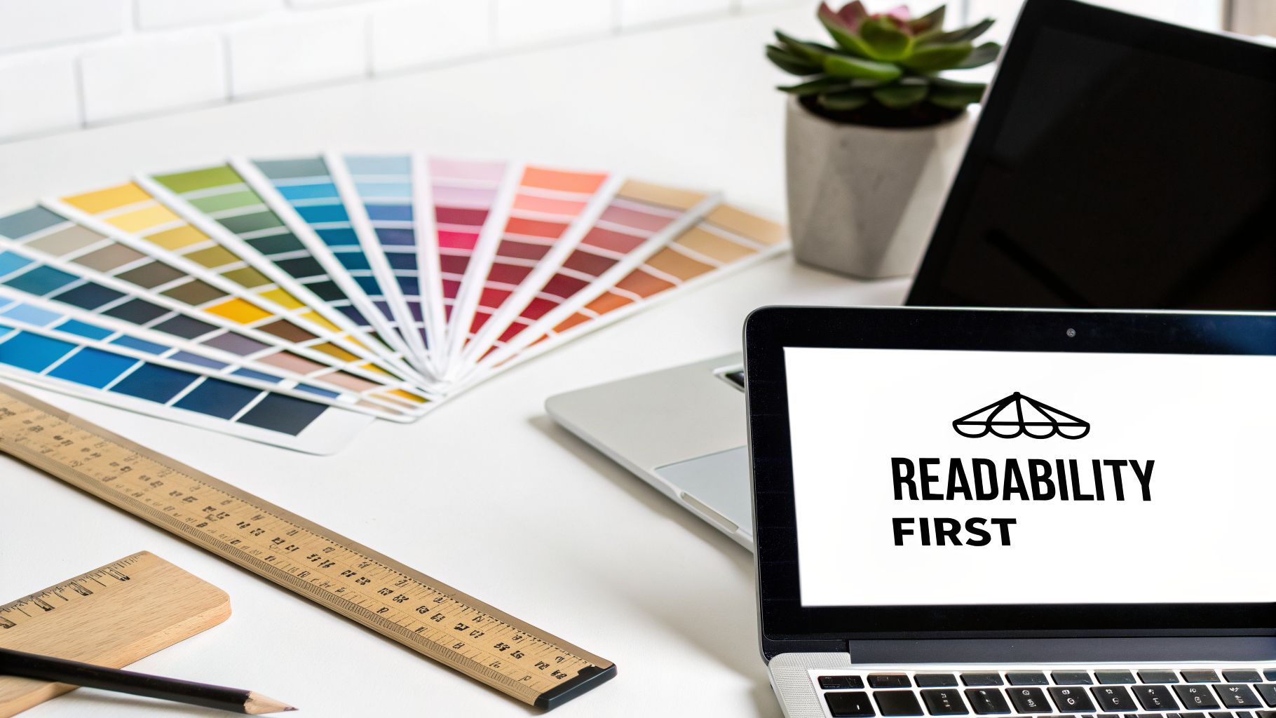
Readability Is Your First Priority
Before your sign can even think about persuading someone, it has to be legible. This sounds incredibly obvious, but it's the number one mistake we see in sign design. A driver passing your business at 40 mph has just a few precious seconds to spot, read, and understand what your sign says.
This makes your font choice absolutely critical. Forget the ornate, script-like, or super-thin fonts; they are a disaster for outdoor signage. Stick with clean, bold, sans-serif fonts like Helvetica, Arial, or Open Sans. They were literally designed for clarity and are easy to read from far away.
The ultimate measure of any sign design is what I call the "glance test." Can a total stranger understand the most important thing—who you are and what you do—in three seconds or less? If the answer is no, the design has failed.
Always think about where the sign will actually live. A sign for a small boutique on a quiet, pedestrian-only street can get away with more detail than a massive pylon sign towering over a busy highway. The faster the traffic, the bigger and simpler your lettering has to be. Practical Example: For a highway sign, letters should be at least 24 inches tall to be readable from over 1,000 feet away.
Master Color and Contrast
Color does so much more than make your sign look attractive. It triggers psychological reactions and, most importantly, has a massive impact on visibility. High contrast is the single most powerful tool you have for making a sign readable at a glance. You want your text and graphics to practically jump off the background.
Some of the most tried-and-true color combinations include:
- Black on White: The undisputed king of high contrast, offering maximum readability.
- Black on Yellow: Incredibly eye-catching. It’s no accident this is used for warning signs.
- White on Blue: A professional and calming combination that conveys trust and dependability.
- White on Red: Creates a sense of urgency and excitement, making it perfect for sales or food businesses.
Stay far away from low-contrast pairings like light gray on white or dark blue on black. These combos cause the letters to blur into the background, making them nearly impossible to read from a distance. As you look through different sign design ideas, always step back and check their contrast.
The Power of Simplicity and a Single Focal Point
A cluttered sign is an ignored sign. So many business owners fall into the trap of trying to cram every last piece of information onto their sign—phone numbers, websites, a bulleted list of services, social media handles. All this does is create visual chaos that makes a potential customer’s eyes glaze over.
A powerful sign has one, and only one, clear focal point. Ask yourself: what is the one thing I absolutely need people to know? For most businesses, it’s their name and what they do.
For instance, a new bakery’s sign should scream "Oakhaven Bakery," not a tiny logo followed by a laundry list of every pastry they offer. The business name is the hero of the story. Supporting details, like "Artisan Breads & Coffee," can be included, but should be smaller. This creates a visual hierarchy that guides the viewer's eye exactly where you want it to go. To really create signs that pull people in, it's worth exploring the fundamental principles of visual merchandising.
One of a designer’s best-kept secrets for fighting clutter is negative space—the empty areas on your sign. Don't be afraid of blank space! It gives your logo and text room to breathe, making them stand out even more. The FedEx logo is a classic example; it famously uses negative space to form a hidden arrow, suggesting speed and forward motion with nothing but clean, simple design. That’s how you get your message across instantly.
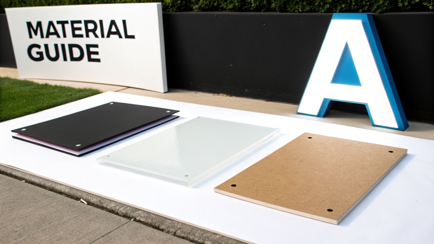
Choosing the Right Materials and Production Methods
Once you've locked in your design, it's time to bring that concept into the real world. This is where you decide what your sign will actually be made of. The materials and production methods you pick will dictate your sign's lifespan, its resilience against the elements, and, of course, the final cost.
This isn't just a technical step; it’s a balancing act. You have to weigh your budget against your brand's look and feel, all while considering where the sign will live. A sign destined for a cozy indoor lobby has a very different job—and very different requirements—than one that needs to survive years of sun, wind, and rain.
Matching Materials to Your Environment
Where your sign is going is the single most important factor in choosing what it's made of. Outdoor signs are soldiers, built for durability, while indoor signs can be more like artists, focused on finish and detail.
For any sign facing the outdoors, you need materials that won't fade, warp, or fall apart. Here are the workhorses of the industry:
- Aluminum: This is the go-to for permanent outdoor signs, and for good reason. It’s tough, lightweight, and completely rust-proof, making it perfect for everything from simple parking signs to huge building letters.
- Acrylic: If you’re going for a premium, modern look, acrylic is your answer. Its glossy finish is great for high-end storefronts and illuminated signs. It's surprisingly durable and stands up well to weather.
- MDO (Medium Density Overlay) Plywood: Think of this as an engineered wood made specifically for sign-making. It’s a solid, budget-friendly choice for large, flat signs, though it generally won't last as long as metal.
The process of choosing the right materials for signs is about understanding these trade-offs to find the perfect fit for your specific needs and location.
Key Production Methods and Sign Types
Beyond the raw material, the way your sign is built defines its look and feel. Different sign types do very different jobs, from screaming for attention on a busy highway to adding a whisper of class to a corporate lobby.
Think about illuminated signs, for instance. They don't clock out when the sun goes down.
A sign’s job doesn’t stop when the sun goes down. For businesses open after dark, like restaurants or retail stores, an illuminated sign isn't a luxury; it's a fundamental requirement for attracting customers.
Let's break down a few of the most common and effective production types:
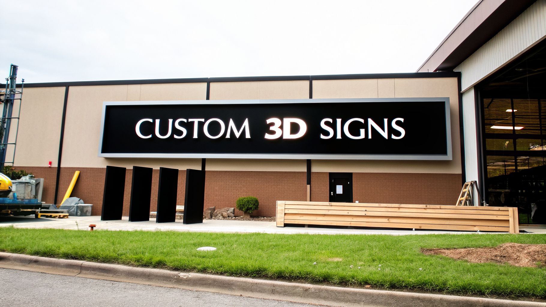
- Channel Letters: These are the three-dimensional, individually crafted letters you see on premium storefronts. Often lit from within by LEDs, they offer a crisp, professional look that’s highly visible day and night.
- Monument Signs: These are low-to-the-ground, freestanding signs, often built on a brick or stone base that echoes the building's architecture. They project a feeling of permanence and are perfect for business parks, residential communities, and professional practices.
- Pylon Signs: You might know them as pole signs. These tall structures are designed for one thing: maximum visibility from far away. They are essential for any business fighting for attention on a highway or in a massive shopping center.
For a deeper dive, our guide on the best materials for outdoor signs can give you even more insight.
Comparing Popular Outdoor Sign Types
This table breaks down where each of these popular sign types shines.
| Sign Type | Best For | Key Advantage | Common Example |
|---|---|---|---|
| Channel Letters | Storefronts, building exteriors | High-end, 24/7 visibility | A retail store in a downtown shopping district. |
| Monument Signs | Entrances to business parks, clinics | Stately, architectural presence | The entrance to a professional law office. |
| Pylon Signs | Highway-front businesses, large centers | Maximum long-distance visibility | A hotel or gas station located off a major interstate. |
The Role of Banners and Temporary Signs
While permanent signs are a serious investment, sometimes you just need something fast, affordable, and flexible. That's where banners and other temporary signs come in. They are the perfect tool for announcing a grand opening, promoting a flash sale, or driving traffic to a one-time event.
There's a reason they are so popular—they work. Well-placed banners can boost event attendance and provide a significant sales lift for small businesses. The impressive impact of signs and banners shows just how powerful these simple tools can be.
Making the right choice here ensures your sign doesn't just look the part but works hard for your business for years to come.
Navigating Permits and Ensuring Legal Compliance
This is the part of the process that trips up countless business owners. You can have the perfect design and the best materials, but none of it matters if your sign breaks the law. Tackling permits and legal compliance isn't just a box to check; it's a non-negotiable step to ensure your sign is a lasting asset, not a liability.
Trying to skip this step is a recipe for disaster. We've seen it all—steep fines, frustrating project delays, and even orders from the city to tear the whole thing down. Understanding the rules of the road from the very beginning saves you from these costly headaches.
Understanding Your Local Sign Ordinances
Before you fall in love with a specific sign design, your first stop should always be your local city or county planning department. Every municipality has its own unique rulebook, often called a sign code or sign ordinance, that dictates what you can and can't do.
And these regulations get surprisingly specific. They govern nearly every aspect of your sign, including:
- Size and Height: Most places have strict maximums. A common rule is allowing 2 square feet of signage for every 1 linear foot of your storefront's width.
- Placement: The code will define exactly how far your sign needs to be set back from sidewalks, roads, and property lines.
- Illumination: There are often rules about whether a sign can be lit, how bright it can be, and if it's allowed to flash or change colors—all to prevent distracting drivers.
- Type: Some commercial zones might allow for low-profile monument signs but completely prohibit towering pylon signs.
Actionable Insight: Search for "[Your City Name] sign ordinance" online or call the local planning department. Ask them for a checklist or application guide for commercial signs; this document is an invaluable roadmap.
The Sign Permit Approval Process
A sign permit is simply the official green light from your local government to install your sign. For almost any permanent outdoor business sign, it's mandatory. This process ensures your sign is safe, meets all local codes, and is properly documented by the city.
While it can vary slightly, the journey usually involves a few key milestones. First, you'll submit a detailed application with scaled drawings and a site plan. Then, a city reviewer will comb through your plans to check them against the ordinance. Once everything is approved, they issue the permit, and only then can work begin. Finally, an inspector might visit after installation to make sure the finished product matches the approved plans.
Think of a sign permit as insurance for your investment. It’s the official stamp of approval that protects you from future problems and confirms your sign is a safe, legal addition to your property.
Don't Forget ADA Compliance
While local ordinances mostly cover outdoor signs, the federal Americans with Disabilities Act (ADA) sets the standard for many indoor signs. These rules are all about making public spaces accessible to everyone. If your sign identifies a permanent room—like a restroom, exit, or office number—it almost certainly needs to be ADA-compliant.
Some of the key ADA requirements include:
- Tactile and Braille Characters: Letters must be raised (tactile) so they can be read by touch, with Grade 2 Braille included below.
- High Contrast: The text and its background must have a high level of color contrast for easy reading.
- Non-Glare Finish: The sign's surface must be matte or non-glare to prevent reflections from making it hard to see.
- Specific Mounting Heights: Signs have to be installed within a specific height range on the wall, usually next to the door they identify, so they are easy to find and read.
Falling short on ADA standards can lead to serious legal issues. As you plan your interior signs, always confirm which ones need to meet these crucial federal rules. For a deeper dive into the paperwork, our guide covering sign permit requirements is an excellent starting point.
Professional Installation and Long-Term Maintenance
Your new sign has passed every checkpoint—from design and permits to fabrication. Now for the moment of truth: turning that vision into a physical landmark for your business. This final step is more than just hanging a sign; it's about skilled execution that ensures safety, maximizes longevity, and protects your investment from day one.
A professional installation team brings the experience to handle everything from complex electrical work to tricky mounting situations. This is where a collection of materials officially becomes your storefront's handshake, so knowing what to expect is key to a smooth handover.
Preparing for a Safe and Flawless Installation
The complexity of an installation can vary wildly. A simple window graphic might take just a few minutes, but a large pylon sign is a mini-construction project involving cranes, concrete foundations, and serious groundwork.
Before the crew arrives, a few simple prep steps can make a world of difference:
- Clear the Area: Make sure the installation site is completely free of cars, planters, furniture, or any other obstructions. This gives the team a safe, clear workspace.
- Manage Access: Let the installers know the best entry points for their trucks and equipment. For bigger jobs, they may need a dedicated spot to stage materials.
- Notify Neighbors: It's a professional courtesy to give neighboring businesses a heads-up if the work will be disruptive, like involving a crane or temporarily blocking a sidewalk.
The installation is where precise engineering and skilled labor come together. It ensures your sign isn’t just visually perfect but is also securely and safely anchored to your property for years of reliable service.
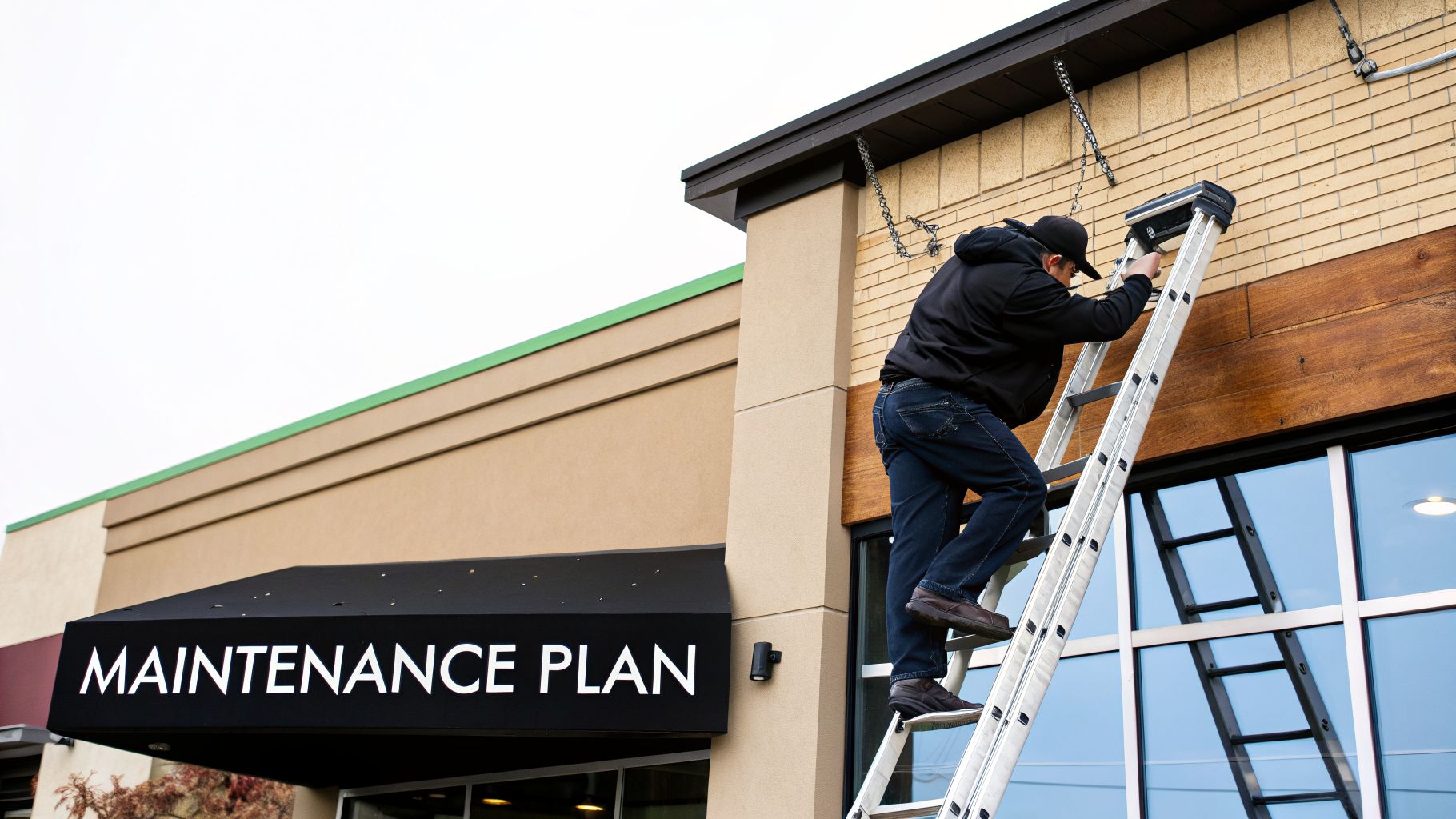
Creating a Proactive Maintenance Plan
Once your sign is up, the focus shifts from creation to preservation. Think of it like a new car; a little routine care keeps it looking sharp and prevents small, fixable issues from snowballing into expensive repairs down the road.
Different materials naturally require different levels of attention. A painted MDO sign, for instance, might need more frequent checks for weathering than a powder-coated aluminum one will. The key is to be proactive. For a deep dive into what's involved, you can explore our overview of professional commercial sign installation.
Key Maintenance Tasks for Sign Longevity
Keeping your sign in top shape doesn't have to be a chore. A simple checklist and regular quarterly inspections can make all the difference, protecting your brand's image around the clock.
Regular Cleaning Schedule
| Sign Material | Cleaning Method | Frequency |
|---|---|---|
| Aluminum & Acrylic | Soft cloth with mild soap and water. Avoid abrasive cleaners. | 2-4 times a year |
| Vinyl Banners | Gentle wipe-down with a damp cloth. | As needed |
| MDO/Wood | Check for moisture damage; clean gently to protect the finish. | Annually |
Beyond a simple wipe-down, your routine should include quick structural and electrical checks. This is especially vital for illuminated signs, which are a powerful tool for visibility. With the digital and illuminated signage market growing rapidly and LED tech dominating that growth, their upkeep is non-negotiable. Bright signs can significantly lift customer engagement, making them a priority to maintain.
When you're doing a quick inspection, look for:
- Secure Mountings: Give brackets and bolts a quick check. Are they tight? Do you see any signs of rust or stress?
- Electrical Connections: For illuminated signs, flickering or dead spots are the first sign that an LED module or ballast might be failing.
- Physical Damage: After a big storm or high winds, do a quick walk-around to check for cracks, dents, or other damage.
A few minutes of preventative care goes a long way, ensuring your sign continues to be a hardworking, 24/7 ambassador for your brand.
Common Questions About Making Business Signs
Even with the best plan, starting your first signage project can feel like stepping into the unknown. It's completely normal to have questions pop up along the way, and getting solid answers is the key to avoiding expensive mistakes and making choices you feel good about.
Think of this section as your quick-reference guide. We’re cutting through the noise to answer the most common questions we hear from business owners just like you, covering everything from real-world costs to project timelines.
How Much Does a Business Sign Typically Cost?
This is usually the first question on everyone's mind, and the honest answer is: it depends entirely on the sign. There's no flat rate because every project is custom, and the price tag can swing dramatically based on size, materials, lighting, and complexity.
A simple vinyl banner for a weekend sale might only run you a few hundred dollars. On the other end of the scale, a massive illuminated pylon sign for a new shopping center can easily climb into the tens of thousands.
Here’s what really drives the cost:
- Sign Type: A flat panel sign is far less labor-intensive than custom-fabricated 3D channel letters.
- Material Choice: Premium materials like aluminum and acrylic cost more upfront than options like plastic or basic MDO wood composite.
- Illumination: Adding LED lighting carries a higher initial cost but ensures your sign works for you 24/7. Non-lit signs are cheaper but invisible at night.
- Installation: A simple wall mount is straightforward. A sign needing a crane, a new concrete foundation, or complex electrical work will have significantly higher installation fees.
As a real-world benchmark, a quality illuminated channel letter sign for a typical retail storefront often falls in the $3,000 to $8,000 range. The only way to know for sure is to get a detailed quote that breaks down the cost of design, fabrication, and installation.
Can I Make and Install My Own Business Sign?
While you can technically DIY a temporary banner, attempting to make and install your own permanent exterior sign is something we strongly advise against. A professional-grade sign involves a lot more than just putting some materials together.
Trying to DIY a permanent outdoor sign is a classic example of a short-term saving that leads to long-term costs. It often results in code violations, safety hazards, and a sign that deteriorates quickly, damaging your brand's image.
Professionals bring crucial expertise in material science for weather resistance, proper fabrication techniques, and installation methods that can withstand high winds and the elements. More importantly, most cities and counties require licensed contractors for sign installation and any electrical work involved. This isn't just red tape—it's about ensuring public safety and meeting strict building codes.
How Long Does It Take to Make a Custom Sign?
A custom sign project can take anywhere from a couple of weeks to several months. It all comes down to the sign’s complexity. A simple, non-illuminated interior logo sign, for instance, might be ready in just 2-4 weeks.
On the flip side, a complex monument sign that requires structural engineering, digging a foundation, and navigating an extensive permitting process could easily take 3-6 months from initial concept to final installation.
The biggest wild card in any sign project timeline is the local permitting process. Getting approval from the city planning department can take a few days in one town and over a month in another. A good sign company will be familiar with your local jurisdiction and can give you a realistic timeline that accounts for this crucial step.
What Is the Difference Between a Monument Sign and a Pylon Sign?
Both are freestanding signs, but they are designed for completely different environments based on their height and how far away they need to be seen.
A monument sign is a low-profile sign built at or near ground level. They often feature a solid base made from materials like brick, stone, or stucco that matches the building's architecture. You see them at the entrances to corporate campuses, medical offices, and upscale communities, where they project an image of quality and permanence.
A pylon sign, in contrast, is the tall one. It's mounted high on one or two large poles to tower over its surroundings. These signs are engineered for maximum visibility from a distance, making them essential for businesses along highways and busy roads—like hotels, gas stations, and retail centers—that need to capture the attention of fast-moving traffic.
At On Display Signs, Inc., we manage every detail of the signage process for you, from initial design consultation and permit navigation to expert fabrication and installation. We deliver standout signage solutions that get your business noticed. Start your sign project with us today.


