Think of your signs for a doctor's office as the first handshake with your patients. Long before they meet the receptionist or the doctor, your signage is already communicating a message. It needs to be clear, professional, and easy to follow, assuring them they're in the right place and reflecting the quality of care they're about to receive. The best systems blend highly visible outdoor signs, intuitive indoor directions, and all the necessary accessibility notices.
Crafting the First Impression With Exterior Signs
A patient's experience doesn't start in the waiting room—it begins in the parking lot. Your exterior signage is their very first point of contact. It’s the silent receptionist that guides, welcomes, and reassures them. A shabby, confusing, or hidden sign can trigger instant stress, making a patient feel lost before they've even parked their car.
On the flip side, clean and professional exterior signs immediately build a foundation of trust. They signal that your practice is organized, modern, and cares about the patient experience from start to finish. That positive first impression is priceless, setting a calm and confident tone for the entire visit.
Key Types of Exterior Signs
To make your practice easy to find and identify from the road, you'll need a few different types of signs working together. Each has a specific job, from grabbing attention a block away to confirming the front entrance.
A combination of exterior signs ensures patients can find you without any guesswork. Let's break down the most common options and what they do best.
Key Exterior Sign Types and Their Primary Functions
| Sign Type | Primary Function | Best Location | Recommended Materials |
|---|---|---|---|
| Building Signs | Primary brand identification; confirms arrival. | Directly on the building facade, above the main entrance. | Dimensional Letters, Aluminum, Acrylic |
| Monument Signs | Marks the property entrance from the street. | At the driveway entrance, close to the road. | Stone, Brick, Concrete, Metal Panels |
| Pylon Signs | Maximum visibility from a distance. | Near a busy road or highway, visible above obstacles. | Aluminum Cabinet, LED Displays |
These core signs work as a team to create a clear path from the main road right to your front door.
Materials and Illumination for Lasting Impact
The materials you choose for your signs say a lot about your practice's standards. Durable and professional-looking options like aluminum offer a sleek, modern finish that holds up against the weather, while acrylic provides a clean, polished look. Both are excellent choices for communicating quality and stability.
But materials are only half the story. Illumination is what makes your practice visible 24/7—an absolute must for urgent care facilities or any clinic with evening hours.
A well-lit sign is not just a marker; it’s a beacon of care and availability. It tells patients that help is accessible, even after standard business hours, projecting a sense of security and reliability.
For example, halo-lit channel letters, where each letter is individually lit from behind, cast a soft, professional glow that’s easy to read without being harsh. Another great option is an internally lit sign cabinet, which provides a bright, clear display that cuts through rain or fog. When you're ready, you can explore more ideas by learning about exterior building signage design to see what fits your building's architecture. These smart choices in materials and lighting aren't just details—they're essential for creating that welcoming and trustworthy first impression.
Guiding Patients Seamlessly With Interior Wayfinding
The moment a patient walks through your doors, their journey to the exam room begins. For someone who isn’t feeling their best, navigating an unfamiliar medical office can crank up their stress levels instantly. This is where your interior wayfinding signs come in—they act as a silent, reassuring guide that gets people where they need to go and frees up your front-desk staff from constantly giving directions.
Think of your interior sign system as a series of breadcrumbs. Each sign is a clue that answers the question, "Okay, where to next?" without forcing them to stop and ask. A smart system turns a confusing maze of hallways into a simple, follow-the-leader path.
The Core Components of Interior Navigation
A solid wayfinding strategy isn't just one type of sign; it’s a team of three working together. Each one plays a specific role, and if you miss one, you create a gap that leads straight to confusion and frustrated patients.
These are the must-have signs for any doctor's office interior:
- Lobby Directories: This is mission control. A big, clear directory in your lobby gives everyone a quick overview of the whole facility—listing doctors, departments, and key spots like labs or restrooms.
- Directional Signs: These are the real workhorses. You'll see them at every hallway intersection or decision point, using simple text and arrows to point people toward specific wings or room numbers.
- Room Identifiers: These are the "you have arrived" markers. They clearly label every single exam room, office, and closet, confirming for patients that they’ve found the right spot.
When these three work in harmony, they create a smooth flow that guides a patient from the front door to the exam room with zero stress. That translates directly to a better patient experience and a much more efficient office.
Actionable Strategies for Intuitive Wayfinding
Just throwing up a few signs isn't enough. The real magic is in the strategy behind their design and placement. A good plan makes every sign feel like part of a single, easy-to-follow system.
You can see these principles in action on a larger scale in the thoughtful design of a hospital, where clear navigation is critical to a welcoming, functional space. The same ideas are just as powerful for a patient-focused medical office.
Here are two practical, high-impact strategies you can put to work right away:
1. Implement a Color-Coding System
This is one of the easiest and most effective visual tricks in the book. Assign a unique color to each department or specialty. This lets patients simply follow a colored line on the floor or look for colored signs, often without even needing to read the words.
- Practical Example: A clinic with multiple specialties could use blue for pediatrics, green for primary care, and yellow for the lab. A patient heading to the lab just has to follow the yellow signs—it’s that simple.
2. Use a Logical Numbering Scheme
Nothing is more confusing than random room numbers. A logical system, on the other hand, is a game-changer. Numbering rooms sequentially or by zone helps patients and staff find specific locations in a snap.
- Practical Example: Use the 100s for the first floor and 200s for the second. Or, in a long hallway, put odd numbers on one side and even numbers on the other.
A well-designed wayfinding system does more than just give directions; it communicates that you care about the patient experience. It quietly tells them that you’ve thought through their visit from every angle, which goes a long way in building comfort and trust.
By focusing on clear, practical strategies like these, you create an environment that feels professional and organized. Great interior signage cuts down on patient anxiety, reduces staff interruptions, and helps every visit run smoothly from start to finish. If you're looking for more inspiration on this topic, our guide on what is wayfinding signage can offer additional insights.
Meeting Accessibility Requirements With ADA Compliant Signage
Making your practice accessible isn't just a nice thing to do—it's a legal and ethical must. For patients with disabilities, navigating an unfamiliar medical office can be a major source of stress. The right signs remove those barriers, creating a welcoming and safe space for everyone who comes through your doors.
The Americans with Disabilities Act (ADA) lays out clear, non-negotiable standards for signage. These rules are designed to help people with visual impairments and other disabilities find their way independently. Following them isn't just about avoiding fines; it shows every patient your genuine commitment to inclusive care.
The Anatomy of an ADA Compliant Sign
An ADA-compliant sign is much more than just a nameplate. It's a carefully designed tool with specific features that work together to make it readable for everyone. Getting these details right is the difference between a helpful sign and a useless one.
Here are the essential ingredients you need to get right:
- Tactile Text: The letters and numbers must be raised 1/32 of an inch off the sign’s surface. This allows someone who is blind or has low vision to read the sign by touch.
- Grade 2 Braille: This isn't just a dot-for-dot translation. Grade 2 Braille is a standardized, contracted system that must be placed directly below the tactile text to make reading by touch faster and more efficient.
- Non-Glare Finish: Glossy signs can create reflections that make them impossible to read for people with certain visual impairments. A matte or non-glare finish is mandatory.
- High Color Contrast: The text and any symbols must pop against the background. Think bold, dark letters on a light background or crisp, light letters on a dark one for maximum readability.
This simple diagram shows how all your interior signs should work together as a system, leading patients smoothly from the front door to the exam room.
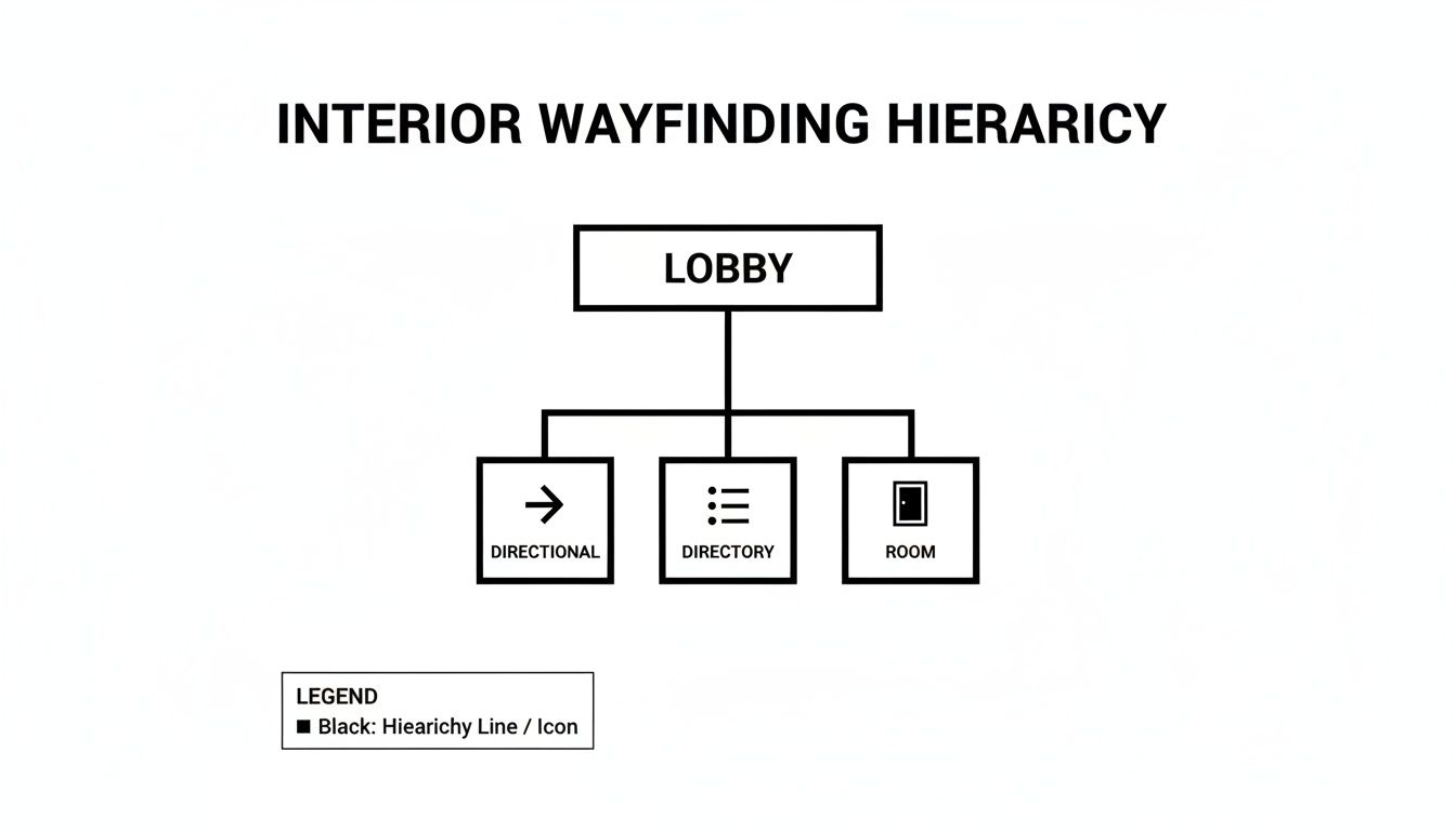
As you can see, a successful wayfinding strategy is built on a clear hierarchy. It guides people from general information in the lobby to specific room signs without confusion.
Proper Placement and Mounting Rules
Even a perfectly designed sign is worthless if it's in the wrong spot. The ADA has very strict rules for where and how high signs should be mounted to make sure they can be found and read by everyone, including patients in wheelchairs.
An accessible environment is a direct reflection of a practice's commitment to patient-centered care. When you prioritize compliance, you are telling every patient, "We see you, and we have prepared this space for you."
Here are the key mounting rules you have to follow:
- Mounting Height: The baseline of the raised characters must be between 48 inches from the floor (at its lowest) and 60 inches (at its highest). This puts the sign within a comfortable viewing and touching range for most adults.
- Mounting Location: For single doors, the sign always goes on the wall next to the latch side of the door. This simple rule prevents someone from getting hit by the door while they're trying to read the sign. If it's a set of double doors, it goes on the right side.
- Clear Floor Space: You must have an unobstructed patch of floor of at least 18 x 18 inches in front of the sign. This ensures a person in a wheelchair can get close enough to read it without bumping into furniture or other objects.
To dig deeper into the technical details, you can review these comprehensive ADA signage requirements that break down all the rules.
Essential Regulatory Signs Beyond the ADA
While ADA compliance covers your permanent room signs, it's not the only rulebook you need to follow. Other regulations demand specific notices be posted throughout your office for patient safety, privacy, and legal reasons.
Here are a few mandatory signs you can't afford to miss:
- HIPAA Notices: The law requires you to post a "Notice of Privacy Practices" in a prominent spot where patients are sure to see it.
- Biohazard Warnings: Any room where biohazardous materials are present, like a lab or disposal area, must have the universal biohazard symbol clearly displayed.
- No Smoking Signs: Depending on your state and local ordinances, you'll almost certainly need to post "No Smoking" signs at every entrance.
- Exit Signs: All exit routes and doors need to be marked with illuminated signs that meet local fire code standards.
Beyond the physical signs, the importance of digital accessibility compliance is growing, as your website and patient portal are often the first "door" a patient walks through. A full audit of your facility for all required signage is the only way to ensure you're creating a safe, transparent, and legally sound environment for your patients and staff.
Enhancing Patient Communication With Digital Signs
While traditional signs are the backbone of navigation and compliance, today’s medical practices are finding a powerful ally in digital displays. They’re transforming the patient environment from a place of stressful waiting into a space for dynamic communication.
Think of it this way: instead of a tacked-up, out-of-date poster, a patient sees a crisp screen sharing useful health tips, introducing the on-staff physicians with a friendly bio, or even showing real-time wait updates. This simple shift turns passive waiting time into an engaging experience that can dramatically lower perceived wait times and ease patient anxiety.
Strategic Applications for Digital Displays
A digital sign is more than just a fancy screen; it’s a versatile communication hub that can solve real problems in a busy medical office. When you place screens strategically in high-traffic areas like the lobby, waiting rooms, and check-out counters, you can deliver the right message to the right person at the right time.
Here are a few smart ways to put them to work:
- Dynamic Waiting Room Content: Share wellness tips, announce upcoming clinic events, or highlight new services. This keeps patients informed while subtly marketing your practice’s full range of care.
- Physician and Staff Introductions: Run short profiles or welcome videos of your medical team. It’s a great way to build a personal connection and a sense of familiarity before the appointment even begins.
- Real-Time Queue Management: Display an anonymized queue or estimated wait times. This transparency is a game-changer for managing patient expectations and frees up your front desk from constant questions.
- Interactive Check-In Kiosks: Let patients check in, update their personal information, and fill out forms electronically. It’s a huge step toward streamlining intake and boosting office efficiency.
This practical, problem-solving approach is why the technology is catching on so fast. The global healthcare digital signage market was valued at USD 7.51 billion and is expected to hit USD 8.80 billion in the coming year, showing just how seriously facilities are rethinking their patient communication.
The Return on Investment for Your Practice
Putting money into digital signage pays off in tangible ways that go far beyond just looking modern. The biggest return is in the patient experience itself, which directly fuels higher satisfaction scores and better patient retention. A calm, informed patient is almost always a happier one.
Digital signage is a powerful patient education tool. By delivering relevant health information in an engaging format, you empower patients to take a more active role in their well-being while reinforcing your practice's role as a trusted health resource.
This visual shows just how quickly the healthcare digital signage market is expected to grow over the next decade.
That steady upward trend is a clear signal that medical facilities see real value here. It confirms that investing in digital signage isn't just following a trend—it's aligning your practice with the future of patient-centered care.
On top of that, these systems deliver real operational wins. By automating check-ins and using screens to answer frequently asked questions, you free up your administrative staff to handle more complex patient needs. This cuts down on repetitive tasks, improves workflow, and can even lower your operational costs over time. If you're considering this leap, exploring different types of digital sign and LED options is the perfect next step. Ultimately, digital signage is an investment in better communication, smoother operations, and a genuinely better patient experience.
Selecting the Right Sign Materials and Design

Think of your signs as more than just directions—they're the first handshake. They quietly communicate the quality of care and professionalism patients can expect long before they meet a doctor. A thoughtfully designed sign builds trust and reinforces a patient's decision to choose your practice.
On the flip side, a sign made with cheap materials or a dated design can send the wrong message, suggesting a practice that might cut corners elsewhere. Getting this right is a crucial step in creating a patient environment that feels both cohesive and reassuring.
Matching Materials to Your Brand Identity
The material you choose for your signs instantly sets a tone. Are you a cutting-edge specialty clinic or a warm, family-focused practice? There's a material that perfectly captures that feeling, each with its own look and practical benefits.
Here are a few popular choices and the vibe they create:
- Brushed Aluminum: This choice gives off a clean, sleek, and modern feel. It’s a perfect fit for specialists like orthopedic surgeons or cosmetic practices aiming to project precision and sophistication.
- Acrylic with Standoffs: When you mount clear or frosted acrylic signs with metal standoffs, it creates a cool "floating" effect. This delivers a high-end feel that works wonders for dermatology clinics or premium medical spas.
- Engraved Wood: For a family practice or a holistic health center, engraved wood signs communicate warmth, tradition, and comfort. They just feel established and welcoming.
Your sign material is a physical extension of your brand promise. It's the first tangible piece of your practice a patient interacts with, and it should immediately feel consistent with the level of care you provide.
Essential Design Principles for Cohesion
Once you’ve landed on a material, the design is what pulls it all together. The golden rule here is consistency. A messy mix of different fonts, colors, and styles creates visual noise, undermining the professional atmosphere you're trying to build.
To keep everything looking sharp and unified, stick to these core design elements:
- Consistent Brand Palette: Stick to the one or two primary colors from your logo and website across all your signage. This kind of visual repetition is a powerhouse for building brand recognition.
- Standardized Typography: Pick one clean, easy-to-read font family and use it everywhere. You can use different weights (like bold for headings and regular for text) to create a clear hierarchy, but avoid the temptation to mix in a bunch of unrelated fonts.
- Glare-Reducing Finishes: The finish is just as critical as the material itself. Always go for a matte or non-glare finish, especially for interior signs that will be under direct lighting. This is a must for readability and is also a requirement for ADA-compliant signs.
As medical practices invest more in creating patient-friendly environments, the demand for high-quality signage is surging. In the United States, the healthcare segment of the digital signage market is growing at an 11.49% CAGR, showing just how much importance facilities are placing on every detail of the patient experience.
These simple design rules ensure your entire signage system works in harmony, guiding patients seamlessly from the parking lot all the way to the exam room. If you're ready to dive deeper, you might want to explore our detailed guide on sign board materials to see the full spectrum of options.
Common Questions About Doctor's Office Signs
Getting a new signage system for your practice can feel like a big undertaking. It's perfectly normal to have questions about everything from timelines and costs to navigating the maze of city permits. We've been there, and we've helped countless practices get it right.
To make things easier, we've pulled together the most common questions we hear from doctors and office managers. Getting straightforward answers is the best way to kick off a project that makes your practice look as professional as the care you provide.
How Long Does the Signage Process Take
It's one of the first things everyone wants to know: when will the signs be up? A full signage project, from the first sketch to the final bolt being tightened, usually takes anywhere from four to twelve weeks. The exact timing really depends on how complex the job is.
Here’s a rough breakdown of how that time is spent:
- Design & Approval (1-2 weeks): This is the creative part where we create mockups and work with you to nail down the final look.
- Permitting (2-6 weeks): This is the wildcard. Getting permits from the local municipality can be quick or it can drag on, depending entirely on their workload and processes.
- Fabrication (2-4 weeks): Once the permits are in hand, our team gets to work actually building your signs.
- Installation (1-3 days): The final step is getting the signs physically and securely installed at your office.
For instance, a simple batch of interior ADA signs could be done and dusted in about a month. But a large exterior monument sign that needs a new concrete base and electrical wiring? That’s going to be on the longer end of the scale.
What Factors Influence the Cost of Signs
Trying to budget for signs can be tricky because there's no simple price list. The final cost is a mix of a few key ingredients, and understanding them will help you make choices that fit your budget.
These are the main drivers behind the final price tag:
- Materials: Premium materials like brushed aluminum or custom acrylic are going to cost more than your standard, workhorse materials like PVC or vinyl.
- Size & Complexity: Bigger signs simply use more material and labor. The same goes for intricate designs, like detailed logos or signs with multiple layers.
- Illumination: Adding LED lighting—whether it's the soft glow of halo-lit letters or a bright, internally lit cabinet—will add to the cost but makes a world of difference for nighttime visibility.
- Permit Fees: Every city has its own fee schedule for sign permits, and this has to be factored into the budget.
- Installation Needs: A sign that requires a crane, digging for a foundation, or complex electrical work will naturally have higher installation costs than a sign that just needs to be mounted on a wall.
Think of your signage as a long-term investment in your practice's brand and the patient experience. High-quality signs not only look more professional on day one, but they also hold up better over time, saving you money on repairs and replacements down the road.
Can a Sign Company Handle the Permit Process
You bet. Trying to figure out municipal codes and permit applications is a headache most people would rather avoid. A good, full-service sign company will take that entire process off your plate, from start to finish.
This is a huge stress reliever. Your sign partner will prepare and submit all the drawings and paperwork, handle all the back-and-forth with city planners, and make sure every sign is 100% compliant with local laws. It frees you up to focus on your patients, knowing all the red tape is being handled by an expert.
A well-thought-out signage system is one of the most effective tools for boosting patient confidence and showcasing your professionalism. For a partner who can manage every detail from the initial design to the final installation, trust the experts at On Display Signs, Inc.. Get your free quote today and take the first step toward signs that truly reflect the quality of your care.


