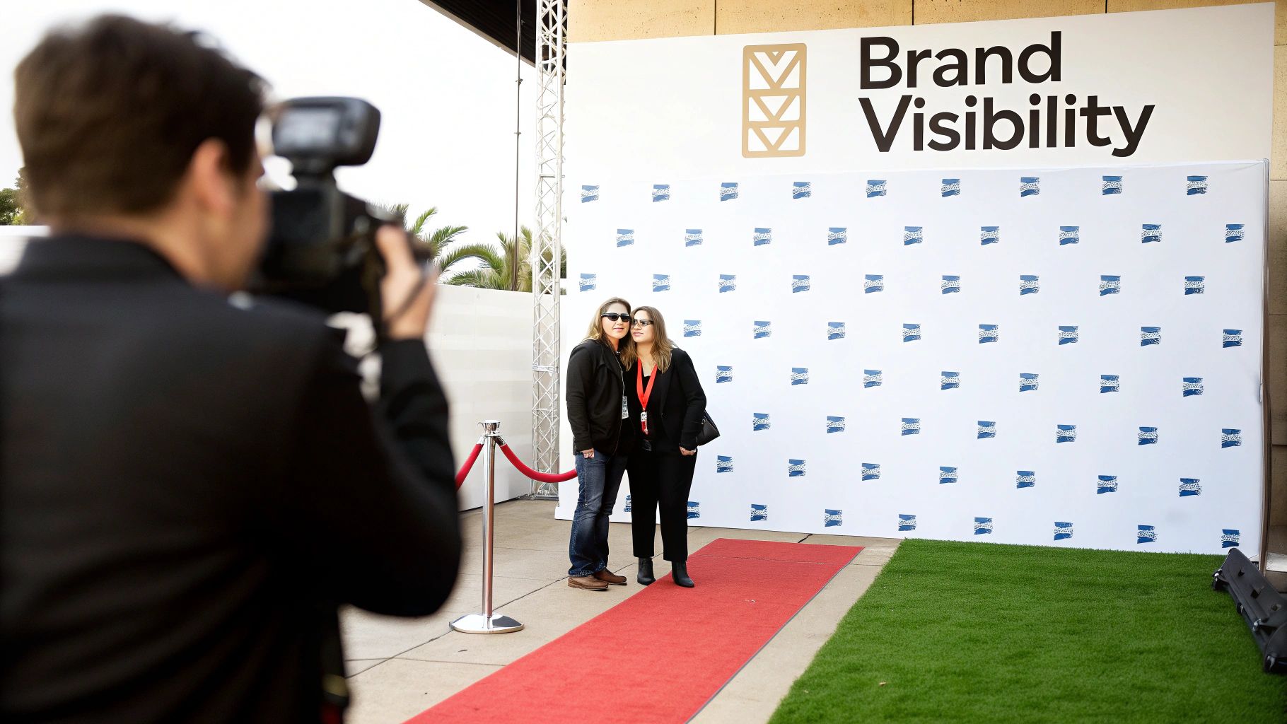
Think of a step and repeat banner as your event's silent marketing partner. It's the backdrop you see at galas, premieres, and trade shows, covered in a repeating pattern of logos. More than just decoration, it transforms every photo op into a powerful branding moment, ensuring your sponsors and your own brand get seen alongside guests and VIPs.
It’s a simple concept with a huge impact.
The Power Of Repetition: How Step And Repeat Designs Began
The idea behind a step and repeat is beautifully straightforward: turn a physical space into a recurring advertisement. By arranging logos in a consistent, repeating grid, you guarantee that no matter where someone stands for a photo, your brand will be clearly visible.
This simple act turns every snapshot shared on social media, every press photo, and every event video into organic promotion. It’s an unobtrusive yet incredibly effective way to gain exposure while keeping the focus on the people in front of the camera.
From Hollywood Glamour to Main Street Marketing
The "step and repeat" got its start in the high-glamour world of Hollywood. These banners first became a fixture on the red carpet at the Academy Awards in the late 20th century, turning celebrity arrivals into a branding bonanza for sponsors. The name itself is literal—a celebrity would "step" onto the carpet, pose, and then the next person would "repeat" the action.
By the 1990s, this format had become standard at over 80% of major award shows. What was once a tool for elite events has now become a go-to for all kinds of organizations.
Today, you’ll see them everywhere:
- Grand Openings: A real estate developer opening a new luxury apartment complex can use a step and repeat with their logo and the property's name to create a VIP feel for the launch party, generating shareable photos for social media.
- Trade Shows: A software company at a tech conference can use a branded backdrop to define its booth space, making it a professional spot for product demos and photos with potential clients.
- Corporate Functions: A business celebrating its annual awards dinner can use a step and repeat to create a formal photo area, making employees feel recognized and adding a polished look to the event.
- Community Events: A local animal shelter hosting a fundraising gala can use a backdrop featuring sponsor logos, providing valuable exposure for those who donated and elevating the look of the event.
Key Takeaway: The whole point of a step and repeat is to ensure consistent brand presence in event photos, effectively turning attendees into brand ambassadors every time a picture is shared online.
Why Repetition Works So Well
The real magic of step and repeat designs is how they tap into the power of visual repetition for brand recall. When people see logos over and over, it builds familiarity and reinforces your brand’s identity, making it a cornerstone of any smart event marketing strategy.
This is all about creating a controlled branding environment where your company’s image is presented exactly as you intend. For anyone serious about mastering branding in events, this is non-negotiable.
A good backdrop works hand-in-hand with all your other visual elements, like outdoor event signs, to create a cohesive experience. It’s a simple design concept that delivers a huge return by maximizing your exposure and making any occasion feel more professional.
Core Principles For Flawless Step And Repeat Layouts
Think of designing a step and repeat backdrop less as an art project and more as a science. The difference between a background that looks sharp and professional in every photo and one that just looks cluttered comes down to a few fundamental layout rules. Get these right, and you guarantee your logos aren't just visible, but perfectly presented.
The whole game is a balancing act between brand visibility and clean aesthetics. You need logos big enough to be clear in photos but not so huge they swallow the people standing in front of them. It's all about the interplay between size, spacing, and the pattern you choose.
Nail The Perfect Logo Size
Your first big decision is the size of the logos themselves. This is where most people go wrong. If you make them too small, they become unreadable blurs in photos. Too large, and the whole backdrop looks amateurish and distracting.
For most standard backdrops, a good sweet spot is keeping logos between 8 and 12 inches wide. This size is beefy enough to be easily identified in group shots without completely overpowering the people being photographed.
- Actionable Insight: For a standard 8×8 foot backdrop used at a trade show booth, a logo size of 9-11 inches is ideal. This ensures your logo is clearly visible in photos of two or three people.
- For a larger 10×8 or 12×8 foot backdrop: You’ve got more real estate, so you can bump the logo size up to 10-12 inches to maintain a strong visual presence across that wider canvas.
Don't forget to consider the logo's complexity. A simple, bold wordmark will read well at 10 inches, but a more intricate crest or detailed logo might need to be 12 inches to keep all its fine points from turning to mush. Always try to picture the design through a camera lens, not just on your computer screen.
Master The Art Of Spacing
Just as crucial as the logo's size is the breathing room around it, what designers call negative space. Good spacing is what keeps the design from looking like a chaotic mess and ensures every single logo stands on its own. Too little space feels frantic, while too much can look sparse and unfinished.
A solid rule of thumb is to leave a generous gap between each logo—often equal to or even a bit more than the logo's width. So, if your logos are 10 inches wide, try spacing them 10 to 15 inches apart, both horizontally and vertically. This creates that clean, organized grid that looks so polished on camera.
A well-spaced design lets the eye move naturally and keeps the focus where it belongs: on the people in the photo. The brands become a clean, supportive background. Clutter is the enemy of professional step and repeat designs.
Choose The Right Repeat Pattern
Once you've got your size and spacing locked in, the final piece of the puzzle is the repeat pattern. A simple grid is the old standby, but different patterns can create totally different vibes.
The term 'step and repeat' actually has a cool backstory, born from both Hollywood premieres and the printing tech that changed event photography in the 1980s. Photographers would have stars "step" onto the red carpet for a photo, while printers would "step" the graphic pattern across huge sheets to create a seamless look. It worked so well that by 2010, these backdrops were a staple at 90% of major red carpet events. You can learn more about the history of step and repeat banners on heritageprinting.com.
Here are the most popular patterns you'll see:
- Grid (or Full-Drop): This is the most straightforward approach. Logos are aligned in simple rows and columns. It’s classic, professional, and almost impossible to mess up. Use this when: You have multiple sponsor logos of similar size and need a clean, organized look for a corporate conference.
- Staggered (or Half-Drop): In this layout, every other row is shifted over, usually by half the width of a logo. The result is a more dynamic, brick-like pattern that feels less rigid and a bit more visually engaging. Use this when: You have a single logo to repeat. The staggered pattern fills the space more organically and is less likely to be completely obscured by someone standing in front of it.
- Checkerboard: If you're working with two main logos, alternating them in a checkerboard pattern is a fantastic solution. It gives equal visual weight to both brands, making sure neither one gets lost in the shuffle. Use this when: A charity event has one title sponsor and the charity's own logo to display. This gives both equal billing.
Ultimately, the right pattern comes down to how many logos you're featuring and the overall feel you're going for. A staggered pattern is often the best look for a single logo, while a grid can handle multiple logos with ease.
Preparing Print-Ready Artwork: Your Technical Checklist
Submitting a design file that isn't ready for production is one of the most common—and costly—mistakes people make when ordering a banner. It's the kind of thing that causes delays, surprise fees, and a final product that just looks off.
Think of your artwork file as the blueprint for the final backdrop. You wouldn't expect a builder to construct a house from a napkin sketch, and a print shop can't produce a crisp, vibrant banner from a low-resolution web graphic. Getting these technical specs right from the start is the secret to a professional result.
Vector Versus Raster: The File Format Showdown
The first decision you'll face is the file format, and for logos on a step and repeat design, this one isn't even a contest. Vector is king.
- Vector Files (AI, EPS, PDF): These are the gold standard. Built with mathematical paths instead of pixels, a vector logo can be scaled to the size of a billboard and will stay perfectly sharp. This infinite scalability is non-negotiable for large-format jobs.
- Raster Files (JPG, PNG, GIF): These are pixel-based, meaning they have a fixed resolution. Try to enlarge a small JPG to fit an 8-foot banner, and you’ll get a blurry, pixelated mess. It's the fastest way to make an otherwise professional setup look amateur.
Actionable Insight: When requesting logos from sponsors, specifically ask their marketing department for a ".AI" or ".EPS" version of their logo. If they say they only have a JPG, explain it's for large format printing and a vector file is required to ensure a high-quality result. This prevents back-and-forth and ensures you get the right file the first time.
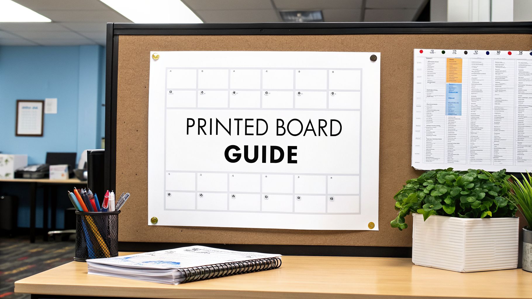
This quick visual guide breaks down the core elements you need to nail in your design file before sending it off.
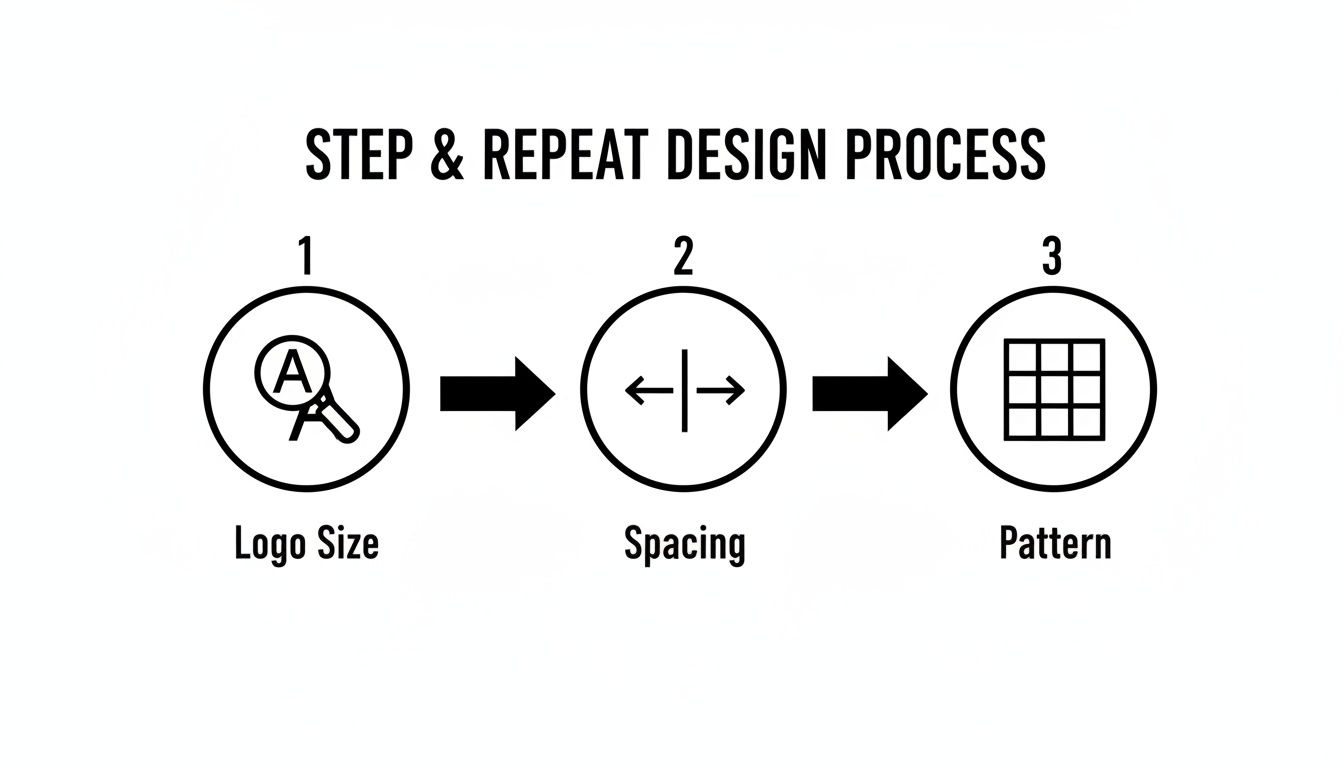
Getting the technical setup of your logo size, spacing, and pattern right is the foundation for a flawless final print.
Getting The Resolution Right With DPI
DPI, or dots per inch, is the measure of print resolution. You’ve probably heard that 300 DPI is the standard for things like brochures or magazines. For a huge banner that people will be seeing from a few feet away, that much detail is overkill—and it creates massive, clunky files.
The sweet spot for step and repeat backdrops is 150 DPI at the final print size. This gives you all the sharpness you need without slowing down the production workflow. So, if your banner is going to be 8×8 feet (that’s 96×96 inches), your file should be set up to those exact dimensions at 150 DPI.
Pro Tip: You can't fake resolution. Taking a 72 DPI web graphic and simply changing the setting to 150 DPI in Photoshop won't work. The software just stretches the existing pixels, resulting in an even blurrier image. You have to start with a high-quality source file.
Understanding Color Profiles: CMYK vs. RGB
Here’s a detail that trips up a lot of people: your computer screen and a printer see color in completely different ways. Getting this wrong can seriously mess with your brand colors.
- RGB (Red, Green, Blue): This is the color space for digital screens. It’s an "additive" model where light is combined to create color. It’s why colors on your monitor look so bright and vibrant.
- CMYK (Cyan, Magenta, Yellow, Black): This is the color space for physical printing. It’s a "subtractive" model where ink is used to absorb light on a surface.
Your final print file must be designed and saved in the CMYK color profile. If you send an RGB file, the printer's software will convert it, often leading to disappointing color shifts. Those brilliant electric blues and lime greens in RGB often turn out much duller in CMYK. To avoid surprises, design in CMYK from the beginning. You can get a deeper dive into the production side of things by exploring the basics of what is large format printing.
Don't Forget The Bleed
Last but not least, every print-ready file needs a bleed. This is simply a small extra margin of your background design that extends beyond the banner's final trim lines. For most large banners, a 0.25 to 0.5-inch bleed on all four sides is perfect.
This little buffer is a safety net. It ensures that if the banner shifts even a tiny bit during the cutting process, you won’t see any unprinted white edges. The bleed area gets trimmed off in the finishing stage, leaving you with a clean, professional, edge-to-edge graphic.
To make things easier, here's a quick checklist for your artwork files.
Artwork File Specification Checklist
| Specification | Recommended Setting | Reasoning |
|---|---|---|
| File Format | Vector (AI, EPS, PDF) | Ensures logos are infinitely scalable and remain sharp at any size. |
| Resolution | 150 DPI at full print size | Provides excellent clarity for large banners without creating overly large files. |
| Color Profile | CMYK | Matches the color language of commercial printers, preventing unexpected color shifts. |
| Bleed | 0.25" to 0.5" on all sides | Creates a margin of error for trimming, ensuring a clean edge-to-edge final product. |
Following these specs is the surest way to get your file approved on the first try and receive a final banner that looks exactly like you envisioned.
Choosing The Right Materials And Finishing Options
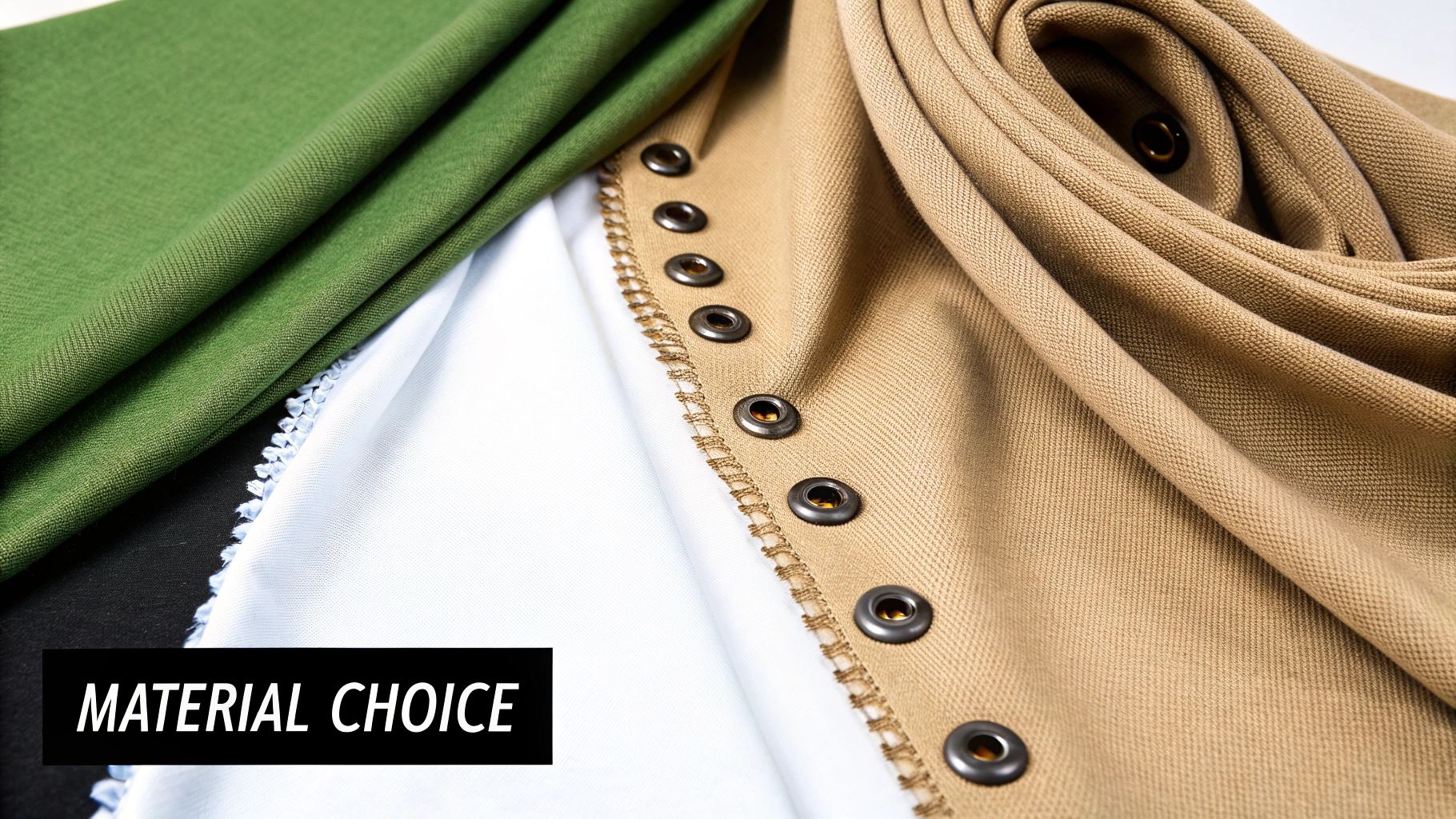
Once you've nailed down the artwork, it’s time to decide what your backdrop will actually be made of. This isn’t just a minor detail—the material you choose directly impacts how your banner looks in photos, how long it will last, and how much of a headache it is to set up. Think of it as a practical choice that balances looks, durability, and convenience.
Picking the right material for your step and repeat designs is like picking the right tool for the job. You wouldn't use a sledgehammer to hang a picture frame. A heavy-duty material is perfect for a permanent installation but a total nightmare for a team that has to fly to three different trade shows in a month.
Matte Vinyl: The Workhorse Material
For a lot of jobs, matte vinyl is the go-to choice, and for good reason. It’s tough, it’s budget-friendly, and it makes graphics look incredibly sharp and vibrant. The real magic, though, is its matte finish, which is engineered to soak up light and kill the harsh glare you get from camera flashes.
But there are tradeoffs. Vinyl is heavy, which can make it a pain to transport and set up by yourself. It’s also notorious for creasing if you don't roll and store it perfectly. That makes it a solid pick for a one-off event or a semi-permanent display, like inside a retail store, where it's not being packed up and shipped around constantly.
Fabric: The Premium And Portable Option
If you're aiming for a high-end, professional look, fabric is hands-down the better choice. Polyester-based materials have a soft, elegant finish that looks fantastic and completely eliminates any chance of glare. Plus, they’re way lighter than vinyl, which is a massive win for anyone who has to haul their display across the country for events.
Fabric backdrops are also more forgiving. Most tension fabric stands pull the material so taut that any small wrinkles from shipping just disappear. The only real downside is that fabric usually costs more upfront and you have to be more careful to keep it clean. For a national company shipping its setup to different trade shows, a lightweight fabric banner is almost always the right call.
Choosing the right material is all about your priorities. Matte vinyl gives you durability and a great price point, while fabric delivers a premium, glare-free look and maximum portability. Just ask yourself: is this for a single local event or a traveling roadshow?
Essential Finishing Touches
"Finishing" is just a shop term for how the edges of the banner are prepped for display. Don't overlook these details—they’re what makes the difference between a clean, professional installation and a saggy, unprofessional mess. Get this wrong, and you might not even be able to mount your banner properly.
The physical construction of your banner matters just as much as the printed design; it’s a concept that applies across industries, which is why you see articles about the importance of selecting appropriate materials for all kinds of projects.
Here are the most common ways we finish a banner:
- Pole Pockets: These are just loops of material sewn into the top and bottom. The poles from the stand slide right through, pulling the banner tight and flat. This is the standard for almost every adjustable banner stand out there.
- Sewn Hems: This means we fold the edges of the banner over and stitch them down. Hemming reinforces the sides to stop fraying and tearing, which really extends the life of the banner, especially for vinyl.
- Grommets: These are the little metal rings we punch along the banner’s edges. They give you strong anchor points for hanging the backdrop with rope or hooks, which comes in handy if you're mounting it directly to a wall or a custom-built frame.
It’s also worth noting that sustainability is becoming a bigger deal. By 2025, it's expected that 45% of productions will use sustainable fabrics, cutting waste by 30%. And because a good quality banner can withstand 50+ uses, it can slash costs by 70% for companies that do a lot of repeat events.
For displays that need to be more rigid and don't use a traditional banner stand, some businesses go with different substrates entirely. For a deeper dive into those options, check out our article explaining what is foam core board. At the end of the day, your choice should line up with your budget, the type of event, and how you plan to use the banner in the future.
Sizing Templates And Installation Best Practices
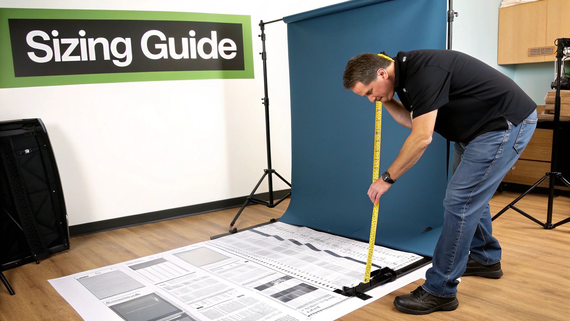
A brilliant design is only half the battle. To really make an impact, your step and repeat backdrop has to be the right size for your space and installed perfectly. These final touches are what separate a professional, photo-ready display from one that just looks wrinkled, poorly lit, or out of place.
Picking the right dimensions is your first big decision. We've all seen pictures where the branding gets awkwardly cut off because the backdrop was too small for the group. On the flip side, a banner that's way too big can completely overwhelm a smaller venue.
Choosing The Right Banner Size
Think of your banner size as being directly tied to how many people you expect to photograph in front of it at once. A common mistake is just ordering a "standard" size without thinking through the actual needs of the event.
To help you get it right, we've put together a quick guide based on the most common sizes we produce.
Common Step and Repeat Banner Sizes and Uses
| Banner Size (Width x Height) | Ideal for (Number of People) | Common Use Cases |
|---|---|---|
| 8 ft x 8 ft | 2-3 people | Small gatherings, trade show booths, standard red carpet entrances |
| 10 ft x 8 ft | 4-5 people | Corporate events, award ceremonies, small team photos |
| 12 ft x 8 ft | 6-7+ people | Large group shots, department photos, championship team pictures |
Ultimately, the goal is to frame your subjects with your branding, not have them spilling out beyond the edges of the backdrop. When in doubt, it's often better to go slightly wider.
Best Practices For A Flawless Installation
A sloppy installation can ruin even the most well-designed banner. Wrinkles, sagging, and bad lighting are the enemies of a great photo op. You need a smooth, taut banner so every logo is flat and crystal clear in the pictures.
Start by assembling the stand on a flat, level surface. Carefully slide the horizontal poles through the banner's pole pockets before attaching them to the vertical supports. This is the key step to creating the tension that pulls the material tight and gets rid of any creases.
Lighting is just as critical. Try to position your backdrop away from harsh overhead lights, which can create unflattering shadows on people's faces. If you can, use two soft light sources placed at 45-degree angles to the banner. This gives you even illumination and kills the camera flash glare you often see on vinyl materials.
For bigger or more complicated setups, bringing in a pro ensures a perfect result every time. You can learn more about what an expert touch provides by checking out options for commercial sign installation to guarantee a flawless finish.
The Final Proof Is Non-Negotiable
Before that file gets sent to print, one final proof is absolutely essential. This is your last chance to catch any mistakes that will be expensive and embarrassing to fix later. A single misspelled sponsor name or an old logo can reflect poorly on your entire organization.
Triple-check every single logo, name, and graphic element against your original files. Confirm the colors are right and that the overall layout feels balanced. Here at On Display Signs, we make this a mandatory part of our process so what you approve is exactly what you get.
Frequently Asked Questions About Step And Repeat Designs
Diving into the world of large-format printing for the first time always brings up a few questions. Getting straight answers is the key to making sure your step and repeat backdrop looks exactly how you pictured it. Here, we'll tackle the most common questions we hear, giving you the practical insights needed to order with total confidence.
Think of this as your final pre-flight check before sending a project to print. These are the details that separate a smooth process from a stressful one.
How Much Lead Time Do I Need To Order A Banner?
This is probably the most critical question we get. You should plan for at least one to two weeks of lead time before your event date. That window gives everyone enough breathing room for the whole process: finalizing the design, getting proofs approved, printing, finishing, and shipping.
Trying to rush it is a recipe for trouble. It’s where mistakes happen, material choices become limited, and you end up paying a fortune for expedited shipping. Planning ahead means you get to review everything properly and your banner arrives without any last-minute panic.
What Is The Most Common Mistake People Make When Designing?
Hands down, the single biggest mistake is grabbing a low-resolution logo off a website. A JPG or PNG file might look sharp on your screen, but when you blow it up to fit an 8-foot-tall banner, it turns into a blurry, pixelated mess. It immediately screams unprofessional.
Key Takeaway: You absolutely must provide logos in a vector format. That means an AI, EPS, or vector-based PDF file. Vector graphics are made of mathematical paths, not pixels, so they can be scaled to the size of a building without losing an ounce of quality. For a crisp print, this is non-negotiable.
Another classic slip-up is designing in the wrong color space. If your file is in RGB (for screens), the colors will shift—sometimes dramatically—when it's converted to CMYK for printing.
Can I Use Multiple Logos On My Backdrop?
Of course. Using multiple sponsor logos is completely standard for events. The trick is to create a balanced design that gives every logo equal importance and visual weight.
A few tips for juggling multiple logos:
- Checkerboard Pattern: Got two main sponsors? Alternating their logos in a simple checkerboard grid is a classic for a reason—it works perfectly.
- Grid Layout: For three or more logos, a clean grid or a staggered "brick" pattern keeps the layout from feeling chaotic and cluttered.
- Consistent Sizing: Pay attention to visual balance. A square logo and a long, horizontal one won't have the same dimensions, but you need to scale them so they feel like the same size next to each other.
Juggling multiple sponsors, collecting logos, and hitting deadlines can get complicated. For bigger projects, understanding the value of dedicated signage project management can be a lifesaver.
Is A Fabric Or Vinyl Banner Better?
The honest answer? It completely depends on your event. Neither material is inherently "better"—they just serve different purposes.
Choose Matte Vinyl if:
- You're using it for a one-off event, like a grand opening, or it will be installed somewhere for a while.
- The budget is tight. Vinyl is generally the more wallet-friendly option.
- You need something super durable with colors that really pop.
Choose Fabric if:
- You'll be traveling with it to multiple trade shows or events. It's lightweight and easy to transport.
- There will be a lot of flash photography. Fabric is completely non-glare.
- You're going for a more high-end, premium feel. The soft finish just looks elegant.
A company hitting the national trade show circuit should go with fabric every time. A local restaurant celebrating its anniversary will be perfectly happy with a quality matte vinyl banner.
How Do I Care For And Store My Banner?
If you want your banner to last for years, how you store it is everything. For vinyl, the golden rule is to always roll, never fold. Folding creates permanent creases and can cause the ink to flake off or transfer. Roll it up tightly around a cardboard tube with the printed side facing out.
Fabric backdrops are much more forgiving. You can usually fold them up, and any slight wrinkles tend to fall right out once you stretch the banner onto its frame. For both types, keep them stored in a cool, dry place out of direct sunlight to keep the colors from fading.
Ready to create a professional backdrop that makes your brand the star of the show? The team at On Display Signs, Inc. is here to guide you through every step, from design specs to final installation.


