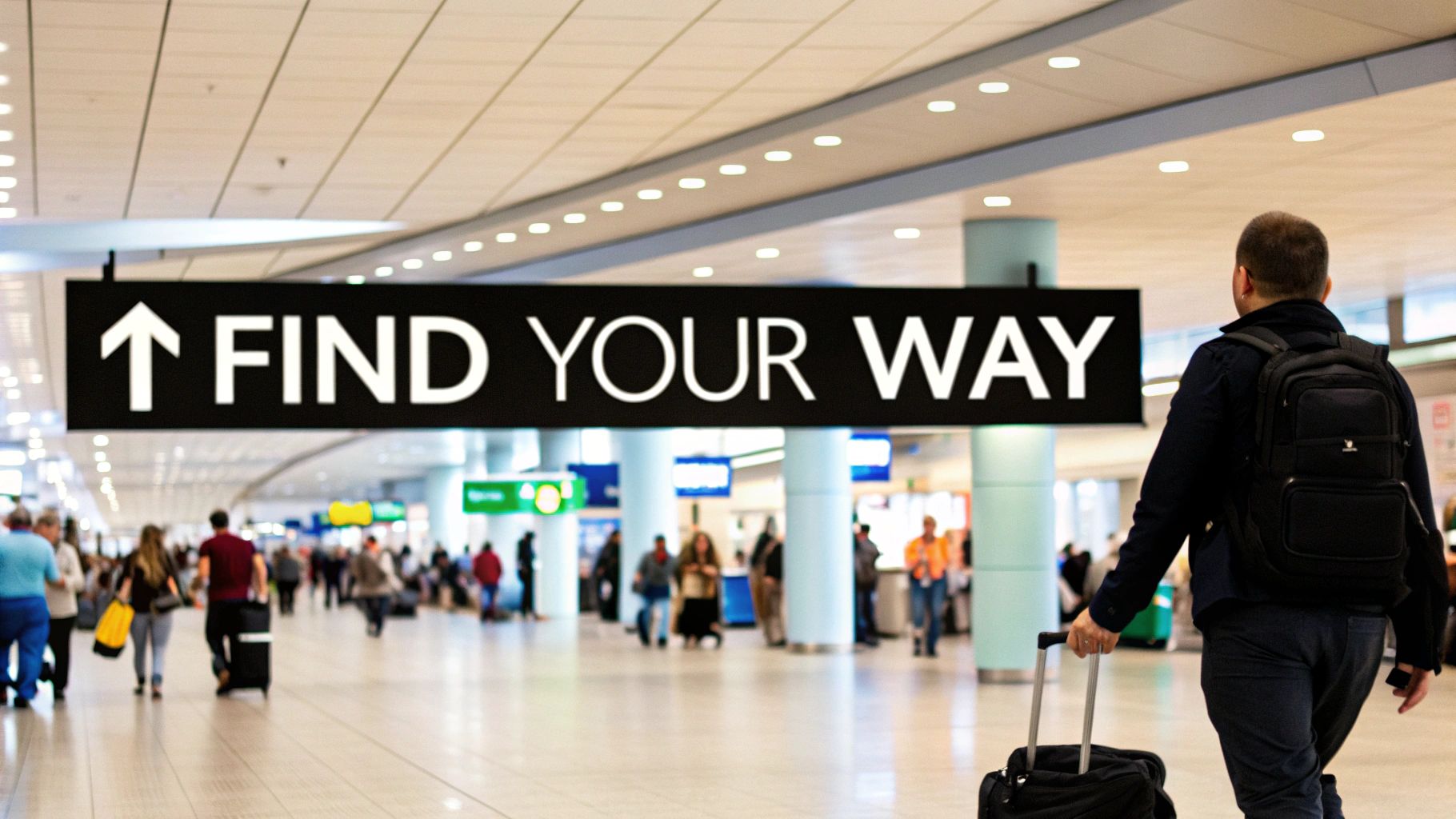
Think of wayfinding signage as the unsung hero of any physical space. It's the silent guide that helps you move through a confusing airport or a massive hospital with confidence.
More than just a few signs on a wall, it’s a complete system of maps, directories, and visual cues working together. It’s the building’s built-in GPS, giving you a clear path from A to B.
What Is Wayfinding Signage and Why It Matters

Imagine showing up to a sprawling corporate campus for a big meeting. Without clear directions, you're instantly stressed, lost, and late before you even walk in the door. The right wayfinding strategy stops this from ever happening. It provides clear, consistent information at every turn, ensuring a smooth journey from the parking garage to the boardroom. A practical insight here is that good wayfinding directly reduces visitor anxiety, which improves their overall impression of your business.
It’s not just about pointing people in the right direction; it’s a thoughtfully designed experience. A good system answers four key questions for any visitor, almost without them realizing it:
- Where am I? (Orientation)
- Where am I going? (Destination)
- How do I get there? (Route)
- Am I here yet? (Confirmation)
When the answers are obvious, people move through complex environments without the mental gymnastics. This doesn't just improve the visitor experience; it also smooths out foot traffic and creates a real sense of safety and security.
The Foundation of an Efficient Space
A smart wayfinding system is a non-negotiable in the modern world, especially as spaces become larger and more complex. It's now a core part of the infrastructure for everything from shopping centers and hospitals to corporate offices.
At its heart, wayfinding is about making a space intuitive. Below is a quick look at the core goals of any effective system.
Table: Core Functions of Wayfinding Signage
A quick look at the primary goals and outcomes of an effective wayfinding signage system.
| Function | Objective | Real-World Example |
|---|---|---|
| Orientation | Help people understand their current location within the larger space. | A "You Are Here" map in a mall lobby. |
| Direction | Guide people along a specific path toward their destination. | Overhead signs pointing toward different airport terminals or gates. |
| Identification | Clearly label destinations so people know they have arrived. | A sign with a room number and name outside a conference room. |
| Information | Provide essential context or rules about the space. | A sign listing the opening hours or safety regulations at a park entrance. |
When these functions work together seamlessly, the system becomes almost invisible.
The best wayfinding systems feel like they aren't even there. People should be able to get where they’re going without having to consciously think about it, letting them focus on the real reason for their visit.
This effortless guidance is absolutely critical in large facilities. For example, well-placed signage for commercial buildings is one of the most important tools for managing visitor flow and boosting the efficiency of the entire property. From simple directional arrows to interactive digital directories, every single piece plays a part in creating a welcoming and functional environment.
The Four Core Types of Wayfinding Signs
A strong wayfinding system is never about a single sign. It’s a team effort, a family of four distinct sign types working in perfect harmony to create a journey that just makes sense. Each type has a specific job, answering a visitor's silent questions right when they need them answered.
Think of it like a toolkit. You don’t use a wrench to hammer a nail. In the same way, you wouldn't use a sign that confirms a location (Identification) to give someone turn-by-turn directions (Directional). Getting to know these four players is the first step in building a system that feels genuinely helpful, not confusing.
Identification Signs: The Destination Markers
The simplest, and arguably most important, is the identification sign. Its only mission is to give visitors that satisfying feeling of arrival. It's the final confirmation, the "you made it" moment that erases any doubt.
You see these everywhere, often without thinking about them:
- The classic "Room 204" plaque on an office door.
- A clean, clear sign for the "Cardiology Department" above a hospital wing.
- The universally understood symbols for restrooms.
These signs act like little landmarks, helping people get their bearings and confidently confirm they’re in the right spot.
Directional Signs: The Navigational Guides
While identification signs are the finish line, directional signs are the guides that get you there. They’re the workhorses of wayfinding, strategically placed at every decision point—lobbies, hallway intersections, elevator banks—to point people down the right path.
Directional signs are the active guides in your system. Their job is to keep people moving forward with confidence, using simple arrows and clear text to eliminate confusion and hesitation.
These are the signs that say "Radiology" with an arrow pointing left and "Patient Registration" with one pointing right. They do the heavy lifting, ensuring a smooth flow from one point to another.
Informational Signs: The Big Picture
Informational signs give people the lay of the land. They provide that high-level context, answering the bigger questions so visitors can plan their next move and understand the space as a whole.
You’ll usually find these at main entrances. Think of the big "You Are Here" mall directory map or a digital kiosk in a lobby that lists all company departments by floor. They provide the essential overview that makes the directional signs far more effective. While many are inside, you can explore the various types of outdoor business signs that serve a similar big-picture purpose.
Regulatory Signs: The Rule Setters
Last but not least are the regulatory signs. Their job isn't so much about navigation as it is about safety and compliance. These signs lay down the law, communicating rules and restrictions that must be followed. They have to be instantly understood and impossible to ignore.
Common examples are impossible to miss:
- Bold "Fire Exit" signs.
- Authoritative "No Entry – Authorized Personnel Only" notices.
- Bright yellow "Wet Floor" signs that prevent accidents.
These signs are non-negotiable. Together, these four sign types create a complete, intuitive conversation with every person who enters your space—guiding, informing, and keeping them safe.
The Psychology of Effective Signage Design
Wayfinding signs are about so much more than pointing people from A to B. They’re a deep dive into human psychology. When someone walks into an unfamiliar building, their brain is on high alert, trying to make sense of everything at once. A great signage system eases that mental load, making the journey feel natural instead of stressful.
The secret sauce is consistency. When the fonts, colors, icons, and sign locations all follow a predictable pattern, people quickly learn the "visual language" of the space. This builds an immediate sense of trust and lets them navigate confidently without second-guessing every turn they make.
Guiding the Eye with Visual Hierarchy
Another core idea is visual hierarchy. This is really just the art of making the most important information impossible to miss. A big directional arrow or a department name should be the first thing a person’s eye is drawn to. Designers pull this off by using larger text, bolder colors, or smart placement to make sure critical info gets seen first.
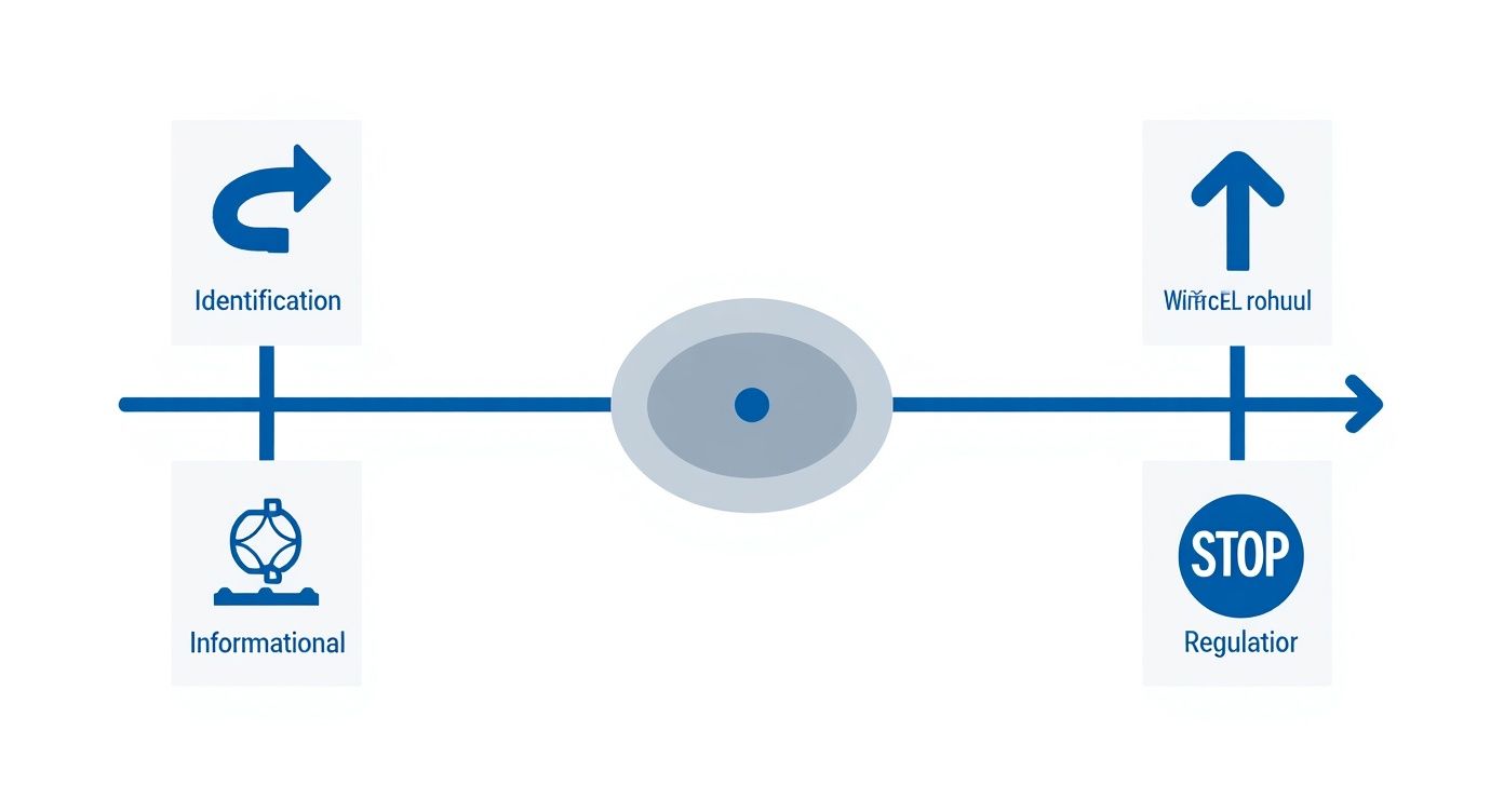
This infographic breaks down how different types of signs work together to create a complete system.
Each of these sign types—Identification, Directional, Informational, and Regulatory—plays its own part in a person's journey, answering different questions at just the right time.
But even the best-designed sign is useless if it's in the wrong spot. That’s why strategic placement is everything. Signs deliver the most value when they're placed at key decision points, like hallway intersections, lobbies, or right before a bank of elevators. These are the natural moments when people pause and look for help, making your sign feel perfectly timed.
The ultimate goal is to make navigation almost subconscious. A successful wayfinding system anticipates a person's questions and provides clear, simple answers right where they expect to find them.
Of course, the physical quality of the signs matters, too. For instance, optimizing large format printing resolution ensures that text is crisp and legible from a distance, while choosing the right fonts for metal signs can make or break readability. When you combine strong psychological principles with high-quality production, you create a system that doesn't just look good—it truly works.
Exploring Wayfinding Systems in the Real World
This is where the theory behind wayfinding really comes to life—out in the real world, solving actual problems. While every environment has its own unique challenges, the goal is always the same: give people a clear, stress-free path to follow.
Let's look at a modern hospital, where the stakes couldn't be higher. Patients and their families are often walking in under a heavy cloud of stress, which makes even simple directions feel overwhelming. Good wayfinding here isn't a luxury; it's a critical part of the patient experience.
Hospitals use a layered approach to cut through the anxiety and confusion. You’ll often see color-coded lines painted right on the floor—a blue line guides you to Cardiology, while a yellow one leads to the Emergency Room. This is combined with large, easy-to-read departmental signs and a logical room numbering system, giving visitors the confidence to get from the front door to their destination. This is a powerful practical example because it shows how different wayfinding elements can be combined for a more robust system.
Navigating Large Public Spaces
Sprawling university campuses and massive corporate headquarters face a similar problem, just on a grander scale. A huge campus can feel like a maze to a new student or first-time visitor. To fix this, they create a kind of navigational net using a mix of different sign types.
You’ll find large directories and "You Are Here" maps at main entrances and key intersections, acting as central information hubs. From those points, directional posts point the way to specific buildings, while identification signs clearly label each facility. This system breaks a long, intimidating journey into a series of smaller, manageable steps.
The best wayfinding systems make a complicated space feel simple. They work by giving you the right information at exactly the right time, empowering you to find your own way and turning a confusing environment into a welcoming one.
This same logic is essential for keeping massive distribution centers safe and efficient. The silent language of painted lines on the floor is what keeps forklift and foot traffic moving smoothly. You can learn more about creating these crucial pathways in our guide to warehouse floor marking guidelines.
Even recreational areas rely on these principles. Think about how effective RV campground guide books are at helping visitors navigate huge, unfamiliar outdoor spaces. From a high-tech digital directory in a corporate lobby to a simple painted trail marker, the mission is always to make the journey seamless.
Wayfinding Applications Across Different Sectors
Wayfinding isn't a one-size-fits-all solution. The specific goal changes depending on the environment, which in turn dictates the types of signs that will work best. Below is a quick comparison of how different sectors put wayfinding to work. This table provides actionable insights into how you can tailor a wayfinding strategy for a specific industry.
| Sector | Primary Navigational Goal | Common Signage Solutions |
|---|---|---|
| Healthcare | Reduce patient stress and ensure timely arrivals for appointments. | Color-coded floor lines, overhead departmental signs, room numbering. |
| Education | Help students, staff, and visitors navigate large, multi-building campuses. | Campus maps, building directories, directional posts, building identifiers. |
| Corporate | Guide visitors and employees efficiently through office buildings or campuses. | Digital directories, floor-level signs, meeting room identifiers. |
| Retail | Enhance customer experience by guiding shoppers to products and amenities. | Aisle markers, overhead category signs, departmental signage. |
| Transportation | Direct high volumes of travelers through complex terminals and stations. | Large-scale directional signs, gate/platform numbers, digital schedules. |
| Warehousing | Maximize safety and operational efficiency by managing traffic flow. | Floor marking tape, safety signs, aisle and rack labels, dock signs. |
As you can see, whether the priority is reducing anxiety in a hospital or improving efficiency in a warehouse, the core strategy remains the same: use clear visual cues to guide people from point A to point B with confidence.
How Ancient Navigation Shapes Modern Wayfinding
The need to get from point A to point B without getting lost is as old as civilization itself. While our sleek digital maps and interactive kiosks feel light-years away from ancient navigation, they’re really just a high-tech solution to the same timeless problem. The core challenge has never changed: how do you guide someone with clarity and confidence?
Looking back shows us that great wayfinding has always been about creating a predictable, easy-to-follow system for travelers. The tools have just gotten a lot better.
The Original Wayfinding System
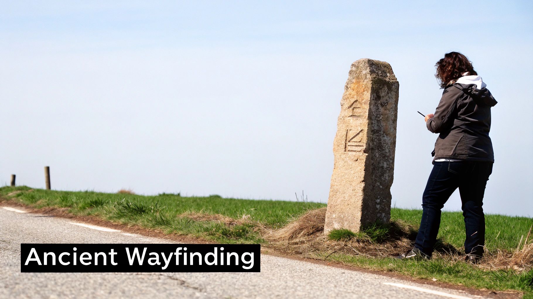
Long before GPS, the ancient Romans were the undisputed masters of this concept. They created what was essentially the world's first large-scale wayfinding system: a massive network of stone pillars known as "Milestones." These weren't just random markers; they provided critical distance and directional info to soldiers, merchants, and citizens across a sprawling empire.
These milestones were the original roadside signs. In fact, wayfinding signage has roots stretching back thousands of years, with the Romans credited for creating the first truly organized system around 2,000 years ago. Their seven-foot-high Milestones gave vital guidance to anyone traveling the extensive Roman road network. You can dig deeper into the history of wayfinding to see how these methods evolved.
Today’s sophisticated what is wayfinding signage systems are simply a modern answer to an ancient question. The fundamental principles established by the Romans—clarity, consistency, and strategic placement—remain the bedrock of effective navigation design.
This connection makes it clear. From stone pillars to digital screens, the goal has always been to make the journey simple.
Common Questions About Wayfinding Signage
As we've dug into the world of wayfinding, a few key questions always seem to pop up. This final section is all about tackling those common points head-on, giving you straightforward answers to help you see how these systems get planned, designed, and put into action.
Think of this as a quick-reference guide to clear up the essential ideas that make or break a wayfinding system. These answers should solidify your grasp on what is wayfinding signage and how it really works in the wild.
What Is the Difference Between Signage and Wayfinding?
This is easily the most common point of confusion, but the answer is simple. Think of it this way: signage is a tool, while wayfinding is the strategy.
A single sign—like a room number or a "Restrooms" plaque—is just one piece of the puzzle. Wayfinding is the entire, thought-out system that uses all those individual signs, plus maps, colors, and even architectural cues, to guide a person from start to finish. A sign is just a sentence; wayfinding is the whole story.
How Do You Start Creating a Wayfinding System?
A great system always starts with people. The first step isn't about signs at all—it's about watching how people naturally move through a space. You have to identify the key "decision points" where they're most likely to feel lost or need a hint, like lobbies, hallway intersections, or elevator banks.
From there, you build a consistent visual language. This means choosing a clear set of:
- Colors to link with different wings or departments.
- Fonts that are easy to read from a distance.
- Icons and Symbols that everyone can understand instantly.
It's a smart blend of strategic thinking and design that puts the user first.
Are Digital Signs Better Than Static Signs?
It's not about one being "better" than the other—they just have different jobs to do. Digital signs offer incredible flexibility, which makes them perfect for places where information is constantly changing. Think airport gate updates or the daily meeting schedule in a hotel conference center. They give you real-time info and can even be interactive.
On the flip side, static signs provide unmatched reliability and clarity for information that never changes. Fire exit signs, room numbers, and ADA-compliant signs need to be there, all the time, no questions asked. The best systems almost always use a hybrid approach, combining the dynamic power of digital with the rock-solid dependability of static signs.
The most important principle in any wayfinding design is consistency. When colors, fonts, and symbols remain the same throughout a space, the system becomes predictable and easy to learn, reducing stress and building visitor confidence.
Finally, a crucial part of the process is navigating the local rules. Before you put up any major signs, inside or out, you have to understand the local sign permit requirements to make sure everything is compliant.
At On Display Signs, Inc., we specialize in creating intuitive and effective wayfinding systems that guide your visitors and enhance your brand. From initial design to final installation, our team manages the entire process to deliver a seamless experience. https://www.ondisplaysigns.com


