Trying to make sense of ADA signage rules can feel like you're untangling a giant knot, but the core idea is actually pretty simple: make your space accessible and navigable for everyone. The whole point of these regulations is to ensure that permanent rooms and spaces—think restrooms, stairwells, and offices—are easy to identify for people with visual impairments using features like tactile lettering and Grade 2 Braille.
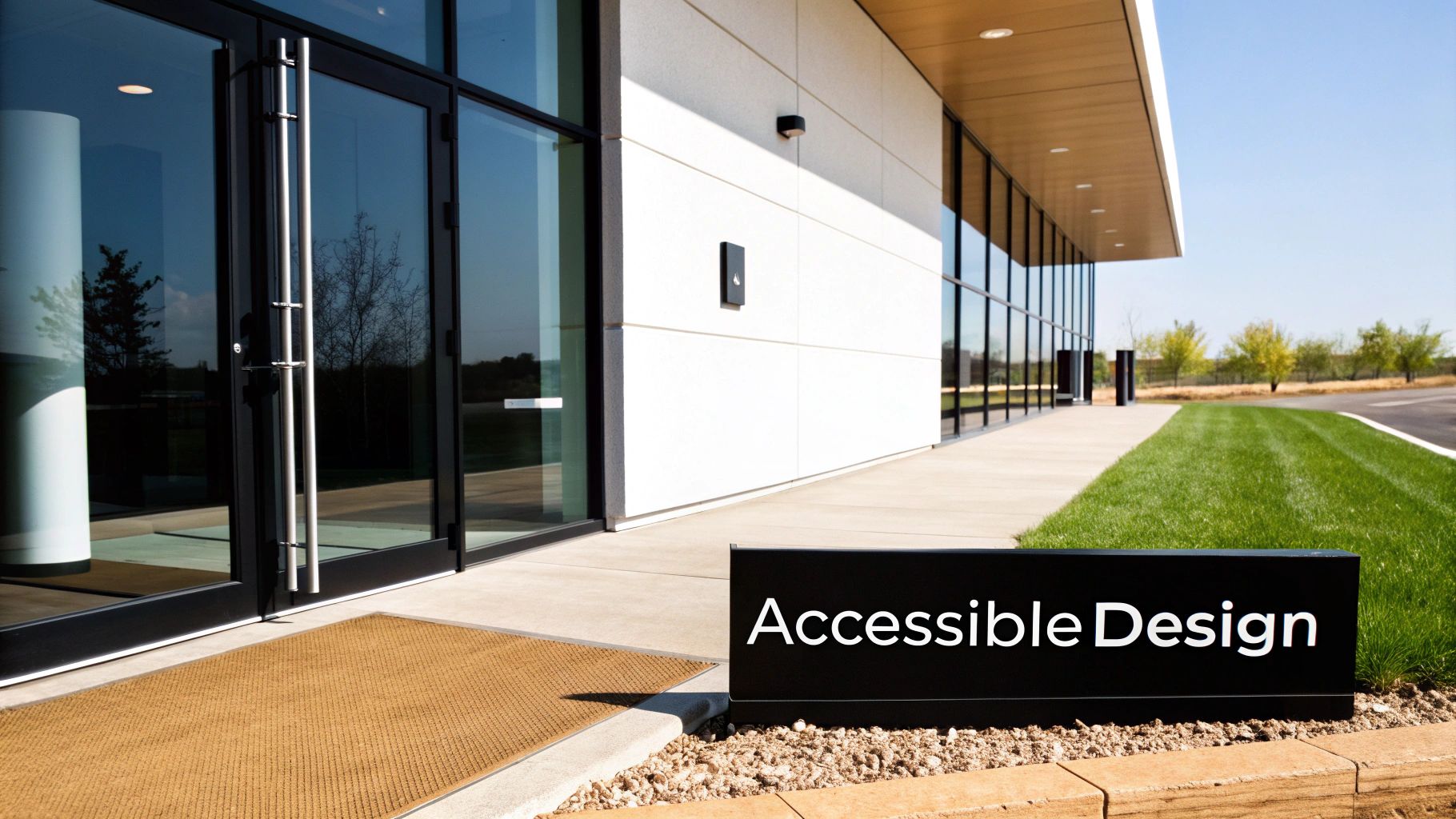
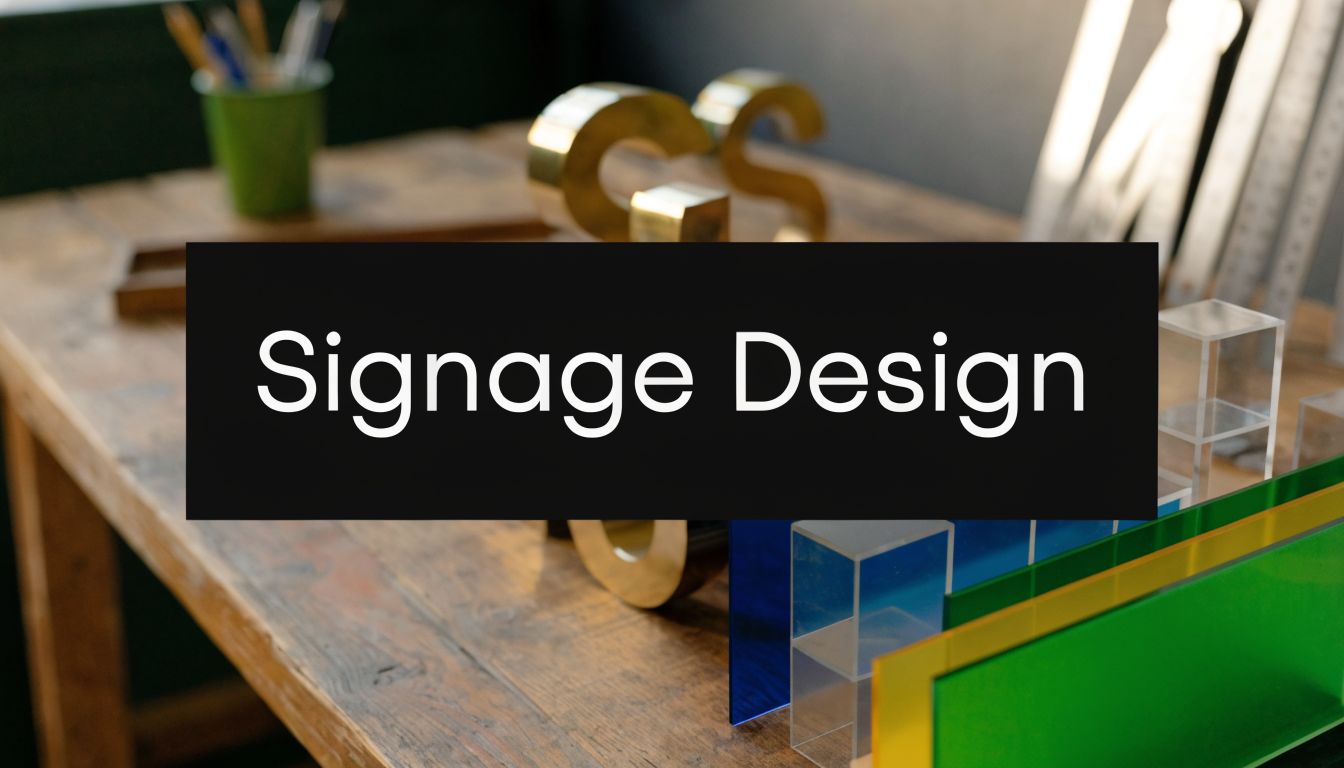
What ADA Signage Requirements Actually Mean for Your Business
Stop thinking of ADA requirements as a restrictive checklist. Instead, see them as a practical blueprint for creating a welcoming and accessible environment. These rules are designed to give individuals with disabilities the same effortless navigation that others take for granted.
By making key locations identifiable by both touch and sight, you empower every customer, visitor, and employee to move through your building with confidence and dignity.
It all boils down to a few foundational concepts:
- Tactile Lettering: Characters on the sign are physically raised so they can be read by touch. For example, the sign for "ROOM 101" must have the letters and numbers raised from the surface.
- Grade 2 Braille: This is a shorthand, contracted version of Braille that's the universal standard for public signage.
- Visual Contrast: The color of the letters and symbols must stand out clearly from the sign’s background, making it easier to read for people with low vision. A practical example is using bold white text on a black background.
The Purpose Behind The Rules
At its heart, the goal of these regulations is to remove barriers. When a sign identifies a permanent space like a restroom or a mechanical room, its message has to get across to everyone, period. This is why the rules get so specific, demanding things like non-glare finishes and simple sans-serif fonts—small details that make a huge difference in legibility for all.
Under the Americans with Disabilities Act (ADA), businesses are required to install compliant tactile signs for permanent spaces like toilet rooms and exit stairways. Ignoring this isn't an option. There were over 11,000 ADA Title III lawsuits filed in 2023 alone, and fines can hit $75,000 for just a first violation.
Think of it this way: just as a ramp provides physical access for a wheelchair user, a tactile sign provides navigational access for a visually impaired person. Both are essential for a truly accessible space.
Successfully navigating these rules also means understanding that local codes can add another layer of requirements. Getting a clear picture of the full sign permit requirements in your area is always a smart first step before you order anything.
And while you're focused on getting your physical building right, remember that accessibility extends to your digital front door, too. It's a good idea to dig into ADA website compliance requirements to ensure you’re creating a seamless experience for every single customer, both online and off.
Quick ADA Signage Compliance Checklist
To help you get started, here’s a quick-reference table that breaks down some of the most critical ADA signage elements you’ll need to get right. Think of this as your starting point for a compliance check.
| Requirement | Key Specification | Practical Example |
|---|---|---|
| Tactile Characters | Raised 1/32"; uppercase; sans-serif font | Room numbers, restrooms, exit signs |
| Grade 2 Braille | Must be located directly below the tactile text | Required on all permanent room signs |
| Mounting Height | 48" minimum from floor to baseline; 60" maximum | Wall adjacent to the latch side of the door |
| Clear Floor Space | 18" x 18" minimum clear space in front of the sign | Centered on the sign, free of trash cans or furniture |
| Visual Contrast | At least 70% contrast between characters and background | All signs, both tactile and visual-only |
| Finish | Non-glare or matte finish to reduce reflections | All ADA-compliant signs |
This checklist covers the big-ticket items, but remember that specific applications can have their own unique rules. It's always best to work with an expert to ensure every detail is spot-on.
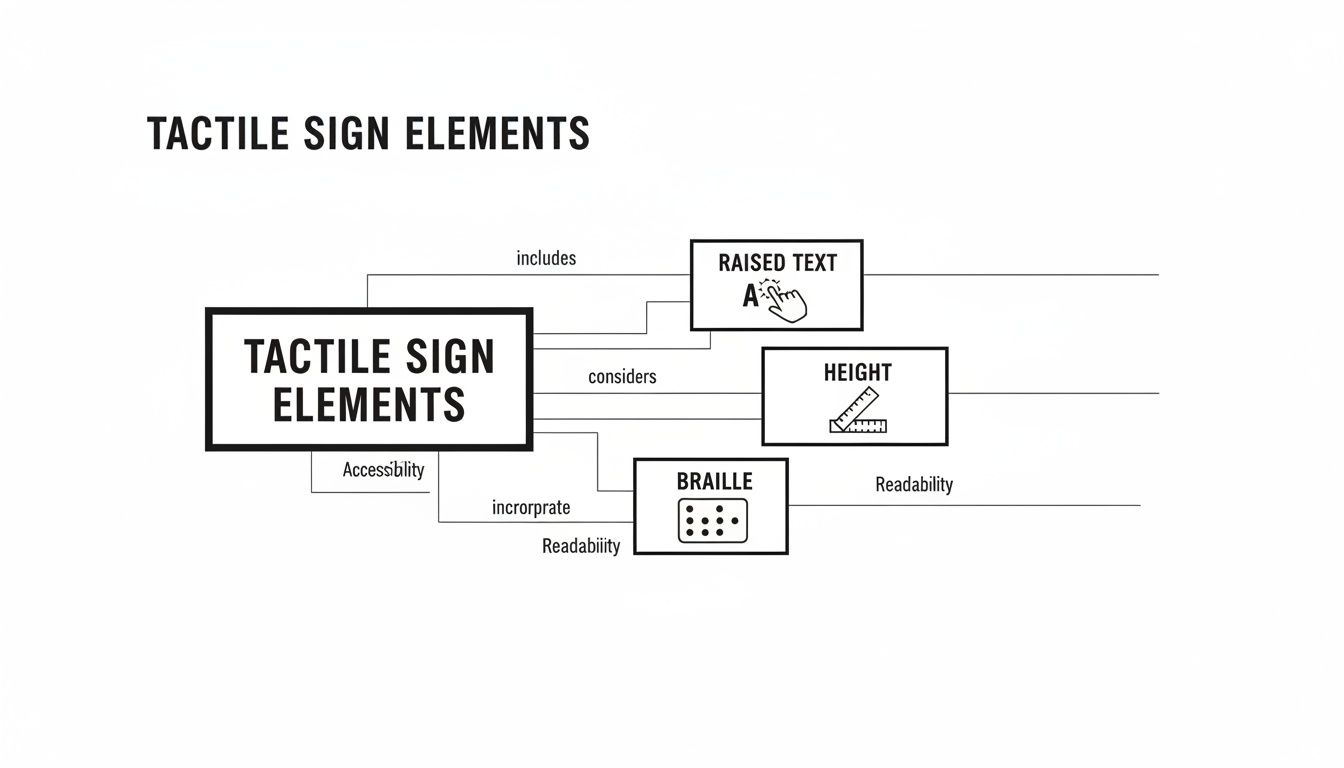
Decoding Tactile Text and Braille Specifications
To get ADA signage right, you have to think beyond what people see and focus on what they can feel. This isn't just about sticking some text on a sign; it's about creating a tactile experience that delivers information clearly and reliably. The two pillars of this experience are raised characters and Grade 2 Braille, and each comes with its own set of very specific rules.
The heart of any tactile sign is the raised text. The characters must be physically raised from the sign’s surface by exactly 1/32 of an inch. That number isn't random—it's the sweet spot that allows most people to easily discern letters by touch. Any lower, and they’re hard to read; any higher, and they can feel distorted or sharp.
If you’ve ever run your finger over the embossed numbers on a credit card, you have a good idea of what compliant raised text feels like. That slight elevation provides the essential feedback someone with a visual impairment needs to identify a room or space.
Making Tactile Characters Readable
Beyond just being raised, the characters themselves are held to strict design standards to make sure they are universally easy to read by touch. Think of it as a standardized alphabet for the visually impaired.
- Font Style: You can only use sans-serif fonts. Clean, simple fonts like Helvetica or Arial are the go-to choices because their uniform stroke widths are easy to distinguish. Decorative, italic, or script fonts are off-limits because they’re just too confusing to read by touch.
- Character Height: All uppercase letters must be between 5/8 inch and 2 inches tall. This range keeps the characters large enough to feel but not so big that a person has to trace the entire letter just to figure out what it is.
- Uppercase Only: All tactile text on ADA signs must be in uppercase. This simple consistency removes any ambiguity and makes the characters far easier to recognize through touch alone.
So, a sign for a "MECHANICAL ROOM" would use all-caps, sans-serif letters, with each one raised a precise 1/32 of an inch. Every single detail is designed for pure function, ensuring the message gets through to everyone.
Understanding Grade 2 Braille
Directly below the line of tactile text, you must have its Braille translation. The ADA is very specific here: it requires the use of Grade 2 Braille.
The best way to think of Grade 2 Braille is as a kind of shorthand. While Grade 1 Braille spells everything out letter-for-letter, Grade 2 uses contractions for common words or letter groups—much like we use "don't" instead of "do not." This makes signs faster to read and lets more information fit into a smaller space, which is why it has become the standard for public signs.
The placement is non-negotiable: Braille must be located directly beneath the corresponding tactile text. It also needs to be at least 3/8 of an inch away from any raised borders or decorative elements on the sign to prevent any confusion.
The incredible precision required for these signs really underscores the need to work with fabrication experts. Creating compliant signs involves specialized techniques, especially when you start looking at more durable materials. For anyone curious about the longevity and look of different options, understanding the process of making metal signs offers great insight into how quality and compliance come together.
Why These Details Matter
Every one of these rules—from the height of a character to the placement of Braille—is there to build a consistent, predictable system. When a person with a visual impairment finds an ADA-compliant sign for "STAIRS" in one building, they can confidently expect to find a similarly designed sign in the next.
This uniformity is the whole point. It removes the guesswork and empowers people to navigate public spaces independently and safely. The details aren't just about following the rules; they're about fostering confidence and genuine accessibility.
Mastering Sign Mounting Heights and Locations
Even the most perfectly designed ADA-compliant sign is worthless if it's installed in the wrong place. This is where so many well-intentioned businesses fail inspection, leading to frustrating delays and expensive rework. Mastering the specific rules for mounting heights and locations isn't just a good idea—it's non-negotiable for real compliance with ADA signage requirements.
Think of the installation rules as a playbook. Follow it, and your investment pays off by making the sign truly functional for every single visitor.
The most fundamental rule governs mounting height. Tactile signs that identify permanent rooms and spaces must be installed within a very precise vertical range. The baseline of the raised characters—not the bottom edge of the sign panel itself—must fall between 48 inches minimum and 60 inches maximum from the finished floor. This 12-inch "sweet spot" ensures the sign is within easy reach for someone in a wheelchair while still being at a comfortable height for a standing person to read by touch.
This diagram breaks down how all the tactile elements have to work together in the right position.
It’s a great visual reminder that placement is just as critical as the sign's physical design.
Finding the Right Wall Space
Knowing the correct height is only half the battle; you also have to put the sign in exactly the right spot. For single doors, the rule is refreshingly straightforward and practical.
The sign has to be mounted on the wall right next to the latch side of the door. This simple placement keeps a person from getting hit by the door swinging open while they’re standing close to the wall to read the sign. It’s a common-sense safety measure.
But what about trickier setups?
- Double Doors: For double doors where both sides swing open, the sign goes on the right-hand wall. If only one door is typically used, you’ll install the sign on the wall next to that active door’s latch side.
- No Wall Space: What if you have glass walls or narrow sidelights with no room on the latch side? The sign can be mounted on the nearest adjacent wall. The goal here is consistency and predictability.
Ensuring Unobstructed Access
Beyond height and side placement, the ADA requires that people have enough room to get close to the sign without bumping into anything. This is the clear floor space requirement.
You must have an imaginary 18-inch by 18-inch square of clear floor space centered on the sign's tactile characters. This guarantees that a person using a wheelchair can position themselves directly in front of the sign without being blocked by furniture, trash cans, or decorative plants.
This clear zone has to be kept free at all times. It allows for an unobstructed approach, letting a person get close enough to comfortably read the tactile characters and Braille. When you’re planning your interior layout, you absolutely have to account for this space around every permanent room sign.
Handling Out-Swinging Doors
Another critical detail is how a door's swing path interacts with that clear floor space. No one should have to stand in the line of fire just to read a sign.
If a door swings out into a hallway or corridor, the sign cannot be mounted where the person reading it would be in the door's path. This is another reason the latch-side placement is so important—it naturally positions someone away from the hinge side where the door swings open.
Imagine a restroom door that opens out into a narrow hallway. Putting the sign on the push side would force a person directly into the path of anyone exiting. The latch-side rule prevents this obvious hazard, ensuring safety and accessibility go hand in hand. Getting these placement details right is fundamental to passing your inspection and fulfilling the true purpose of the law.
Applying Contrast and Finish Rules for Visual Clarity
True accessibility goes way beyond just tactile lettering. For the many people who live with low vision, how clearly a sign can be seen is just as critical as how it feels. This is where the visual ada signage requirements kick in, focusing on contrast, finish, and even the style of the font to make sure signs are easy to read for everyone.
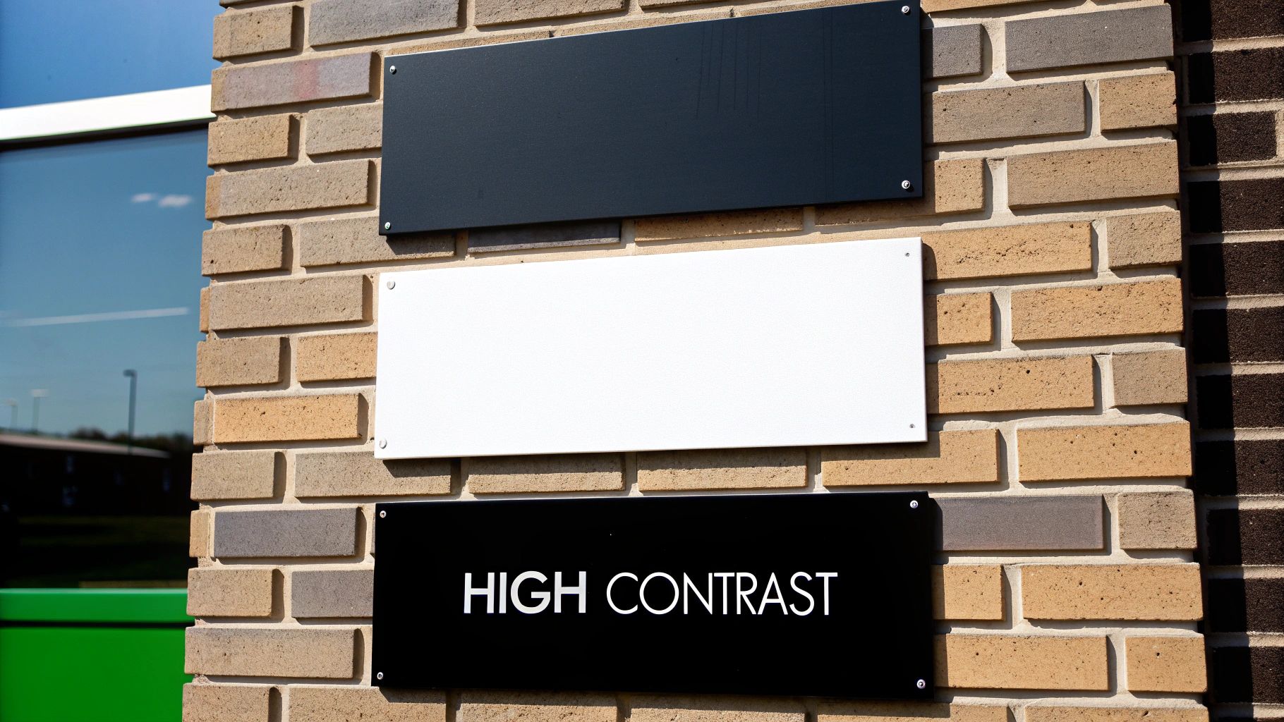
Think about trying to read a message written in yellow highlighter on a plain white sheet of paper—it’s practically invisible. The ADA has specific rules to prevent exactly that kind of problem by mandating a clear "light-on-dark" or "dark-on-light" approach. This isn't just a friendly suggestion; it's a measurable scientific standard.
To be compliant, the characters and symbols on your signs must have a light reflectance value (LRV) that contrasts with their background by at least 70%. This mathematical formula removes any and all guesswork, ensuring a high level of legibility every time.
Choosing Compliant Color Combinations
Hitting that high-contrast target is actually simpler than it sounds. It all boils down to creating a really strong visual separation between the text and the sign's base color.
Effective, Compliant Pairings:
- Black text on a white background: The classic combo. It offers the maximum possible contrast and is always a safe, compliant choice.
- White text on a navy blue background: The deep blue creates a solid, non-distracting canvas for crisp white lettering.
- Dark brown text on a beige background: This pairing offers a more subtle, earthy look while still easily meeting the required contrast levels.
Non-Compliant, Ineffective Pairings:
- Gray text on a silver background: These colors are just too similar in tone and will fail a contrast test, making the sign tough to decipher.
- Yellow text on a white background: While yellow feels bright, it doesn't have enough darkness to stand out properly against a light base.
- Red text on a black background: This combination can be surprisingly difficult to read, especially for people with certain types of color blindness.
These rules are also vital for exterior signage, where being seen from a distance is everything. Outdoor ADA signs for parking and building entrances have strict specifications to guide people safely. For instance, the International Symbol of Accessibility (ISA) is mandatory for van-accessible spots, and those signs often must be mounted at least 60 inches high to be seen over vehicles.
Why a Non-Glare Finish Is Mandatory
Now, imagine you have a perfectly contrasted sign, but you hang it right under a bright ceiling light. If that sign has a glossy, reflective finish, it basically turns into a mirror. The resulting glare can completely wash out the text, making it unreadable.
This is exactly why the ADA requires all compliant signs to have a non-glare or matte finish. It’s a simple but brilliant rule that ensures the sign stays legible from different angles and in all kinds of lighting, whether it's bright sunlight streaming through a window or the fluorescent lights of a long hallway. The right finish and the right color contrast have to work together to deliver a clear message without any visual interference. Many modern materials are perfect for achieving this, and you can see some great examples in today's clear acrylic signage.
Following Strict Typography Guidelines
Just as tactile fonts need to be simple for someone to read by touch, visual fonts have to be clean and unadorned to be read by sight. The ADA is very clear on this, mandating the use of sans-serif fonts like Arial, Helvetica, or other similar styles.
The reasoning here is purely functional: these fonts have clean lines and uniform stroke widths. They don't have the little decorative "feet" (serifs) that can cause letters to blur together for people with certain vision impairments.
Furthermore, any decorative, script, italicized, or overly condensed fonts are strictly off-limits for any text that's part of the required ADA message. The goal is instant recognition, not artistic flair. Every single element—from the finish on the sign's surface to the shape of each letter—is designed with one purpose in mind: delivering clear, unambiguous information to every single person who comes into your building.
Pictograms and the Wild West of State Code Variations
Once you’ve got text and Braille down, the next piece of the puzzle is symbols—or pictograms. But here’s the tricky part: just when you think you’ve mastered the federal rules, you discover that your state or even your city has a completely different playbook.
Pictograms are the universal language of signs, instantly communicating a room’s purpose. The most famous is the International Symbol of Accessibility (ISA), the classic person-in-a-wheelchair icon. You’ll see it identifying everything from accessible restrooms and parking spots to entrances and checkout lanes.
When you use a pictogram on a tactile sign, there's a hard and fast layout rule: the symbol needs its own dedicated 6-inch high field, completely separate from the raised text. This buffer zone is critical—it ensures someone reading by touch won't mistake the edge of a symbol for a letter.
When Federal Law Is Just the Starting Point
Here’s one of the biggest mistakes we see businesses make: they assume that meeting the federal ADA standards is the finish line. It’s not. Many states, and even some major cities, have their own building codes that pile stricter or just plain different rules on top of the federal baseline. This is where compliance gets messy.
Think of the federal ADA as the national floor—the absolute minimum you have to do. States have the power to build on top of that floor, and if your business is in one of those states, you must follow the more demanding local code.
Getting this wrong is a classic recipe for failed inspections and having to rip out and replace perfectly good (but non-compliant) signs.
A Tale of Two States: Comparing Local Requirements
States like California and New York are famous for their extra layers of accessibility rules. They’re a perfect example of why a one-size-fits-all approach to signage is doomed to fail.
Let's take a common example: restroom signs.
- Federal ADA Standard: For most situations, a single tactile sign installed on the latch side of the door does the job.
- California Title 24: California throws a curveball with its unique dual-sign system. You need that standard tactile wall sign, plus a second, non-tactile geometric sign mounted right on the door—a circle for women's rooms and a triangle for men's.
This means a sign package that's 100% compliant in Arizona would get you flagged for a violation in California. New York has its own local quirks that add another layer of complexity, especially in public buildings. These differences show just how critical local expertise is. For a deeper dive into how symbols and text work together to guide people, our post on what is wayfinding signage is a great resource.
Ultimately, the only way to navigate this maze of state-specific codes is with careful research or by teaming up with an expert. Always check with your local building authority or partner with a sign company that lives and breathes the codes in your region. It’s a proactive step that saves you from expensive mistakes and ensures your space is genuinely welcoming to everyone.
Ensuring Compliance With an Expert Partner
Knowing the rules for ADA signs is one thing, but actually getting them right across an entire building is a whole different ballgame. This is where partnering with a sign professional stops being a nice-to-have and becomes your best defense against costly mistakes and project delays.
Think of an expert as your compliance guarantee. They’re the ones who can look at a set of architectural plans and spot every single location that needs a compliant sign—from restrooms and stairwells to the often-forgotten electrical closets. Getting this right from day one prevents those last-minute emergencies that throw budgets and timelines off track.
From Design to Durable Fabrication
A true expert’s guidance goes way beyond just where a sign should go. It’s also about what the sign is made of. They know which materials and finishes will meet the strict non-glare and contrast rules while also standing up to the real-world environment of your space.
For example, an outdoor sign at a coastal hotel needs a completely different level of durability than an indoor sign in a climate-controlled office. The right partner makes sure your signs not only pass inspection but also continue to look professional and stay compliant for years to come.
The core 2010 ADA Standards mandate visual signs for room IDs and exits feature sans-serif fonts, characters between 5/8 and 2 inches tall, and a character height-to-width ratio of over 40%. As accessibility standards expand globally, proactive businesses are finding that inclusive designs can increase foot traffic by as much as 25%. Discover more insights about these evolving standards and their benefits for businesses.
The Critical Last Step: Professional Installation
Here’s a hard truth: the single most common reason for failing an ADA inspection is improper installation. A perfectly designed, beautifully made sign is useless if it’s mounted just one inch too high or on the wrong side of the door.
This is why professional installation isn't a luxury; it's essential. Trained installers live and breathe these codes. They know the exact nuances of federal, state, and local rules, ensuring every single sign is:
- Mounted so the tactile characters are between 48 and 60 inches from the finished floor.
- Placed on the latch side of the door, where someone would naturally reach.
- Given the required 18×18 inch clear floor space in front of it.
Navigating all the fine print, including complex emergency exit signage requirements, is exactly what a good partner does for you. Our end-to-end signage project management handles everything from the initial code check to the final installation, taking the burden completely off your shoulders. You can open your doors with total confidence, knowing your building is truly welcoming to everyone.
Answering Your ADA Signage Questions
Getting into the weeds of ADA compliance always brings up a few practical questions. It’s one thing to read the rules, but another to apply them in a real building. Let’s clear up some of the most common things that trip people up.
Do All Signs in My Building Need to Be ADA Compliant?
Nope, not every sign you put up needs to have tactile characters and Braille. The really strict ADA signage requirements are for signs that identify permanent rooms and spaces. Think restrooms, conference rooms, stairwells, and mechanical closets—places that aren't going anywhere.
Signs that are temporary, like for a weekend event, or purely for marketing don't fall under these rules. The same goes for your company logo and most overhead directional signs. They should still be easy to read, of course, but they don't need the tactile treatment.
What Is the Biggest Mistake Businesses Make with ADA Signs?
By far, the most common and expensive mistake we see is getting the installation height wrong. It’s heartbreaking. A business will invest in beautiful, perfectly compliant signs, only to fail their final inspection because they were mounted a few inches too high or too low. It’s the one detail that can bring an occupancy permit to a screeching halt.
The rule is non-negotiable: the baseline of the raised, tactile characters has to be between 48 inches minimum and 60 inches maximum from the finished floor. The easiest way to nail this is to have a professional installer handle it. They live and breathe these measurements.
Can I Use My Brand’s Font on ADA Signs?
For the tactile part of the sign, you can’t use your own brand font. The guidelines are very specific here, requiring simple, sans-serif fonts like Helvetica or Arial. The reason is purely functional—their clean, simple lines are easy to read by both sight and touch.
Anything decorative, script-based, or overly stylized is an immediate no-go for the required text. The rules even get into the nitty-gritty of character width-to-height ratios to make sure the letters aren't too squished together to be easily understood.
How Do I Know if My State Has Stricter Rules?
This is a big one. It's a classic mistake to assume the federal ADA standards are the final word. Many states and even big cities have their own building codes that are often tougher. California and New York are famous for having unique requirements that add another layer on top of the federal law.
The only way to be absolutely sure is to check with your local building department. An even better move? Work with a sign partner who knows the local landscape. Someone with experience in your specific city or state will save you a ton of headaches and guarantee you’re covered on all fronts.
Getting this right doesn’t have to be a guessing game. At On Display Signs, Inc., our team handles every piece of the puzzle—from design and fabrication to the final professional installation—to make sure your project sails through inspection. Visit us online to start your signage project with confidence.

