A warning signage symbol is, at its core, a universal language designed to communicate danger instantly and cut through language barriers. These graphics are far more than a regulatory box to check; they are a vital safety tool, using a simple system of colors, shapes, and pictures to warn people about everything from high voltage to a wet floor.
The Universal Language of Safety
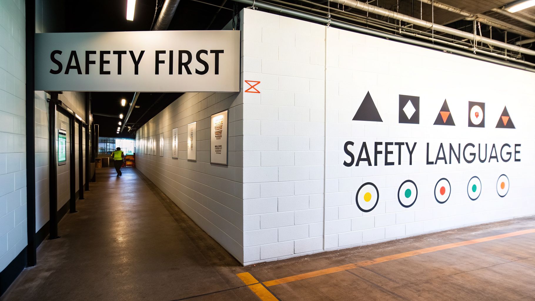
Imagine a language that anyone, from any country, can understand in a split second. That’s the real-world power of the warning signage symbol system. These aren't just signs; they're immediate, life-saving conversations that happen without a single word being spoken.
This system turns a simple piece of plastic or metal into a crucial alert. For any facility manager or business owner, getting fluent in this visual language is the first practical step toward creating a workplace that is not only compliant but genuinely safe.
The Foundation of Hazard Communication
At the heart of this system is a clear hierarchy of hazard levels, each identified by a specific signal word and color. This structure is brilliant in its simplicity—it lets anyone assess the severity of a risk from a distance. Getting these distinctions right is a non-negotiable, actionable insight for safety.
This is where the three primary signal words come into play. They create an instant visual shorthand for risk.
| Signal Word | Hazard Level | Actionable Insight |
|---|---|---|
| DANGER | Most Severe | Use for immediate, high-risk hazards where death or serious injury will occur if not avoided. Practical Example: An exposed high-voltage busbar or an un-shored trench deeper than 5 feet. |
| WARNING | Serious | For hazards where death or serious injury could occur. This signals a major risk. Practical Example: A sign on a baler indicating pinch points where a limb could be caught. |
| CAUTION | Moderate to Minor | For hazards that could cause minor or moderate injury, or to flag unsafe practices. Practical Example: A "Slippery When Wet" sign placed near an entrance on a rainy day. |
Each level gives people the information they need to react appropriately, turning a potential disaster into a non-event.
A History Forged in Safety
The standards we rely on today weren't created in a boardroom; they were forged in the harsh realities of industrial accidents. As the industrial revolution ramped up, so did workplace tragedies. In 1914, the Worker's Compensation Bureau started pushing for simple 'DANGER' signs to protect people.
By 1941, the American Standards Association (the precursor to ANSI) released the first official specifications for industrial accident prevention signs, standardizing the formats for DANGER, CAUTION, and NOTICE. The need for clear, visual warnings was driven home again after 9/11, when New York City mandated glow-in-the-dark photoluminescent signs to guide evacuations in high-rise stairwells.
A well-designed safety sign does more than just warn; it provides clear, actionable information. Its purpose is to guide behavior, prevent errors, and ultimately protect lives by making hazards impossible to ignore. For a deeper dive, you might be interested in understanding the primary purpose of safety signs.
Navigating ANSI and ISO Safety Sign Standards
When it comes to the warning signage symbol system, clarity saves lives. Two major organizations set the global rulebook for safety signs: the American National Standards Institute (ANSI) for the United States, and the International Organization for Standardization (ISO) for the rest of the world.
Think of them as two dialects of the same visual language. Both are designed for instant understanding, but they have their own distinct grammar and vocabulary. For any business, especially one operating across state lines or internationally, knowing the difference is a critical and actionable requirement.
ANSI Z535 The US Standard
Here in the U.S., the go-to framework is the ANSI Z535 series. This system is famous for its three-panel sign format, which is built to deliver a ton of information in a quick, layered way. An ANSI-compliant sign is an actionable tool that includes:
- A Signal Word Header: The top panel that displays the hazard level with words like DANGER, WARNING, or CAUTION.
- A Pictogram: A simple, universally understood symbol showing the specific hazard.
- A Text Message: A concise explanation of the hazard, potential consequences, and how to avoid it.
This multi-pronged approach combines bold visuals and clear text to ensure the message is understood and acted upon.
ISO 7010 The Global Standard
The ISO 7010 standard, on the other hand, puts almost all its emphasis on symbols. Its main goal is to create a set of pictograms so clear they can be understood instantly by anyone, anywhere, with zero need for text. This approach is highly effective at overcoming language barriers.
ISO signs are all about shape and color. For example, a yellow triangle always signals a warning, while a blue circle always tells you a specific action is mandatory. This heavy reliance on symbols makes ISO 7010 a practical choice for multinational corporations and public venues serving a diverse audience. You can see how these standards are applied in specific sectors, like in our guide to construction site signage requirements.
The worldwide push for a unified symbolic language isn't just a good idea—it's backed by a mountain of research. While safety sign studies were scarce in the 1990s, an incredible 81.4% of all research in the field was published between 2009 and 2019, with the U.S. leading the charge. This explosion in research shows a clear global consensus: a universal warning signage symbol works. You can find more insights about these rapid advancements in safety science.
While following ANSI and ISO is a huge step toward a safer workplace, it’s not the whole story. Small businesses in particular should also be using OSHA resources to make sure they're buttoned up on every single safety regulation that applies to them.
Decoding the Grammar of Safety Signs
Every color and shape on a safety sign has a specific job. Think of them as a visual language that communicates risk in a fraction of a second, much like a traffic light instantly tells you whether to stop, slow down, or go. Understanding this system is the key to reading any warning signage symbol and reacting correctly.
The colors on a sign are like the first and loudest part of the message. They’re designed to signal the level of danger involved, allowing anyone to assess a situation from a safe distance before they even get close enough to read the text. This color-coding is a core principle of the American National Standards Institute's (ANSI) Z535 standard.
The Meaning Behind Colors
Color is the most immediate way to convey a hazard's severity. Just as a driver has an ingrained reaction to a red light versus a yellow one, employees should instinctively understand what each sign color implies about the risks ahead.
- Red: Paired with the signal word DANGER, this combination is reserved for the most extreme hazards. These are situations that will cause death or serious injury if not avoided. Practical Example: A sign on a chemical tank containing a substance that is immediately dangerous to life or health.
- Orange: Used with the signal word WARNING, it flags a serious hazard that could result in death or injury. Practical Example: A warning on a forklift about its rear-end swing radius.
- Yellow: Matched with the signal word CAUTION, this signals a lesser hazard that could cause minor to moderate injury. Practical Example: A sign indicating a low-hanging pipe in a storeroom.
This is all part of a global effort to create a universal language for safety. This diagram breaks down the two primary standards that govern these rules.
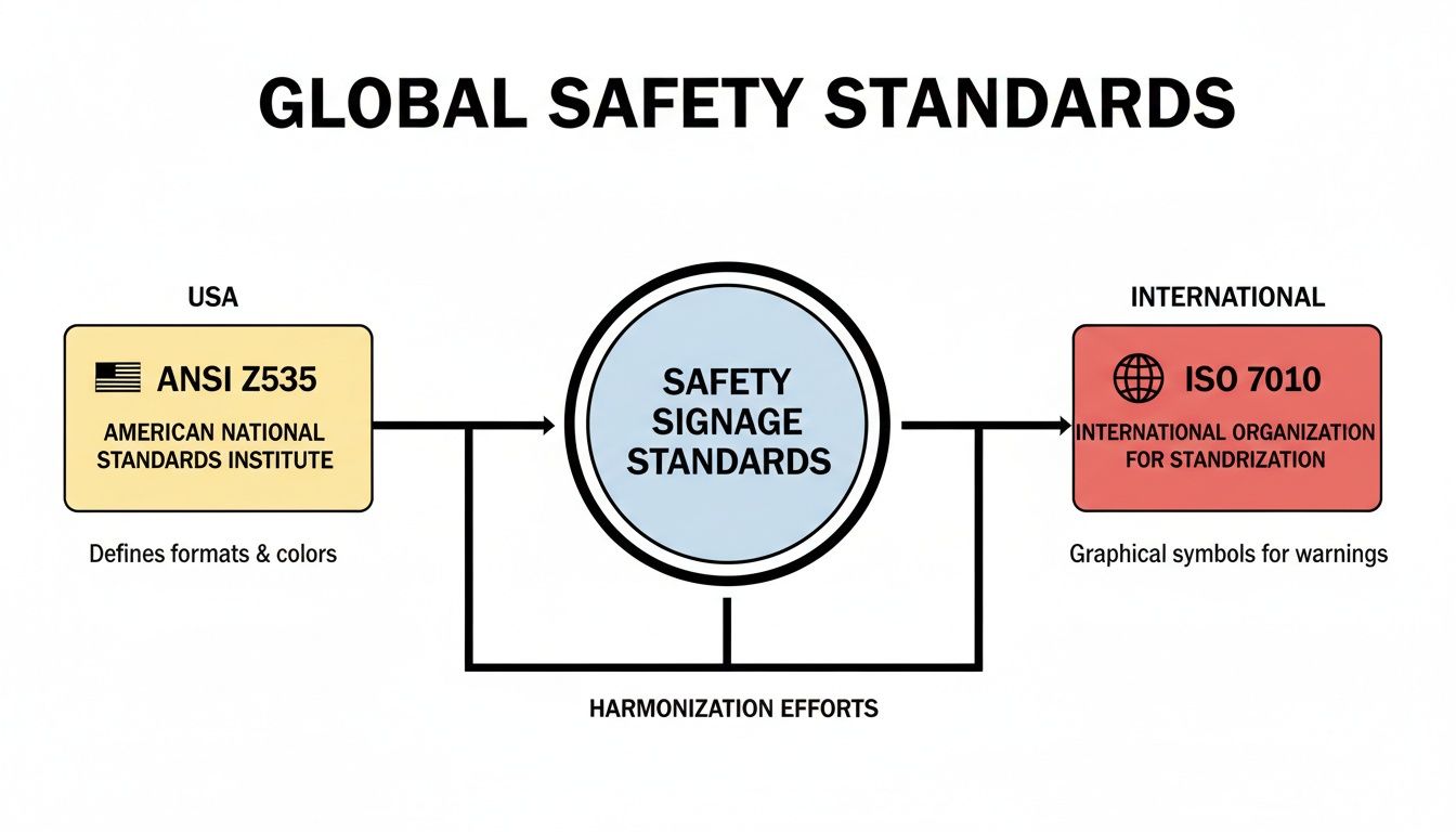
The visual highlights how ANSI Z535 is the standard here in the U.S., while ISO 7010 is used internationally. More importantly, it shows the ongoing effort to harmonize these systems so a warning sign in Texas means the same thing as one in Tokyo.
ANSI Z535 Color and Shape Code Breakdown
To make this even clearer, here's a quick reference table breaking down the ANSI Z535 system. It’s a cheat sheet for understanding how color and shape work together to keep people safe.
| Element | Color/Shape | Meaning | Practical Example |
|---|---|---|---|
| Hazard Level | Red with "DANGER" | Immediate and severe hazard; will cause death or serious injury. | High Voltage Area, Confined Space |
| Hazard Level | Orange with "WARNING" | Potentially serious hazard; could cause death or injury. | Moving Machinery, Forklift Traffic |
| Hazard Level | Yellow with "CAUTION" | Minor or moderate hazard; could cause injury. | Slippery Floor, Low Headroom |
| Safety Info | Green with "NOTICE" or general safety header | Provides general safety instructions or information. | Location of First Aid Kit, Eye Wash Station |
| Prohibition | Circle with a red slash | An action is strictly forbidden. | No Smoking, No Entry |
| Mandatory Action | Blue Circle with a white pictogram | A specific action is required to be safe. | Wear Hard Hat, Safety Goggles Required |
| Hazard Type | Yellow Triangle with a black pictogram | Alerts to a specific type of hazard. | Electrical Shock Risk, Biohazard Symbol |
This simple, structured system is what allows signs to communicate complex information almost instantly, preventing accidents before they happen.
How Shapes Define the Message
While colors alert you to the level of risk, shapes give you crucial context about the type of message. This is the next layer of the sign’s grammar, telling you what to look for or what you need to do.
The goal of a well-designed symbol is to be "memorable and meaningless" at first—something so unique it sticks in your mind without having any prior associations. This was the principle used to create the now-universal biohazard symbol in 1966.
The shapes used on safety signs are kept simple and direct for a reason:
- Triangle: This is the universal shape for a hazard warning. The pictogram inside the triangle specifies the exact danger, like an electrical shock bolt or a corrosive chemical symbol.
- Circle: This shape indicates a mandatory action or a prohibition. A solid blue circle tells you what you must do (e.g., wear safety goggles). A circle with a red slash through it tells you what you must not do (e.g., no smoking).
- Square/Rectangle: This shape is all about providing general safety information. It’s used for everything from directional signs pointing to an emergency exit to signs marking the location of a first aid station.
This powerful combination of color and shape creates a communication tool that cuts through language barriers and gets the point across fast. For more on putting these principles to work, see our practical guide on warehouse floor marking guidelines.
Essential Warning Symbols and Their Meanings
We've covered the rules of sign design; now it's time to get practical. Think of this section as your field guide to the universal language of warning symbols. Being able to spot a warning signage symbol and know its meaning instantly is a non-negotiable skill for anyone responsible for a commercial or industrial site.
These simple pictograms are your first line of defense, communicating danger faster than words ever could. Understanding them allows you to walk through your own facility, perform a quick safety audit, and spot any gaps where a critical hazard isn't being clearly marked.
Must-Know Hazard Symbols
Some hazards are universal, and so are their symbols. You'll see these pictograms across dozens of industries, from manufacturing floors to research labs. Getting familiar with this visual library is fundamental to safety and is a key part of implementing effective workplace fire prevention tips that keep people and property safe.
Biohazard: This iconic three-sided symbol, first introduced in 1966, signals the presence of biological materials that are a threat to your health. You’ll find it on medical waste containers, in labs, or anywhere infectious agents are present.
High Voltage: The classic lightning bolt is the undisputed symbol for electrical danger. It warns of the risk of serious injury or death from electric shock and is posted on electrical panels, substations, and powerful equipment.
Corrosive Materials: This graphic image shows a substance burning through a hand and a solid surface, clearly communicating a chemical hazard. It's a critical warning wherever acids, bases, or other corrosive materials are used or stored.
The biohazard symbol was brilliantly designed to be "memorable and meaningless" when it was created. The goal was to invent a completely new image with no existing associations, so its very specific meaning—biological danger—could be taught and understood globally without any confusion.
Action and Prohibition Symbols
Safety isn't just about avoiding hazards; it's about taking the right actions. This next group of symbols doesn't just warn you—they give you direct, non-verbal commands to either do something or not do something. Following these instructions is just as vital as heeding a hazard warning.
No Entry: A red circle with a person inside, crossed out by a bold diagonal line, is a universal "Keep Out." It's used to block access to restricted, private, or dangerous areas for anyone without authorization.
Wear Eye Protection: When you see a blue circle with an image of safety glasses, it’s not a suggestion—it's a mandatory command. This sign means you must wear eye protection to guard against flying debris, chemical splashes, or other eye hazards in the area.
Flammable Material: The simple flame pictogram, usually inside a yellow triangle or a red diamond, warns of anything that can easily catch fire. This is a crucial warning signage symbol in any area containing fuels, solvents, or combustible gases. For a deeper dive into creating signs for these specific risks, see our complete guide on custom warning signs.
Placing Signs for Maximum Visibility and Impact
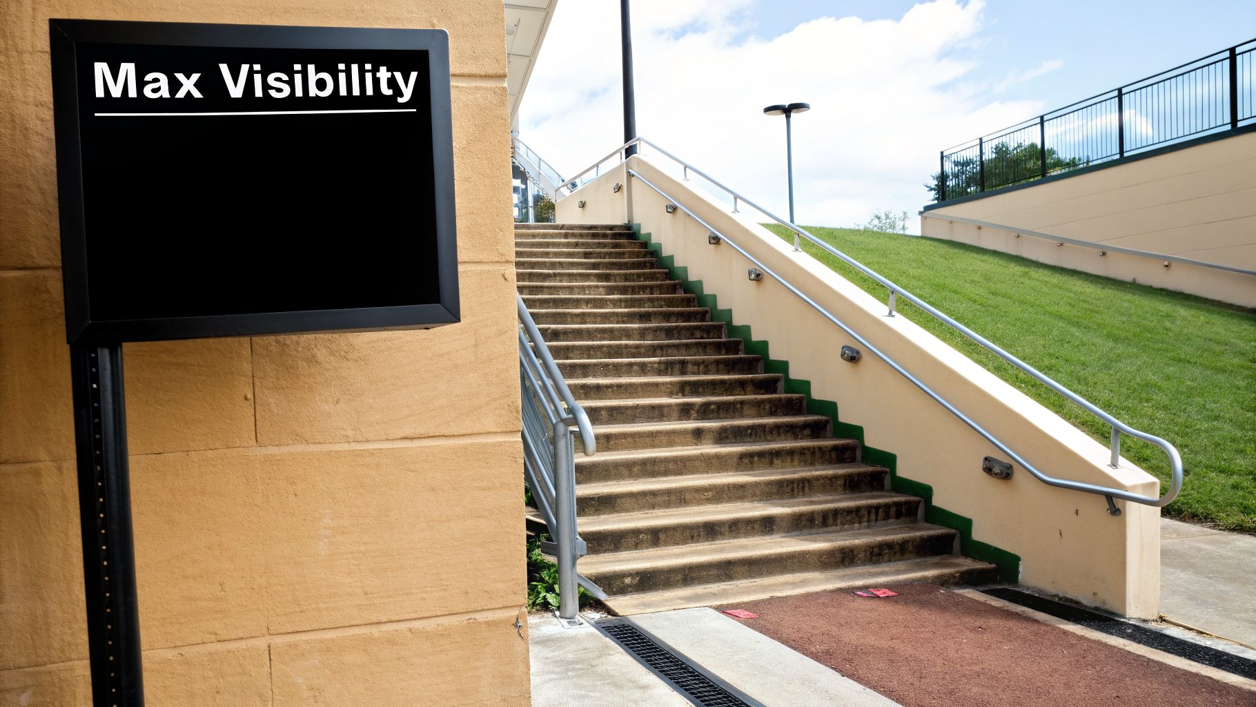
Even the best-designed warning signage symbol is just expensive wall decor if nobody sees it in time. Proper placement and installation are what turn a sign from a passive compliance checkbox into an active, life-saving tool. The core principle is simple: a warning is only useful if it gives someone enough time to see, understand, and react.
This means putting the sign right where the action is, not 50 feet down the hall. For example, for a dangerous piece of machinery, that sign needs to be mounted directly on or immediately next to the equipment. If you're marking a hazardous area, a sign must be at every single entrance so no one can possibly walk in without being warned.
Key Placement Strategies
Getting placement right is about making the warning impossible to miss without creating a confusing visual mess. A few smart strategies can make all the difference.
Mounting Height: The sweet spot is eye level. As a rule, hang signs so the center is between 60 and 66 inches from the ground. This puts your message directly in a person's natural line of sight.
Legibility Distance: Think about how far away someone will be when they need to see the sign. A small label is fine for an operator standing inches from a control panel, but it’s completely invisible to a forklift driver coming from across the warehouse floor.
Avoid "Sign Clutter": Bombarding people with too many signs in one spot is a recipe for disaster. Our brains eventually tune out the noise. Group related information together and make sure your most critical warnings have room to breathe and stand out.
Calculating Sign Size and Legibility
A great rule of thumb for sign sizing is the distance-to-letter-height ratio. Generally, for every inch of letter height, a sign is readable from about 25 feet away for someone with average eyesight.
An improperly placed or sized sign isn't just ineffective; it can increase liability. The sign must give an individual enough time to see the warning, understand the risk, and take appropriate action before being exposed to the hazard.
So, if you need a warning to be crystal clear from 50 feet, the text on your sign should be at least 2 inches tall. This simple math ensures your investment in safety actually pays off. Getting these details right can be tricky, which is where a professional installer becomes invaluable. You can learn more in our guide on proper sign installation services.
Choosing the Right Material for the Job
The sign’s material is just as important as its message. The environment dictates the material, ensuring the sign stays put and stays readable for years to come.
Aluminum: This is the undisputed champion for outdoor signs and tough industrial settings. It’s incredibly durable, won't rust, and holds up against fading from sun exposure, making it the go-to for parking lots, construction sites, and exterior walls.
Adhesive Vinyl: Perfect for indoor use on smooth, clean surfaces. Think doors, painted walls, or machine casings. It's a cost-effective and practical choice for offices, retail stores, and climate-controlled work areas.
Plastic (PVC): A versatile and lightweight workhorse. Plastic signs are great for many indoor applications and can even be used in sheltered outdoor spots. They offer a fantastic balance of durability and affordability.
Frequently Asked Questions About Warning Signage
Even after you get a handle on the official standards, real-world questions always pop up. We get them all the time from business owners and facility managers. Here are the straightforward answers to the most common things people ask about putting up a warning signage symbol and keeping their business compliant.
What Is the Difference Between an ANSI and an ISO Warning Sign?
The biggest difference comes down to their core approach. Think of it as the difference between a detailed, multi-step instruction manual versus a set of universally understood icons on your car's dashboard.
ANSI Z535 signs, which are the go-to standard in the United States, are all about layered information. They almost always use a three-part structure: a bold signal word header (like DANGER or WARNING), a pictogram for a quick visual cue, and a text block spelling out the hazard and how to stay safe.
On the other hand, international ISO 7010 signs are built to be understood instantly, no matter what language you speak. They rely almost entirely on the pictogram inside a specific shape—a yellow triangle for a hazard, a blue circle for a required action—to do all the talking. While the two standards are becoming more alike, you have to know which one applies where you operate to stay compliant.
How Do I Know Which Warning Signs I Need for My Business?
There’s no generic checklist for this; figuring out what you need starts with a hands-on risk assessment of your own space. You have to identify the specific dangers that exist right there in your facility.
The best way to do this is to walk through your entire property with a fresh pair of eyes. Seriously, put on your safety goggles and look for anything that could go wrong. Pay close attention to:
- Anywhere chemicals are stored or used.
- Machinery with moving parts that someone could get caught in.
- High-voltage electrical panels and equipment.
- Floors that get wet or slippery.
- Areas with forklift or heavy foot traffic.
Once you have your list of hazards, check it against OSHA's guidelines for your industry and your local building codes. If you’re in a complex environment, bringing in a signage professional is a smart move. They can make sure you cover every single regulation.
Can I Create My Own Custom Warning Signs?
You absolutely can—and should—create custom signs for unique hazards not covered by a standard symbol. But here's the critical part: they must follow the strict design rules of ANSI Z535 or ISO 7010 to be effective and legally sound. A handwritten sign taped to the wall won't cut it and could become a huge liability if an accident happens.
To be legally defensible, a custom sign must use the correct signal word, colors, and a clear pictogram that follows the established visual grammar. It has to be instantly understandable to anyone, even someone totally unfamiliar with your operation.
For any custom work, your best bet is always to partner with a professional sign company. They have the expertise to design a fully compliant sign that gets the message across and will hold up to legal scrutiny.
How Often Should I Inspect or Update My Safety Signage?
Safety signs aren't a "set it and forget it" asset. At a minimum, they need to be formally inspected at least once a year as part of your regular safety audit. Walk around and check every single sign for fading, damage, or dirt that makes it hard to see.
More importantly, your signs must be updated immediately anytime a new hazard shows up or an old one is removed. Standards also change—ANSI Z535, for instance, gets reviewed every five years. It's just good practice to check your signs against the latest rules, especially in high-risk zones, to keep your facility as safe and compliant as possible.
Navigating the world of safety and compliance signage can feel overwhelming, but you don't have to figure it out on your own. The experts at On Display Signs, Inc. offer complete solutions, from risk assessment and design to fabrication and installation, making sure your business is protected and your people are safe. Visit us online to get started on your project today.

