Imagine your business name doing more than just sitting on a wall—it projects forward, making a statement of quality and permanence before anyone even says a word. That's the real-world power of 3d sign letters. Unlike a flat sign that can fade into the background, dimensional letters use physical depth and shadow to create a powerful first impression that makes your brand feel solid and professional.
Why 3D Sign Letters Are a Game Changer for Your Brand
Think of the difference between a flat photograph and a sculpture. One is a representation, but the other has a physical presence you can’t ignore. Dimensional signage works the same way for your storefront or office lobby. It adds a tangible quality that signals to customers that you’re serious about your business and you invest in quality.
This simple shift from a flat to a 3D format is one of the smartest moves you can make to boost brand visibility. The depth of the letters catches light and casts natural shadows, making the sign pop and change throughout the day. This dynamic effect helps your business get noticed whether it's on a crowded street or in a quiet office park.
Creating a Powerful First Impression
You get just a few seconds to make a first impression, and your sign is often the very first handshake a customer has with your brand. A well-crafted 3D sign instantly communicates permanence and quality before anyone even walks through the door. The material choice alone sets the tone.
Practical Example: A modern tech company can use sleek, brushed aluminum letters to project a clean, forward-thinking image. A cozy neighborhood café, on the other hand, might choose bold, custom-painted letters to create a warm and inviting look that pulls people in off the street. This tangible quality signals you've invested in your business.
Actionable Insight: A dimensional letter sign is a 3D sign made from materials like metal or acrylic, designed to give your business a more eye-catching and professional look. They get their name from their three-dimensional construction, which makes them more engaging and noticeable from different angles than flat signs.
Enhancing Brand Recognition and Trust
Consistency is everything when building a brand people remember. High-quality signage is a huge part of that equation. When customers see substantial, well-made 3d sign letters, it reinforces the idea that your brand is trustworthy and here to stay. This works for any type of business:
- Retail Shops: A vibrant, dimensional sign can attract foot traffic and make a boutique stand out in a sea of competitors.
- Corporate Offices: Polished 3D letters in a reception area create a professional, established atmosphere for visiting clients.
- Restaurants: Custom-shaped letters can perfectly capture a restaurant’s unique theme, whether it’s rustic, modern, or playful.
Ultimately, investing in dimensional letters is far more than just a cosmetic upgrade; it's a direct investment in your brand's reputation. By moving from two dimensions to three, you give your business a tangible presence. To see how different materials can impact your look, you might be interested in our guide on outdoor business signs. This simple visual upgrade ensures your brand name isn't just seen—it's remembered.
Choosing The Right Material For Your 3D Sign
The material you choose for your 3D sign letters is the foundation of your brand's physical identity. This isn't just about looks; it's a strategic decision that hinges entirely on your location, brand personality, and budget. The right choice ensures your sign not only looks fantastic on day one but also holds up for years to come.
Practical Example: A sign baking in the hot Florida sun needs a completely different build (like durable aluminum) than one hanging in a climate-controlled office lobby in Chicago (where acrylic might be perfect). This single choice sends a powerful, non-verbal message to every customer about your brand's quality and attention to detail.
The simple move from a flat, 2D sign to a dimensional one immediately makes a bigger impression. It’s the difference between a picture and a sculpture.
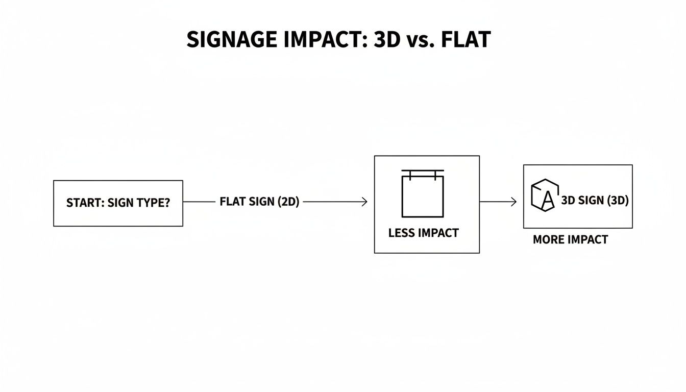
As you can see, giving your sign physical depth instantly makes it more professional and harder to ignore.
Common Materials and What They Say About Your Brand
The most popular materials for 3D sign letters each bring something different to the table. Getting familiar with their strengths is the first step to creating a sign that feels like a natural extension of your business.
We've put together a quick comparison to help you navigate the most common options and see how they stack up.
3D Sign Letter Material Comparison
| Material | Best For | Durability | Aesthetic & Finish Options |
|---|---|---|---|
| Aluminum | Outdoor storefronts and exterior signs in any climate. | Excellent; rustproof, waterproof, and very strong yet lightweight. | Modern and clean. Can be custom painted, anodized, or given a brushed or polished finish. |
| Acrylic | Versatile for both indoor and outdoor use; great for intricate logos and vibrant colors. | Very good; weather-resistant and holds color well. | Highly customizable with endless colors. Finishes include glossy, matte, frosted, and metallic. |
| Stainless Steel | High-end interior and exterior signs for a premium look. | Exceptional; extremely tough, corrosion-resistant, and timeless. | Sophisticated and powerful. Available in brushed, polished (mirror), or orbital finishes. |
| Formed Plastic | Budget-conscious businesses needing bold, durable letters. | Good; tough, chip-resistant, and handles weather well. | Offers great depth and can be molded into custom fonts. Available in standard and custom colors. |
Each of these materials sends a distinct message. Choosing the right one is about matching the physical material to your brand's core identity.
How a Finish Can Make or Break Your Sign's Impact
The base material is the skeleton, but the finish is the personality. This is where you dial in the exact look and feel to align the sign with your brand, turning a simple set of letters into a powerful statement piece.
Actionable Insight: Your sign's material and finish aren't just decorative touches; they are strategic brand decisions. A brushed metal finish conveys timeless authority, while a vibrant, glossy paint color communicates energy and fun. This is your chance to tell a story without saying a word.
Consider these practical examples:
- A high-end law firm might choose brushed stainless steel for its lobby to project an image of stability and quiet confidence.
- A fun retail boutique could use glossy, custom-painted acrylic in its signature brand colors to feel energetic and draw in shoppers from the street.
- An industrial company might opt for matte black aluminum for a rugged, modern exterior sign that feels both tough and professional.
To see how these materials perform in the real world, check out our deep dive into exterior sign materials for more practical insights.
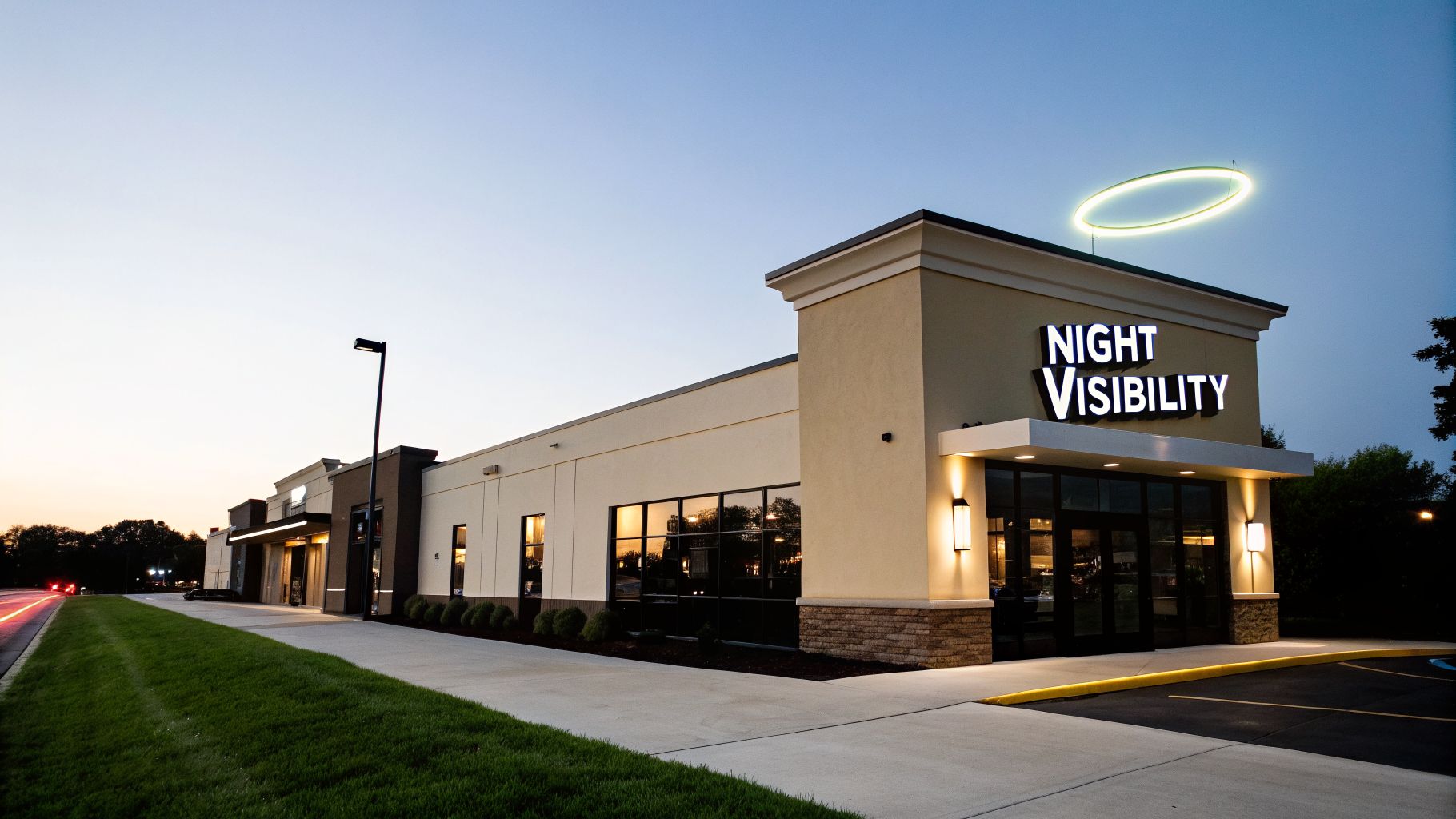
Using Illumination to Maximize Your Sign's Impact
Your business doesn't close down when the sun sets, and your sign shouldn't either. Adding illumination turns your 3D sign letters into a hardworking, 24/7 marketing tool that keeps your brand visible long after neighboring businesses have gone dark.
This isn’t just about flipping a switch; it's a strategic move that makes your sign impossible to ignore. An illuminated sign can boost visibility significantly in low-light conditions, turning your storefront into a beacon for customers.
Face-Lit Letters for Bold Visibility
Also known as front-lit, face-lit letters are the go-to for maximum punch and readability. The light shines directly through the front surface—the "face"—of each letter, creating a brilliant glow that cuts through the visual noise from a great distance.
This is the perfect approach for any business that needs to shout for attention.
- Gas Stations: Bright, clear signage helps drivers spot them from the highway with plenty of time to exit.
- Urgent Care Clinics: A well-lit sign acts as a beacon of assurance, guiding people quickly in a moment of need.
- Retail Stores in Plazas: Face-lit letters make one store pop from a busy lineup, drawing in evening shoppers.
Halo-Lit Letters for an Elegant Glow
Halo-lit, or back-lit, letters offer a completely different feel. Instead of shining forward, the light is cast backward onto the wall, tracing each letter with a soft, ambient glow. This "halo" effect adds an immediate sense of depth and an upscale, premium feel.
Actionable Insight: Halo-lighting creates an air of distinction and elegance. It’s less about shouting for attention and more about making a confident, refined statement that draws people in with its subtlety and style.
This is the ideal choice for brands that want to communicate quality and create an atmosphere. A high-end restaurant can use a soft glow on its name to set a fine-dining mood. A boutique hotel can use the same effect to give arriving guests a welcoming and luxurious first impression.
While face-lit signs shout, halo-lit signs speak with quiet authority. If you're exploring different lighted sign options, you might also be interested in our guide to light box outdoor signs.
Getting Your Sign Design and Installation Right
A brilliant idea for your 3D sign letters is just the starting point—the real magic happens during execution. This is where the technical details separate a sign that looks amateur from a professional one that truly embodies your brand. It’s the practical, hands-on planning that makes your investment pay off.
This level of precision in the final moments makes all the difference. When a sign is installed correctly, it’s not just stunning to look at—it’s also secure and built to last, reflecting the very quality of your business.
Critical Design and Sizing Considerations
Before a single piece of material is cut, you must lock in two things: font and size. The font you choose needs to be clean and on-brand, but above all, it must be readable from a distance. An overly scripty or thin font might look great up close but will blur into an unreadable mess from across the parking lot.
Actionable Insight: When it comes to sizing, there's a simple rule of thumb that works wonders: you need one inch of letter height for every ten feet of viewing distance. So, if you need your sign to be clear from 100 feet away, your letters have to be at least 10 inches tall. This guideline ensures your sign commands attention instead of getting lost on your building’s facade.
This is a huge deal for retail shops and restaurants aiming to make a lasting impression on passersby.
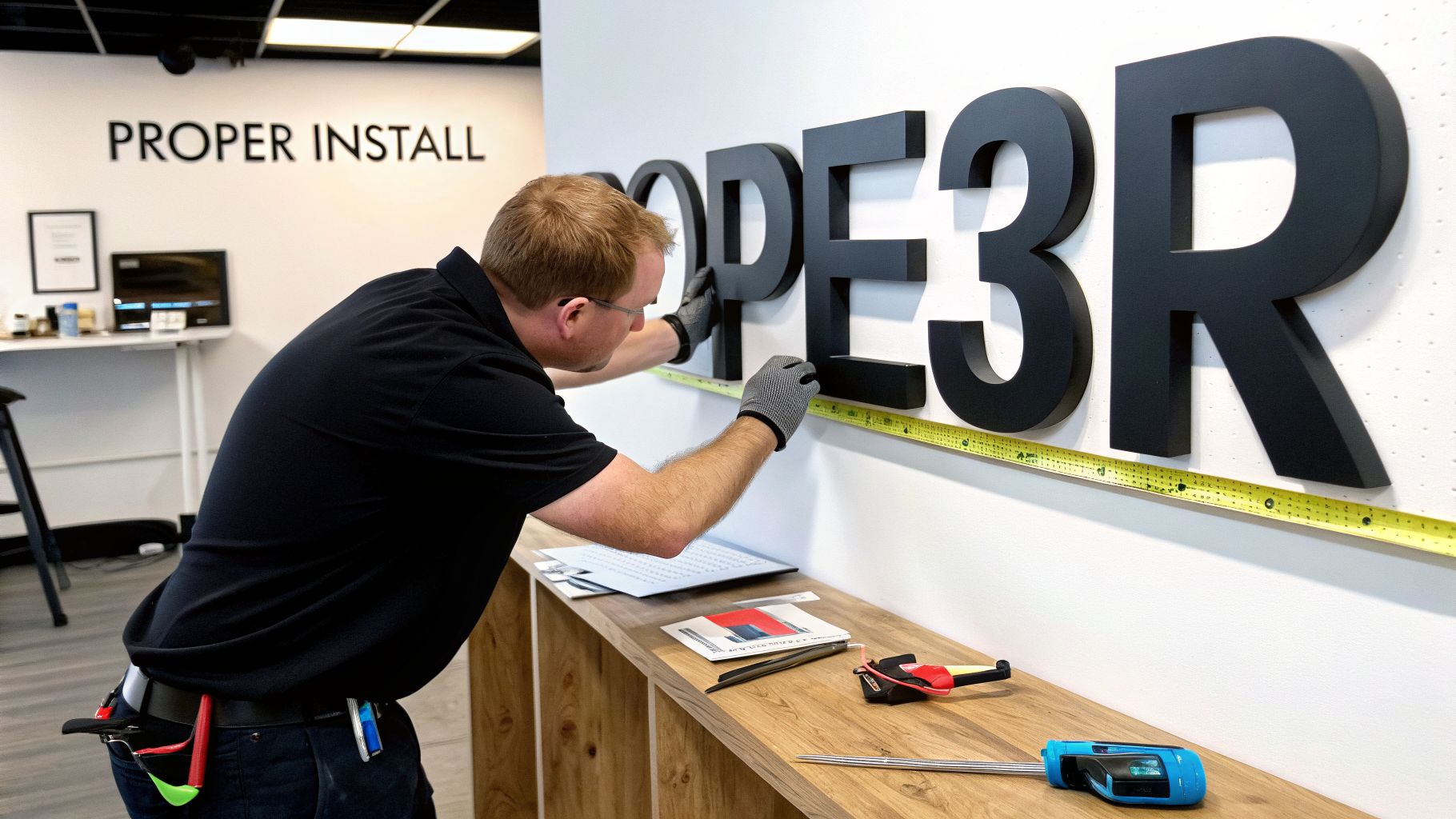
Choosing the Right Installation Method
How your 3D sign letters are attached to the building impacts both the final aesthetic and the complexity of the job, especially if the sign is illuminated. There are two main ways to do it, each with its own clear trade-offs.
Raceway Mounting:
- What it is: All the letters are first mounted onto a long metal box, or "raceway," which houses the wiring. That entire unit is then mounted to the wall.
- Pros: This method is much faster and requires far fewer holes drilled into your building. It’s a great solution for tricky surfaces like brick or stone.
- Cons: The raceway itself remains visible. While it can be painted to blend in, it doesn't offer the ultra-clean look of other methods.
Direct-to-Wall Mounting:
- What it is: Each letter is mounted individually onto the wall, and the wiring is painstakingly fed through the wall behind each one.
- Pros: This delivers a flawless, high-end look where the letters appear to float right off the surface. It's as clean as it gets.
- Cons: It is significantly more labor-intensive, requiring precise drilling and wiring for every single letter.
Actionable Insight: Partnering with a professional sign company is the most important step in the entire process. They perform essential site surveys, manage complex local permit requirements, and ensure your installation is flawless and secure.
A professional team removes all the guesswork. They’ll assess your building, recommend the best mounting technique for your situation, and handle every technical detail from beginning to end. To see what that involves, check out our guide to professional sign installation service.
Navigating Budgets and Permits for Your Signage Project
Alright, you’ve got a great design in mind for your 3d sign letters. Now comes the practical part: figuring out the budget and navigating the paperwork. Thinking through these details early on is the best way to prevent headaches and sticker shock down the road, ensuring your project moves smoothly from a concept on paper to a finished sign on your wall.
The final price tag depends on a few key choices. The most obvious is size—bigger letters naturally cost more in materials and labor. The material itself is a major factor, too; premium metals like stainless steel will be a bigger investment than versatile acrylic or formed plastic. Finally, adding internal lighting or tackling a tricky installation will also shape the overall cost.
Understanding the Sign Permitting Process
Before any sign gets mounted, it almost always needs a permit from your local city or county. This isn't just bureaucratic red tape; it’s a non-negotiable safety step. Permits guarantee your sign is structurally sound, wired correctly, and meets all local zoning codes that dictate things like size, placement, and even brightness.
Trying to handle this yourself can quickly turn into a nightmare of paperwork and confusing rules, since every municipality has its own process. This is where working with a full-service sign partner really pays off.
Actionable Insight: A professional sign company manages the entire permitting process for you. They handle the applications, submit the required engineering drawings, and communicate with city officials to secure approvals, freeing you to focus on your business.
This becomes absolutely critical for businesses with multiple locations. A national partner ensures that a sign in one city meets all the same brand standards as one in another, while still adhering to each city’s unique codes. You can learn more about how we make this simple by exploring our guide to sign permit requirements.
Making Your Signage an Accessible Investment
Putting money into high-quality signage is one of the smartest moves a business can make. It’s not just an expense; it’s a hardworking asset.
Durable 3d sign letters do more than just announce your name. They boost visibility and lock in brand consistency across all your locations for a powerful long-term return.
To make this crucial investment fit your budget, any good sign company will have options to give you peace of mind.
- Warranties: A solid warranty should cover both materials and workmanship. This protects your investment from defects and guarantees your sign is built to last.
- Financing Options: Many companies offer financing plans that let you spread the cost out over time. This makes it much easier to get the high-impact sign you need without a huge upfront cash outlay.
These tools help turn a major capital purchase into a manageable operational expense, so you can get the professional, attention-grabbing sign your business deserves.
Your Questions About 3D Sign Letters, Answered
Jumping into a new signage project always brings up questions. It's a big investment, and you want to get it right. To give you complete confidence, we’ve put together straightforward answers to the questions we hear most from business owners about 3D sign letters.
Getting these details sorted out means you can move forward with clarity, knowing you’re making a smart choice for your brand’s presence and professional look.
How Long Do 3D Sign Letters Typically Last?
The lifespan of your letters comes down to one thing: the material you choose. When you invest in high-quality materials from the start, you're buying durability that pays for itself over years, and often decades.
Practical Example: Outdoor signs built from aluminum or stainless steel are engineered to handle anything the weather throws at them, resisting rust and corrosion to keep looking sharp. Even the modern LEDs used for illumination are incredibly tough, with a typical rating of 50,000 hours or more. That means less time worrying about maintenance and more time running your business.
What Is the Difference Between 3D Letters and Channel Letters?
This is a common question, and we get it. The distinction is actually pretty simple. Think of "3D letters" as the main category, and "channel letters" as a very specific, specialized type within it.
Actionable Insight: All channel letters are 3D letters, but not all 3D letters are channel letters. The key difference is how they are built for illumination.
A channel letter is fabricated with a hollow interior—a "channel"—that’s designed specifically to house lighting elements like LEDs. This is what allows a sign to be internally lit, creating that classic face-lit or halo-lit glow. In contrast, other kinds of 3d sign letters, like solid flat-cut acrylic or metal, have that same great dimensional shape but aren't built to be lit from the inside.
Can 3D Letters Be Installed on Any Type of Wall Surface?
Yes, you can install 3D letters on almost any surface imaginable—but the secret is using the right hardware and technique for the job. You wouldn't use the same anchors for a smooth drywall lobby wall as you would for a rough, uneven brick exterior.
Actionable Insight: Any professional installation starts with a site survey. An expert will analyze the wall, checking its material (like brick, stucco, or metal siding) and its structural integrity. From there, they determine the safest and most visually appealing mounting method, whether that’s mounting directly to the wall for a clean look or using a raceway to simplify wiring and minimize drilling.
How Do I Ensure My Sign Design Is Effective?
A truly effective sign finds the perfect sweet spot between your brand’s personality and simple, undeniable readability. A design that looks amazing up close but is impossible to read from the road is a wasted investment.
To make sure your sign works as hard as you do, stick to these core principles:
- High Contrast: Choose colors that make your letters jump off the building’s facade. A dark letter on a light background (or vice versa) is a classic for a reason—it works.
- Simple, Bold Fonts: Stay away from thin, overly scripty, or decorative fonts. A clean, strong typeface is always easier for a potential customer to read at a glance.
- Appropriate Sizing: The "one-inch-per-ten-feet" rule is your friend. If you need your sign to be legible from 50 feet away, your letters need to be at least five inches tall.
The best way to nail the design is to partner with an experienced sign designer. They know exactly how to blend your brand identity with these proven rules to create a sign that’s not just beautiful, but also a powerful customer-attracting tool.
Ready to create a sign that gets your business noticed? The team at On Display Signs, Inc. manages every step of the process, from design and permitting to fabrication and installation, ensuring your project is seamless and your brand stands out. Contact us today to get started.
