Signs in a medical office are far more than just directions on a wall. They are a core part of the patient experience, working to reduce stress and build trust from the moment someone pulls into your parking lot. A well-planned signage system—from clear exterior identification to intuitive interior wayfinding—guides patients seamlessly, turning a potentially confusing journey into a reassuring one.
The Role of Signage in Patient Care

Think of your signage not as simple decoration, but as a silent concierge. It's the first and most consistent touchpoint for a patient, constantly working to make their visit easier.
Imagine a patient arriving for an important appointment, already feeling anxious. If they have to circle the block to find your building, can't figure out where to park, or get lost in a maze of hallways, that anxiety skyrockets. That negative first impression can easily color their entire perception of the care they receive, long before they ever see a doctor.
Signs as an Extension of Your Care
This is where your signs become a direct extension of your practice's commitment to patient well-being. Good signs do more than point the way; they silently communicate professionalism, competence, and compassion. This is the core principle of environmental graphic design, which focuses on shaping a person's experience within a space. You can dive deeper into how this works in our guide on what environmental graphic design is.
The goal is to create a physical setting that feels supportive and intuitive, not frustrating.
A well-thought-out signage strategy is a direct investment in patient satisfaction. It demonstrates that you've considered their journey and are actively working to make it as smooth and stress-free as possible.
Different types of signs must work together to create this seamless experience. It’s about building a cohesive system.
- Exterior Signs: This is your first handshake. A large, visible monument sign or illuminated building letters ensure patients find you without a moment of doubt. For example, a monument sign at the entrance to your parking lot clearly marks the turn from a busy street.
- Wayfinding Signs: Once inside, directional signs act as a guide, pointing visitors to specific departments like Radiology, different wings, or essential facilities like restrooms.
- ADA and Room ID Signs: These are non-negotiable. Legally required ADA signs ensure accessibility for everyone, while clear room identifiers for exam rooms and offices eliminate confusion.
- Digital Displays: In waiting areas, modern digital signs can reduce perceived wait times by displaying health tips, introducing staff members, or providing helpful updates.
By integrating these elements, you build a system that instills confidence and reinforces the quality of care your practice provides. Every clear, helpful sign contributes to a positive patient outcome before the appointment even begins.
Designing Effective Exterior and Building Signs
Your exterior signs are the handshake before the hello, offering a promise of professionalism and care before a patient even walks through the door. This isn't just about looking good; it's about making a patient's journey to your facility as seamless and stress-free as possible. The right sign ensures you're found easily, dialing down patient anxiety from the very first moment.
Think of your main building sign as a landmark. For a sprawling medical campus or a clinic set back from the main road, a monument sign is a fantastic choice. These are solid, freestanding structures—often built with brick, stone, or durable composites—placed right near your property's entrance. They act as a highly visible anchor, clearly marking the turn for approaching traffic.
On the other hand, if you're a standalone clinic or an office in a medical plaza, channel letters mounted directly to the building are often the more practical route. These individual, three-dimensional letters create a crisp, professional look that really pops off the facade. The choice between a monument sign and channel letters comes down to your physical location and how patients will find you.
Choosing Materials and Lighting for Durability
Outdoor signs have a tough job. They have to stand up to everything from scorching sun to freezing rain, all while looking professional. This is where material selection becomes critical for long-term value. For instance, aluminum is a go-to for both channel letters and sign backings because it’s strong, lightweight, and won't rust. Another great option is high-density urethane (HDU), a versatile material that can be crafted to look like classic wood but won’t ever rot or crack.
Lighting is what makes your sign a 24/7 asset, which is non-negotiable for clinics with evening hours or emergency services. The right illumination makes sure your name is clear day and night.
- Face-Lit Channel Letters: With this style, internal lighting shines through a translucent acrylic face, making the entire letter glow. It delivers maximum brightness and is easily readable from a distance.
- Halo-Lit (or Back-Lit) Channel Letters: Here, the light source sits behind the letters, casting a soft glow onto the wall behind them. This creates a sophisticated, modern look that feels high-end and is less intense than direct face-lighting.
To see how these options work in the real world, you can check out our complete guide to exterior office signage and find the perfect match for your practice.
Integrating Your Brand with Exterior Signs
Your exterior sign is one of your most powerful branding tools. It must be a perfect reflection of your medical office’s identity, using consistent colors, fonts, and logo placement. A great sign doesn't just state your name; it builds immediate brand recognition and reinforces the trust you want patients to feel.
An effective exterior sign combines visibility, durability, and brand identity. It should be designed not just to be seen, but to reassure patients that they have arrived at the right place for their care.
For example, a pediatric clinic might use its playful logo and bright brand colors on its monument sign to create a warm, welcoming first impression. In contrast, a specialized surgical center might go for sleek, halo-lit channel letters in a conservative font to project precision and expertise. The goal is to create a sign that is both functional and a true extension of the quality care you provide inside.
Creating Intuitive Interior Wayfinding Systems
Once a patient steps through your front door, their journey is far from over. A confusing interior can instantly sour a great first impression, turning a calm patient into a stressed one who’s late for their appointment. Worse, it leads to constant interruptions for your already busy staff.
Think of an effective wayfinding system as an intuitive indoor GPS. It should feel like a series of connected breadcrumbs, guiding visitors so naturally from the lobby to the exam room that they never have to stop and ask for help. The goal isn't just to give directions—it's to empower patients to navigate on their own, reducing their anxiety and freeing up your team.
This visual shows that logical flow in action, starting with a large, anchoring sign that funnels people toward more specific identification.
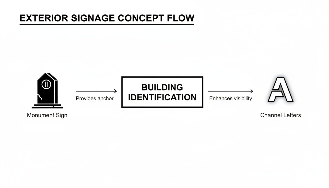
It’s the same principle you want inside: a main directory leads to a department sign, which leads to a hallway sign, and finally, to the right door. Each sign builds on the last.
Mapping The Patient Journey
To build a system that actually works, you have to walk in your patients' shoes—literally. Start at your main entrance and physically trace the most common paths people take.
Where does everyone go after checking in at the front desk? The key destinations are usually predictable:
- Specific departments like Radiology, Pediatrics, or Lab Services
- Numbered wings or different floors
- The main elevators or stairwells
- Public restrooms
- The on-site pharmacy or café
By mapping these critical pathways, you can identify the exact decision points where a person might hesitate, like a hallway T-intersection or an elevator lobby. Placing signs here anticipates their questions and prevents confusion before it even starts. If you're looking for a deeper dive into this strategy, our guide on what wayfinding signage is is a great resource.
The Building Blocks of a Clear System
An excellent wayfinding system is more than just a collection of signs; it’s a cohesive visual language where every element works together. When it's done right, the entire system feels seamless and easy to follow.
A smart wayfinding strategy uses clear tools to create this language. Think color-coding, instantly recognizable icons, and clean, simple typography. You might assign a specific color to each major service—blue for Cardiology, green for Orthopedics—and use that color on every single sign pointing the way. For example, a patient following the "Green Wing" for Orthopedics would see green directional signs at every turn, reinforcing their path.
Below is a practical breakdown of the key signs you'll need and where they do their best work, helping you guide patients smoothly from point A to point B.
Key Wayfinding Signs and Their Strategic Placement
| Sign Type | Strategic Location | Primary Purpose |
|---|---|---|
| Main Directories | Main lobby, near the primary entrance. | Provides a full overview of the facility, listing all departments, key doctors, and their locations. |
| Overhead Directionals | Suspended from ceilings at hallway intersections. | Offers highly visible guidance above crowds, pointing toward major wings, floors, and departments. |
| Wall-Mounted Directionals | Along long corridors and before/after elevators. | Reassures patients they are on the right path and confirms their direction between major decision points. |
| Room Identification Signs | Next to the door of every exam room and office. | Provides the final confirmation that the patient has arrived at their exact destination. |
By placing these signs thoughtfully, you transform a potentially confusing building into a self-navigating environment. A patient can arrive, check the main directory, follow the overhead signs, confirm their path with wall-mounted signs, and find their specific room with zero stress. It’s a simple system that shows you respect their time and peace of mind.
Meeting ADA and Safety Signage Requirements
Getting your facility's signage right isn't just about checking a legal box or avoiding fines. It’s a direct reflection of your commitment to providing a safe, accessible space for every patient, visitor, and staff member. These signs are essential tools that ensure everyone can navigate your office with dignity and safety, making them a core part of compassionate patient care.
This goes far beyond simple compliance. For a patient with a visual impairment, a sign with raised letters and braille isn't just a nice feature—it's what allows them to find their exam room independently. For someone using a wheelchair, a sign mounted at the right height is the difference between seeing it clearly and missing it completely. These details matter.
Decoding Key ADA Signage Rules
Navigating the Americans with Disabilities Act (ADA) guidelines can seem intimidating, but the core principles are refreshingly straightforward. The rules apply to signs that identify permanent rooms and spaces—think exam rooms, restrooms, and offices. The goal is simple: create a consistent, predictable system that everyone can understand.
Here are the non-negotiable elements for compliant signs in a medical setting:
- Tactile and Braille Text: Letters must be raised by 1/32 inch so they can be read by touch. Directly below the raised text, Grade 2 Braille is mandatory.
- High Contrast: The characters must stand out sharply from their background—dark letters on a light surface or vice versa. This is critical for people with low vision.
- Non-Glare Finish: The sign's surface must have a matte or non-glare finish to stop reflections from washing out the text.
- Sans-Serif Font: Typefaces need to be simple and clean. Forget the fancy, decorative, or script fonts; they aren't compliant and are hard to read.
These specifics ensure your information is accessible to the widest possible audience. You can get a deeper dive into these requirements on our page covering ADA signs with braille and how to get them right.
Proper Placement and Mounting
Where you install a sign is just as critical as what’s written on it. ADA rules for placement are designed to guarantee that signs are easy to find and read for everyone, including individuals who use wheelchairs or have vision impairments.
Proper sign placement is not an afterthought. Placing a sign just a few inches too high or on the wrong side of a door can make it completely useless for the very people it's meant to help.
For room identification signs, the standard placement is on the wall right next to the latch side of the door. This allows someone to locate and read the sign before opening a door that might swing out toward them.
Here’s a quick guide to mounting heights:
- The baseline of the lowest tactile character on the sign must be mounted between 48 inches and 60 inches from the finished floor.
- This specific height range puts the sign within reach for tactile reading and within the direct line of sight for both standing individuals and wheelchair users.
Beyond ADA: Essential Safety Signs
While ADA compliance is a huge piece of the puzzle, your facility’s safety signage doesn't stop there. These other signs are about protecting everyone by clearly communicating hazards and emergency plans. Think of them as your silent guardians, constantly providing vital information.
These are the non-negotiables for any medical facility:
- Fire Safety Signs: This includes brightly lit EXIT signs, fire extinguisher locators, and fire alarm pull stations. They have to be impossible to miss, even in a panic.
- Biohazard and Warning Signs: In a medical environment, signs for biohazardous materials, radiation zones (like an X-ray room), or areas requiring personal protective equipment (PPE) are absolutely essential for staff and patient safety.
- Evacuation Maps: Posted in high-traffic areas like lobbies and elevator banks, these maps give a clear, simple overview of the floor plan and the fastest, safest routes out in an emergency.
By thoughtfully integrating both ADA and general safety signs, you create a space that is not only compliant but visibly demonstrates a deep commitment to the well-being of every person who walks through your doors. This is how you build trust and solidify your reputation as a safe, professional, and caring healthcare provider.
Using Digital Signs for Better Patient Communication
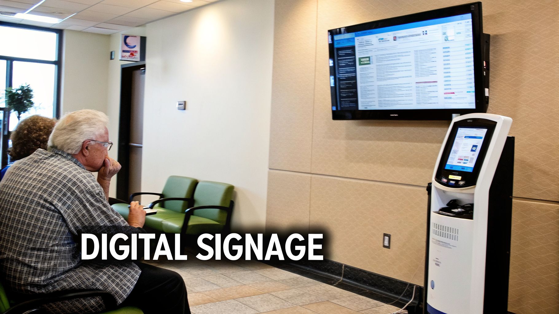
Imagine turning your waiting room from a place of anxious clock-watching into an active communication hub. Digital signs for medical offices do exactly that, replacing the stack of outdated magazines with dynamic screens that can genuinely improve the patient experience. It's about turning a passive wait into a productive, reassuring part of their visit.
This isn’t just a fad; it’s a fundamental shift in how modern healthcare facilities operate. The numbers prove it: the global market for digital signage in healthcare was valued at USD 6.83 billion in 2024 and is on track to hit USD 13.03 billion by 2032. This explosive growth is happening for a simple reason—it works. You can see the full picture in this detailed research on the healthcare digital signage market.
Reducing Perceived Wait Times
Nobody likes waiting, but what really wears on a patient's patience is the feeling of waiting with nothing to do. Digital signs are the perfect tool to tackle this head-on by giving people something valuable to focus on. Instead of staring at the clock, they can engage with bright, clear, and helpful information.
This is your chance to educate and reassure them with content like:
- Health and Wellness Tips: Short, easy-to-digest videos or graphics on seasonal health topics, diet advice, or managing common conditions.
- Meet Your Care Team: Humanize your practice with brief video introductions or bios of your doctors and specialists. This builds trust before the appointment even starts.
- Facility Information: Announce new services, share patient testimonials, or simply display office hours and contact details.
This strategy makes the wait feel significantly shorter and more purposeful. You're turning what was once dead time into an opportunity for patient education and anxiety reduction.
By engaging patients with relevant, dynamic content, digital signs can effectively reduce perceived wait times by as much as 35%. That’s a huge win for patient satisfaction and a calmer waiting room.
Streamlining Patient Flow and Check-In
Beyond making the wait more pleasant, digital displays are workhorses that can sharpen your office's operational efficiency. They guide patient flow, deliver instant updates, and take a significant administrative load off your front-desk staff.
Interactive kiosks, a popular form of digital signage, are a perfect example. These freestanding units empower patients to handle routine tasks themselves, which dramatically speeds up the entire intake process.
Here’s what they can do:
- Self-Check-In: Patients can confirm their appointment, verify personal details, and fill out digital forms, freeing up your team for more complex patient needs.
- Payment Processing: Many kiosks can securely handle co-pays and balance payments, simplifying the billing process for everyone involved.
- Digital Directories: In a large clinic or hospital, an interactive map is invaluable. A patient can touch a doctor’s name on the screen and get instant, easy-to-follow directions.
This kind of automation leads to a more organized front desk with fewer bottlenecks. When paired with a digital queue system that calls patients forward by number, you create a fair and transparent process that eliminates confusion. For a deeper dive into the technologies available, our guide to digital and LED signs offers more detail.
Delivering Critical and Timely Information
Perhaps the single greatest advantage of digital signage is its immediacy. In a medical setting, where information can change in an instant, this is a game-changer. Think about how slow and expensive it is to replace printed signs every time a policy or schedule changes.
With digital screens, you can push urgent updates in real time. If a doctor has an emergency and is running late, a quick message on the waiting room screen keeps patients informed and eases frustration. During a public health concern, you can instantly broadcast updated safety protocols to every screen in the building.
This ensures everyone—patients, visitors, and staff—receives the same accurate information simultaneously. It’s a direct investment in your facility’s agility, safety, and patient trust.
Your Guide to Signage Planning and Installation
Great signage doesn't just appear—it’s the final product of a deliberate, step-by-step process. Think of it like building a house; you wouldn’t start without a detailed blueprint. From the initial concept to the final bolt being tightened, having a clear roadmap is the only way to ensure your signs are delivered on time, on budget, and in perfect sync with your patient care philosophy.
This guide is that roadmap. We've broken down the entire journey into straightforward steps, giving facility managers and practice owners the framework you need to lead a successful project that truly enhances your facility.
Starting with a Clear Assessment and Budget
Before you even think about colors or fonts, you need to walk the walk—literally. Put yourself in a new patient's shoes and walk through your facility, from the parking lot to the exam room. This on-the-ground needs assessment is the foundation of your entire signage plan.
Take notes as you go. Where are the confusion points? Are patients constantly asking for directions to the lab? Is the main entrance hard to find from the street? An honest audit like this uncovers the real problems your signage needs to solve and prevents expensive mistakes down the line.
Once you have a solid list of needs, you can build a realistic budget. This is also the perfect time to think bigger. If you’re planning a renovation, it's critical to understand what tenant improvements are and how signage can be integrated from the very beginning, rather than tacked on as an afterthought.
Partnering with Professionals for a Site Survey
With your plan and budget in hand, it's time to bring in the pros. Working with a professional sign company is the single most important decision you'll make. They have the real-world experience to translate your vision into a physical reality and steer you clear of common pitfalls.
The first thing your sign partner will do is a thorough site survey. This isn't a quick glance; it's a technical deep-dive. They’ll take precise measurements, analyze installation surfaces, check for electrical access for any illuminated signs, and identify potential obstructions. This expert audit guarantees your new signs will fit perfectly and function as intended.
Navigating Design and Local Regulations
After the site survey gives you the technical green light, the fun part begins: design. Your sign company will create design proofs, which are digital mockups showing exactly what your signs will look like in place. This is your moment to scrutinize every detail—from colors and materials to placement and scale—before a single piece of metal is cut.
Approving the final design proof is your green light for production. Take your time during this review; catching a mistake now is far easier and less expensive than correcting a finished sign.
At the same time, a good sign partner will be navigating the maze of local permits. Most exterior signs are governed by complex zoning laws that dictate size, height, and even lighting. A reputable company will handle all the paperwork, ensuring your project is 100% compliant with city and county codes.
Managing a Multi-Site Rollout
For healthcare systems with more than one location, brand consistency isn't just a goal—it's essential for building patient trust. A multi-site signage rollout demands airtight project management to ensure every sign at every facility is identical in quality and appearance.
Here’s how to pull off a flawless multi-location project:
- Create a Brand Standards Guide: This is your rulebook. It must define the exact colors, logo usage, fonts, and sign types to be used across every single location. No exceptions.
- Centralize Project Management: Don't juggle multiple vendors. Work with a single sign company that has national reach and can oversee the entire process, from design proofs to final installation.
- Coordinate Installation Logistics: A smart, phased installation schedule is key to minimizing disruptions at each office. Your partner should work with each facility to ensure their daily operations are not impacted.
By following these steps, you can execute a cohesive signage strategy that strengthens your brand and gives patients a consistent, professional experience, no matter which of your doors they walk through.
Your Top Questions About Medical Office Signs, Answered
When you're ready to invest in new signage for your practice, you're bound to have questions. It’s a big decision, and getting straightforward answers is the only way to feel confident you're making the right choice for your patients and your bottom line.
Here, we tackle the most common questions we hear from healthcare providers, with practical, no-nonsense answers.
How Much Do Medical Office Signs Cost?
This is usually the first question on everyone's mind, and the honest answer is: it depends entirely on the sign. Think of it like buying a car—a basic sedan and a fully loaded truck have vastly different price tags. The same goes for signs. A simple, non-lit interior wall sign might only be a few hundred dollars, but a large, illuminated pylon sign can easily run into the thousands.
The real price comes down to a few key factors:
- Size: Bigger signs naturally use more materials and take more time to build, which drives up the cost.
- Materials: High-end exterior materials built to last, like aluminum or stone, will be a bigger investment than the standard plastics used for basic interior signs.
- Illumination: Lighting up a sign with internal LEDs requires wiring, power supplies, and specialized fabrication, all of which add to the final price.
- Complexity: A custom-shaped sign with intricate logos or multi-layered elements will cost more to produce than a simple, flat rectangle.
The best approach is always to get a detailed quote that breaks down the cost of design, fabrication, and installation. That’s the only way to see the full picture.
How Long Does It Take to Get a New Sign?
The timeline for a signage project hinges on two things: the complexity of the sign itself and the local permitting process. A set of simple interior signs, like room identifiers, can often be designed, produced, and installed in just a few weeks.
However, an exterior sign—especially a large monument or pylon sign—is a different story. You should realistically plan for a timeline of 6 to 12 weeks, and sometimes longer. This isn't just about making the sign; it involves a whole sequence of steps, from design and engineering to submitting permit applications, waiting for city approval, fabrication, and finally, installation.
The biggest wildcard is almost always the permit approval process. Some city planning departments move quickly, while others can take weeks or even months. Working with a sign company that knows the local codes and has experience with your municipality is the best way to keep things moving.
Can I Install the Signs Myself?
For small, simple interior signs like basic room numbers or printed posters, a DIY installation is definitely possible. But for almost everything else, professional installation isn't just a good idea—it's essential for safety and compliance.
Exterior signs, anything with electrical components, and signs mounted high on a wall or facade require specialized tools and, more importantly, expertise. A professional crew makes sure the sign is securely anchored to your building, all electrical work is up to code, and the placement meets strict ADA regulations.
Trying to handle a complex installation yourself can lead to property damage, a broken sign, or worse, create a serious safety hazard. It protects your investment and shields you from liability.


