A lot of wall graphic projects start the same way. Someone stands in a lobby, warehouse corridor, retail bay, or office bullpen, looks at a blank wall, and says, “We should do something with that.” That instinct is right, but the next step is where projects either become useful or expensive.
A wall graphic only works when it solves a job in the space. Sometimes that job is branding. Sometimes it’s wayfinding. Sometimes it’s making a large, cold room feel intentional. If you skip that question and jump straight to colors and mockups, you usually end up revising artwork, changing materials late, or fighting installation problems that were predictable from day one.
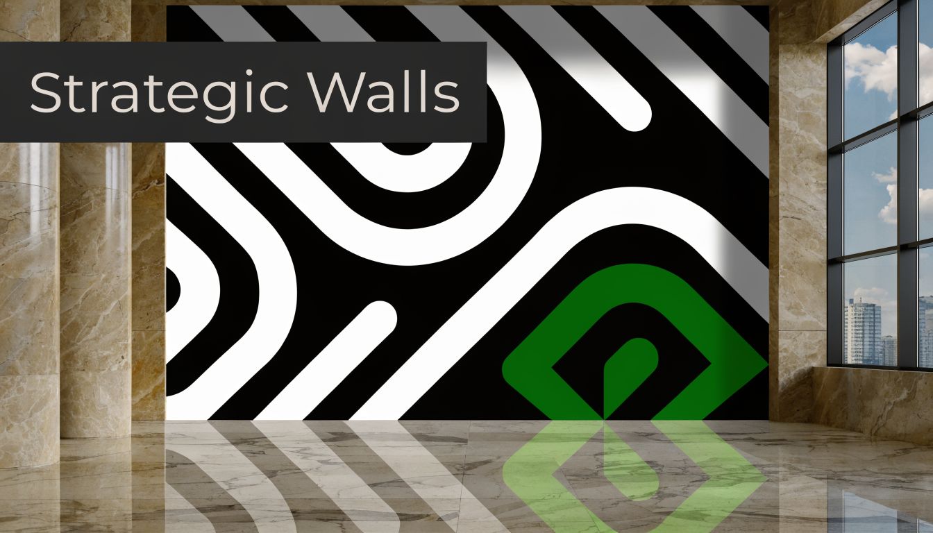
Beyond Paint A Strategic Approach to Wall Graphic Design
Wall graphic design sits in a long line of visual communication. Johannes Gutenberg’s printing press in 1439 enabled the mass production of visual materials for the first time in Western culture, which opened the door to posters and other commercial formats that eventually shaped modern wall graphics for business spaces, as outlined in this history of graphic design overview.
That history matters because it explains what wall graphics really are. They aren't just decoration applied to drywall. They’re a business communication tool placed at architectural scale.
What the wall needs to do
The strongest projects start with a plain question: what should this wall accomplish?
- Guide people: In a warehouse or distribution environment, a graphic can break up long corridors, mark zones, and support navigation.
- Reinforce brand: In a headquarters lobby, the wall often needs to communicate credibility before anyone speaks to a visitor.
- Shape atmosphere: In retail, the wall can set tone, frame merchandise, and help the space feel memorable instead of generic.
- Explain complex information: In training spaces, churches, or manufacturing facilities, a wall can carry values, process graphics, or safety-minded messaging.
That’s why I treat wall graphic design as part design problem, part operations problem. The artwork matters, but so do field dimensions, substrate condition, file prep, scheduling, and permit questions.
Practical rule: If you can’t describe the wall’s job in one sentence, you’re not ready to design it yet.
A useful way to frame the scope is to borrow estimating discipline from adjacent trades. Teams that already use tools like painting estimating software understand how quickly wall condition, access, and square footage affect labor and budget. Wall graphics need the same level of planning.
For businesses sorting out how graphics fit into a wider branded environment, this explanation of environmental graphic design is also a good reference point. It helps separate “something nice on the wall” from a coordinated space strategy.
Strategy before style
A wall can be large and still fail. I’ve seen beautiful concepts lose their impact because they were placed too high, broken by outlets, washed out by window glare, or printed on the wrong film for the wall texture.
The practical mindset is simple. Start with the business objective. Match it to the space. Then build the design, material, print spec, and installation plan around that reality. That sequence is what makes wall graphic design hold up in practice.
Start with the Wall Planning and Site Assessment
Most expensive mistakes happen before anyone opens Adobe Illustrator. They happen when teams rely on old floor plans, rough tape measurements, or a few phone photos and assume that’s enough.

A proper site assessment turns a blank wall into a documented production surface. That means dimensions, texture, obstructions, lighting, access, and code-related constraints all need to be captured before design gets approved.
Define the wall’s role before you measure it
Don’t start with width and height. Start with use.
A reception wall needs a different approach than a warehouse aisle graphic. A church foyer has different viewing behavior than a small retail fitting area. Some walls are seen straight on. Others are read while people walk past at an angle. That changes layout decisions, letter sizing, and where you place the focal point.
I usually ask clients to decide which of these is most important:
- Brand statement
- Wayfinding support
- Storytelling
- Decorative atmosphere
- Information delivery
If every answer is “all of the above,” the design usually gets cluttered.
Measure what exists, not what the plan says
Architectural plans are helpful, but they aren’t installation documents. Walls move in construction. Millwork gets added. Thermostats get relocated. Sprinkler heads and access panels show up where nobody expected them.
Take field measurements on site and document them clearly. Useful records include:
- Overall wall dimensions: Width and height at multiple points if the building is older or visibly uneven
- Obstacle map: Switches, thermostats, cameras, alarms, vents, outlets, trim breaks, and mounted screens
- Edge conditions: Inside corners, outside corners, returns, soffits, reveals, and base details
- Surface notes: Painted drywall, block, brick, metal panel, wood veneer, glass, or mixed substrate
- Access conditions: Ladder room, lift access, after-hours restrictions, occupied workspace, loading route
One overlooked issue is angled architecture. According to a 2025 industry report, 22% of wall graphic delaminations occur on angled or sloped surfaces because uneven tension and adhesion challenges weren’t addressed during the initial assessment, based on this angled wall reference. If the wall is canted, sloped, or broken into planes, note that early. It affects both design geometry and film choice.
A wall that looks flat in a photo can behave like three separate installation zones once you’re on site.
Document the substrate like an installer would
Designers often ask, “What color is the wall now?” Installers ask better questions.
Is the paint fresh? Is the wall dusty? Does the surface have orange peel texture, patched areas, concrete pores, block joints, or low-surface-energy paint? Was it recently repainted with something stain-resistant that resists adhesion? Those questions determine whether standard film will hold or fail.
A simple phone camera record helps, but it needs purpose. Shoot wide shots, straight-on elevation shots, close-ups of texture, corner conditions, and any damage. Include a tape measure or scale reference in at least some photos.
Check lighting and viewing paths
A graphic viewed from across a showroom behaves differently than one seen from six feet away in a hallway. Window light, overhead LEDs, glossy finishes, and shadows from shelving all change readability.
Look at the wall at the times people use the space. Morning glare in a glass-front retail store can flatten color and contrast. A matte finish may work better than a gloss film in that setting. In a warehouse, high-bay lighting can create harsh hotspots on darker graphics if the finish is too reflective.
This is also the stage where project management matters. If several stakeholders are involved, one person should own the site packet, revision log, and approvals. For teams handling multiple trades, this overview of signage project management is useful because wall graphics rarely happen in isolation. They often share schedules with painters, electricians, fixture installers, and facilities staff.
A quick visual on site planning helps if your team needs a field reference before final art is built:
A field checklist that prevents surprises
Before you approve design time, make sure you have these items in hand:
- Final dimensions from site: Not “approximate.” Not from memory.
- Clear wall photos: Include full elevation and detail views.
- Substrate identification: Drywall, brick, concrete, panel system, glass, or mixed.
- Obstacle inventory: Every item that interrupts the graphic area.
- Access and schedule notes: Occupied site, overnight install, lift requirement, security escort, or badging.
- Decision maker identified: One client-side approver for scope and one for artwork.
When teams rush this stage, the same problems repeat. Panels show up too short. Logos land across devices. Material gets ordered for a smooth wall that turns out to be heavily textured. Then everyone thinks the issue is installation. Usually it started in assessment.
Designing Graphics That Command Attention
The biggest design mistake in wall graphic design is treating a wall like a laptop screen. What reads well at arm’s length can disappear on a large wall because the room changes how people see, move, and process information.
Visual hierarchy is the first thing I check. Industry data shows that ignoring it causes 40% of large-format designs to fail viewer retention tests, according to this large-format design guidance. In plain terms, the viewer doesn’t know where to look first, so the message gets lost.
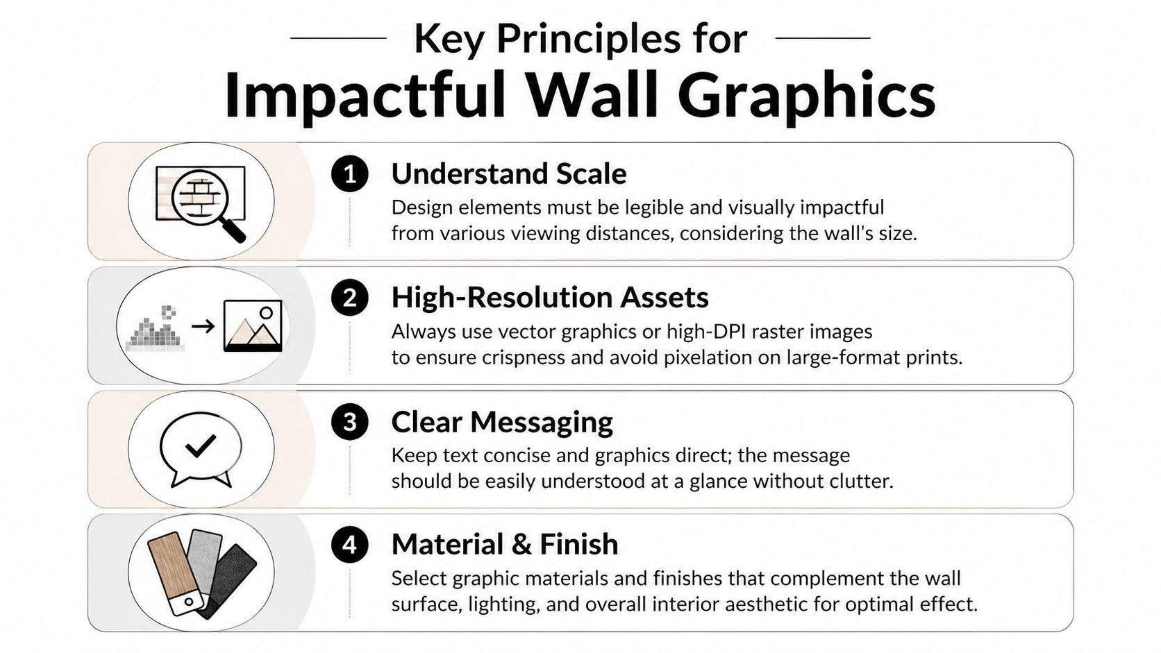
Start with one dominant message
A wall needs a focal point. That can be a brand line, a logo lockup, a bold shape system, or a large photographic element. It should be obvious from the primary viewing position.
If everything is large, nothing is important. If every sentence is trying to sell, teach, inspire, and explain at once, people absorb very little.
Good hierarchy usually looks like this:
- Primary layer: The first thing people should notice from the main approach
- Secondary layer: Supporting message or graphic system
- Tertiary layer: Fine detail for viewers who stop and engage
That sounds basic, but it solves a lot of real-world problems. Retail walls need quick read time. Office culture walls need breathing room. Warehouse graphics often need stronger contrast and simpler language because people view them while moving.
Design for distance, not just for proof PDFs
A proof on a monitor hides scale problems. So does a letter-size printout.
In practice, a wall graphic should be reviewed at simulated distance. Shrink the design on screen until it represents how the viewer will first encounter it. If the main idea gets muddy, the wall is too busy. If type only works when zoomed in, it’s too small.
Here’s what usually works better at scale:
- Short phrases over paragraphs
- Bold type over delicate letterforms
- High contrast over subtle tonal shifts
- Large, simple shapes over many small decorative elements
Field note: The wall doesn’t reward clever details nearly as much as it rewards clear reading order.
Negative space is not wasted space
Clients often see open space and want to fill it. That instinct hurts walls more than it helps them.
A wall graphic needs room around key elements so the eye can settle. In busy commercial interiors, the wall is already competing with products, people, furniture, fixtures, lighting, and architecture. Packing the graphic edge to edge can make the whole space feel louder and less organized.
This is one reason many polished large-format projects feel restrained. They aren’t underdesigned. They’re edited.
Typography and color choices that survive the room
Thin scripts, compressed novelty fonts, and low-contrast palette choices often die on the wall. The room eats them.
Choose typefaces that stay legible from expected viewing distances. Keep your message concise. If the brand uses a highly stylized font, pair it with a cleaner supporting typeface for practical readability.
Color also behaves differently after print and installation. A bright brand accent may look controlled on screen and overpowering at wall scale. Deep charcoal can read elegant in a mockup and nearly black out under low interior lighting. Printed samples and scaled proofs offer assistance in these scenarios.
For teams exploring concept directions before committing, this gallery of sign design ideas can be useful for seeing how different graphic approaches behave in physical spaces. If your project specifically uses adhesive interior graphics, this ultimate guide to custom vinyl wall decals is also a practical companion for understanding how decorative intent intersects with wall application.
What strong wall layouts tend to have in common
Instead of chasing trends, I look for these traits in designs that consistently install well and communicate clearly:
| Design choice | What works | What fails |
|---|---|---|
| Headline structure | One clear dominant phrase | Multiple equal-priority messages |
| Graphic scale | Large elements with room around them | Too many small shapes or icons |
| Brand integration | Controlled use of color and logo | Logo repeated so often it loses impact |
| Read path | Clear entry point and flow | Random placement with no order |
A strong wall graphic doesn’t need more content. It needs stronger decisions. When the hierarchy is right, people understand the message quickly, even in a busy environment.
Selecting Materials and Finalizing Print Specs
Creative intent meets physics. A wall graphic can be well designed and still fail because the wrong film was chosen or the production file wasn’t built for large-format output.
Material selection isn’t about picking the cheapest printable vinyl that looks acceptable on a sample swatch. It’s about matching the film, adhesive, finish, and print method to the actual wall and expected wear.
Cast vs calendared is not a minor detail
The most common material mistake is using calendared vinyl where cast vinyl should have been specified. That usually happens when a project starts with a square-foot price target instead of surface conditions.
A common and costly failure is using calendared vinyl on curved or textured walls. Industry benchmarks show it can lead to 40% material shrinkage within a single year, while cast vinyl offers a 7 to 10 year lifespan with better conformability, according to this material performance reference.
That doesn’t mean calendared film never has a place. It does. But it belongs on flatter, more forgiving surfaces and shorter-term applications. If the wall has texture, curves, returns, or any architectural complexity, cast film is usually the safer call.
A practical comparison for common wall graphic materials
| Material Type | Best For | Durability | Finish Options | Notes |
|---|---|---|---|---|
| Cast vinyl | Curves, textured walls, long-term branded interiors, challenging surfaces | Long-term | Matte, satin, gloss, laminate options | Better conformability and dimensional stability |
| Calendared vinyl | Flat, smooth walls, shorter-term promotions, budget-sensitive projects | Shorter-term than cast | Matte, gloss | Lower cost, but less forgiving on difficult surfaces |
| Printable wall fabric | Soft visual finish, upscale interiors, lower-glare applications | Depends on environment and adhesive system | Matte, textile look | Can look refined, but surface prep still matters |
| High-tack specialty film | Problem substrates, rougher walls, some low-energy surfaces | Varies by product | Usually matte or satin | Test first. Aggressive adhesive can complicate removal |
Match the material to how the wall behaves
A few examples make the trade-offs clearer.
A smooth painted office wall often gives you more options. You may be able to use a standard interior wall film if the paint is cured and the surface is clean. A concrete block wall in a distribution facility is different. The valleys and peaks of the surface demand a film and installation method that can handle texture, heat forming, and long-term grip.
Restaurant interiors add another variable. Cleaning chemicals, grease film near prep zones, and frequent wipe-downs affect finish choice. A matte film can look better under lights, but a laminate may still be worth it if the surface gets touched or cleaned often.
For teams comparing production approaches, this overview of large-format printing is useful because it connects material choices to output quality and finishing decisions. A provider such as On Display Signs can handle that material-to-installation coordination as part of a managed sign project, which matters when the job includes permitting, site verification, and fabrication under one workflow.
Material choice should be driven by wall condition first, design second, and price third.
Print files fail for predictable reasons
Most production delays come from ordinary file-prep issues. Missing fonts. Linked images not packaged. Raster art scaled too far. No bleed. Wrong color mode. Tiny drop shadows that won’t reproduce cleanly at size.
The phrase 300 DPI also causes a lot of confusion. It’s useful, but not universal. Large-format graphics don’t always need the same resolution standard people use for small printed pieces. A practical explanation of 300 DPI resolution helps if you need to understand the print concept before talking with your vendor.
What matters most is whether the file is appropriate for the final output size and viewing distance.
What to send your print partner
For a smooth handoff, production files should include:
- Vector artwork whenever possible: Logos, icons, line art, and type built in Adobe Illustrator or similar vector software scale cleanly.
- High-resolution raster files when needed: Photography must be sized appropriately for final use, not dragged up from a web image.
- Outlined fonts or packaged fonts: Avoid substitution problems at RIP stage.
- CMYK-aware artwork: Screen color and print color are different workflows.
- Bleed and paneling considerations: Large wall graphics may be tiled into installable sections, so critical elements shouldn’t land poorly across seams.
Watch the finish as closely as the file
Finish affects readability more than many buyers expect.
Gloss can make colors pop, but it also catches reflections. Matte is often easier to live with in offices, lobbies, and retail interiors because it reduces glare. Satin can split the difference. Lamination adds protection, but it can also shift the look slightly, so sample it before approving.
If you’re making a budget decision, cut cost in noncritical decorative coverage before you cut cost in material suitability. A less extensive graphic on the right film beats a full-wall concept that starts shrinking, lifting, or telegraphing every wall defect.
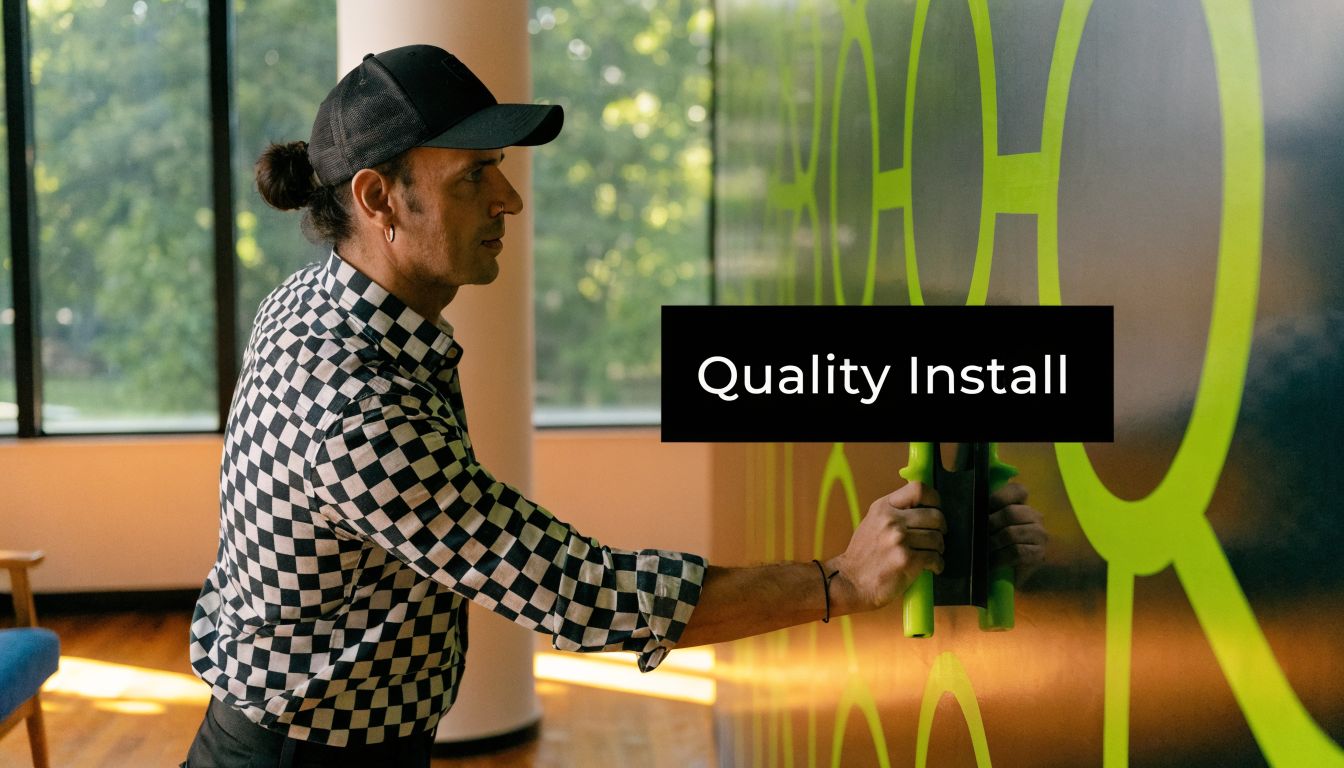
Navigating Installation Maintenance and Compliance
Printing the graphic isn’t the finish line. Installation is where design intent meets ladders, seams, wall texture, HVAC airflow, jobsite dust, and real schedule pressure.
That’s why I push clients toward professional installation for most commercial wall graphic design projects. DIY can work for small, simple pieces on smooth walls. It usually breaks down when the project involves multi-panel alignment, textured surfaces, access equipment, operating businesses, or any wall where failure would be expensive to remake.
Why professional installation pays for itself
Large wall graphics don’t fail because someone can’t use a squeegee. They fail because the installer has to make good decisions in the field.
A pro will check surface readiness, room temperature, panel order, seam strategy, edge wrap conditions, and obstacle cuts before committing adhesive to the wall. They’ll also know when to stop and call out a problem such as uncured paint, contaminated substrate, or unexpected texture that wasn’t in the site packet.
That matters even more if the wall sits in a public-facing area. A slightly crooked seam on a back-of-house utility wall is one thing. A visible misalignment behind a reception desk is another.
Maintenance starts with realistic expectations
Wall graphics aren’t zero-maintenance. They’re low-maintenance when specified and installed correctly.
Good care habits are simple:
- Use gentle cleaning methods: Soft cloths and non-aggressive cleaners are safer than abrasive scrubbing.
- Avoid picking at edges: Lift usually gets worse once someone starts pulling.
- Report damage early: Small edge issues are easier to correct before dirt gets into the adhesive line.
- Protect high-contact areas: If the wall sits near carts, chairs, or hand traffic, plan for that in the original spec.
A maintenance plan doesn’t need to be complicated. It just needs to exist before the wall goes live.
Permits and ADA details are not optional
Many clients assume interior wall graphics never touch compliance. That’s not always true. Depending on jurisdiction, location, and building use, graphics can intersect with permit review, code interpretation, and accessibility concerns.
Forgetting local regulations is a frequent pitfall. Neglecting code compliance, including placing key visual information outside the ADA-specified height range of 48 to 60 inches from the floor, can trigger 10 to 15% of permit rejections for commercial projects. If your project may require review, check the local sign permit requirements early.
The practical takeaway is straightforward. Don’t place essential information where users can’t access it comfortably. Don’t interfere with life-safety signage, room identification, or existing required markings. And don’t assume a wall is exempt from review because it’s inside the building.
Installation-day realities you should plan for
Some of the most avoidable delays happen on install day because nobody confirmed site logistics. Before installers arrive, verify these items:
- Wall is ready: Paint is cured, patching is complete, and the surface is clean
- Room is accessible: Furniture moved, lifts cleared, security coordinated
- Approval is locked: Final proof and panel layout signed off before printing
- Site contact is available: Someone with authority can answer field questions quickly
If any of those are loose, the installation crew ends up making decisions they shouldn’t have to make. That’s where timelines slip and rework starts.
Your Project Handoff Checklist
A good handoff makes you easier to work with and protects your timeline. It also reduces the vague back-and-forth that slows production, especially when multiple people on the client side are reviewing design, facilities, and brand details separately.
Use this checklist before sending your wall graphic design project to a sign company, printer, or project manager.
Site information to gather first
Send the physical facts before you send opinions about design.
- Confirmed wall dimensions: Field-measured width and height, plus notes on any irregularities
- Wall photos: Full straight-on shots, angled room views, and close-ups of texture
- Substrate description: Painted drywall, concrete, block, glass, panel system, or mixed materials
- Obstacle map: Outlets, alarms, switches, vents, cameras, trim, screens, and access panels
- Lighting notes: Window glare, spotlighting, dim corridors, or overhead industrial fixtures
- Access conditions: Lift need, ladder restrictions, security check-in, after-hours windows
Artwork package to provide
If the art files are messy, the project will feel messy.
Send these items in one organized folder:
- Editable master file: AI, EPS, or other native vector file where available
- High-resolution PDF proof: A clean visual reference everyone can approve
- Images used in layout: Full-resolution linked files, not low-quality placeholders
- Fonts handled correctly: Either packaged or converted to outlines
- Print-aware color setup: CMYK-ready artwork where appropriate
- Placement notes: Any nonnegotiable logo spacing, seam concerns, or cut-line instructions
If the only file available is a screenshot from a presentation deck, stop there and rebuild the art before production starts.
Project specifications your vendor needs
Many clients stay too vague at this point. “We want something durable and modern” isn’t enough to quote or schedule accurately.
Include:
- Intended use of the wall: Branding, navigation, donor recognition, storytelling, decor, or wayfinding
- Preferred material direction: Cast vinyl, fabric, removable film, or “need recommendation based on wall texture”
- Finish preference: Matte, satin, gloss, laminated, or undecided
- Installation responsibility: Client-provided installer or turnkey install by vendor
- Target schedule: Desired install window and any immovable opening dates
- On-site contact: Name, phone, and role for day-of coordination
- Approval chain: Who signs off on design, production, and field changes
Questions worth asking before you approve production
A prepared client asks better questions. These are the ones that prevent late surprises:
- Is the specified film right for this exact wall surface?
- Will panel seams fall in visible or awkward locations?
- Does the proof reflect true scale in the room?
- Are there any permit or ADA concerns based on placement?
- What surface prep is required before installation?
- What cleaning method should facilities use after install?
Bring complete information to the handoff, and the project usually moves faster, cleaner, and with fewer revisions.
If you're planning a wall graphic project and want one team to handle site review, design coordination, permitting questions, fabrication, and installation, On Display Signs, Inc. provides national sign project support for commercial environments, including wall graphics for offices, retail spaces, warehouses, and other branded interiors.

